North star · Keep the interface visually quiet and let crisp typography and lavender product imagery carry the story.
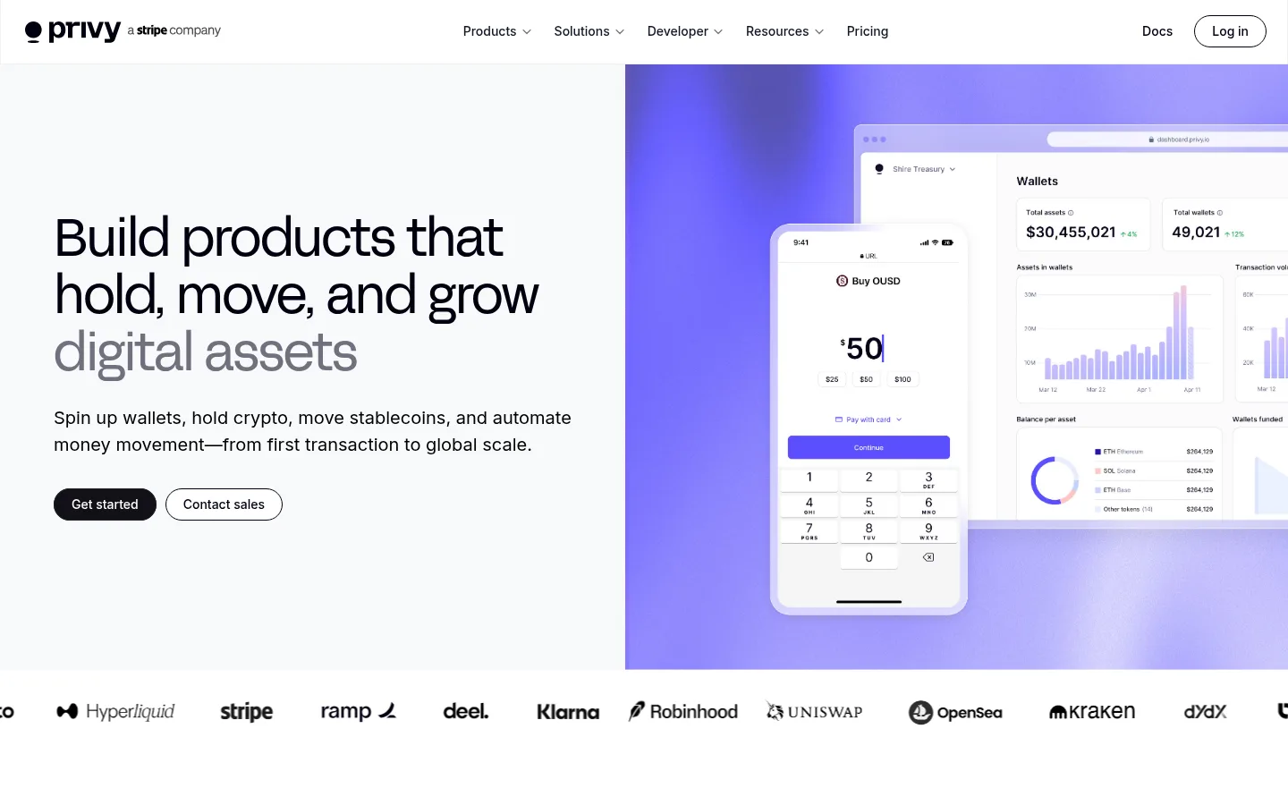
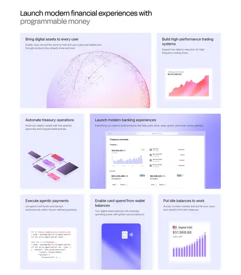
The page builds its identity from a quiet white and near-white canvas, using dark text and muted gray to keep attention on the message and product visuals. Lavender and violet gradients appear primarily in dashboard mockups and feature artwork, rather than as a pervasive interface accent. Display headlines use FFF Acid Grotesk Normal with light, closely tracked forms; Inter carries compact body copy, navigation, and supporting labels. A broad, left-aligned hero pairs concise copy and pill-shaped actions with a large financial dashboard composition. Below it, modular image-led panels, four bold metrics, customer case-study cards, and a trust-focused split section create a deliberate progression from capability to proof. Generous section spacing and a predominantly flat surface treatment keep the long page calm, while rounded media and buttons soften the otherwise precise, developer-oriented presentation.
Body copy, navigation, labels, and smaller headings.
Aa 设计
FFF Acid Grotesk Normal
网络字体 · 字重 400 · 占比 14%
免费替代:Space Grotesk
Display, H1–H3, and prominent text links.
Aa 设计
Inter-Medium
系统字体 · 字重 500 · 占比 2%
免费替代:Inter
System fallback for medium-weight interface text.
角色
示例
字号
字重
行高
字距
特大标题
Oversized hero and high-impact section headline treatment.
Privy
58px
400
1.1
-0.03em
一级标题
Primary page or section headline, especially the hero.
Privy
52px
400
1.15
-0.03em
二级标题
Major section titles introducing capabilities and proof.
Privy
42px
400
1.14
-0.03em
三级标题
Feature-panel titles and secondary content headings.
The quick brown fox 敏捷的狐狸
26px
400
1.23
-0.01em
四级标题
Supporting headings within product and trust sections.
The quick brown fox 敏捷的狐狸
22px
400
1.27
-0.03em
正文
Descriptions, explanatory copy, and navigation details.
The quick brown fox 敏捷的狐狸
14px
300
1.43
0
辅助文字
Compact labels, metric descriptors, and small metadata.
The quick brown fox 敏捷的狐狸
12px
500
1.5
0
链接
Prominent text links and secondary action labels.
The quick brown fox 敏捷的狐狸
20px
400
1.4
-0.03em
间距与布局
基准单位 2px · 密度:宽松
40px版块间距
70px元素间距
—卡片内边距
1200px内容最大宽度
4px
6px
8px
10px
12px
16px
20px
24px
32px
40px
60px
70px
Use a spacious, vertically sequenced page with a measured 1200px maximum content width. The hero is a two-part composition: left-aligned copy and actions beside large product media. Follow with a logo strip, asymmetrical modular feature panels, a four-column metrics row, customer cards, a two-column trust section, centered CTA, and multi-column footer. Keep text alignment mostly left, reserving centered alignment for the closing CTA. The measured density is spacious; preserve generous separation between sections and avoid crowding.
圆角与层次
按钮 · 9999px
图片 · 8px
链接 · 8px
没有测到阴影:页面是扁平的,层次靠底色和描边区分。
The interface reads mostly flat, with little reliance on visible shadows or decorative borders. Separate sections through white and near-white bands, whitespace, and the imagery itself. Rounded media and pill-shaped actions provide the main softness; product mockups create internal depth through overlapping screens and layered illustrations.
组件
下面的预览按实测的按钮、输入框、徽标、卡片样式重建(字体用替代字体)。
Primary CTA
Dark near-black pill button with white label, used for the main Get started action; keep its treatment compact and high contrast.
Secondary CTA
White pill button with a fine dark outline and dark label, paired directly with the primary action.
Product feature panels
Pale lilac or near-white image-led modules with a concise heading, short supporting copy, and product artwork.
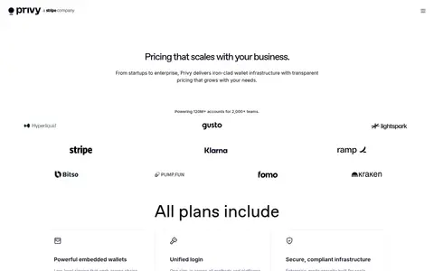
Customer logo strip
A single horizontal row of partner marks beneath the hero, shown in restrained monochrome.
Metrics row
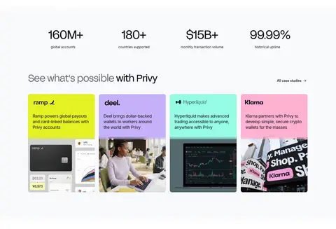
Four evenly distributed large numeric proof points with small muted descriptors beneath.
Case-study cards
A horizontal set of customer cards combining vivid brand-colored panels, short summaries, and supporting images.
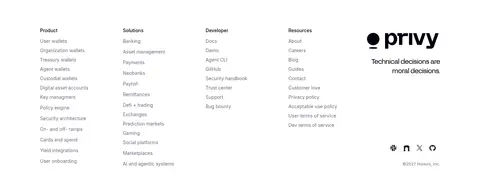
Footer link columns
Dense multi-column navigation groups with small headings, compact links, and a larger Privy brand mark.
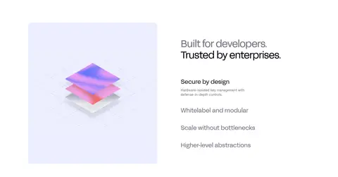
Imagery · Prioritize polished product-interface mockups, including wallets, dashboards, charts, and cards, framed as large rounded media. Lavender and violet gradients, pale lilac panels, and soft pink highlights mostly belong to these product illustrations rather than the core interface palette. Mix interface captures with abstract globe, workflow, and layered 3D-style artwork; case-study tiles combine customer identity, concise copy, and imagery.
Use white and Cloud Canvas as the dominant page surfaces.
Reserve saturated violet gradients for product visuals and illustration.
Set prominent headlines in a light editorial grotesk with tight tracking.
Pair primary and outlined secondary pill actions.
Organize capabilities into image-led modular panels.
Use customer proof and metrics as distinct page beats.
✕ 不该做
Do not turn the whole interface into a saturated gradient.
Do not add unsupported palette colors or decorative accent hues.
Do not crowd sections or compress the generous vertical rhythm.
Do not use heavy shadows to separate otherwise flat content.
Do not make body copy compete with oversized headlines.
Do not treat illustration-only colors as interface-wide brand colors.
给 AI 的提示词
想快速出一个同风格的新页面,把这段话连同 DESIGN.md 一起发给 AI。
Build a new Privy-style fintech page with a quiet, spacious interface. Use Gallery White (#ffffff) as the main canvas and Cloud Canvas (#f8f9fc) for soft section bands. Set headlines in an editorial grotesk similar to Space Grotesk, with compact Inter-style supporting copy and dark True Black (#000000) or Midnight Ink (#111117) text. Keep Lavender/violet color effects confined to product mockups and illustrations; do not invent interface accent colors. Use a clear hero with copy and paired pill CTAs beside polished wallet or dashboard media. Follow with modular feature panels, customer proof, and concise metrics. Favor generous section separation, mostly flat surfaces, rounded media, and clear left alignment; reserve centered composition for a closing CTA. Keep interactions legible and the overall mood precise, calm, and developer-focused.