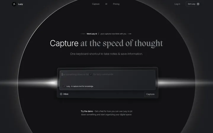
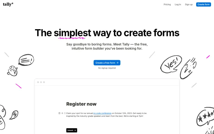
North star · Keep the page shell warm, quiet, and spacious; concentrate saturated colour and layered depth inside the product previews.
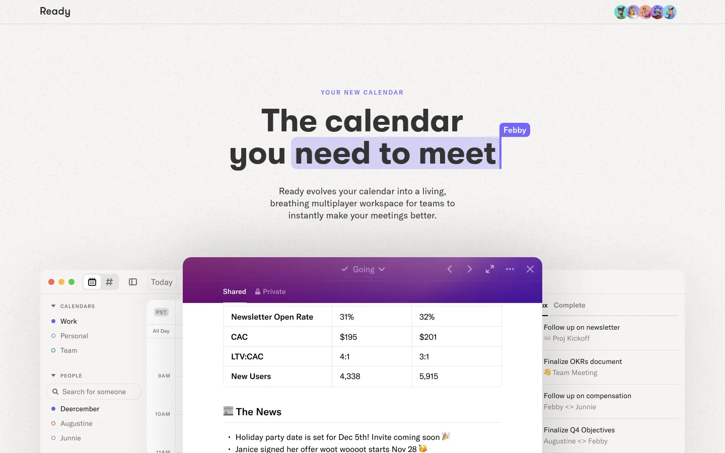
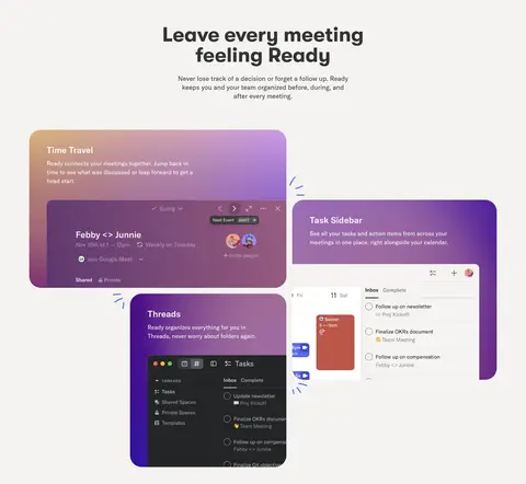
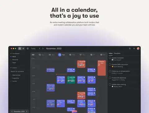
The visual identity is built around a consistent warm off-white canvas (#f5f4f1), with charcoal headings and body copy providing crisp contrast. Large, heavy GT Walsheim headlines give the page an assertive editorial voice; GT America Standard handles supporting copy in a quieter, readable rhythm. Most sections remain centered and generously separated, while feature explanations shift into staggered, asymmetrical arrangements. Product imagery carries the strongest colour: calendar and meeting interfaces sit inside saturated purple, blue, teal, and coral-tinted cards. These are product-preview colours, not a reason to recolour the neutral page shell. Subtle radial purple light appears behind the large calendar showcase, and soft shadows lift interface mockups from the canvas. A thin pale-gray hairline distinguishes the compact top navigation. Overall, the page keeps its framing restrained so the detailed, colorful software previews—not decorative chrome—supply the visual energy.
Body copy, navigation, captions, links, and eyebrow labels.
Aa 设计
GT Walsheim
网络字体 · 字重 700 · 占比 12%
免费替代:Manrope
Display headlines and the main hero heading.
角色
示例
字号
字重
行高
字距
特大标题
Large bold display headlines for prominent section statements.
Ready
64px
700
1
0
一级标题
Hero title, split across centered lines.
Ready
56px
700
1
0
二级标题
Secondary section headings and feature titles.
The quick brown fox 敏捷的狐狸
24px
500
1.25
0
正文
Supporting paragraphs describing Ready and its features.
The quick brown fox 敏捷的狐狸
16px
400
1.5
0
辅助文字
Small supporting copy within product or feature contexts.
The quick brown fox 敏捷的狐狸
14px
300
1.43
0
链接
Quiet utility and footer links.
The quick brown fox 敏捷的狐狸
14px
300
1.43
0
眉题
Small uppercase label above the hero title.
The quick brown fox 敏捷的狐狸
12px
500
1.33
0.167em
间距与布局
基准单位 8px · 密度:适中
48px版块间距
16px元素间距
—卡片内边距
640px内容最大宽度
2px
8px
10px
16px
20px
24px
32px
40px
48px
80px
96px
Use a centered content column with a measured maximum width of 640px for text-led material, opening into full-bleed or wider product previews where needed. The hero is centered, while selected feature-introduction content is left-aligned and the showcase cards use staggered, asymmetrical placement. Sections share the same canvas and are separated by generous measured vertical rhythm; avoid dense stacks of unrelated content. The overall density is comfortable, with compact supporting copy and substantial breathing room around headings and media.
圆角与层次
卡片 · 24px
图片 · 16px
导航 · 50%
lg · card
xl · media
xl · card
The page shell stays visually flat, with a fine pale-gray navigation divider rather than boxed sections. Product previews gain depth through soft, diffuse shadows and overlapping windows. Rounded card and media edges soften the interface, while inset tables, panels, and task lists retain crisp internal separators.
组件
下面的预览按实测的按钮、输入框、徽标、卡片样式重建(字体用替代字体)。
Compact top navigation
Minimal header with the Ready wordmark at left, small overlapping team avatars at right, and a thin #dcdbd8 divider.
Centered hero
Uppercase tracked eyebrow above a bold centered two-line headline, brief explanatory copy, and a large full-bleed product preview.
Meeting-space gallery
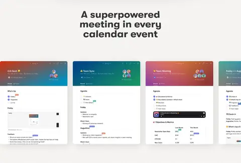
Centered section title followed by a horizontal sequence of colorful meeting-interface previews.
Feature cards
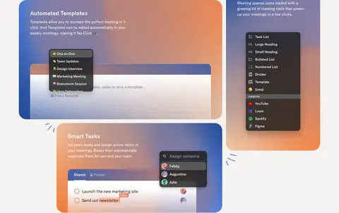
Asymmetrically arranged feature demonstrations, including measured #6c77b0 and #817da6 card backgrounds and rounded corners.
Workspace showcase
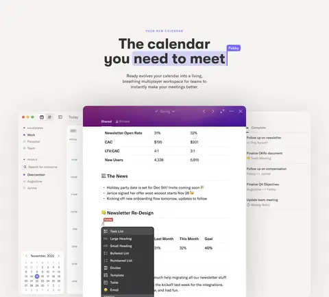
Large calendar interface presented as a wide product view against the warm canvas, with a subtle purple radial glow.
Closing CTA and footer
Centered closing headline and concise copy, followed by a quiet footer with muted policy links and small social marks.
Imagery · Product UI imagery is the page’s main visual content: calendar views, meeting spaces, task panels, and collaborative documents appear as detailed interface mockups rather than lifestyle photography. Large previews are framed as floating windows or rounded cards, sometimes overlapping to suggest a live workspace. Feature artwork uses saturated purple, blue, teal, and coral gradients inside the mockups; keep surrounding page areas neutral. The hero uses a large, full-width product preview.
Keep the hero title bold, centered, and visually dominant.
Reserve vivid gradients for product previews and interface cards.
Give text-led sections generous breathing room.
Use #333333 for primary text and #8b8c96 for quiet footer links.
Layer product windows with soft shadows and rounded edges.
✕ 不该做
Do not introduce new page-shell colours beyond the measured palette.
Do not make every section a boxed card.
Do not let decorative gradients compete with product imagery.
Do not compress the spacious section rhythm into a dense grid.
Do not use heavy borders around the main content.
Do not replace the product-led previews with generic stock photography.
给 AI 的提示词
想快速出一个同风格的新页面,把这段话连同 DESIGN.md 一起发给 AI。
Build a new Ready-style SaaS page with a warm, continuous #f5f4f1 canvas and a restrained header divided by a #dcdbd8 hairline. Use bold GT Walsheim-like headlines in #333333 and calm GT America Standard-like supporting text. Center the opening statement and pair it with concise copy and a large, detailed software-interface preview. Organize later content into spacious feature introductions and staggered product demonstrations, keeping saturated hues such as #6c77b0, #8f4d75, and #817da6 inside interface cards rather than spreading them across the page shell. Use rounded media, subtle diffuse shadows, and a restrained purple glow for a large showcase. Finish with a centered CTA and quiet footer links in #8b8c96. Preserve comfortable spacing and a clear hierarchy.