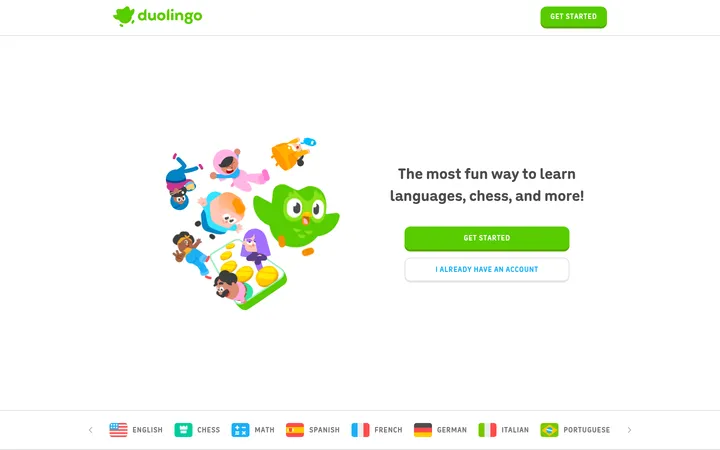
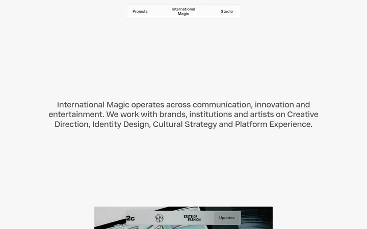
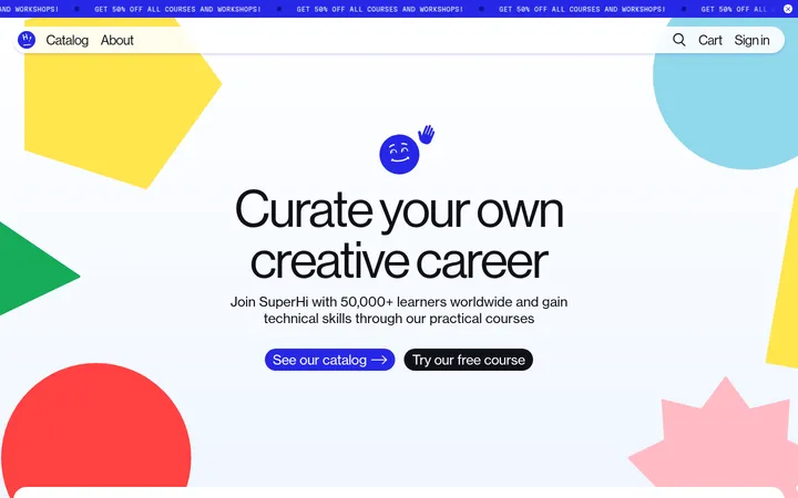
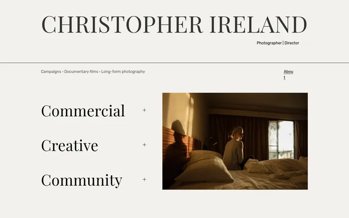
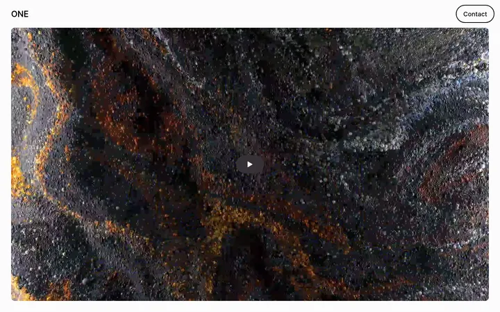
North star · Keep the interface monochrome and editorial; let real creative work provide the color and personality.
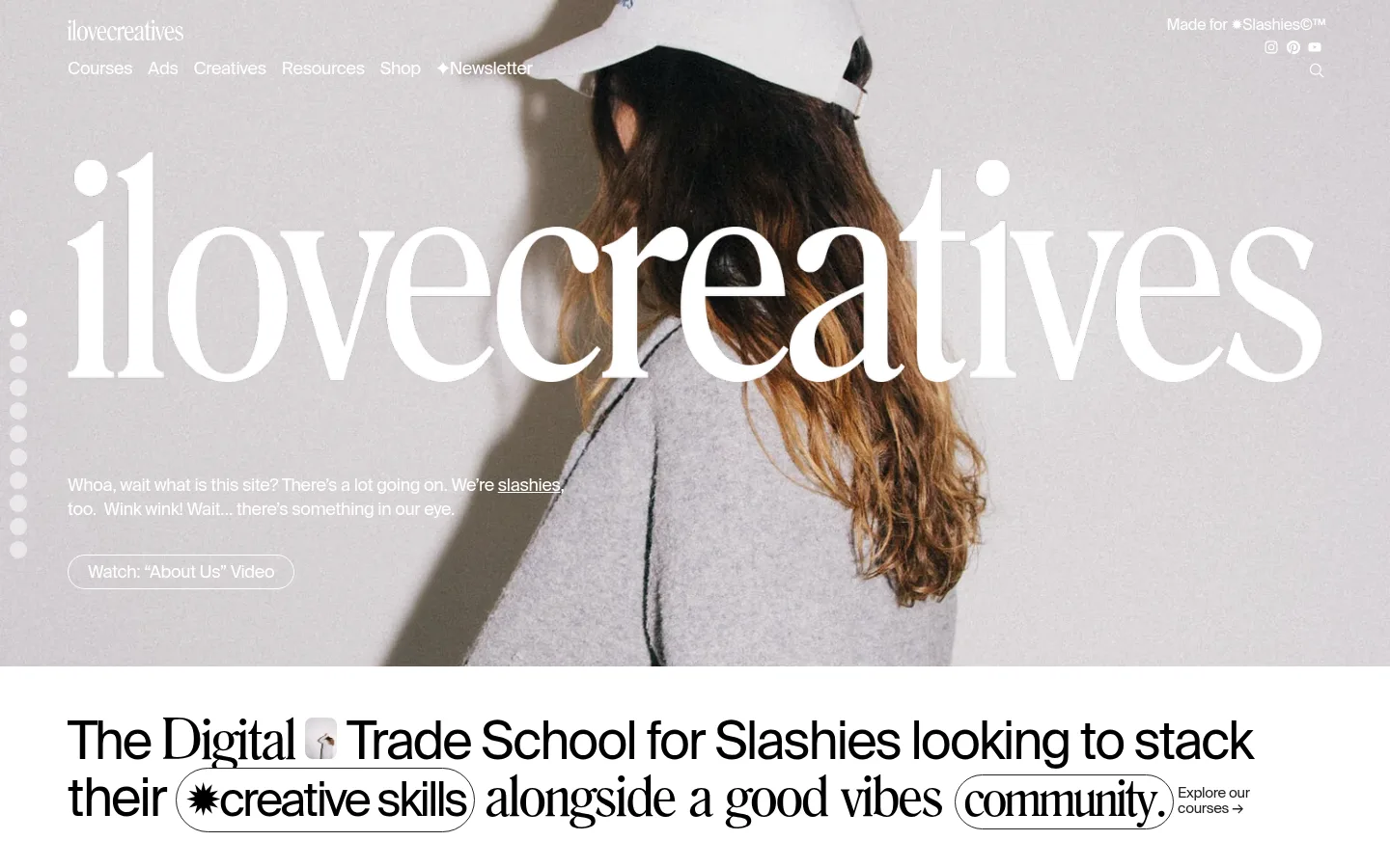
The visual strategy is built on a near-monochrome foundation: white is the main canvas, black anchors the inverse hero and footer, #222222 carries subdued text and outlines, and #ebebeb marks occasional section bands. The opening is deliberately image-led, with an oversized white serif wordmark over a full-bleed photograph; later sections switch to white space and sharp black typography. SuisseRegular supplies the clean, compact interface voice, while romana adds expressive editorial contrast to display headings. The page alternates broad, airy introductions with horizontally browsable cards for courses, profiles, products, ads, articles, and creative websites. Rounded outline treatments make key phrases and actions feel informal without introducing a separate accent color. Photography, course artwork, product imagery, and student work supply nearly all the color, so the measured palette stays quiet while the content feels energetic. Thin dark borders and limited surface shading keep cards crisp and direct.
Primary sans-serif for headings, body copy, navigation, links, and controls.
Aa 设计
romana
网络字体 · 字重 100 · 占比 4%
免费替代:Bodoni Moda
Expressive serif display face for the wordmark and selected editorial headings.
Aa 设计
Arial
系统字体 · 字重 100 · 占比 3%
免费替代:Arial
Secondary fallback for a measured heading role.
角色
示例
字号
字重
行高
字距
特大标题
Oversized serif wordmark and expressive display moments.
ilovecreatives
59.5px
100
0.95
-0.04em
一级标题
Primary introductory statement and major page heading.
ilovecreatives
54px
100
1.05
-0.04em
二级标题
Section titles and prominent editorial statements.
ilovecreatives
48.5px
100
1.17
-0.06em
三级标题
Serif subheads and selected card or section headings.
ilovecreatives
35px
100
1
-0.04em
四级标题
Smaller subsection headings where a neutral sans-serif appears.
ilovecreatives
32px
100
1.1
-0.02em
正文
Course descriptions, profile details, and supporting copy.
The quick brown fox 敏捷的狐狸
14px
100
1.4
-0.02em
按钮
Large outlined inline phrase treatments and prominent action text.
ilovecreatives
48.5px
100
1.17
-0.06em
导航
Header navigation and compact section-level navigation.
The quick brown fox 敏捷的狐狸
18px
100
1
-0.02em
链接
Card titles, browse actions, and secondary text links.
The quick brown fox 敏捷的狐狸
15px
100
1.8
-0.02em
间距与布局
基准单位 2px · 密度:适中
50px版块间距
—元素间距
58px卡片内边距
1300px内容最大宽度
1px
2px
3px
4px
5px
6px
8px
10px
13px
15px
17px
20px
24px
70px
A long single-column homepage uses a centered content area capped at the measured 1300px maximum width, with full-bleed media at the opening and near the lower page. Most sections align content to the left and place horizontal card rails beneath concise headings and browse actions. Generous gaps separate distinct content bands, while cards themselves are closely grouped for browsing. The #ebebeb bands interrupt the white canvas sparingly; a black newsletter/footer closes the page. Overall density is comfortable, with more breathing room around section titles than within card details.
圆角与层次
按钮 · 9999px
卡片 · 20px
图片 · 20px
徽标 · 9999px
导航 · 50%
链接 · 9999px
没有测到阴影:页面是扁平的,层次靠底色和描边区分。
The page reads mostly flat: no measured shadows or gradients define its surfaces. Thin #000000 or #222222 outlines distinguish pill controls, profile and listing cards, and badges from the white canvas. Rounded corners soften those borders, while large photography and artwork provide depth through their own imagery rather than interface layering.
组件
下面的预览按实测的按钮、输入框、徽标、卡片样式重建(字体用替代字体)。
Hero and wordmark
Full-bleed photographic opening with a huge white serif wordmark, overlaid light navigation, concise intro copy, and an outlined video link.
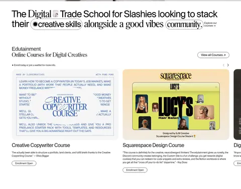
Course rail
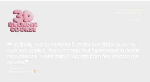
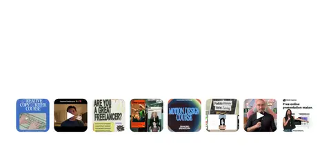
Section heading and outlined browse action above horizontally arranged course cards with artwork, title, short description, and enrollment badge.
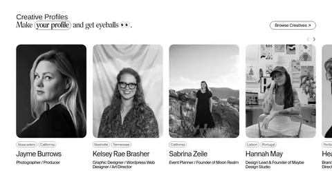
Creative profiles
Portrait-led horizontal cards pair rounded photography with location, creator name, and discipline.
Outlined phrase pills
Short emphasized phrases and actions use black text inside thin, rounded outlines, creating a playful inline control treatment.
Content and product rails
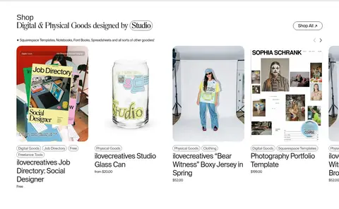
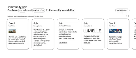
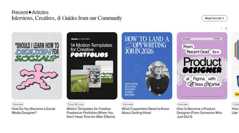
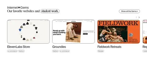
Product, community-ad, article, and website cards use compact labels and imagery in horizontal browsing collections.
Newsletter footer
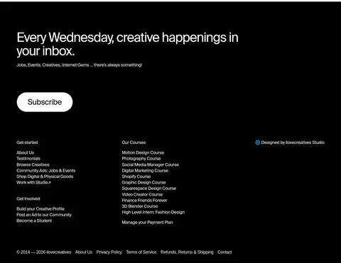
A black closing section combines a white signup heading and button with dense grouped navigation and small legal links.
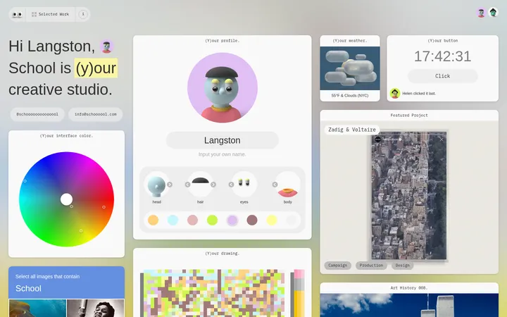
Imagery · The hero uses a full-bleed lifestyle photograph, with the white wordmark layered prominently over the subject and pale background. Lower sections rely on varied real-world creative content: monochrome portraits, course graphics, product photography, article covers, and screenshots or examples of student and community work. Media is presented as rounded cards or tightly framed tiles; vivid colors belong to the artwork and photography, not the interface palette.
Use the measured palette only for interface colors.
Let photographs and creative work supply visual color.
Set display moments in a contrasting editorial serif.
Keep section headings concise and left aligned.
Use thin outlines and rounded pills for informal emphasis.
Organize repeated content into horizontally browsable rails.
✕ 不该做
Do not add a new bright brand accent.
Do not apply shadows or gradients to cards.
Do not make every section a boxed panel.
Do not use decorative display type for dense descriptions.
Do not separate media from the content it represents.
Do not crowd the section transitions with extra UI.
给 AI 的提示词
想快速出一个同风格的新页面,把这段话连同 DESIGN.md 一起发给 AI。
Build a new page in the ilovecreatives style: keep the interface palette to Gallery White (#ffffff), Studio Black (#000000), Soft Ink (#222222), and Quiet Fog (#ebebeb). Use a clean sans-serif similar to SuisseRegular for navigation, copy, and controls, with a high-contrast serif similar to romana reserved for expressive display moments. Start with a confident photographic or creative-work feature, then organize content into spacious, left-aligned sections with horizontal card rails and compact browse actions. Use real imagery as the primary source of color. Make cards feel flat and editorial, using fine dark outlines, rounded corners, and no shadows or gradients. Include playful outlined phrase pills sparingly, and finish with a strong black newsletter or navigation area with white text.