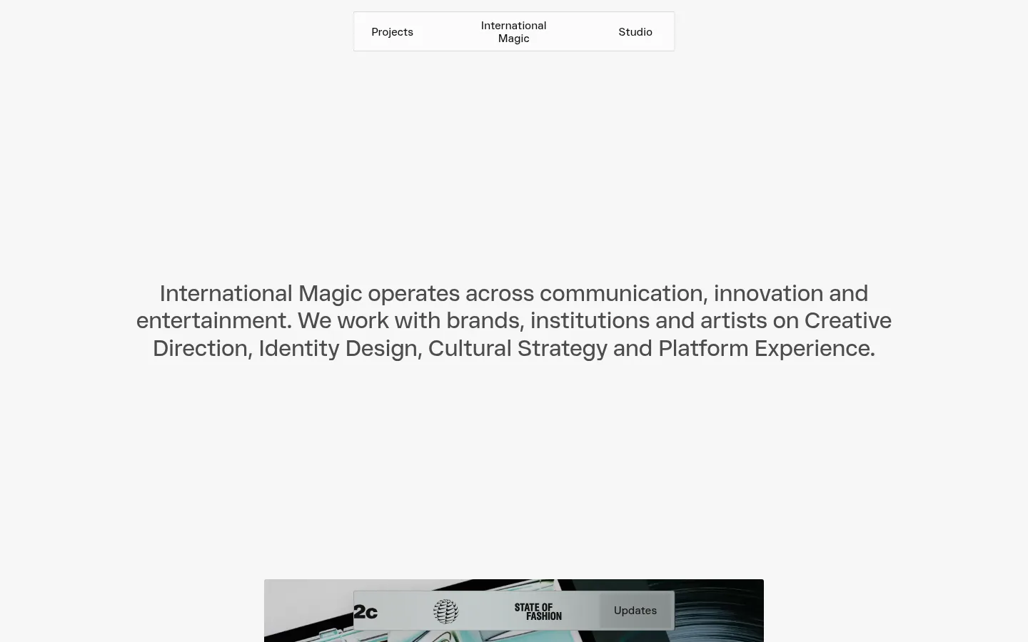
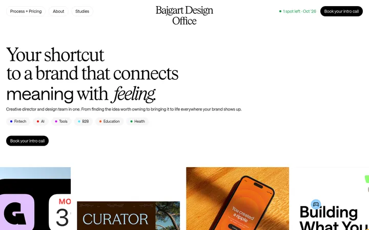
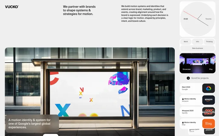
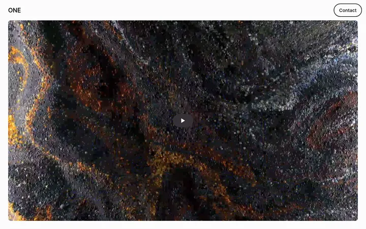
North star · Keep the interface visually quiet and let generous space and vivid project imagery carry the experience.
The page is anchored by a near-white canvas, #f7f7f7, that extends through the introduction and project sequence. Typography stays within a narrow grayscale range: #4d4d4d carries the prominent introductory statement, #121212 marks stronger text and navigation, while #737373 is used for quieter text and links. A fine #d4d4d4 hairline defines the compact top navigation without introducing heavy framing. Wand UI Pro gives the page a clean, contemporary sans-serif voice; the large centered opening statement is followed by small navigation and caption-like text. The layout is deliberately sparse: generous blank intervals separate isolated project images, letting each image read as an editorial plate. Imagery supplies the page’s strongest color and contrast, including photographic scenes, printed graphics, and dark artwork; those hues belong to project content, not the core interface palette. Subtle image shadows add depth while the surrounding interface remains nearly flat.
All measured text: introduction, navigation, body copy, captions, buttons, and links.
角色
示例
字号
字重
行高
字距
一级标题
Centered introductory studio statement.
International Magic
32px
500
1.2
-0.01em
正文
Project names, supporting copy, and general interface text.
The quick brown fox 敏捷的狐狸
15px
500
1.2
0.013em
辅助文字
Small project metadata and quiet supporting labels.
The quick brown fox 敏捷的狐狸
11px
500
1.6
0.025em
按钮
Navigation or utility actions such as Updates.
The quick brown fox 敏捷的狐狸
15px
500
1.25
0.013em
链接
Small secondary links such as Privacy.
The quick brown fox 敏捷的狐狸
11px
500
1.6
0.025em
间距与布局
基准单位 4px · 密度:适中
—版块间距
10px元素间距
—卡片内边距
1432px内容最大宽度
1px
4px
8px
10px
12px
16px
20px
The page uses a single-column, editorial composition within a measured maximum width of 1432px. The compact navigation sits centered near the top, while the introductory statement is centered below it. Project images are presented individually rather than in a dense grid, with substantial blank intervals establishing a slow vertical rhythm. Image widths and placements vary, creating a curated sequence rather than a rigid card system. Comfortable density and broad surrounding whitespace are defining features.
圆角与层次
按钮 · 3px
卡片 · 3px
xl · card
lg · other
The interface is predominantly flat, without filled cards or prominent shadows. A fine grey hairline outlines the navigation, while project images may have a deep, diffuse shadow that separates artwork from the canvas. Keep borders and layering limited to these restrained cues.
组件
下面的预览按实测的按钮、输入框、徽标、卡片样式重建(字体用替代字体)。
Compact top navigation
A centered, lightly outlined horizontal bar with Projects and Studio at the sides and the International Magic wordmark centered; labels use Wand UI Pro.
Introductory statement
A large centered block of muted grey copy on the canvas, serving as the homepage’s primary introduction.
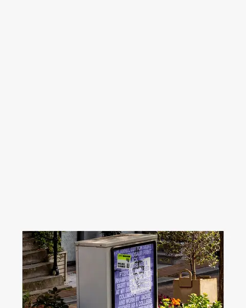
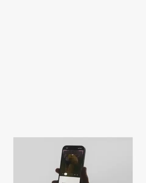
Project image plate
An isolated project image positioned within the open single-column flow; image content supplies its own palette and contrast.
Utility Updates control
A compact, pale-grey button with near-black text, a subtle 3px corner radius, and horizontal padding.
Project label
Small, understated text identifying work such as State of Fashion or Martine Rose × Nike, with ample space around the associated image.
Quiet text link
Small grey utility link such as Privacy, without a filled background or visible border.
Imagery · Project imagery is the main source of color and visual contrast: photographed installations, printed design, campaign imagery, and dark graphic compositions. Frames sit directly on the pale canvas, with varied image proportions and occasional subtle shadows. Bright hues and black backgrounds occur within the artwork itself; they should not be generalized into interface accents.
Separate project plates with generous blank space.
Use Wand UI Pro or a close sans-serif substitute.
✕ 不该做
Do not add colorful interface accents.
Do not compress projects into a dense grid.
Do not place heavy card backgrounds behind images.
Do not use oversized decorative headings in navigation.
Do not mistake colors inside artwork for brand palette colors.
Do not add strong borders or pronounced interface shadows.
给 AI 的提示词
想快速出一个同风格的新页面,把这段话连同 DESIGN.md 一起发给 AI。
Build a new creative-studio page with the quiet editorial character of International Magic. Use Gallery White (#f7f7f7) as the continuous canvas, Soft Graphite (#4d4d4d) for the centered introductory statement, Near Black (#121212) for strong labels, Slate Grey (#737373) for quieter links, and Quiet Hairline (#d4d4d4) for delicate framing. Use Wand UI Pro, or Inter as a free substitute, with restrained medium-weight typography. Keep the navigation compact and centered, then give the opening copy generous breathing room. Present projects as a vertical sequence of individually framed images, varying their proportions and allowing artwork to bring its own color. Favor large blank intervals, subtle image shadows, and an otherwise flat interface; avoid dense grids, decorative gradients, and loud controls.