North star · Let bright green actions and expressive character illustrations carry the personality while generous white space keeps the page clear.
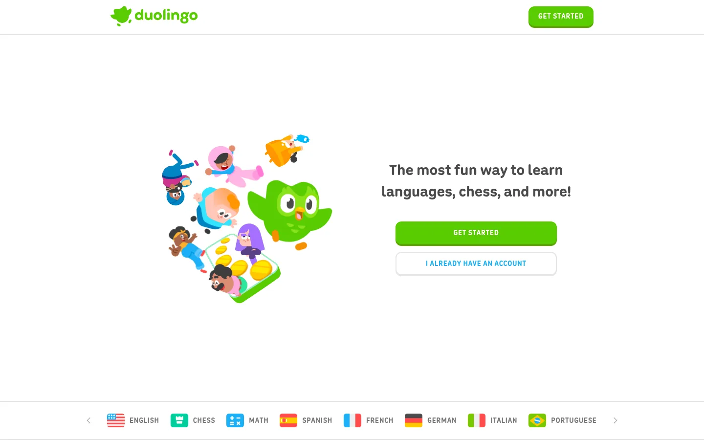
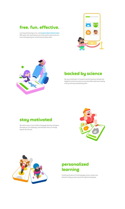
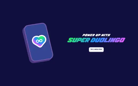
The page is anchored by a white canvas (#ffffff), with a restrained neutral palette that leaves room for the colourful character artwork to stand out. Duolingo Green (#58cc02) marks the main start actions, feature headings, and footer; Signal Blue (#1cb0f6) is reserved for links and the secondary account action. A deep navy band (#100f3e) creates a clear visual break for the Super Duolingo promotion. Headings use the rounded, distinctive Feather display face, while Duolingo Sans handles body copy, navigation, and controls. A centered, two-column hero balances the headline and actions against a character cluster. Below it, generous white space supports alternating image-and-copy feature rows, followed by a full-width dark promotion and a green footer. Keep surfaces mostly flat: fine gray dividers and outlined secondary controls provide structure without competing with the illustrations.
Body copy, feature headings, navigation, links, and controls.
Aa 设计
feather
网络字体 · 字重 700 · 占比 7%
免费替代:Nunito
Display headline and main hero heading.
角色
示例
字号
字重
行高
字距
特大标题
Large promotional display headline.
Duolingo
64px
700
normal
-0.02em
一级标题
Main hero headline.
Duolingo
48px
700
normal
0
二级标题
Feature and section headings.
Duolingo
32px
700
normal
0
正文
Feature descriptions and supporting copy.
The quick brown fox 敏捷的狐狸
17px
500
1.41
0
辅助文字
Compact labels and short supporting details.
The quick brown fox 敏捷的狐狸
15px
700
1.47
0
导航
Navigation and language selector labels.
The quick brown fox 敏捷的狐狸
15px
700
1.15
0.053em
链接
Inline links and prominent text actions.
The quick brown fox 敏捷的狐狸
17px
700
1.41
0
眉题
Short uppercase section or category labels.
The quick brown fox 敏捷的狐狸
15px
700
1.33
0.053em
间距与布局
基准单位 8px · 密度:宽松
96px版块间距
10px元素间距
—卡片内边距
988px内容最大宽度
8px
10px
12px
14px
16px
24px
32px
40px
48px
96px
101px
Use a centered content frame with a measured maximum width of 988px and a spacious density. The hero is a two-column composition with the character illustration opposite the centered headline and stacked actions. Feature content alternates image and copy sides down the page, separated by generous section intervals. Keep the language strip horizontally aligned beneath the hero. The dark promotion and bright footer span the full viewport, while the English-test and closing CTA sections return to centered content layouts.
圆角与层次
按钮 · 12px
导航 · 12px
链接 · 12px
没有测到阴影:页面是扁平的,层次靠底色和描边区分。
The page is largely flat, with no measured shadow system. Use thin #e5e5e5 dividers and outlined secondary actions to separate controls from the white canvas. Reserve stronger depth and colour contrast for the illustrated assets, the solid navy promotional band, and the full-width green footer.
组件
下面的预览按实测的按钮、输入框、徽标、卡片样式重建(字体用替代字体)。
Primary start button
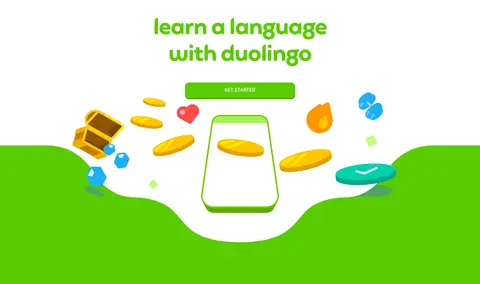
Wide Duolingo Green (#58cc02) rounded action with bold uppercase white text; used to make starting a course the clearest next step.
Secondary account action
White rounded outlined control with Signal Blue (#1cb0f6) uppercase text, positioned directly below the main hero CTA.
Language category strip
Horizontally arranged course links with small flag or subject icons, uppercase labels, and subtle divider lines.
Alternating feature row
Open two-column feature presentation, switching the illustration and copy sides between rows; green headings introduce each benefit.
Dark promotional band
Full-width Midnight Navy (#100f3e) section pairing Super Duolingo artwork with a compact free-trial action.
Footer link columns
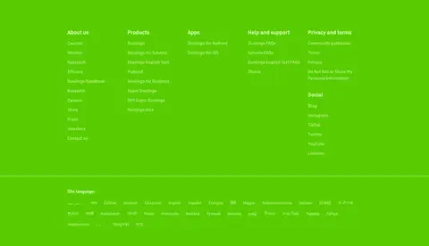
Bright green footer with several compact link groups, pale supporting text, and a separated language-links row.
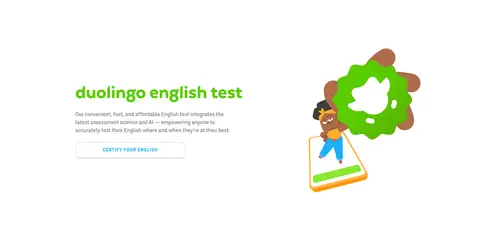
Imagery · Use polished, colourful character illustrations rather than photography. Characters, learning props, phones, and course icons appear as playful clusters with clean edges and saturated colours; keep them distinct from the surrounding white canvas. Artwork can overlap its local composition, but should not obscure headlines or actions. The observed illustrations contain colours beyond the measured brand palette, so treat those hues as artwork details rather than page-level UI colours.
Use white space to keep the page calm and legible.
Make Duolingo Green the most prominent UI accent.
Pair bold rounded headings with concise supporting copy.
Alternate illustration and copy sides in feature rows.
Use Signal Blue sparingly for secondary actions and links.
Keep major promotional and footer bands full width.
✕ 不该做
Don't add gradients or a heavy shadow system.
Don't crowd the hero with extra interface elements.
Don't use the artwork's many hues as new UI colours.
Don't make the secondary account action compete with the primary CTA.
Don't turn the feature rows into dense cards.
Don't apply the dark promotional background to the whole page.
给 AI 的提示词
想快速出一个同风格的新页面,把这段话连同 DESIGN.md 一起发给 AI。
Build a new Duolingo-style education page with a spacious white canvas (#ffffff), centered content, and playful character illustrations. Use Duolingo Green (#58cc02) for primary actions and feature headings, Signal Blue (#1cb0f6) only for links or secondary actions, and Midnight Navy (#100f3e) for one focused promotional band. Use rounded, bold display headings and friendly sans-serif body text; keep navigation labels compact and uppercase. Arrange the hero in two columns, then alternate illustration and copy sides through the feature content. Let artwork provide colour and personality without turning its internal hues into UI tokens. Keep surfaces mostly flat, use subtle Divider Gray (#e5e5e5) separators, and finish with a full-width green footer containing clear link groups.