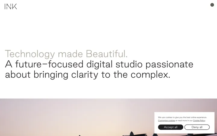
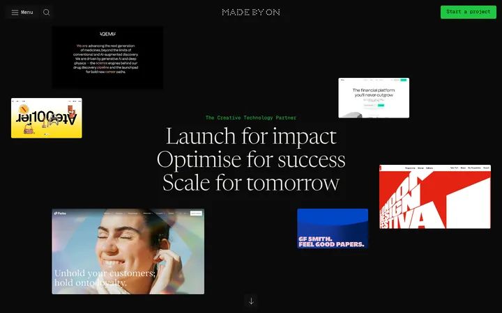
North star · Keep the interface nearly invisible: let broad white space and expressive media carry the page, with black type and hairline-like outlines as anchors.
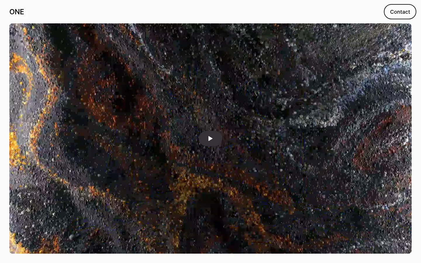
The page builds its identity from a near-white canvas (#fbfbfa), black typography and outlines (#000000), and pale gray supporting text (#bec0c5). The measured palette is deliberately narrow; saturated hues and earthy tones in the hero are video imagery, not a site-wide brand palette. MagicUiPro gives the small navigation, body copy, and headings a consistent sans-serif voice, with modest negative tracking on the measured heading role. The layout pairs a compact top bar with an almost full-width video framed by broad page margins. Farther down, substantial blank intervals separate a slim editorial text column, a stack of outlined partner-name pills, a collaboration prompt, a broad logo field, and a long manifesto. Most elements sit directly on the canvas rather than in cards. Rounded outline controls supply the page’s most visible interface detail, while the media provides the visual intensity.
配色
点色块复制色值。用途说明来自对页面的实测位置(背景、文字、描边、按钮)与截图判读。
品牌色
表层色
中性色
页面底色 · Gallery White表层 · Studio Ink主文字 · Studio Ink次要文字 · Soft Haze描边 · Studio Ink
Navigation, headings, body copy, and outlined button labels.
角色
示例
字号
字重
行高
字距
一级标题
Heading role for prominent page statements and editorial leads.
The quick brown fox 敏捷的狐狸
24px
500
1.4
-0.01em
正文
Descriptive studio copy, supporting text, and interface labels.
The quick brown fox 敏捷的狐狸
18px
500
normal
0
间距与布局
基准单位 8px · 密度:适中
32px版块间距
—元素间距
—卡片内边距
1376px内容最大宽度
2px
16px
19px
24px
28px
32px
64px
80px
96px
Use a single-column page with a centered content boundary; the measured page maximum is 1376px. Keep the compact navigation aligned across the top, then place the video as a broad, near-full-bleed block. Below it, the long page is intentionally sparse: a narrow editorial column and manifesto sit amid large blank intervals, with partner names and logos arranged in broader groupings. The measured spacing scale runs from 16px to 96px, with a 32px section gap; preserve the comfortable rhythm rather than compressing content.
圆角与层次
按钮 · 9999px
没有测到阴影:页面是扁平的,层次靠底色和描边区分。
The interface is essentially flat: no measured shadows or gradients establish depth. Separate content through open canvas and generous whitespace rather than stacked cards. Use crisp black outlines for pill controls; the hero video itself provides the main visual depth and contrast.
组件
下面的预览按实测的按钮、输入框、徽标、卡片样式重建(字体用替代字体)。
Top navigation
Place the ONE wordmark at the left and an outlined Contact pill at the right on the near-white canvas.
Hero video
Use a wide, rounded video surface with a centered dark circular play control; keep the media visually dominant.
Editorial text
Set studio description in a narrow, left-aligned column using the measured sans-serif body style and muted supporting text.
Partner pills
Show studio names as vertically stacked, black-outlined capsules with concise labels.
Partner logo field
Arrange monochrome client and partner marks across a broad area on the uninterrupted canvas.
Manifesto
Present a long, narrow list of short statements in pale gray text, visually subordinate to the hero.
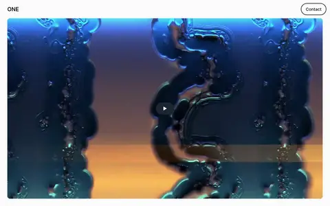
Imagery · The hero is a large, rounded video window featuring abstract, tactile, high-contrast moving imagery. Its dramatic dark, blue, and warm tones belong to the media, not the measured interface palette. Use immersive footage or similarly atmospheric creative work, crop it to fill the frame, and keep surrounding interface elements quiet. Partner logos appear as monochrome marks on the plain canvas.
Reserve #000000 for primary text, wordmarks, and outlined controls.
Use #bec0c5 for low-priority supporting text.
Give the hero media a broad, prominent frame.
Separate long-page content with generous open space.
Use rounded, outlined pills for compact actions and labels.
✕ 不该做
Do not turn colors inside the hero video into interface tokens.
Do not add decorative shadows to the flat interface.
Do not fill the page with card containers.
Do not make supporting copy as dark or prominent as navigation.
Do not crowd the manifesto or partner marks into the hero.
Do not add unmeasured accent colors to the core palette.
给 AI 的提示词
想快速出一个同风格的新页面,把这段话连同 DESIGN.md 一起发给 AI。
Build a new page in ONE’s restrained creative-studio style. Use Gallery White (#fbfbfa) as the main canvas, Studio Ink (#000000) for primary text and crisp pill outlines, and Soft Haze (#bec0c5) only for secondary copy. Use MagicUiPro where available, or a close neutral sans-serif substitute, with medium weights and subtle negative heading tracking. Keep navigation compact and put a broad, rounded, immersive video near the top; do not treat colors in footage as brand colors. Arrange content in a narrow editorial column with substantial vertical breathing room, then use simple outlined capsules and a broad monochrome partner-mark field. Avoid cards, shadows, gradients, and ornamental UI. Let large media and spacing provide the drama while the typography and controls remain quiet.