North star · Let one saturated blue-violet canvas, oversized white typography, and a single cyan emphasis carry the page.
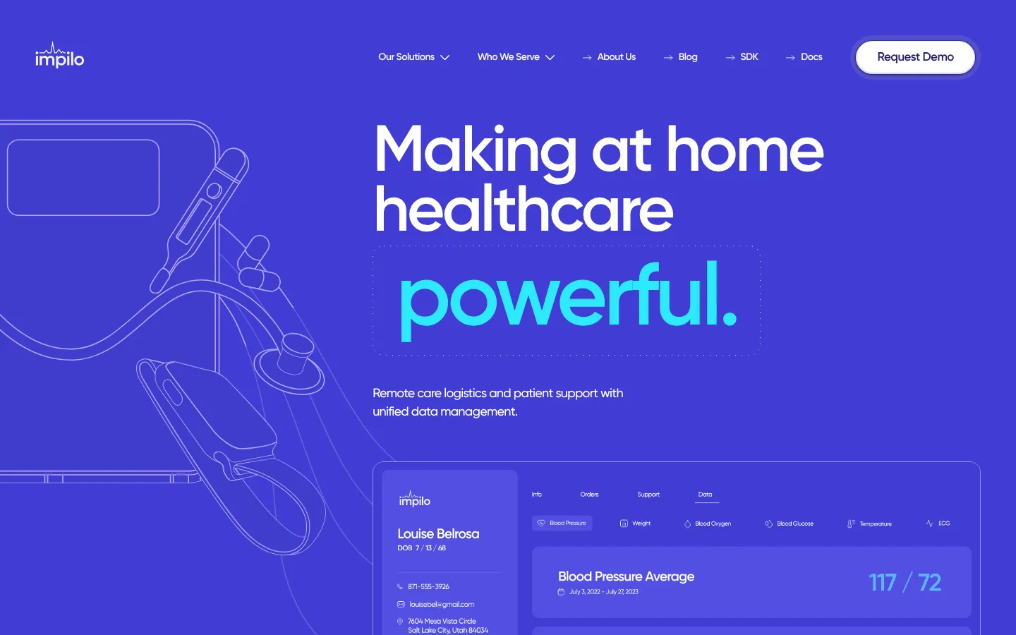
The page is built around a vivid blue-violet hero rather than a conventional white healthcare canvas. White navigation and headline text remain crisp against the saturated field, while the oversized cyan keyword creates a strong visual focal point. Gilroy’s geometric sans-serif forms support the digital-health tone: display text is large, heavy, tightly tracked, and arranged in short lines; supporting copy is compact and readable. The hero pairs fine, low-contrast line art of monitoring devices on the left with a translucent-looking patient dashboard across the lower right, making the product tangible without shifting to photography. Navigation and the demo action sit at the top, with the headline and explanatory copy aligned to the right of the illustration. The captured page is unusually spacious below the hero content, so preserve the broad uninterrupted color field rather than filling it with invented sections. Rounded controls and restrained edge highlights soften the strong geometry.
Across navigation, hero headings, body copy, links, and buttons.
角色
示例
字号
字重
行高
字距
特大标题
Oversized hero keyword or short display statement.
Impilo
124px
600
0.92
-0.04em
一级标题
Primary hero headline, set in large stacked lines.
Impilo
92px
600
0.92
-0.04em
二级标题
Major section heading where subsequent content appears.
Impilo
66px
600
0.92
-0.075em
三级标题
Feature or supporting section headline.
Impilo
54px
600
0.92
-0.04em
四级标题
Compact subsection heading.
Impilo
46px
600
0.92
-0.04em
正文
Hero description and general explanatory copy.
The quick brown fox 敏捷的狐狸
18px
500
1.44
-0.04em
辅助文字
Small dashboard labels and supporting metadata.
The quick brown fox 敏捷的狐狸
14px
600
1.44
-0.04em
按钮
Demo and article action labels.
The quick brown fox 敏捷的狐狸
14px
600
1.44
-0.04em
导航
Top-level navigation links.
The quick brown fox 敏捷的狐狸
14px
600
1.44
-0.04em
链接
Inline calls to action and navigation links.
The quick brown fox 敏捷的狐狸
14px
600
1.44
-0.04em
间距与布局
基准单位 4px · 密度:适中
50px版块间距
8px元素间距
—卡片内边距
—内容最大宽度
1px
8px
9px
12px
15px
16px
17px
20px
24px
30px
32px
34px
36px
43px
48px
50px
The hero is a full-bleed color field with a horizontal navigation row at the top. Its main composition balances cropped device line art on the left against a right-aligned text column, with a wide patient dashboard overlapping the lower portion. Keep content aligned to a broad central span while allowing the illustration to extend beyond the text column. The screenshot shows generous open space below the initial content; maintain that airy, low-density rhythm rather than inventing packed modules.
圆角与层次
按钮 · 9999px
卡片 · 24px
图片 · 7px
导航 · 9999px
inset · nav, other, footer
inset · button
The composition is mostly flat, with fine outlines separating the dashboard and its internal panels from the saturated background. The navigation CTA and dashboard gain subtle lifted, inset-looking highlights rather than heavy shadows. Use rounded pill controls and softly rounded media corners; avoid large drop shadows or card stacks.
组件
下面的预览按实测的按钮、输入框、徽标、卡片样式重建(字体用替代字体)。
Top navigation
White logo and compact links sit across the hero’s top edge; finish with a pale pill-shaped Request Demo control.
Hero headline
Large, bold, tightly tracked white text forms short stacked lines, followed by a prominent cyan keyword.
Hero description
A short, left-aligned supporting statement sits beneath the headline in small white text.
Medical line art
Oversized, thin-outline monitoring devices occupy the left side and crop off the viewport.
Patient dashboard
A wide, outlined monitoring interface overlaps the lower hero, combining a patient summary, navigation labels, and metric panels.
Demo CTA
A compact, rounded pale control contrasts with the hero field and anchors the far-right side of navigation.
Imagery · Use delicate medical-device line art—monitor, thermometer, and connected equipment—as a large cropped illustration entering from the left. Pair it with a wide patient-monitoring dashboard panel in the lower foreground. Keep both integrated into the blue-violet field with fine, low-contrast outlines and cool highlights. The screenshot contains no prominent photography; prioritize product UI and illustration over stock healthcare imagery.
Use Vivid Periwinkle (#403cd5) as the dominant hero field.
Keep primary headlines white and emphasize one short phrase in Signal Cyan (#00b1ff).
Use Gilroy or a close geometric sans-serif substitute.
Set display and heading text with tight tracking and strong weight.
Pair medical line art with a realistic-looking monitoring dashboard.
Leave broad, uninterrupted breathing room around hero content.
✕ 不该做
Do not replace the vivid hero with a white healthcare layout.
Do not introduce unmeasured colors or gradients.
Do not fill the page with dense cards or repeated content modules.
Do not use generic hospital or clinician stock photography as the focal point.
Do not make the dashboard visually heavier than the headline.
Do not use oversized shadows or sharp, default rectangular buttons.
给 AI 的提示词
想快速出一个同风格的新页面,把这段话连同 DESIGN.md 一起发给 AI。
Build a new Impilo-style health technology page around a full-bleed Vivid Periwinkle (#403cd5) canvas. Use Gilroy, or Plus Jakarta Sans as a free substitute, with bold oversized white headings, tight tracking, and one short Signal Cyan (#00b1ff) phrase as the focal accent. Place a compact white navigation row at the top and a pale rounded Request Demo control at the far right. Compose the hero with fine medical-device line art cropped along the left edge, a right-side text block, and a wide patient dashboard panel overlapping below. Keep UI outlines subtle, use Clinical White (#ffffff) and Cool Porcelain (#f4f4f6) sparingly for contrast, and reserve Deep Indigo (#16165c) for deeper details. Maintain generous open space and a restrained, low-elevation interface; do not invent dense sections or decorative gradients.