North star · Make family health technology feel reassuring and human through restrained earthy surfaces, editorial serif headlines, and authentic lifestyle imagery.
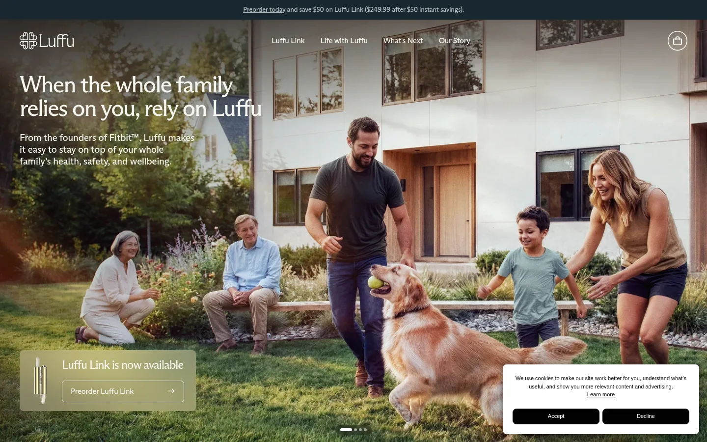
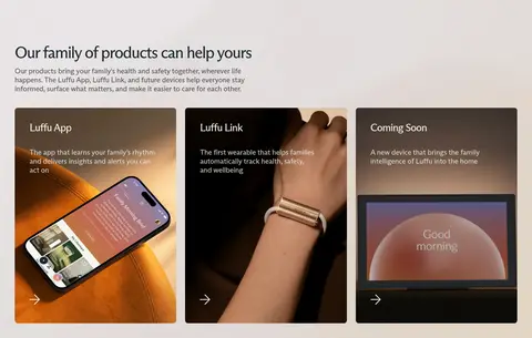
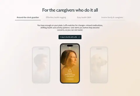
The visual strategy balances a muted, earthy canvas with product storytelling that feels domestic and human. The measured canvas #d7d7cb anchors the page, while pale #e4e7da and warm off-white #f6f7f0 distinguish content bands without relying on strong dividers. Deep blue-black #192830 and charcoal #2f3136 carry readable text; light text is reserved for dark overlays and CTA contexts. ABCArizonaFlare gives headings an editorial, approachable character, while ABCArizonaSans keeps navigation and supporting copy crisp. A full-bleed family hero establishes emotional context, followed by image-led product cards, a centered caregiving feature, and quieter story, press, newsletter, and footer sections. Layouts alternate between broad photographic compositions and compact centered content. Rounded controls and cards soften the interface; the overall treatment stays mostly flat, with photography supplying much of the visual depth and color.
配色
点色块复制色值。用途说明来自对页面的实测位置(背景、文字、描边、按钮)与截图判读。
品牌色
表层色
中性色
功能色
页面底色 · Quiet Sage表层 · Mist Olive表层 2 · Soft Linen主文字 · Deep Fjord次要文字 · Soft Linen弱文字 · Pure White描边 · Stone Line
Major product, caregiver, story, and newsletter section headings.
Luffu
44px
400
1
-0.045em
三级标题
Subsection headings and key feature titles.
Luffu
28px
400
1
-0.036em
四级标题
Smaller feature and product-card headings.
The quick brown fox 敏捷的狐狸
24px
400
1
-0.042em
正文
Introductory and supporting explanatory copy.
The quick brown fox 敏捷的狐狸
20px
400
1.2
-0.01em
辅助文字
Compact labels and secondary supporting text.
The quick brown fox 敏捷的狐狸
16px
400
1.2
-0.02em
导航
Header navigation links.
The quick brown fox 敏捷的狐狸
16px
400
1.2
-0.012em
链接
Small inline links and secondary actions.
The quick brown fox 敏捷的狐狸
14px
400
1.2
-0.02em
间距与布局
基准单位 8px · 密度:紧凑
40px版块间距
12px元素间距
—卡片内边距
681px内容最大宽度
11px
12px
16px
17px
18px
24px
32px
40px
64px
72px
108px
120px
The page uses broad, full-bleed visual sections, with content arranged in changing grids: a photographic hero, three product cards, a centered caregiving feature, and single-column story and press bands. Measured content has a compact density and a 681px page max-width reference for text-led content, while media extends beyond it. Headings shift between left alignment for introduction and center alignment for feature storytelling. Sections maintain clear vertical separation, but transitions are soft and rely more on surface changes than borders.
圆角与层次
按钮 · 6px
卡片 · 8px
链接 · 8px
没有测到阴影:页面是扁平的,层次靠底色和描边区分。
The measured interface has no notable shadow system; most sections and cards read as flat compositions. Layer text and controls directly over photographs where contrast allows, using darkened image areas for legibility. Cards use restrained rounded corners, and hairline borders are most appropriate for footer separators and subtle outlined actions.
组件
下面的预览按实测的按钮、输入框、徽标、卡片样式重建(字体用替代字体)。
Announcement strip
A narrow dark top band with centered preorder messaging and a small inline link.
Overlay navigation
Brand mark and compact sans-serif links sit over the hero image in light text, with a simple utility icon at the opposite edge.
Hero CTA card
A translucent, image-overlaid product availability panel pairs a short serif message with an outlined preorder action.
Product cards
Three image-led cards introduce the app, wearable Link, and upcoming device; use concise light copy and a directional affordance.
Feature tabs
A centered caregiver feature pairs a row of topic labels with short explanatory copy and a prominent product visual.
Newsletter field
A wide white signup field with a compact prompt and a simple right-aligned submit affordance.
Footer link columns
A quiet pale footer organizes brand, navigation, social, and legal links with subtle separators.
Imagery · Use authentic, warm lifestyle photography as the emotional anchor, especially family members interacting outdoors or at home. Product cards show close, tactile views of devices and app screens, while the caregiving section uses product imagery in a centered, isolated composition. Video and image-led blocks are prominent; avoid decorative illustration as the main storytelling device. Let photography retain natural, nuanced color.
Use authentic family photography as the emotional entry point.
Set major headings in the editorial display serif.
Keep body and interface text in the measured sans-serif style.
Use Quiet Sage and pale surfaces as the foundation.
Reserve Deep Fjord for strong text and dark actions.
Let media span wide while keeping text blocks controlled.
✕ 不该做
Do not make the page feel clinical or sterile.
Do not add saturated accent colors absent from the measured palette.
Do not place heavy shadows on cards or controls.
Do not turn every section into a centered card grid.
Do not use bold, oversized navigation styling.
Do not overdecorate product imagery with illustrations.
给 AI 的提示词
想快速出一个同风格的新页面,把这段话连同 DESIGN.md 一起发给 AI。
Build a new Luffu page with a warm, family-centered health-tech identity. Use Quiet Sage (#d7d7cb) as the grounding canvas, alternate with Mist Olive (#e4e7da) and Soft Linen (#f6f7f0), and use Deep Fjord (#192830) for primary text and dark actions; Graphite Ink (#2f3136) is supporting text. Pair an editorial serif similar to ABCArizonaFlare with a clean sans like ABCArizonaSans. Lead with authentic lifestyle photography and concise, human copy, then mix image-led product cards with centered feature storytelling and quieter content bands. Keep layouts broad and airy but text blocks controlled; use subtle rounded corners, minimal borders, and no prominent shadows. Favor light text only where image or dark-surface contrast requires it. Keep all UI calm, legible, and understated.