Bevel 以明亮留白的页面、柔和渐变和设备展示,清晰呈现健康应用的功能。深色全宽区域与白色内容区形成对比,突出 AI 健康指导体验。
North star · Keep the interface calm and legible, using restrained gradients and real product imagery to make health features feel approachable.
The visual identity is built on a white canvas, near-black text, and pale blue-gray cards, with soft multicolor gradients bringing warmth and dimensionality to feature areas. Large, tightly tracked system-sans headlines establish a clear hierarchy; body copy is smaller, muted, and compact, keeping the focus on the product. The page alternates centered introductions and testimonial moments with image-rich feature panels, then shifts into a long charcoal chapter for Bevel Intelligence. Product imagery—phones, wearables, app screens, and lifestyle scenes—does most of the storytelling, with gradients used as atmospheric backdrops rather than as decoration everywhere. Generous section whitespace separates otherwise dense product details. Cards have substantial rounded corners and rely on tonal contrast and imagery instead of visible borders. The overall effect is calm, modern, and clinical without feeling sterile.
配色 点色块复制色值。用途说明来自对页面的实测位置(背景、文字、描边、按钮)与截图判读。
品牌色
Muted Violet
#5d557c
Measured violet accent, present in gradient treatments rather than as a dominant UI fill.
强调色
Sky Wash
#d2e5ff
Pale blue gradient stop behind hero and product imagery.
Warm Cream
#fff9ee
Warm gradient stop that softens atmospheric section backgrounds.
Lavender Haze
#e3dbff
Lavender gradient color in feature backdrops, especially dark-chapter cards.
Ice Tint
#e6f9f8
Cool mint gradient stop in health feature and interface backdrops.
Aqua Mist
#cdf4f2
Soft aqua gradient color, supporting the cool product palette.
Mint Light
#d9fff3
Light mint gradient stop in atmospheric section treatments.
Mint Glow
#b2ffe7
Brighter mint gradient color; use as a subtle glow, not a primary control color.
表层色
Canvas White
#ffffff
Main page canvas and bright content sections.
Cloud Blue
#ebf0f8
Rounded feature and testimonial cards, plus light text on dark download controls.
Mist Gray
#f3f6f7
Subtle cool alternate surface tone.
中性色
Graphite Ink
#222326
Primary headings, body copy, dark-section text, and deep surfaces.
Slate Copy
#717379
Muted descriptions and supporting text.
Soft Graphite
#79797c
Secondary navigation and subdued supporting text.
Pewter Note
#a5a6a8
Low-emphasis supporting copy; not a defining surface color.
功能色
Earth Umber
#753e30
Occasional warm gradient color; not a core interface or brand surface.
文字 背景 对比度 WCAG #222326 Graphite Ink#ffffff Canvas White15.71:1 AAA #222326 Graphite Ink#ebf0f8 Cloud Blue13.73:1 AAA #222326 Graphite Ink#f3f6f7 Mist Gray14.47:1 AAA #717379 Slate Copy#ffffff Canvas White4.74:1 AA #717379 Slate Copy#ebf0f8 Cloud Blue4.14:1 AA-large #717379 Slate Copy#f3f6f7 Mist Gray4.36:1 AA-large
字体 字号阶梯:Augmented Fourth(比例约 1.452,正文 18px)。示例用免费替代字体渲染,数值为实测。
Aa 设计
-apple-system 系统字体 · 字重 400 / 600 / 500 · 占比 100%
免费替代:Inter
System sans-serif for navigation, headings, body copy, and controls.
角色 示例 字号 字重 行高 字距 特大标题 Oversized hero statement and high-impact landing-page message.
Bevel
80px 600 1 -0.03em 一级标题 Primary section or page headline.
Bevel
64px 600 1 -0.03em 二级标题 Feature-section headline and prominent content heading.
Bevel
40px 600 1 -0.03em 三级标题 Feature card titles and supporting section headings.
The quick brown fox 敏捷的狐狸
24px 400 1.3 0 正文 Product explanations and descriptive paragraphs.
The quick brown fox 敏捷的狐狸
18px 400 1.3 0 辅助文字 Compact review, rating, and supporting interface text.
The quick brown fox 敏捷的狐狸
16px 500 1.4 0 导航 Header navigation and download control text.
The quick brown fox 敏捷的狐狸
16px 500 1.4 0
间距与布局 基准单位 8px · 密度:紧凑
32px 版块间距
8px 元素间距
32px 卡片内边距
1376px 内容最大宽度
8px
12px
16px
24px
32px
40px
48px
80px
160px
The measured content max width is 1376px, with a compact spacing system based on an 8px unit. Sections use a mix of centered, single-column introductions and wide split feature panels; the testimonial and device imagery can span broad horizontal bands. The page has a spacious rhythm between major chapters, while cards group denser feature details. White sections dominate the upper and lower page, interrupted by a full-width charcoal AI chapter. Alignment shifts intentionally between centered headings and left-aligned product descriptions.
圆角与层次 md · media
inset · text
inset · section, card
md · media
Cards are primarily defined by pale fills, rounded corners, and the imagery they contain, not by visible borders. Media may use restrained soft shadows to separate devices from their backgrounds. Inset highlights appear in selected media and section treatments; avoid adding heavy elevation to ordinary content cards.
组件 下面的预览按实测的按钮、输入框、徽标、卡片样式重建(字体用替代字体)。
Header navigation Compact centered brand and navigation row, with secondary links and a dark pill-shaped download CTA.
Download CTA Near-black rounded pill with light text and an Apple mark; repeated in the header and hero.
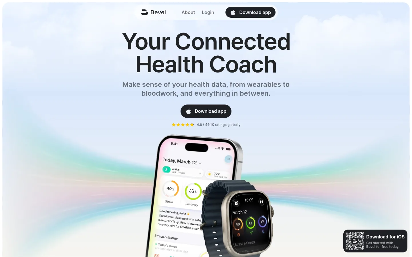
Hero product stage Centered headline and supporting copy over a pale atmospheric gradient, with layered phone and wearable media.
Feature cards Rounded #ebf0f8 panels for health metrics and reviews, with app imagery and near-black text.
Intelligence chapter Full-width #1f2025 section with light text and large rounded gradient-backed feature panels.
Testimonial carousel Lifestyle-image strip above centered social-proof copy and horizontally arranged rounded review cards.
Imagery · The page relies on phone and wearable product renders, app interface screenshots, lifestyle photos, and a hero video. Devices are layered against soft, luminous gradients; feature screenshots sit inside rounded panels, while lifestyle images appear as a horizontal mosaic and review context. Keep product UI legible and treat gradients as atmospheric backdrops. Some tiny interface colors and imagery details belong to app mockups, not the brand palette.
页面版块 共 15 个版块,按页面从上到下排列,每个都标了类型、布局和交互套路。
该做与不该做 ✓ 该做 Use white as the default canvas. Set primary text in #222326. Use cool pale surfaces for grouped feature content. Reserve dark charcoal for a distinct feature chapter. Keep gradient color soft and atmospheric. Show app screens and devices as the main evidence. ✕ 不该做 Do not use bright gradients as a page-wide default. Do not add prominent borders to cards. Do not make body copy compete with headlines. Do not flatten every section into the same layout. Do not mistake mockup colors for interface brand colors. Do not use heavy shadows on ordinary cards. 给 AI 的提示词 想快速出一个同风格的新页面,把这段话连同 DESIGN.md 一起发给 AI。
复制 Build a new Bevel-style health product page with a calm white canvas (#ffffff), Graphite Ink text (#222326), and Cloud Blue surfaces (#ebf0f8). Use a system sans-serif such as Inter, with bold, tightly tracked headlines and restrained muted body copy. Organize content into spacious, distinct chapters: centered introduction, product-led feature panels, and an optional full-width dark section. Use pale gradients such as Sky Wash (#d2e5ff), Warm Cream (#fff9ee), and Lavender Haze (#e3dbff) only as soft backdrops. Prioritize believable phone, wearable, and app-screen imagery; keep interface details legible. Give cards generous rounded corners, relying on fill and media rather than borders. Maintain strong contrast, clear download actions, and varied alignment without making the layout visually busy.
DESIGN.md Tailwind v4 CSS 变量 Design Tokens
---
title: "Bevel design system"
variant: extended
source: https://www.bevel.health/
captured_at: 2026-10-12
theme: light
industry: health
generator: Design DNA (https://four.wiralomi.com/style/bevel-health)
ai_generated: true
ai_label: "本文件由 AI 辅助生成:数值取自公开网页的实测样式,命名、用途说明与建议为模型解读。商标归原所有者。 / AI-assisted content"
---
# Bevel · Design System
> Personal health data, presented with calm clarity
**Theme:** light · **Industry:** health · **Source:** https://www.bevel.health/ · **Captured:** 2026-10-12 (1440×900 desktop)
_AI-assisted content: values are measured from the public page at capture time; names, roles and guidance are model-written interpretations. Trademarks belong to their owners._
Bevel pairs a bright, spacious health-app homepage with soft color gradients, device imagery, and clear product explanations. A full-width dark feature chapter contrasts with the white editorial sections and gives its AI coaching features a distinct visual setting.
## North star
Keep the interface calm and legible, using restrained gradients and real product imagery to make health features feel approachable.
## Overview
The visual identity is built on a white canvas, near-black text, and pale blue-gray cards, with soft multicolor gradients bringing warmth and dimensionality to feature areas. Large, tightly tracked system-sans headlines establish a clear hierarchy; body copy is smaller, muted, and compact, keeping the focus on the product. The page alternates centered introductions and testimonial moments with image-rich feature panels, then shifts into a long charcoal chapter for Bevel Intelligence. Product imagery—phones, wearables, app screens, and lifestyle scenes—does most of the storytelling, with gradients used as atmospheric backdrops rather than as decoration everywhere. Generous section whitespace separates otherwise dense product details. Cards have substantial rounded corners and rely on tonal contrast and imagery instead of visible borders. The overall effect is calm, modern, and clinical without feeling sterile.
## Colors
| Name | Hex | Token | Group | Role |
|---|---|---|---|---|
| Graphite Ink | ` | `--color-graphite-ink` | neutral | Primary headings, body copy, dark-section text, and deep surfaces. |
| Canvas White | ` | `--color-canvas-white` | surface | Main page canvas and bright content sections. |
| Cloud Blue | ` | `--color-cloud-blue` | surface | Rounded feature and testimonial cards, plus light text on dark download controls. |
| Mist Gray | ` | `--color-mist-gray` | surface | Subtle cool alternate surface tone. |
| Slate Copy | ` | `--color-slate-copy` | neutral | Muted descriptions and supporting text. |
| Soft Graphite | ` | `--color-soft-graphite` | neutral | Secondary navigation and subdued supporting text. |
| Pewter Note | ` | `--color-pewter-note` | neutral | Low-emphasis supporting copy; not a defining surface color. |
| Sky Wash | ` | `--color-sky-wash` | accent | Pale blue gradient stop behind hero and product imagery. |
| Warm Cream | ` | `--color-warm-cream` | accent | Warm gradient stop that softens atmospheric section backgrounds. |
| Lavender Haze | ` | `--color-lavender-haze` | accent | Lavender gradient color in feature backdrops, especially dark-chapter cards. |
| Muted Violet | ` | `--color-muted-violet` | brand | Measured violet accent, present in gradient treatments rather than as a dominant UI fill. |
| Ice Tint | ` | `--color-ice-tint` | accent | Cool mint gradient stop in health feature and interface backdrops. |
| Aqua Mist | ` | `--color-aqua-mist` | accent | Soft aqua gradient color, supporting the cool product palette. |
| Mint Light | ` | `--color-mint-light` | accent | Light mint gradient stop in atmospheric section treatments. |
| Mint Glow | ` | `--color-mint-glow` | accent | Brighter mint gradient color; use as a subtle glow, not a primary control color. |
| Earth Umber | ` | `--color-earth-umber` | semantic | Occasional warm gradient color; not a core interface or brand surface. |
### Semantic aliases
`--color-canvas` → ` (Canvas White) · `--color-surface` → ` (Cloud Blue) · `--color-surface-2` → ` (Mist Gray) · `--color-surface-3` → ` (Graphite Ink) · `--color-text` → ` (Graphite Ink) · `--color-text-muted` → ` (Slate Copy) · `--color-text-subtle` → ` (Soft Graphite) · `--color-accent` → ` (Muted Violet)
### Contrast (WCAG 2.x)
| Text | Background | Ratio | Level |
|---|---|---|---|
| ` | ` | 15.71:1 | AAA |
| ` | ` | 13.73:1 | AAA |
| ` | ` | 14.47:1 | AAA |
| ` | ` | 4.74:1 | AA |
| ` | ` | 4.14:1 | AA-large |
| ` | ` | 4.36:1 | AA-large |
| ` | ` | 3.32:1 | AA-large |
| ` | ` | 4.34:1 | AA-large |
| ` | ` | 3.79:1 | AA-large |
| ` | ` | 4:1 | AA-large |
### Gradients
- `linear-gradient(rgb(210, 229, 255), rgb(255, 249, 238))`
- `linear-gradient(rgba(255, 255, 255, 0), rgba(185, 166, 255, 0.4) 90%, rgba(185, 166, 255, 0.4))`
- `linear-gradient(rgba(255, 255, 255, 0), rgba(131, 227, 222, 0.2) 90%, rgba(131, 227, 222, 0.4))`
- `radial-gradient(circle at 50% 0px, rgba(255, 255, 255, 0) 40%, rgba(63, 255, 194, 0.2) 90%, rgba(63, 255, 194, 0.4))`
## Typography
| Family | Token | Source | Weights | Role | Free substitute |
|---|---|---|---|---|---|
| -apple-system | `--font-body` | system | 400, 600, 500 | System sans-serif for navigation, headings, body copy, and controls. | Inter |
- **-apple-system:** Use semibold display headings with tight negative tracking; keep body text regular and sentence case.
### Type scale — Augmented Fourth (ratio ≈ 1.452, base 18px)
| Role | Size | Weight | Line height | Letter spacing | Case | Family | Used for |
|---|---|---|---|---|---|---|---|
| display | 80px | 600 | 1 | -0.03em | — | -apple-system | Oversized hero statement and high-impact landing-page message. |
| h1 | 64px | 600 | 1 | -0.03em | — | -apple-system | Primary section or page headline. |
| h2 | 40px | 600 | 1 | -0.03em | — | -apple-system | Feature-section headline and prominent content heading. |
| h3 | 24px | 400 | 1.3 | 0 | — | -apple-system | Feature card titles and supporting section headings. |
| body | 18px | 400 | 1.3 | 0 | — | -apple-system | Product explanations and descriptive paragraphs. |
| caption | 16px | 500 | 1.4 | 0 | — | -apple-system | Compact review, rating, and supporting interface text. |
| nav | 16px | 500 | 1.4 | 0 | — | -apple-system | Header navigation and download control text. |
## Spacing & layout
- Base unit **8px**, density **compact**.
- Scale (most used values): 8, 12, 16, 24, 32, 40, 48, 80, 160 px.
- Section rhythm 32px · element gap 8px · card padding 32px · max content width 1376px.
The measured content max width is 1376px, with a compact spacing system based on an 8px unit. Sections use a mix of centered, single-column introductions and wide split feature panels; the testimonial and device imagery can span broad horizontal bands. The page has a spacious rhythm between major chapters, while cards group denser feature details. White sections dominate the upper and lower page, interrupted by a full-width charcoal AI chapter. Alignment shifts intentionally between centered headings and left-aligned product descriptions.
## Shape & elevation
- Radius: button `9999px` · card `32px` · media `16px` · nav `9999px` · xs `16px` · sm `24px` · md `32px` · pill `9999px`
- Shadow `md` (media): `rgba(0, 0, 0, 0.25) 0px 0px 16px -8px`
- Shadow `inset` (text): `rgb(255, 255, 255) 0px 1px 0px 0px inset, rgba(255, 255, 255, 0.25) 0px 0px 4px 0px inset`
- Shadow `inset-2` (section, card): `rgb(255, 255, 255) 0px 0px 24px 0px inset`
- Shadow `md-2` (media): `rgba(0, 0, 0, 0.15) 0px 2px 16px 0px`
- Shadow `inset-3` (media): `rgba(255, 255, 255, 0.36) 0px 1px 0px 0px inset`
- Motion: standard transition `0.15s ease` on interactive elements.
Cards are primarily defined by pale fills, rounded corners, and the imagery they contain, not by visible borders. Media may use restrained soft shadows to separate devices from their backgrounds. Inset highlights appear in selected media and section treatments; avoid adding heavy elevation to ordinary content cards.
## Imagery
The page relies on phone and wearable product renders, app interface screenshots, lifestyle photos, and a hero video. Devices are layered against soft, luminous gradients; feature screenshots sit inside rounded panels, while lifestyle images appear as a horizontal mosaic and review context. Keep product UI legible and treat gradients as atmospheric backdrops. Some tiny interface colors and imagery details belong to app mockups, not the brand palette.
## Components
### Header navigation
Compact centered brand and navigation row, with secondary links and a dark pill-shaped download CTA.
### Download CTA
Near-black rounded pill with light text and an Apple mark; repeated in the header and hero.
### Hero product stage
Centered headline and supporting copy over a pale atmospheric gradient, with layered phone and wearable media.
### Feature cards
Rounded ### Intelligence chapter
Full-width ### Testimonial carousel
Lifestyle-image strip above centered social-proof copy and horizontally arranged rounded review cards.
### Measured component styles
- **Primary button** (“Download app”): background ## Do
- Use white as the default canvas.
- Set primary text in ## Don't
- Do not use bright gradients as a page-wide default.
- Do not add prominent borders to cards.
- Do not make body copy compete with headlines.
- Do not flatten every section into the same layout.
- Do not mistake mockup colors for interface brand colors.
- Do not use heavy shadows on ordinary cards.
## Agent prompt
Build a new Bevel-style health product page with a calm white canvas (## Page sections (top to bottom)
| # | Type | Layout | UX patterns | UI patterns |
|---|---|---|---|---|
| 1 | hero | Full-bleed video hero with centered navigation, headline, CTA, and layered device imagery. | primary download CTA, app rating proof, floating app download prompt | pale gradient backdrop, oversized centered heading, layered devices |
| 2 | testimonials | Centered social-proof heading over a wide, horizontally arranged image strip. | member proof, brand trust signals | centered headline, lifestyle and app-image carousel |
| 3 | feature-grid | Centered introduction followed by a three-column health-metric card group. | feature comparison, health metrics overview | pale rounded cards, app screen imagery |
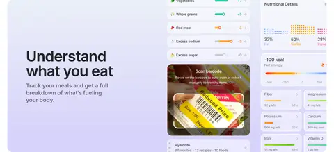
| 4 | feature-split | Wide split feature panel with copy on one side and food-tracking screens on the other. | feature explanation, meal tracking showcase | soft gradient panel, app interface collage |
| 5 | feature-split | Wide split feature panel pairing record-management imagery and copy. | feature explanation, health-record organization | cool-toned backdrop, phone and floating app marks |
| 6 | feature-grid | Dark four-column visual strip with character imagery and short labels. | coach persona selection | charcoal background, floating character media |
| 7 | how-it-works | Centered heading and explanatory copy within the charcoal chapter. | AI coach introduction | light-on-dark typography, centered layout |
| 8 | feature-split | Large rounded feature card with left-aligned copy and supporting product media. | ask questions, answers grounded in personal metrics | light gradient card, dark chapter background |
| 9 | feature-split | Large rounded gradient-backed card within the dark feature chapter. | daily summaries, reminders and nudges | warm-tinted gradient, rounded feature panel |
| 10 | feature-split | Wide rounded feature card with concise copy and product imagery. | research-informed answers, source discovery | cool pastel panel, dark surrounding section |
| 11 | feature-split | Wide rounded feature card with copy and supporting media. | goal-based workout planning, schedule-aware recommendations | cool gradient wash, rounded panel |
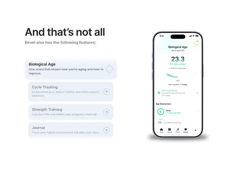
| 12 | feature-grid | Bright three-column feature area combining a feature list and phone app demonstrations. | feature discovery, in-app feature previews | white background, phone mockups, compact feature rows |
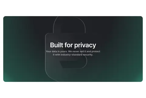
| 13 | feature-split | Centered copy within a wide, dark green-toned visual panel. | privacy reassurance, data ownership message | large lock graphic, dark atmospheric panel |
| 14 | gallery | Wide multi-column mosaic of narrow lifestyle images. | lifestyle storytelling | rounded image tiles, asymmetric photo grid |
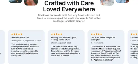
| 15 | testimonials | Centered title and introduction above a horizontal row of review cards. | star ratings, user reviews, social proof | lifestyle image band, rounded pale review cards |
## Source CSS custom properties (selected)
```css
--_typography---font-families--sf-pro: -apple-system,BlinkMacSystemFont,Inter,"Segoe UI",sans-serif;
--v3-bento-radius: 36px;
--_theme---text--primary: