North star · Keep the interface calm and spacious: let dark, rounded typography explain the product while color appears only as a restrained accent or product surface.
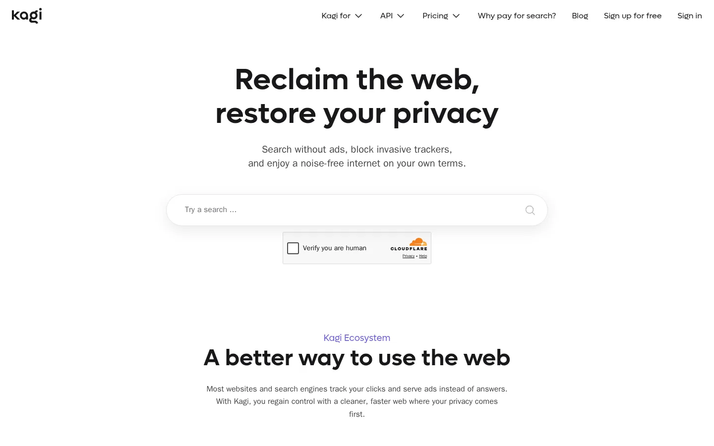
The visual strategy is built around a bright, mostly white canvas with generous open space and a calm, low-noise feel. Near-black headings and navigation provide crisp contrast, while muted gray copy keeps supporting information readable without competing with the message. Lufga gives the display headings and navigation a distinctive rounded character; system-ui handles the practical body text and controls. The page moves from a centered search-led hero into product previews, tool cards, human-first editorial content, organization features, and a dark FAQ/footer band. Pastel lavender, pale blue, and warm yellow appear sparingly on cards and product imagery, not as broad page backgrounds. Rounded search and CTA controls soften the interface; thin gray borders organize cards and FAQ rows. Product screenshots and simple illustrations supply proof and personality while the surrounding layout stays restrained.
Body copy, captions, buttons, links, and general interface text.
Aa 设计
Lufga
网络字体 · 字重 400 / 600 / 500 · 占比 19%
免费替代:Nunito Sans
Display and page headings, plus navigation labels.
Aa 设计
Arial
系统字体 · 字重 400 · 占比 4%
免费替代:Arial
Fallback used in small auxiliary controls.
角色
示例
字号
字重
行高
字距
特大标题
Large centered hero headline.
Kagi
60px
600
1.13
0
一级标题
Primary section headlines and prominent feature headings.
Kagi
46px
600
1.13
0
二级标题
Supporting section headings and secondary statements.
The quick brown fox 敏捷的狐狸
24px
400
1.33
0
三级标题
Product and feature card titles.
The quick brown fox 敏捷的狐狸
20px
400
1.4
0
正文
Main explanatory copy throughout sections.
The quick brown fox 敏捷的狐狸
16px
400
1.6
0
辅助文字
Small labels, metadata, and supporting notes.
The quick brown fox 敏捷的狐狸
14px
400
1.6
0
按钮
CTA labels and compact action controls.
The quick brown fox 敏捷的狐狸
14px
400
1.6
0
导航
Header navigation labels.
The quick brown fox 敏捷的狐狸
16px
400
1.5
0
链接
Inline text links and linked card labels.
The quick brown fox 敏捷的狐狸
16px
400
1.6
0
间距与布局
基准单位 8px · 密度:适中
64px版块间距
12px元素间距
—卡片内边距
—内容最大宽度
2px
4px
7px
8px
11px
12px
16px
21px
24px
32px
48px
64px
128px
164px
A simple top navigation gives way to a centered hero and long-form vertical storytelling. Content alternates between centered section introductions, paired product previews, three-card tool groupings, and split text/image features. Broad white intervals separate these blocks, keeping the page comfortable rather than dense. The organization area uses horizontally divided rows; a full-width charcoal FAQ and footer close the page. Align most section headings centrally, with left-aligned copy inside product cards and feature splits. Keep the overall content width restrained and preserve generous side margins.
圆角与层次
按钮 · 50%
输入框 · 9999px
卡片 · 24px
图片 · 12px
链接 · 24px
lg · link, other
md · media
The interface is mostly flat, using whitespace and thin borders instead of stacked panels. Search and linked cards may receive a soft, diffuse shadow, while product previews sit within rounded pastel surfaces. Keep outlines delicate and layering restrained; reserve the strongest surface contrast for the dark FAQ and footer band.
组件
下面的预览按实测的按钮、输入框、徽标、卡片样式重建(字体用替代字体)。
Header navigation
A light, uncluttered header with the Kagi wordmark at left and Lufga navigation links aligned across the right.
Search hero
Centered headline and supporting copy above a long, pill-shaped search input with a subtle shadow and search icon.
Primary CTA
Near-black pill button with white, regular system-ui text; used for prominent product actions.
Product preview cards
Paired search and assistant screenshots framed by rounded lavender or warm yellow surfaces, with text and compact CTA below.
Tool cards
A row of three white tool cards with fine outlines, small line icons, short titles, and concise descriptions.
Organization feature rows
Text-led rows paired with a softly rounded illustration surface, separated by a light horizontal rule.
FAQ and footer
A full-width Kagi Ink section with a centered FAQ title, stacked divider-separated questions, and a closing signup area.
Imagery · Use product screenshots as framed evidence of the search and assistant interfaces, with soft lavender or yellow treatments around selected previews. Pair these with simple, friendly line illustrations for organizational features and the dark footer. Imagery is sparse and carefully placed; there is no dominant photography or 3D language. Preserve clear, uncluttered crops and let the white surrounding space frame each visual.
该做与不该做
✓ 该做
Keep the main canvas bright and spacious.
Use Kagi Ink for primary headings and key actions.
Set display headings in a rounded Lufga-like sans.
Use Quiet Violet for occasional links and eyebrow labels.
Reserve pastel surfaces for selected product cards and illustrations.
Separate long content with generous vertical breathing room.
✕ 不该做
Do not introduce gradients or loud full-page color bands.
Do not crowd the centered hero or section introductions.
Do not use pastel accents as the primary text color.
Do not add heavy shadows to ordinary content cards.
Do not make every section a boxed card grid.
Do not let product imagery overpower explanatory content.
给 AI 的提示词
想快速出一个同风格的新页面,把这段话连同 DESIGN.md 一起发给 AI。
Build a new Kagi-style page with a clean white canvas (#ffffff) and an intentionally quiet rhythm. Use Kagi Ink (#18181a) for headings, navigation, and the primary pill CTA; use Muted Graphite (#454549) for supporting copy and Quiet Violet (#6c5edc) for occasional links or eyebrow labels. Keep Lufga-like rounded sans headings, with system-ui body text. Center the hero and section introductions, then alternate product previews, concise card groups, and split text-and-illustration features. Use Mist Blue (#d6e3e8), Lavender Haze (#c9c1ff), and Marigold (#ffb319) sparingly on visual surfaces. Prefer thin borders over elevation, with soft shadows only on search or selected linked cards. Close with a full-width dark FAQ/footer treatment. Preserve open space and avoid decorative clutter.