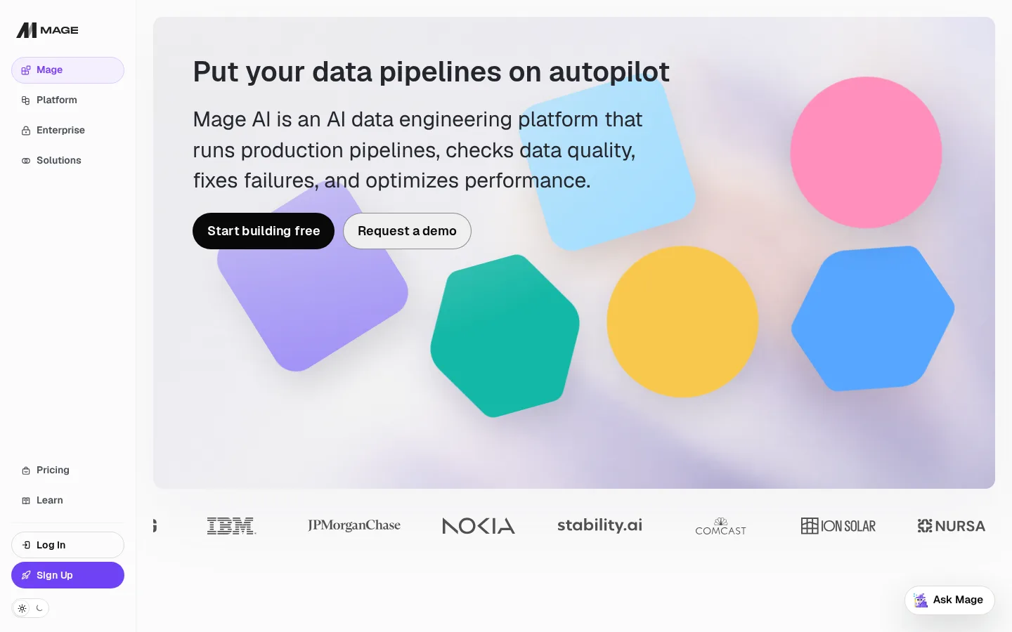
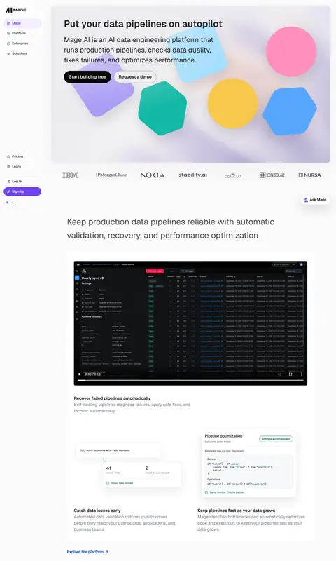
Mage AI 以近白色画布和克制的文字排版,搭配鲜明的几何首屏插画与深色产品界面。固定侧边导航和宽松的功能分区,让长首页更像一场循序渐进的产品介绍。
North star · Keep the interface quiet and spacious; let product screens and contained bursts of color demonstrate the value.
The page is anchored by a near-white canvas (#fbfbfc), with near-black headings and copy providing crisp contrast. Muted slate text and fine pale borders keep supporting information quiet; violet, green, and blue appear sparingly in actions, badges, and links. The hero’s soft, blurred backdrop and bright geometric forms are illustrative rather than a cue to recolor the interface. Geist Sans carries the page: bold, compact hero headings give way to readable paragraph text and smaller uppercase eyebrow labels. A fixed left rail frames the main content, which flows through centered product demonstrations, feature explanations, and use-case sections. Generous whitespace separates these blocks, while rounded media and cards soften the otherwise restrained layout. Product videos and dark UI captures provide visual contrast, and occasional editorial illustrations add warmth without changing the neutral page foundation.
Major section headings for product capabilities and use cases.
Mage AI
38px
600
1.3
0
三级标题
Supporting feature headings and prominent explanatory statements.
Mage AI
36px
400
1.6
0
四级标题
Smaller feature or card titles within content sections.
Mage AI
30px
400
1.45
0
正文
Hero description and primary explanatory paragraphs.
The quick brown fox 敏捷的狐狸
18px
400
1.5
0
辅助文字
Compact supporting copy and descriptions beneath demonstrations.
The quick brown fox 敏捷的狐狸
16px
400
1.63
0
导航
Sidebar navigation labels and primary navigation items.
The quick brown fox 敏捷的狐狸
18px
600
1.22
0
眉题
Small uppercase labels that introduce use-case or feature groups.
The quick brown fox 敏捷的狐狸
14px
600
1.4
0.08em
代码
Technical snippets and compact developer-facing interface details.
const style = 1;
10px
500
1.35
0
间距与布局
基准单位 2px · 密度:适中
56px版块间距
5px元素间距
—卡片内边距
—内容最大宽度
4px
5px
6px
7px
8px
9px
10px
11px
12px
13px
14px
15px
16px
20px
24px
26px
A persistent vertical navigation rail sits beside the broad main content area. The page uses a comfortable, editorial rhythm: a large hero, a horizontal customer-logo row, then centered product media and feature explanations. Headings generally align to the left edge of their content groups, while demonstrations and illustrations sit within rounded frames. Sections are separated by generous whitespace rather than strong background bands. Cards and feature groups use orderly columns, with no measured maximum width or card padding specified.
圆角与层次
按钮 · 9999px
卡片 · 16px
图片 · 22px
徽标 · 50%
导航 · 9px
链接 · 16px
lg · other
lg · card
hairline · other
xl · card
The page is mostly flat, with pale borders distinguishing cards and controls from the canvas. Product media, cards, and occasional floating elements use soft, broad shadows rather than sharp elevation. Dark interface previews create their own visual depth; reserve stronger layering for framed media and prominent cards.
组件
下面的预览按实测的按钮、输入框、徽标、卡片样式重建(字体用替代字体)。
Sidebar navigation
Persistent left rail with brand mark, grouped navigation, and lower account actions; use muted labels, a softly tinted active pill, and rounded navigation items.
Hero panel
Large rounded visual panel pairs a bold headline and readable summary with primary and secondary pill actions over softly colored geometric artwork.
Customer logo row
A horizontal strip of customer marks follows the hero, rendered quietly so logos add social proof without competing with the headline.
Product showcase
Rounded video or interface capture with a dark data-tool screen; pair it with a short title and subdued explanatory copy.
Feature cards
Light cards use restrained borders, modest rounding, dark titles, and muted descriptions; use violet or green for small status details.
Action links
Use blue text links for exploration actions and compact pill buttons for primary conversion actions.
Imagery · The hero uses a soft, hazy background with colorful geometric shapes; treat those hues as artwork rather than the core interface palette. Product videos and screenshots show dark, dense data tools in rounded frames, creating contrast with the light canvas. Later sections use friendly, colorful illustrations of people and workflow concepts. Keep imagery contained and purposeful, with product screens as the main evidence of functionality.
Keep the page canvas near-white and visually quiet.
Use dark headings with muted supporting copy.
Reserve violet, green, and blue for small, clear accents.
Frame product demonstrations with rounded corners.
Give major sections generous breathing room.
Use illustrations as contained accents, not background decoration.
✕ 不该做
Do not turn the hero artwork palette into the interface palette.
Do not fill every section with a contrasting color band.
Do not make secondary copy compete with headlines.
Do not crowd the sidebar or feature demonstrations.
Do not add heavy borders or harsh shadows to every card.
Do not use decorative display typography in place of Geist-like sans.
给 AI 的提示词
想快速出一个同风格的新页面,把这段话连同 DESIGN.md 一起发给 AI。
Build a new Mage AI page with a persistent sidebar and a spacious, product-led content flow. Use Gallery White (#fbfbfc) as the canvas, Near Ink (#080808) for strong text, Slate Haze (#737985) for supporting copy, and Quiet Divider (#dfe0e1) for subtle outlines. Apply Mage Violet (#6f42f5), Pipeline Green (#006b5f), and Action Blue (#0b4bb8) only to focused actions, status details, or links. Use Geist Sans or Inter for the interface and Geist Mono or Roboto Mono for compact technical details. Keep headings clean and left-aligned within their content groups. Place rounded dark product screens and occasional friendly illustrations within generous whitespace. Favor light, fine borders and soft shadows; avoid dense layouts, loud section fills, and oversized decorative color outside contained artwork.