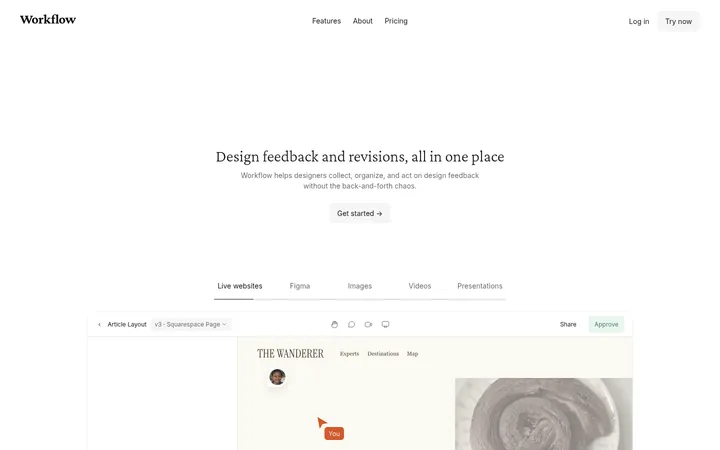
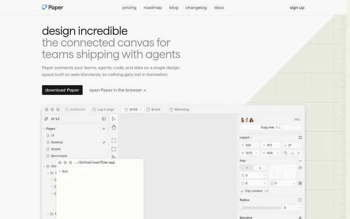
North star · Keep the interface nearly monochrome and spacious, using elegant serif display type and product captures—not bright decoration—to create contrast.
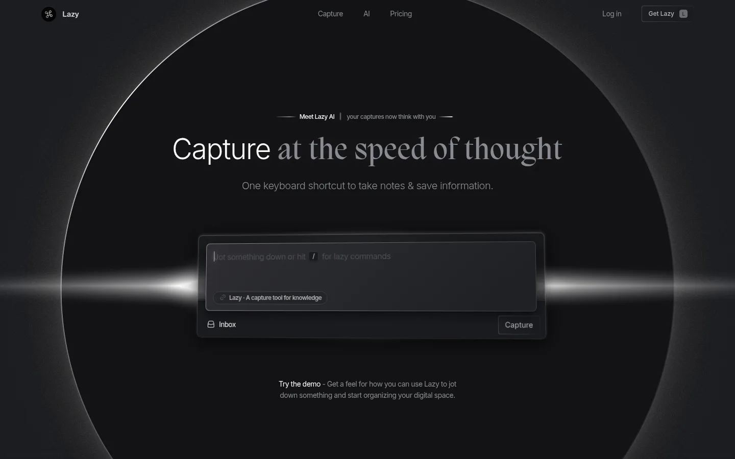
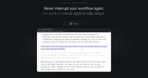
The page uses a near-black canvas, #131416, to create a quiet, cinematic foundation. The opening hero adds a large circular product backdrop and a thin horizontal glow; this is an atmospheric treatment, not a cue to introduce bright brand colours. White headlines sit beside subdued gray text, with Migra providing expressive serif emphasis and Inter carrying navigation, descriptions, and interface copy. The opening composition is centered and immersive, while later feature content shifts to a more structured, left-aligned presentation within a measured maximum width. Generous vertical gaps separate the major content moments, giving the page a deliberately spacious pace. Product screenshots and browser-like captures supply most of the visual detail, framed in dark rounded surfaces with restrained borders and shadows. Keep interface surfaces close in value to the canvas: contrast comes primarily from typography, image framing, and selective light rather than vivid accents.
Navigation, body copy, interface labels, and lightweight sans-serif headings.
Aa 设计
Migra
网络字体 · 字重 400 / 500 · 占比 10%
免费替代:Cormorant Garamond
Editorial display headlines and serif contrast within hero and feature headings.
角色
示例
字号
字重
行高
字距
特大标题
Serif display emphasis in the hero and editorial feature headlines.
Lazy
58px
500
1.09
0.026em
一级标题
Light sans-serif hero heading and prominent primary page statement.
Lazy
55px
300
1.09
-0.025em
二级标题
Serif-led feature heading, often paired with a sans-serif line.
Lazy
39px
400
1.23
0.031em
三级标题
Light sans-serif heading for secondary product or feature content.
Lazy
36px
300
1.25
-0.019em
四级标题
Small, light sans-serif labels and supporting subheadings.
The quick brown fox 敏捷的狐狸
20px
300
1.1
-0.025em
正文
Descriptions, supporting copy, and explanatory text.
The quick brown fox 敏捷的狐狸
14px
400
1.57
-0.036em
辅助文字
Compact interface captions and low-priority product details.
The quick brown fox 敏捷的狐狸
13px
400
1.2
0
眉题
Uppercase section labels above feature headings.
The quick brown fox 敏捷的狐狸
13px
500
1.23
0.138em
间距与布局
基准单位 2px · 密度:宽松
220px版块间距
40px元素间距
—卡片内边距
1064px内容最大宽度
1px
2px
3px
4px
5px
6px
8px
9px
10px
11px
12px
14px
15px
16px
20px
24px
Use a spacious single-page flow with a centered, immersive hero followed by feature sections that sit within a measured 1064px maximum width. The hero centers its headline and interactive product capture inside a full-bleed circular visual; later content shifts toward left-aligned headings and product media. Keep the measured 220px section gap and 40px element gap as the rhythm baseline. Feature content can use a four-column structure, while the visible content stays sparse and product-led. Avoid dense stacking: negative space is a defining part of the composition.
圆角与层次
卡片 · 8px
图片 · 22px
md · card
inset · card
lg · card
md · other
Keep most surfaces visually flat and close to the canvas. Product cards use soft dark shadows and subtle edge definition to separate layered interface captures without looking like bright floating panels. Apply the measured 8px card radius and 22px media radius to their corresponding elements. Reserve the more pronounced glow for atmospheric hero lighting or a specific product detail, not every component.
组件
下面的预览按实测的按钮、输入框、徽标、卡片样式重建(字体用替代字体)。
Top navigation
Compact, low-contrast navigation over the dark hero: brand mark at left, primary links centered, and account and Get Lazy actions at right.
Hero headline
Centered headline combining a light Inter phrase with expressive Migra serif emphasis, followed by a subdued one-line product promise.
Capture demo
Dark capture composer centered in the hero, with restrained borders, layered controls, an Inbox option, and a compact Capture action.
Feature media
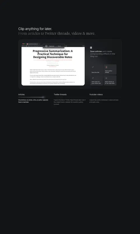
Large product screenshots and browser-like captures sit in rounded dark frames, with captured article content providing the brightest area.
Capture detail cards
Small dark cards present save-link actions and metadata such as author details and notes; use the measured 8px card radius.
Section eyebrow
Small uppercase Inter label above centered or left-aligned feature headlines, separated clearly from the main copy.
Imagery · Use product demonstrations, browser-like screenshots, and captured content rather than lifestyle photography or decorative illustration. Frame media inside dark, softly rounded surfaces and let readable white document areas appear as part of the product capture. The hero’s circular backdrop and horizontal light flare are cinematic visual treatments. Keep their brightness controlled so the surrounding page remains nearly black and the product stays legible.
Keep text hierarchy within white, gray, and near-black tones.
Pair Inter utility text with occasional Migra serif emphasis.
Give major sections generous vertical separation.
Let product screenshots carry the visual detail.
Use dark, softly rounded surfaces for interface mockups.
✕ 不该做
Do not introduce bright accent colours absent from the measured palette.
Do not fill the negative space with extra decoration.
Do not make every heading serif or highly expressive.
Do not turn screenshots into generic lifestyle imagery.
Do not use strong borders around every card.
Do not crowd the hero with extra calls to action.
给 AI 的提示词
想快速出一个同风格的新页面,把这段话连同 DESIGN.md 一起发给 AI。
Build a new page in Lazy’s quiet, product-led visual style. Use Midnight Canvas (#131416) as the dominant background, Slate Surface (#27282d) and Deep Graphite (#17171a) for restrained layering, Quiet White (#ffffff) for primary text, and Soft Graphite (#8a8c93) for supporting copy. Use Inter for navigation, interface labels, and body text; reserve a refined serif such as Cormorant Garamond for Migra-like editorial emphasis. Center the hero around a product capture, then organize later content in spacious, clearly separated sections within the measured 1064px content width. Prefer screenshots and realistic interface mockups over decoration. Keep cards softly rounded, shadows subtle, borders low contrast, and all contrast intentional. Do not add vivid accents or compress the generous whitespace.