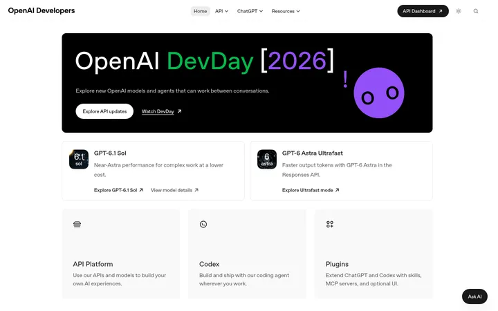
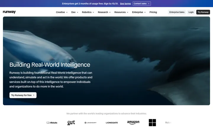
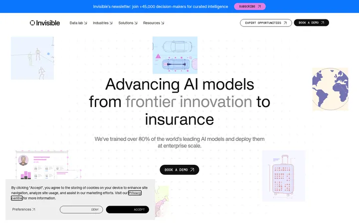
North star · Keep the interface monochrome and spacious, letting editorial imagery supply color without disrupting the grid.
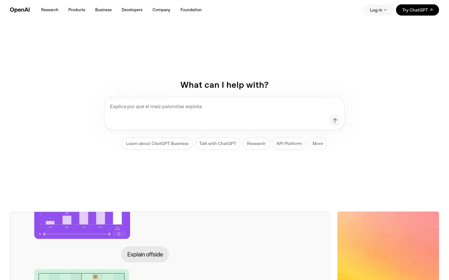
The page uses a white canvas and black OpenAI Sans typography as its visual foundation. Black is reserved for headings, navigation, links, and the main ChatGPT action; muted gray supports secondary labels, while pale gray marks borders, card edges, and quiet controls. The interface stays deliberately color-sparse, so the vivid gradients, photographs, and product imagery in editorial tiles provide most of the color. A compact top navigation gives way to a centered ChatGPT prompt area, followed by wide editorial sections arranged in two- and three-column grids. Headings are left-aligned except for the centered get-started callout. Typography favors medium weights, tight heading tracking, and concise metadata. Rounded pill buttons and prompt controls soften the otherwise crisp modular layout. Sections remain on a white background, with spacing and imagery—not colored bands—establishing hierarchy.
配色
点色块复制色值。用途说明来自对页面的实测位置(背景、文字、描边、按钮)与截图判读。
品牌色
表层色
中性色
功能色
页面底色 · Canvas White表层 · Quiet Line主文字 · Pure Ink次要文字 · Soft Graphite描边 · Quiet Line
All page typography, from navigation and metadata to headings, body copy, and buttons.
角色
示例
字号
字重
行高
字距
一级标题
Primary page or feature headline, including the hero prompt heading.
OpenAI
48px
500
1.16
-0.03em
二级标题
Section headings such as Recent news and Latest research.
OpenAI
28px
600
1.21
0.011em
三级标题
Editorial card and feature titles.
The quick brown fox 敏捷的狐狸
22px
500
1.26
-0.01em
四级标题
Smaller supporting headings within content groups.
The quick brown fox 敏捷的狐狸
18px
500
1.32
-0.01em
正文
Card descriptions, metadata, and supporting copy.
The quick brown fox 敏捷的狐狸
13px
500
1.51
0
按钮
Pill CTA labels and compact action text.
The quick brown fox 敏捷的狐狸
14px
500
1
0
导航
Primary navigation and footer category links.
The quick brown fox 敏捷的狐狸
13px
500
1.51
0
链接
Editorial titles and standalone actions such as View all.
The quick brown fox 敏捷的狐狸
14px
500
1
0
间距与布局
基准单位 8px · 密度:紧凑
32px版块间距
8px元素间距
25px卡片内边距
736px内容最大宽度
4px
8px
12px
16px
20px
24px
32px
40px
64px
120px
A compact top navigation spans the page, followed by a centered prompt experience and a long editorial homepage. Content sections use two- or three-column grids, with the first feature area split between a large lead story and a narrower stack. Section headings and most content align to the left; the get-started CTA is centered. Keep the canvas white and let generous vertical gaps distinguish sections. The measured page max-width is 736px; preserve the observed broad editorial composition without introducing colored section bands.
圆角与层次
按钮 · 9999px
输入框 · 9999px
卡片 · 24px
导航 · 50%
链接 · 4px
sm · button
xl · card
The overall treatment is flat, with white surfaces and fine pale-gray borders doing most of the separation. Prompt controls and outlined pills use quiet edges rather than strong fills. The measured data includes very subtle button shadowing and a stronger card shadow, but the screenshots emphasize clean editorial tiles over conspicuous floating layers.
组件
下面的预览按实测的按钮、输入框、徽标、卡片样式重建(字体用替代字体)。
Top navigation
Compact horizontal links in OpenAI Sans on white, with a light login pill and a black pill-shaped ChatGPT action.
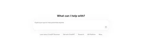
Prompt composer
Centered prompt heading above a broad white input with a subtle #e0e0e0 outline, rounded treatment, and a submit icon.
Suggestion pills
Short outlined pill actions beneath the composer; labels use compact medium-weight typography and subdued borders.
Editorial feature feed
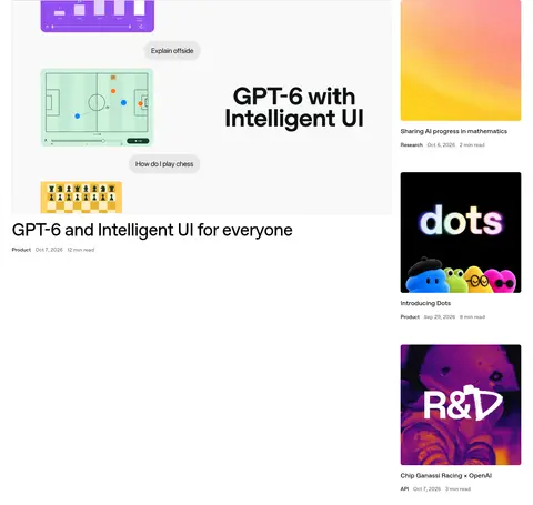
Large lead story paired with a narrow stack of image-led cards; titles and metadata sit close to their imagery.
News list
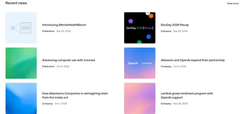
Compact two-column editorial rows combine small image thumbnails with title, category, and date information.
Story and research grids
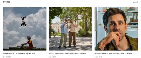
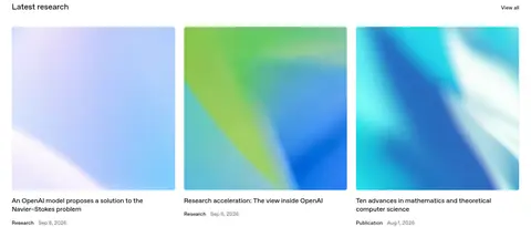
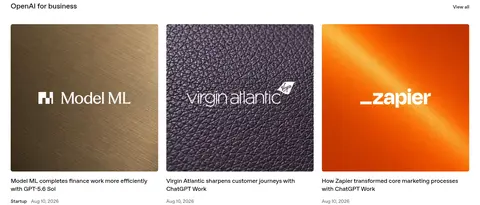
Three-column card rows with prominent image crops, short titles, and understated publication metadata.
Footer link directory
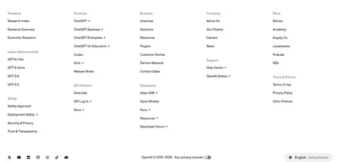
Multi-column link groups on white, using compact navigation typography and small social and locale controls.
Imagery · Editorial imagery is the page’s main source of color: gradients, product visuals, brand tiles, and documentary-style photographs appear in feed cards. Use clean rectangular crops with consistent grid alignment and rounded card framing where shown. The prompt area also previews ChatGPT product experiences. Keep images vivid and largely unfiltered; the measured interface palette remains neutral rather than sampling these image colors as brand accents.
Use black for primary text and high-priority actions.
Keep secondary metadata subdued in gray.
Use fine pale-gray outlines for quiet controls.
Let editorial images provide the strongest color.
Keep section headings aligned consistently with their grids.
✕ 不该做
Do not add decorative color bands between sections.
Do not turn image colors into interface brand accents.
Do not use heavy shadows to separate every card.
Do not make metadata compete with editorial titles.
Do not crowd the prompt area with extra controls.
Do not replace the modular grids with dense text walls.
给 AI 的提示词
想快速出一个同风格的新页面,把这段话连同 DESIGN.md 一起发给 AI。
Build a new OpenAI-style page with a white Canvas White (#ffffff) foundation and Pure Ink (#000000) text. Use OpenAI Sans or Inter, compact medium-weight navigation, carefully tracked headings, and muted supporting copy in Soft Graphite (#666666). Keep controls quiet: use fine Quiet Line (#e0e0e0) borders and rounded pill actions, reserving a black filled pill for the primary CTA. Organize content into clean editorial grids with clear left alignment, generous separation between sections, and a centered hero or action block only when appropriate. Let photography, gradients, or product visuals provide color inside content tiles; do not add decorative color to the interface itself. Favor flat surfaces and restrained shadows, and keep titles and metadata visually distinct.