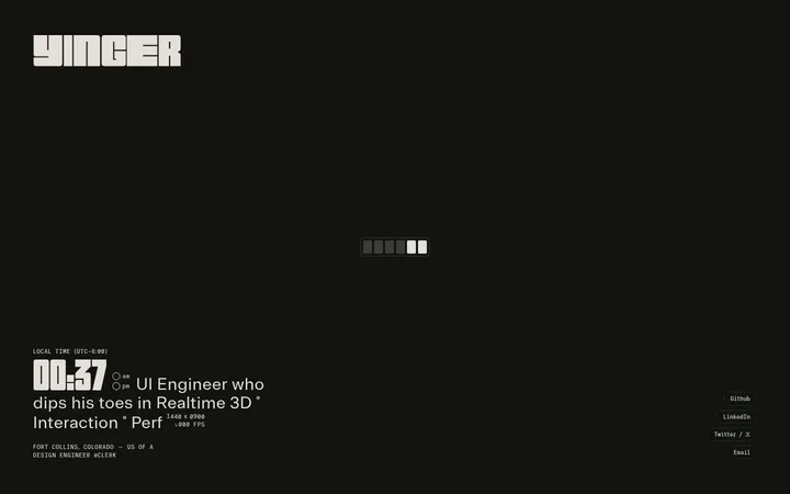
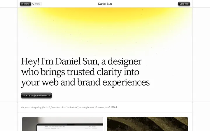
North star · Let serif typography and deliberate whitespace define the page; use rules and imagery only as quiet structure.
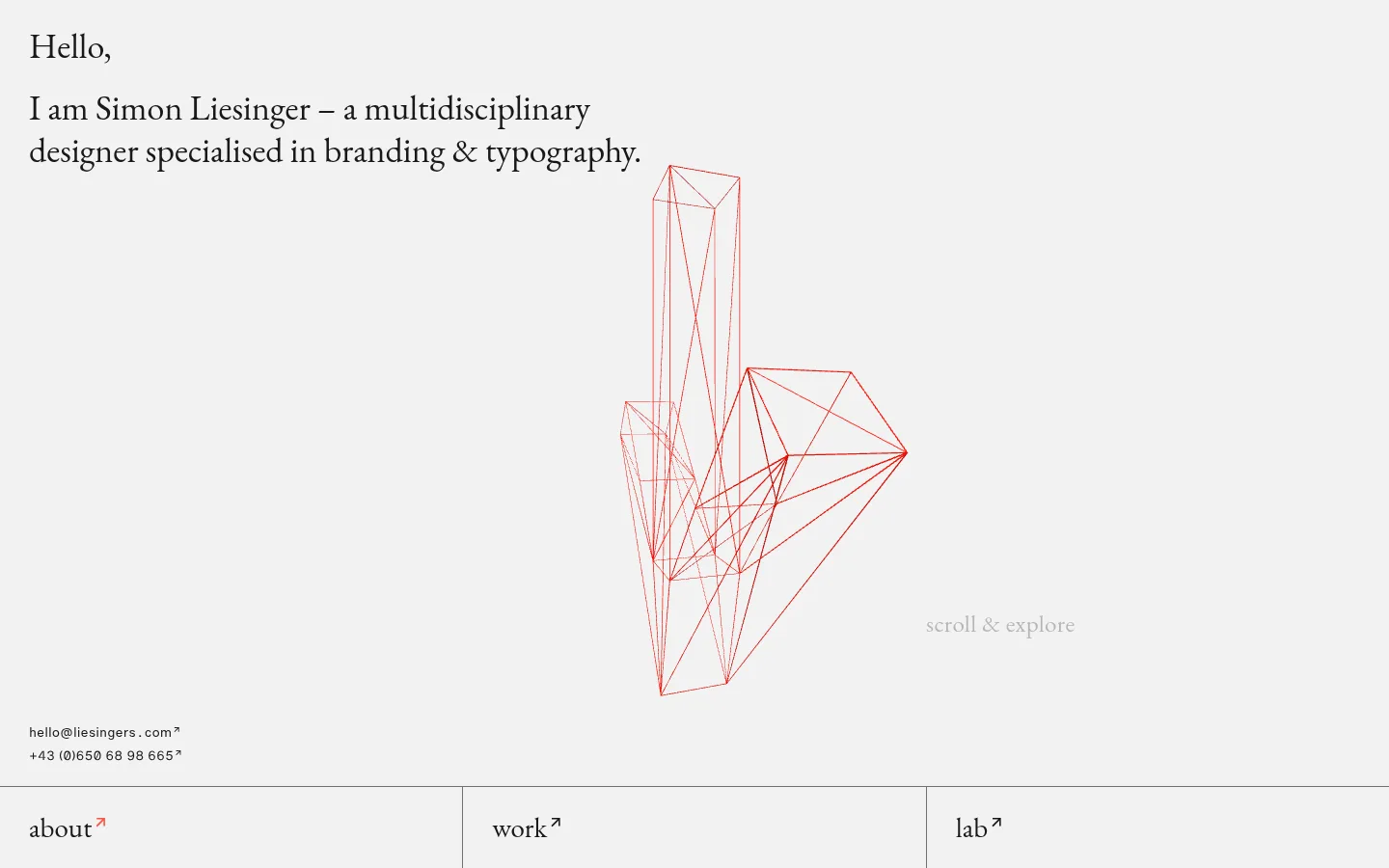
The page uses a soft light-gray canvas throughout, with near-black text providing crisp contrast and a muted gray reserved for hairline dividers. The dark footer forms the only substantial inverse-color band. Typography carries the identity: Garamond-style serif headlines and prose create an editorial, personal voice, while restrained Helvetica sans-serif supports compact contact details and functional labels. The opening is intentionally sparse: a left-aligned greeting and introduction sit above a delicate red geometric line illustration, with contact details tucked near the lower edge. A three-column index is separated by fine rules, then the long-form sections return to a quiet label-and-copy arrangement with generous vertical pauses. Photography appears sparingly as a centered portrait, shown without decorative framing. There are no visible shadows, rounded cards, gradients, or ornamental UI effects; structure comes from alignment, whitespace, typography, and thin borders.
Serif display and editorial text for the greeting, section labels, navigation, and long-form copy.
Aa 设计
HelveticaMd
网络字体 · 字重 600 · 占比 12%
免费替代:Inter
Semibold sans-serif for service and project links and compact functional copy.
Aa 设计
HelveticaRg
网络字体 · 字重 400 · 占比 5%
免费替代:Inter
Regular sans-serif for small contact and caption text.
角色
示例
字号
字重
行高
字距
一级标题
Hero greeting and primary introductory statement.
Simon Liesinger
36px
400
1.22
0
二级标题
Large section or navigation labels, including the index.
Simon Liesinger
29px
400
0.86
0
三级标题
Secondary editorial headings and smaller section labels.
The quick brown fox 敏捷的狐狸
25px
400
1.28
0.016em
正文
Prominent service and portfolio links.
The quick brown fox 敏捷的狐狸
16px
600
1.13
0
辅助文字
Contact details and small supporting labels.
The quick brown fox 敏捷的狐狸
12px
400
1.67
0
链接
Interactive text links, including collaborators and email.
The quick brown fox 敏捷的狐狸
16px
600
1.13
0
间距与布局
基准单位 2px · 密度:宽松
160px版块间距
—元素间距
—卡片内边距
660px内容最大宽度
5px
10px
12px
14px
25px
29px
30px
40px
160px
Use a centered, narrow editorial canvas with a measured page max width of 660px where content is constrained, while allowing the opening and section bands to span the available viewport. Align text to the left. The first screen balances an upper-left introduction against open space for the geometric drawing, then anchors contact details low in the hero. Follow with a ruled three-column index. Long-form sections use a small label column and a wider prose column, separated by spacious vertical intervals; keep density low and avoid packed UI.
圆角与层次
没有测到阴影:页面是扁平的,层次靠底色和描边区分。
The page is flat, with no measured shadows or gradients and no rounded-corner system. Establish hierarchy through whitespace and alignment rather than raised surfaces. Use thin gray hairlines to divide the index and section edges; reserve the near-black surface for the footer, without adding ornamental layering.
组件
下面的预览按实测的按钮、输入框、徽标、卡片样式重建(字体用替代字体)。
Editorial hero
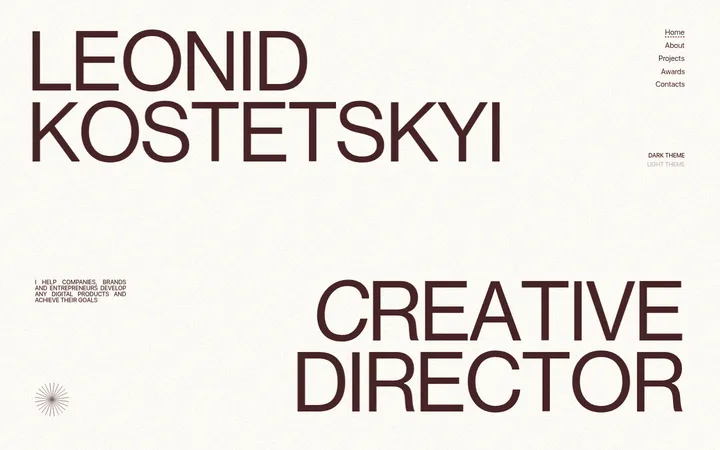
Left-aligned serif greeting and introduction on the light canvas, with ample open space for a fine-line geometric illustration.
Contact details
Small utility links sit near the lower edge of the hero, visually subordinate to the main introduction.
Three-column index
Services, awards, and collaborators form a compact index divided into columns by thin gray rules.
Section label and prose
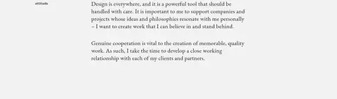
Small section labels align beside a wider column of serif editorial copy, with generous vertical spacing between blocks.
Portrait image
A single centered photograph appears within the otherwise sparse agency section, without a prominent frame or shadow.
Inverse footer
A compact near-black closing band contains a serif sign-off and small legal links.
Imagery · Keep imagery sparse and secondary to typography. The hero illustration is a delicate red wireframe geometric form on the light canvas; treat it as line art rather than a colored illustration panel. Later, place a single understated portrait photograph within the otherwise open layout. Avoid image grids, heavy crops, decorative frames, or overlays.
Set editorial headlines and prose in a Garamond-style serif.
Keep labels and prose aligned to a calm left edge.
Use #6e6e6e sparingly for fine dividing rules.
Preserve substantial whitespace between content sections.
Reserve #181818 for strong text contrast and the closing footer.
✕ 不该做
Do not introduce unmeasured colors into the brand palette.
Do not add shadows, gradients, or rounded-card styling.
Do not compress the long-form sections into dense blocks.
Do not let decorative imagery overpower the typography.
Do not turn the three-column index into heavily boxed cards.
Do not style every label as a large, bold sans-serif.
给 AI 的提示词
想快速出一个同风格的新页面,把这段话连同 DESIGN.md 一起发给 AI。
Build a new page in Simon Liesinger’s restrained editorial portfolio style. Use Gallery Mist (#f2f2f2) as the main canvas and Soft Ink (#181818) for crisp text and a possible inverse footer; use Quiet Rule (#6e6e6e) only for fine dividers. Favor a Garamond-style serif for expressive headings and prose, with a practical sans-serif for compact labels, links, and contact details. Keep content left-aligned, narrow where appropriate, and surrounded by generous whitespace. Organize index-like content into clearly separated columns with hairline rules, then use small section labels alongside wider prose. Keep imagery sparse and understated, with no shadows, gradients, rounded cards, or decorative UI. Prioritize typography, alignment, and quiet pacing over interface ornament.