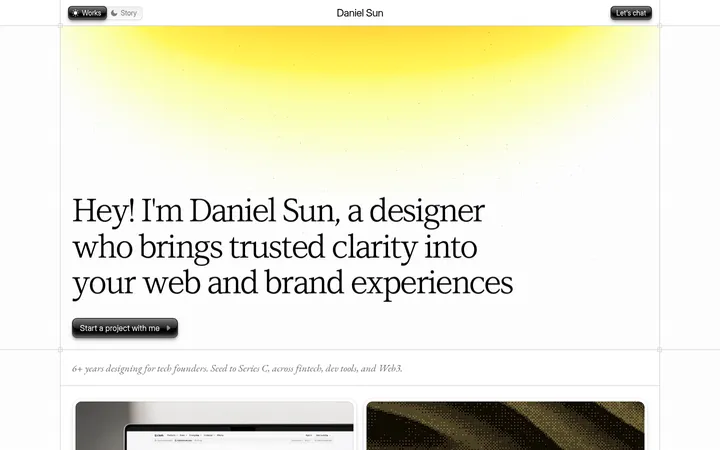
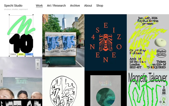
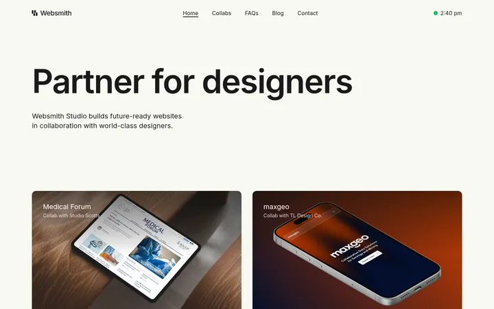
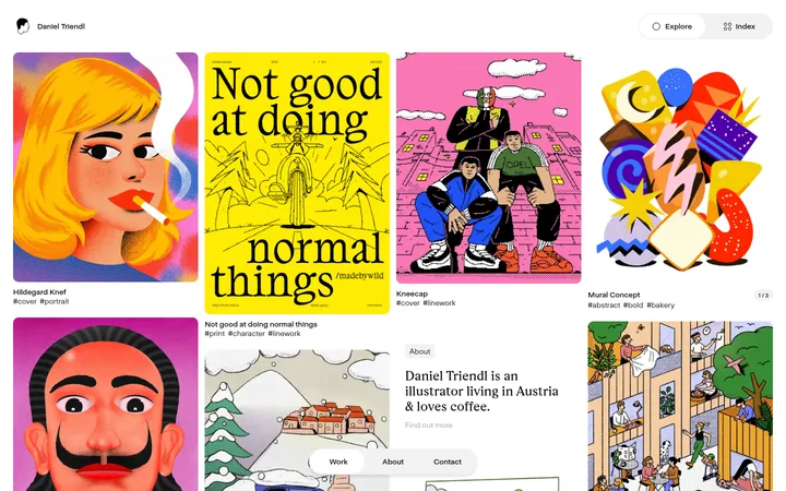
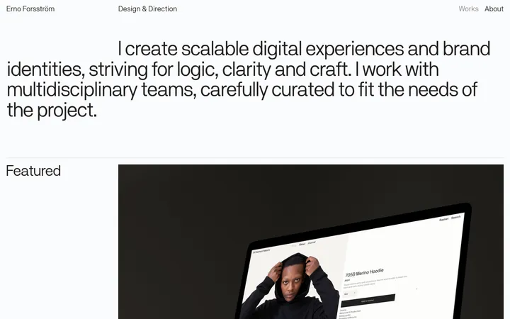
North star · Keep the interface quiet and let a well-aligned, image-led portfolio carry the visual personality.
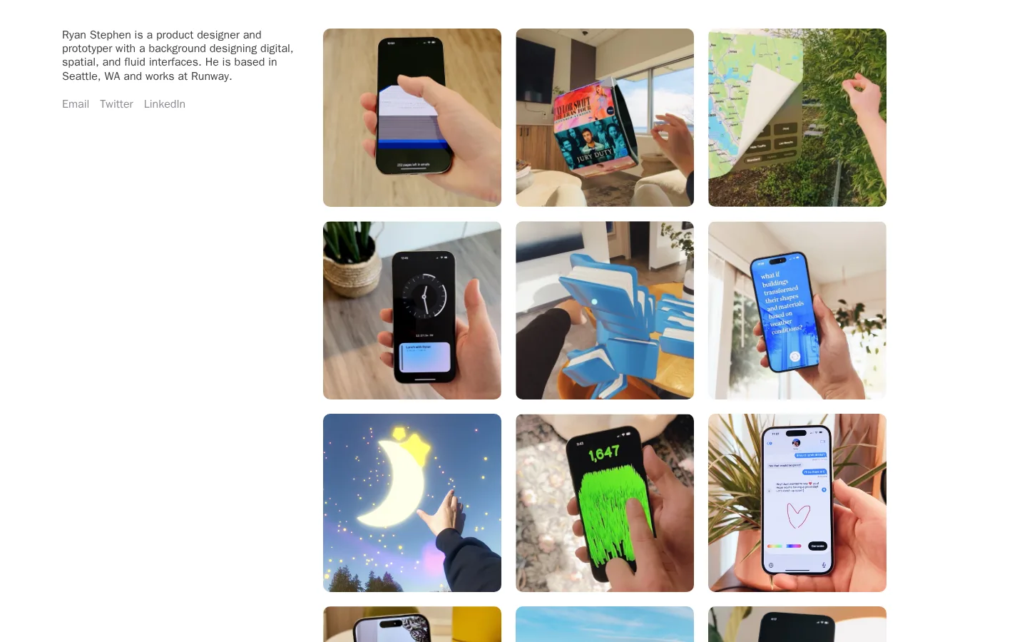
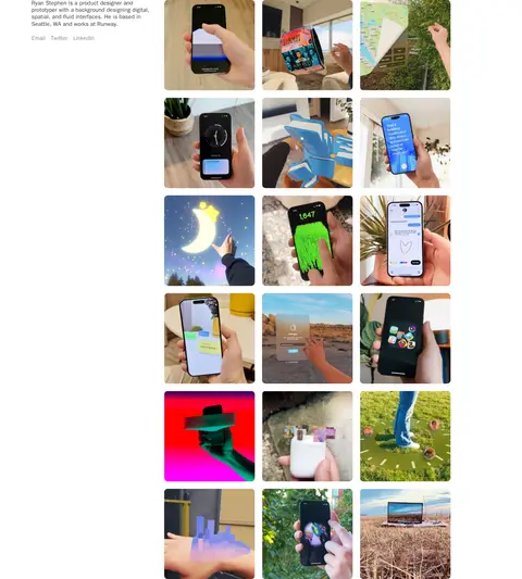
The page uses a pure white canvas as a quiet frame for the portfolio rather than introducing decorative section bands or prominent brand accents. Dark gray body text carries the designer introduction, while a softer gray distinguishes the contact links without turning them into buttons. Typography is system-ui throughout, set at the measured 16px size and medium weight; compact line spacing makes the introductory paragraph feel like a concise caption. The desktop composition places that introduction in a narrow left column beside a three-column gallery, aligning text and imagery at the top. A generous measured section gap and comfortable density preserve open space around the otherwise active collection. Media tiles have softly rounded corners, while the work itself supplies the page’s color: interface screens, objects, environments, and experimental visuals remain photographic and varied. These image colors are project content, not additional brand palette colors.
Designer introduction and supporting portfolio text.
The quick brown fox 敏捷的狐狸
16px
500
1.2
0
链接
Inline contact links below the introduction.
The quick brown fox 敏捷的狐狸
16px
500
1.2
0
间距与布局
基准单位 4px · 密度:适中
40px版块间距
20px元素间距
—卡片内边距
—内容最大宽度
15px
20px
32px
40px
100px
The desktop page is a single, open composition: a narrow introduction column sits to the left of a three-column media grid. The text and first gallery row share a top alignment, with no visible navigation or boxed content sections. Images repeat in consistent rows, creating a compact gallery beside the short introduction. Measured spacing uses a 4px base unit, with 20px element gaps and 40px section rhythm; the overall density reads comfortable. No maximum content width was measured, so avoid imposing a decorative container treatment.
圆角与层次
图片 · 10px
没有测到阴影:页面是扁平的,层次靠底色和描边区分。
The page is visually flat: measured data reports no shadows, and the screenshot shows no elevated cards or layered panels. White space separates content, while the project images themselves define the grid. Media corners use the measured 10px radius; no borders or surface treatments are needed.
组件
下面的预览按实测的按钮、输入框、徽标、卡片样式重建(字体用替代字体)。
Introduction
A compact paragraph in #404040 introduces the designer, practice, location, and current role. It occupies the left column beside the gallery.
Contact links
Email, Twitter, and LinkedIn appear as understated inline text links in #8b8b94 beneath the introduction, without button backgrounds.
Portfolio gallery
A three-column sequence of project images sits to the right of the introduction and continues down the page.
Media tile
Each image is presented directly on the white canvas with the measured 10px media radius, without a card border or shadow.
Imagery · The gallery is built from rounded-corner project images, predominantly photographs of phones, interface prototypes, objects, and environments. Images retain their individual color and content rather than following one uniform filter or art direction. The screenshot’s brighter colors belong to the portfolio work, not the site palette; preserve varied project imagery against the white page.
Place contact links directly below the introduction.
Build the work area as a consistent three-column image grid.
Use the measured 10px radius on media.
Let each project image retain its own colors.
✕ 不该做
Do not add prominent colored section backgrounds.
Do not turn simple contact links into filled buttons.
Do not add shadows or card borders.
Do not treat image colors as brand palette colors.
Do not add oversized headings absent from the reference.
Do not crowd the gallery with decorative labels.
给 AI 的提示词
想快速出一个同风格的新页面,把这段话连同 DESIGN.md 一起发给 AI。
Build a new portfolio page in Ryan Stephen’s quiet, image-led style. Use Gallery White (#ffffff) as the canvas, Soft Ink (#404040) for primary copy, and Quiet Gray (#8b8b94) for understated text links. Set body and link text in system-ui, 16px, weight 500, with 1.2 line height. On desktop, align a concise introduction and its inline contact links in a left column beside a three-column gallery; keep the gallery visually dominant and let it continue down the page. Use comfortable spacing, including the measured 20px element gap and 40px section rhythm where appropriate. Give media the measured 10px corner radius. Avoid borders, shadows, colored panels, and button styling for simple links. Preserve the natural variety of project imagery without turning its colors into interface accents.