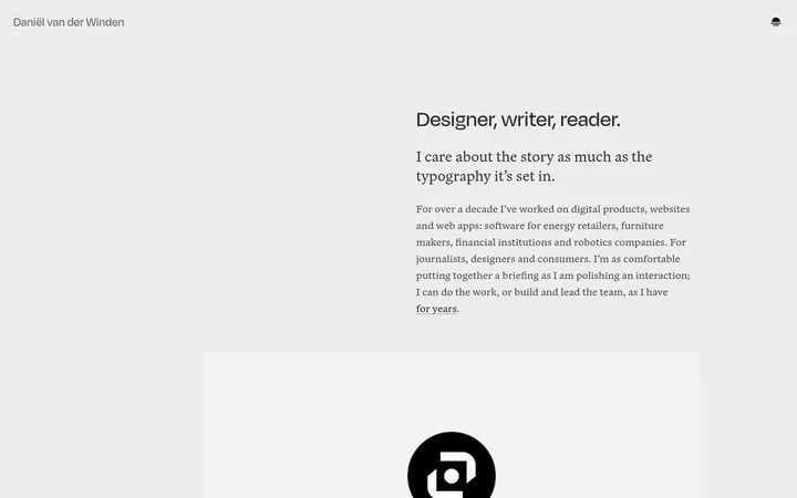
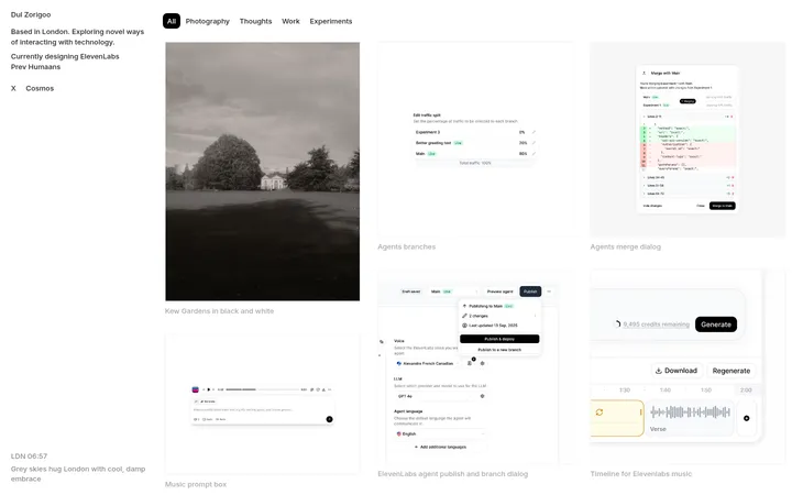
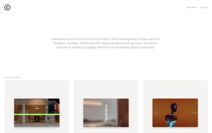
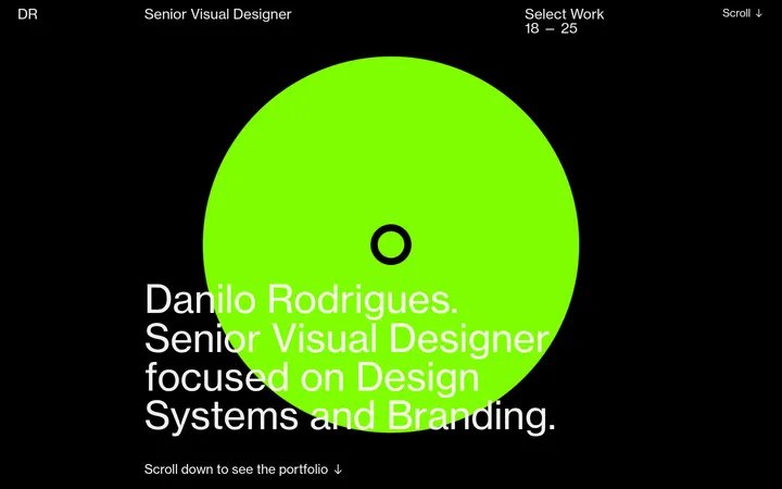
North star · Keep the interface quiet and finely structured so editorial typography and client work provide the visual impact.
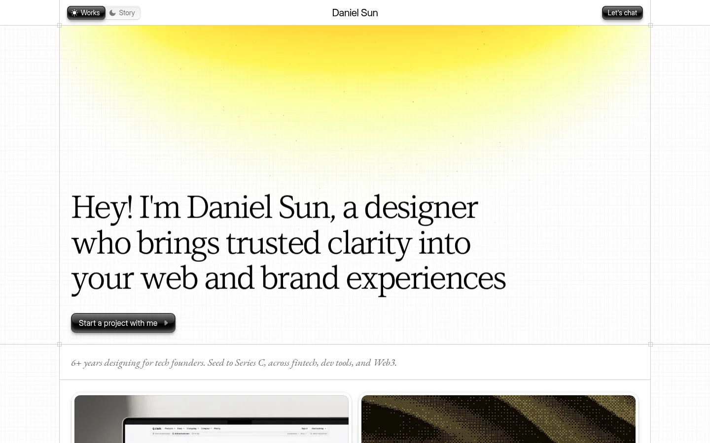
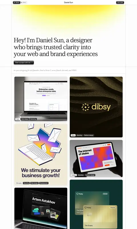
The visual system is built on a white canvas, with black typography and delicate gray rules defining the page rather than broad colored bands. A soft yellow glow at the top adds a restrained note of warmth; stronger colors belong mainly to client project imagery, not the core interface palette. Large, left-aligned serif display copy gives the hero an editorial voice, while the surrounding interface uses compact sans-serif text. The centered page frame is organized as a fine-lined grid, with a narrow top navigation, expansive hero area, and a staggered gallery of rounded project previews. A brief italic experience line separates the introduction from the work. Spacing feels measured and compact around controls and labels, but generous around major statements and section breaks. Project thumbnails bring varied art direction into an otherwise quiet, consistently framed layout.
Interface copy, navigation, labels, and supporting text
Aa 设计
LT Superior Serif Regular
网络字体 · 字重 400 · 占比 16%
免费替代:Cormorant Garamond
Large editorial hero statement and principal section headings
Aa 设计
EB Garamond
网络字体 · 字重 400 · 占比 13%
免费替代:EB Garamond
Italic supporting experience line and occasional serif accents
角色
示例
字号
字重
行高
字距
特大标题
Large editorial hero statement.
Daniel Sun
64px
400
1.13
-0.047em
一级标题
Primary introduction and prominent headline treatment.
Daniel Sun
30px
400
1.33
-0.017em
二级标题
Compact sans-serif secondary headings.
The quick brown fox 敏捷的狐狸
21px
400
0.95
-0.024em
三级标题
Serif supporting headings and editorial accents.
The quick brown fox 敏捷的狐狸
20px
400
1.2
0.005em
正文
Paragraphs, project descriptions, and supporting copy.
The quick brown fox 敏捷的狐狸
16px
400
1.63
0.006em
辅助文字
Navigation labels, project tags, and compact metadata.
The quick brown fox 敏捷的狐狸
14px
400
1.43
0
间距与布局
基准单位 2px · 密度:紧凑
32px版块间距
10px元素间距
—卡片内边距
1200px内容最大宽度
4px
6px
7px
8px
9px
10px
12px
16px
24px
32px
A centered page frame uses the measured 1200px maximum width and a fine, column-based grid. The hero is left aligned, with generous open space around its large headline; the narrow top bar centers the designer name between compact controls. A slim italic statement creates a transition into a two-column, staggered project gallery, followed by a ruled client list and spacious content sections. The overall density is compact at the control and label level, but broad section breaks keep the page from feeling crowded.
圆角与层次
按钮 · 10px
卡片 · 12px
图片 · 12px
链接 · 9999px
hairline · card
lg · card
lg · card
inset · other
The page relies on thin gray rules and a visible grid more than heavy card shadows. Project previews have softly rounded corners and subtle, tactile edge treatment; compact black buttons use inset highlights and restrained shadowing. Keep layers clear but avoid floating, oversized panels.
组件
下面的预览按实测的按钮、输入框、徽标、卡片样式重建(字体用替代字体)。
Top navigation
A narrow white bar places a compact Works/Story switch at left, the designer name in the center, and a dark chat control at right.
Hero statement
Large, left-aligned serif introduction sits over a mostly white field with a gentle warm yellow glow near the top.
Primary project CTA
Compact black pill-shaped button with subtle inset shine, shadow, and a small directional icon.
Project gallery
A staggered two-column sequence of rounded portfolio previews, mixing client websites, identity work, and product imagery.
Project labels
Small, high-contrast category chips identify each work sample with client and discipline metadata.
Client logo grid
A ruled, multi-column client list uses compact monochrome wordmarks against a white background.
Imagery · A varied portfolio gallery combines website previews, brand identities, digital product screens, and illustrative artwork. Tiles are shown as substantial, rounded previews with their own color and art direction, rather than being forced into a uniform palette. Small dark project-category labels sit over or near the images. The hero itself is mostly typography and open space, with a soft yellow glow adding atmosphere behind it.
Frame work samples with fine rules and soft corners.
Let project imagery supply most of the color.
Separate major content with generous white space.
✕ 不该做
Do not introduce broad saturated interface bands.
Do not use heavy shadows on every card.
Do not center the main hero statement.
Do not make interface labels oversized.
Do not flatten all portfolio imagery into one visual style.
Do not substitute thick borders for the fine grid.
给 AI 的提示词
想快速出一个同风格的新页面,把这段话连同 DESIGN.md 一起发给 AI。
Build a new designer portfolio page in this visual language: an editorial, grid-framed layout on Gallery White (#ffffff), with Studio Ink (#000000) typography and Quiet Gray (#666666) for supporting copy. Use a high-contrast serif for the large, left-aligned introduction and a restrained sans-serif for navigation, captions, and labels. Add only a faint warm glow near the top; reserve stronger color for the work itself. Organize project previews in an asymmetric two-column gallery, separated by thin gray rules and generous section breaks. Use compact black pill controls with subtle inset highlights, softly rounded media, and small project-category chips. Keep the interface minimal and precise, and allow each portfolio item to retain its own visual identity.