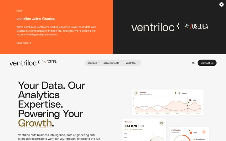
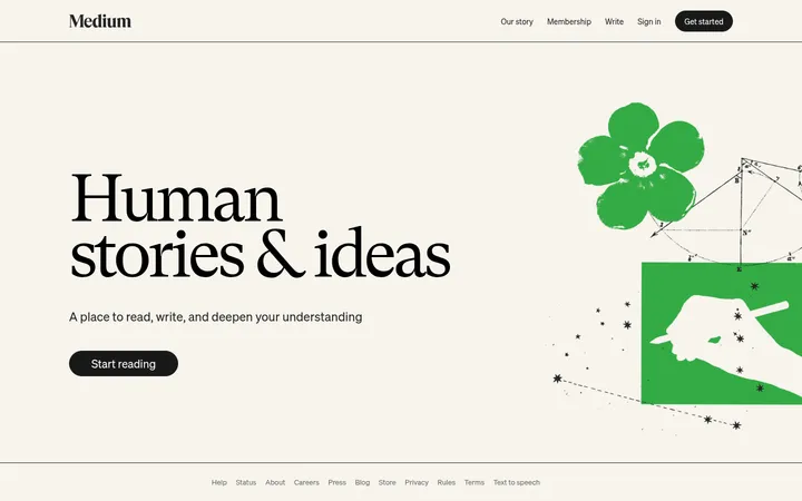
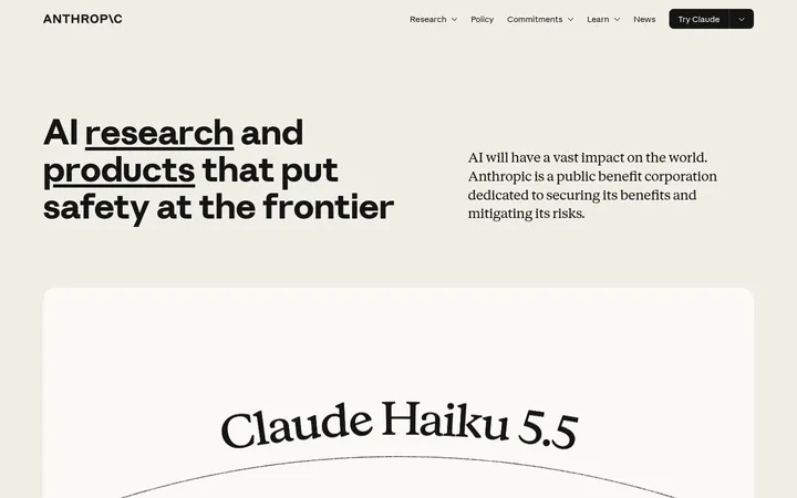
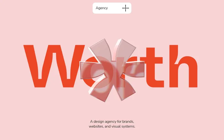
North star · Let warm open space and oversized human-centered storytelling lead, using vivid colour as a purposeful accent rather than decoration.
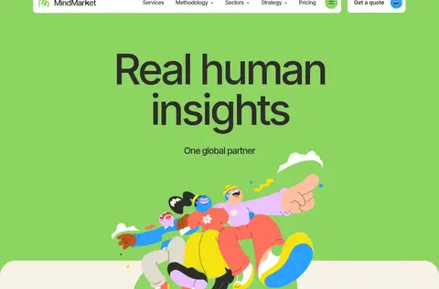
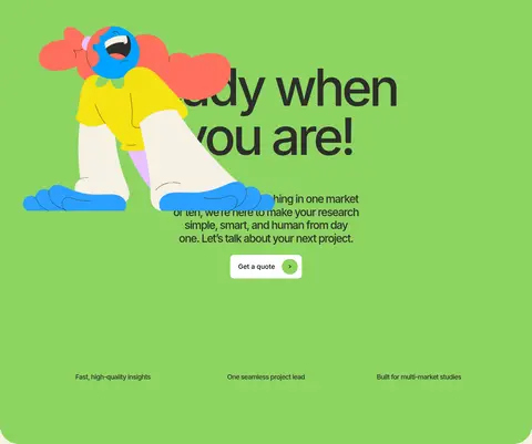
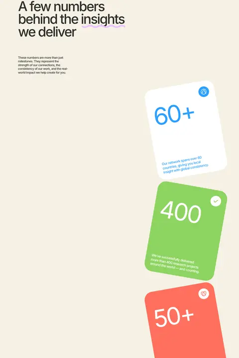
The visual identity is built around a warm ivory canvas (#f5f1e4), dark charcoal typography (#2c2e2a), and a confident, fresh green (#8ed462) used for the opening visual and a prominent CTA band. White cards offer clean contrast; muted beige (#e0dbce) marks the article-feed section. Blue and coral punctuate selected stat cards, while brighter hues elsewhere belong mainly to the page’s expressive character illustrations rather than the core interface palette. Inter is used throughout: very large, tightly tracked headings create an editorial focal point, with compact, readable supporting copy. The layout is vertically expansive and mostly single-column, with staggered illustration-and-card moments, broad open areas, and rounded transitions. Human scenes and playful drawings make global research feel approachable; restrained card treatments keep the content legible without heavy shadows or borders.
Site-wide headings, navigation, body copy, cards, badges, and controls.
角色
示例
字号
字重
行高
字距
特大标题
Oversized hero headline and expressive display moments.
MindMarket
144px
400
0.95
-0.06em
一级标题
Primary page headline in the opening hero.
MindMarket
139.5px
500
0.95
-0.06em
二级标题
Major section titles, including the statistics introduction.
MindMarket
81px
500
0.95
-0.06em
三级标题
Feature-card and article titles.
MindMarket
40.5px
500
1.2
-0.06em
四级标题
Secondary card headings and supporting feature labels.
MindMarket
30px
500
1.2
-0.06em
正文
Introductory copy, service explanations, and CTA text.
The quick brown fox 敏捷的狐狸
20px
500
1.25
-0.04em
辅助文字
Small card descriptions, metadata, and image captions.
The quick brown fox 敏捷的狐狸
17px
500
1.5
0
导航
Header navigation links and compact menu labels.
The quick brown fox 敏捷的狐狸
18px
500
1.25
-0.04em
间距与布局
基准单位 1px · 密度:宽松
170px版块间距
9px元素间距
34px卡片内边距
1223px内容最大宽度
6px
9px
11px
13px
17px
20px
26px
27px
34px
51px
53px
85px
170px
The page uses a spacious, vertically unfolding composition, with a measured maximum content width of 1223px. Most sections read as a single column, while the statistics and article areas introduce two-column arrangements. Hero and feature storytelling rely on asymmetry: illustrations overlap the flow, and white copy cards appear among large open ivory areas. Section rhythm is generous, with measured section gaps of 170px. Keep text aligned to clear content edges and avoid compressing the long illustrated narrative.
圆角与层次
按钮 · 10px
卡片 · 50px
徽标 · 9999px
导航 · 9999px
没有测到阴影:页面是扁平的,层次靠底色和描边区分。
The interface is mostly flat: measured shadow styles are absent, and strong colour fields, whitespace, and rounded silhouettes create hierarchy. White cards sit directly on the ivory or beige canvas without prominent outlines. Layering comes from artwork overlapping sections and cards, while the CTA and navigation controls remain clean, simple shapes.
组件
下面的预览按实测的按钮、输入框、徽标、卡片样式重建(字体用替代字体)。
Pill navigation
White header surface with compact Inter links and rounded navigation treatments; the menu and quote action sit apart from the main content.
Quote action
A compact, rounded white CTA with dark text and a small coloured circular arrow accent.
Illustrated feature cards
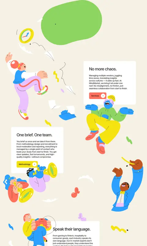
White rounded text panels are interspersed with large character art and short service explanations.
Green CTA band
A broad #8ed462 section centers a prominent invitation and quote action, with brief supporting benefit labels.
Proof-point cards
Large rounded metric cards use white, green, blue text, and coral treatments to distinguish figures and explanations.
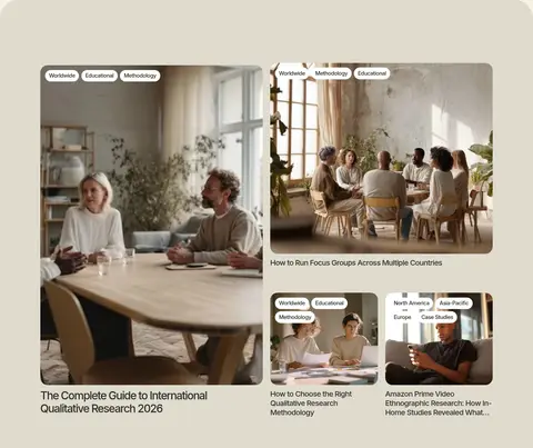
Featured article cards
A #e0dbce feed presents research photography, white category badges, and dark editorial headlines in an asymmetric two-column arrangement.
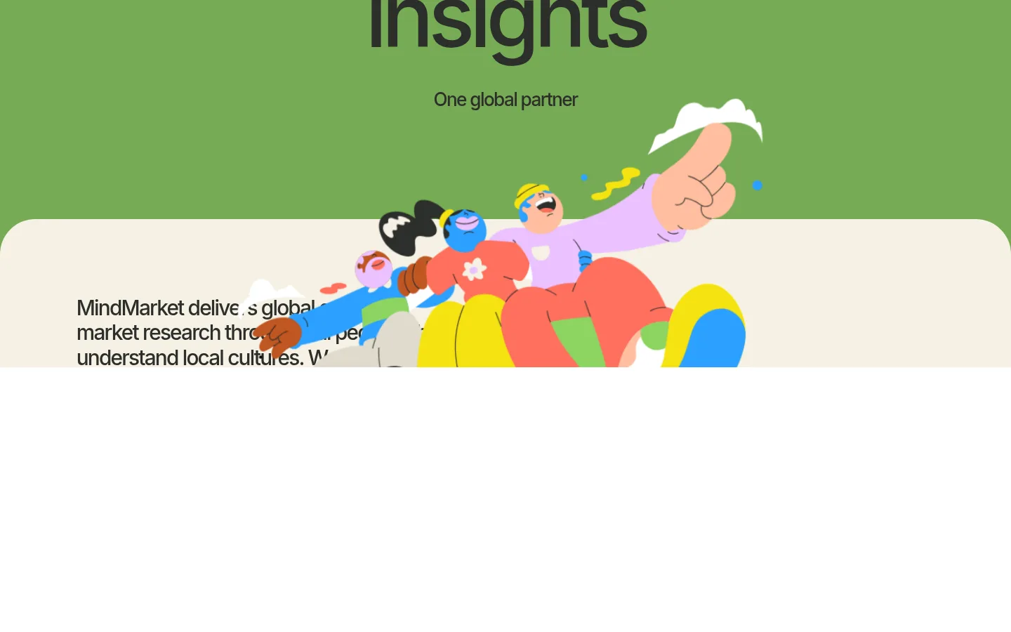
Imagery · Large, colourful character illustrations animate the hero and extended feature narrative, often crossing section edges or overlapping white text cards. A human lifestyle photograph provides a grounded moment before the statistics section. Article cards use photographic research and interview scenes. Keep illustration colours lively and varied; those hues are largely artwork, not new interface colours.
Reserve Fresh Meadow for prominent fields and calls to action.
Use large, tightly tracked Inter headings for hierarchy.
Give illustrations room to overlap cards and section boundaries.
Keep supporting copy concise and readable.
✕ 不该做
Do not turn illustration colours into a competing interface palette.
Do not add heavy shadows or dense borders to cards.
Do not compress the page into a tight dashboard grid.
Do not use generic stock imagery in place of human-centered scenes.
Do not make every section a bright colour band.
Do not use all-caps as the default heading style.
给 AI 的提示词
想快速出一个同风格的新页面,把这段话连同 DESIGN.md 一起发给 AI。
Create a new MindMarket-style page for a global qualitative research agency. Use Warm Ivory (#f5f1e4) as the main canvas, Grounded Charcoal (#2c2e2a) for most text, and Fresh Meadow (#8ed462) for a striking hero or CTA field. Set all typography in Inter, using large, tightly tracked headlines and clear, compact supporting copy. Build a spacious editorial flow with generous section breaks, asymmetrical content, rounded white cards, and human-centered illustrations that may overlap section edges. Use Soft Pebble (#e0dbce) for a quieter content band, and reserve Signal Blue (#2ba0ff) and Coral Pop (#ff705d) for selective emphasis. Keep the interface mostly flat, with no heavy shadows, and make each section feel readable, warm, and distinctly illustrated rather than dashboard-like.