North star · Let the blush canvas and oversized coral typography set the tone, then give each project image generous room to speak.
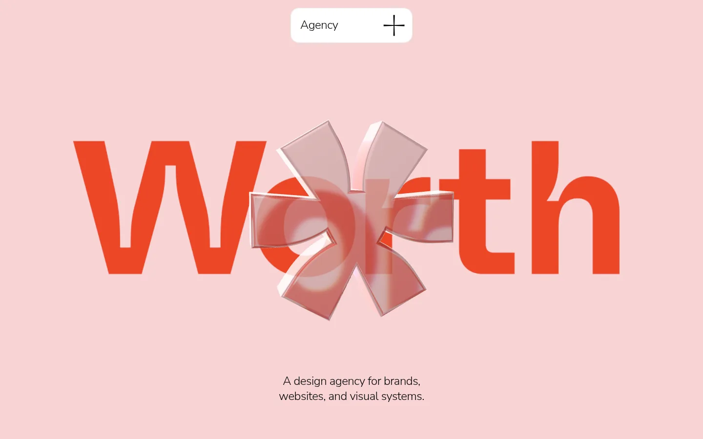
A blush-pink canvas establishes the page’s identity, while large coral-red display lettering creates an immediate focal point. The opening combines this oversized wordmark with a translucent sculptural form and a short, centered agency introduction. Nunito Sans carries the system throughout: light weights and tight tracking keep headlines airy and contemporary, while darker text anchors small captions and supporting copy. Broad white and near-white bands separate the hero, portfolio, and contact areas; generous open space lets the project imagery read clearly. Work is presented in an uneven editorial grid, alternating compact tiles and larger landscape images rather than uniform cards. A pink contact panel returns to the hero palette, with white rounded form fields and a black submit button. The overall strategy is soft and approachable, with carefully placed high-contrast accents instead of heavy borders or decorative UI.
配色
点色块复制色值。用途说明来自对页面的实测位置(背景、文字、描边、按钮)与截图判读。
品牌色
强调色
表层色
中性色
功能色
页面底色 · Blush Canvas表层 · Quiet White表层 2 · Gallery White表层 3 · Studio Ink主文字 · Studio Ink次要文字 · Quiet White强调 · Signal Coral强调 2 · Leaf Green
Display, headings, body copy, captions, and form text across the page.
角色
示例
字号
字重
行高
字距
特大标题
Oversized hero wordmark, set as the dominant visual statement.
Worth Agency
80px
300
1
-0.04em
一级标题
Primary page or section headlines and large introductory statements.
Worth Agency
48px
300
1.16
-0.03em
二级标题
Prominent portfolio or contact section headings.
Worth Agency
32px
600
1.2
-0.02em
三级标题
Project names and smaller supporting headings.
The quick brown fox 敏捷的狐狸
24px
300
1.3
-0.02em
正文
Agency introduction, project descriptions, and form instructions.
The quick brown fox 敏捷的狐狸
16px
300
1.4
-0.02em
辅助文字
Compact project details, labels, and understated utility copy.
The quick brown fox 敏捷的狐狸
13px
300
1.4
-0.02em
间距与布局
基准单位 4px · 密度:适中
72px版块间距
10px元素间距
—卡片内边距
1392px内容最大宽度
4px
6px
8px
10px
16px
20px
24px
32px
36px
48px
60px
72px
96px
The page uses a centered composition and a measured maximum content width of 1392px, with comfortable density and a 72px section rhythm. The hero is spacious and centrally aligned; the portfolio shifts into an asymmetric image grid with varied project footprints. White and near-white bands create clear transitions between the pink opening, work gallery, and contact area. Keep captions close to their images, while preserving broad areas of breathing room around major blocks.
圆角与层次
按钮 · 24px
链接 · 9999px
没有测到阴影:页面是扁平的,层次靠底色和描边区分。
The interface is largely flat, with no measured shadow system or prominent hairlines. Separate content through changes in background colour and generous whitespace. Use rounded white surfaces and image corners for softness; keep the hero 3D object layered over the coral lettering as the page’s intentional depth effect.
组件
下面的预览按实测的按钮、输入框、徽标、卡片样式重建(字体用替代字体)。
Top capsule navigation
A compact white rounded capsule near the top center, containing the Agency label and a simple plus-shaped mark.
Hero wordmark
Oversized coral lettering spans the pink opening, layered with a translucent sculptural 3D shape and a centered short introduction.
Portfolio tiles
An editorial, uneven grid of project images with concise titles and subdued descriptions positioned close to each image.
Contact panel
A rounded blush panel nested within a white section, pairing a large two-line invitation with a compact form.
Form fields
White rounded fields for name, email, budget, service, and project details sit against the pink contact surface.
Submit button
A black rounded submit control provides a small, high-contrast endpoint to the form.
Imagery · Project photography and mockups form the portfolio’s main visual content, including websites on devices, packaging, food, and brand marks. Use crisp rectangular crops with softly rounded corners, and let the source image supply most of its colour. The hero’s translucent sculptural object is a distinctive 3D accent; treat it as a visual overlay, not a recurring card illustration.
Use Blush Canvas (#f8d4d4) as the dominant brand field.
Make the hero lettering oversized and coral.
Keep typography light, clean, and tightly tracked.
Build the project gallery as an asymmetric editorial grid.
Use white bands to separate major page regions.
Give project imagery clear space and restrained captions.
✕ 不该做
Do not turn the gallery into uniform boxed cards.
Do not introduce gradients or heavy shadows.
Do not use Leaf Green as a dominant surface colour.
Do not crowd the hero with navigation or supporting copy.
Do not add decorative borders where whitespace already separates content.
Do not let project-image colours replace the page’s pink-and-coral identity.
给 AI 的提示词
想快速出一个同风格的新页面,把这段话连同 DESIGN.md 一起发给 AI。
Build a new creative-agency page in Worth Agency’s visual style. Use Blush Canvas (#f8d4d4) as the main canvas, Studio Ink (#000000) for text, Gallery White (#ffffff) and Quiet White (#f9f9f9) for rounded surfaces and section bands, and Signal Coral (#eb4726) for a bold focal accent. Use Nunito Sans with light, tightly tracked headings and body copy; reserve semibold weight for selective emphasis. Create a spacious centered opening, then an asymmetric project-image gallery with restrained captions and varied image sizes. Add a clearly separated contact section with a blush panel, white rounded fields, and a black submit control. Keep the UI flat, use whitespace instead of borders, and avoid inventing extra palette colours or decorative effects.