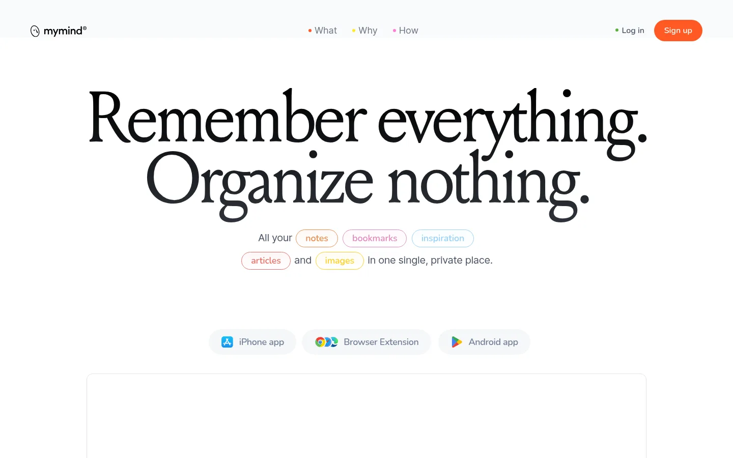
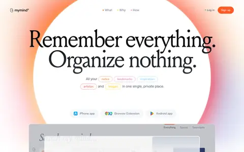
mymind 提供私密的 AI 辅助空间,用于保存和重新发现笔记、图片、链接与灵感。首页以醒目的编辑式大标题和充足留白为主,搭配暖橙渐变与层叠的产品预览。
North star · Let editorial typography and generous white space lead, using orange as a precise signal and product imagery as proof.
The page uses Gallery White (#ffffff) as its dominant canvas, giving the typography and product previews room to breathe. Oversized Louize serif headlines create an editorial voice, while Inter supports readable body copy and navigation. Signal Orange (#ff5924) is a focused highlight for signup, calls to action, and selected section treatments; its peach companion appears in soft atmospheric gradients rather than as a general-purpose interface color. Warm and cool pale surfaces distinguish feature cards without fragmenting the overall calm. The layout alternates quiet text-led passages with vivid, full-width color fields and framed product imagery. Screenshots, saved-content collages, and device views demonstrate the product in use; they sit within generous margins and rounded card surfaces. Fine borders and restrained shadows define layers, while spacious vertical rhythm keeps the long homepage feeling composed rather than dense.
配色 点色块复制色值。用途说明来自对页面的实测位置(背景、文字、描边、按钮)与截图判读。
品牌色
Signal Orange
#ff5924
Primary signup and CTA accent, plus vivid orange section backgrounds and highlights.
强调色
Peach Glow
#ffc0b4
Soft gradient transition paired with orange around atmospheric section treatments.
表层色
Cloud Surface
#f9fafc
Pale background surface for broad, quiet sections.
Warm Mist
#f6f4f2
Soft warm-tinted section background, visible behind AI feature content.
Blue Fog
#e5eaf2
Cool-toned feature card background, notably for smart bookmarking.
Parchment
#f3f0e7
Warm neutral feature-card background, notably for frictionless notetaking.
中性色
Gallery White
#ffffff
Main page canvas and light areas surrounding the hero and product sections.
Editorial Ink
#000000
Primary serif headlines, body emphasis, and dark product-preview areas.
Quiet Rule
#e2e2e2
Subtle card outline and delicate separation on white.
功能色
Slate Copy
#4a5465
Muted navigation and supporting text against light backgrounds.
Deep Slate
#3a475a
Secondary muted copy where a stronger text contrast is needed.
Rose Haze
#e6dbdb
Low-frequency secondary edge color; keep confined to subtle decorative details.
Charcoal Fade
#2f343c
Dark gradient endpoint inside a product or media treatment, not a core canvas color.
Illustration Sky
#99d2fb
Small color appearing in embedded content or illustration; not a defining brand color.
Illustration Rose
#e48abf
Minor pink detail within embedded content; avoid promoting it to a main interface accent.
Muted Steel
#748297
Muted device or platform link text, including the iPhone app link.
文字 背景 对比度 WCAG #000000 Editorial Ink#ffffff Gallery White21:1 AAA #000000 Editorial Ink#f9fafc Cloud Surface20.11:1 AAA #000000 Editorial Ink#f6f4f2 Warm Mist19.14:1 AAA #000000 Editorial Ink#e5eaf2 Blue Fog17.38:1 AAA #4a5465 Slate Copy#ffffff Gallery White7.64:1 AAA #4a5465 Slate Copy#f9fafc Cloud Surface7.32:1 AAA
字体 字号阶梯:Perfect Fifth(比例约 1.476,正文 20px)。示例用免费替代字体渲染,数值为实测。
Aa 设计
Inter-Regular 网络字体 · 字重 400 · 占比 47%
免费替代:Inter
Body copy and navigation
Aa 设计
Louize-Regular-205TF 网络字体 · 字重 400 · 占比 35%
免费替代:Cormorant Garamond
Display headlines and editorial section headings
Aa 设计
Nunito-SemiBold 网络字体 · 字重 400 / 500 · 占比 12%
免费替代:Nunito Sans
Small captions and CTA-style links
Aa 设计
Inter-Medium 网络字体 · 字重 400 · 占比 6%
免费替代:Inter
Strong subheadings and compact headings
角色 示例 字号 字重 行高 字距 特大标题 Oversized hero statement and major editorial moments.
mymind
140px 400 0.85 -0.06em 一级标题 Primary hero headline and prominent page-level title.
mymind
96px 400 0.88 -0.044em 二级标题 Large feature-section headings.
mymind
52px 400 1.3 -0.025em 三级标题 Secondary editorial or product-feature headings.
mymind
42px 400 1.19 -0.019em 四级标题 Compact, stronger sans-serif section subheadings.
mymind
40px 400 1.35 -0.035em 正文 Explanatory paragraphs and product descriptions.
The quick brown fox 敏捷的狐狸
20px 400 1.4 0 辅助文字 Small labels, CTA links, and eyebrow text.
The quick brown fox 敏捷的狐狸
16px 400 1.67 0.063em 导航 Header links and primary navigation.
The quick brown fox 敏捷的狐狸
18px 400 1.11 0
间距与布局 基准单位 2px · 密度:宽松
70px 版块间距
42px 元素间距
50px 卡片内边距
1300px 内容最大宽度
4px
8px
10px
16px
18px
20px
24px
30px
32px
33px
40px
50px
60px
70px
100px
The page is organized as a spacious, mostly centered long-form narrative. A broad hero places navigation above a large two-line statement, supporting copy, platform links, and product media. Content sections alternate centered editorial text, broad color fields, and image-led product demonstrations. Feature cards use a loose grid with varied spans rather than a rigid repeated tile system. The measured page max width is 1300px; preserve generous section rhythm and open margins. Keep the initial viewport particularly uncluttered.
圆角与层次 xl · section
md · other
xl · section
Most surfaces feel flat and open. Fine light borders define selected cards and media frames; rounded feature cards add gentle containment. Use layered screenshots and occasional diffuse shadows to create depth around product demonstrations, but keep shadows soft and localized. Avoid heavy outlines or persistent elevation on every element.
组件 下面的预览按实测的按钮、输入框、徽标、卡片样式重建(字体用替代字体)。
Header navigation A quiet horizontal header with brand mark, compact text links, and a rounded orange signup action.
Editorial hero Large centered Louize serif statement, concise Inter support copy, and outlined category pills.
Platform links Small rounded pale controls for iPhone, browser extension, and Android, with platform icons.
Product preview Large framed product media panel, with layered screenshots that expose saved items and the interface.
Feature cards Rounded cards on Parchment (#f3f0e7) and Blue Fog (#e5eaf2), combining imagery with concise copy.
Section CTA Signal Orange (#ff5924) used as a bold full-width backdrop with centered serif heading and compact action.
Imagery · Use product screenshots, saved-item collages, and device views as the central visual evidence. Frame the imagery in calm cards or large media panels, sometimes layered to suggest a living collection. The page also uses broad, soft orange-to-peach gradients as atmosphere behind key moments. Treat vivid image colors as content, not as additional interface accents; avoid generic stock photography.
页面版块 共 1 个版块,按页面从上到下排列,每个都标了类型、布局和交互套路。
该做与不该做 ✓ 该做 Use Louize-style serif headlines for the main editorial moments. Keep the canvas predominantly white and the composition spacious. Reserve Signal Orange (#ff5924) for important actions and chosen section accents. Use pale surfaces to distinguish feature cards without harsh contrast. Show actual product interfaces and saved-content examples in media areas. Keep navigation and supporting copy understated. ✕ 不该做 Do not turn every section into a dense card grid. Do not use orange as the default background for the entire page. Do not let illustration-only colors become recurring UI accents. Do not replace editorial serif headlines with generic heavy sans-serif type. Do not add strong borders or shadows to every surface. Do not fill the hero with extra labels or controls. 给 AI 的提示词 想快速出一个同风格的新页面,把这段话连同 DESIGN.md 一起发给 AI。
复制 Build a new page in the mymind visual style: calm, editorial, and product-led. Use Gallery White (#ffffff) as the primary canvas, with Cloud Surface (#f9fafc) or Warm Mist (#f6f4f2) for quiet section shifts. Set major headings in a high-contrast editorial serif similar to Louize, paired with Inter for navigation and readable body copy. Use Signal Orange (#ff5924) sparingly for the primary action and one clear emphasis; Peach Glow (#ffc0b4) may soften a gradient. Frame real product imagery in spacious panels and feature cards, including Parchment (#f3f0e7) and Blue Fog (#e5eaf2). Keep the layout centered and open, with alternating text-led and image-led sections. Use fine borders, restrained shadows, and rounded cards; avoid dense decoration or unnecessary interface chrome.
DESIGN.md Tailwind v4 CSS 变量 Design Tokens
---
title: "mymind design system"
variant: extended
source: https://mymind.com/
captured_at: 2026-10-12
theme: light
industry: productivity
generator: Design DNA (https://four.wiralomi.com/style/mymind-com)
ai_generated: true
ai_label: "本文件由 AI 辅助生成:数值取自公开网页的实测样式,命名、用途说明与建议为模型解读。商标归原所有者。 / AI-assisted content"
---
# mymind · Design System
> A quiet canvas for a mind full of ideas
**Theme:** light · **Industry:** productivity · **Source:** https://mymind.com/ · **Captured:** 2026-10-12 (1440×900 desktop)
_AI-assisted content: values are measured from the public page at capture time; names, roles and guidance are model-written interpretations. Trademarks belong to their owners._
mymind presents a private, AI-assisted place to save and rediscover notes, images, links, and inspiration. The homepage pairs oversized editorial typography and generous white space with warm orange gradients and layered product previews.
## North star
Let editorial typography and generous white space lead, using orange as a precise signal and product imagery as proof.
## Overview
The page uses Gallery White (## Colors
| Name | Hex | Token | Group | Role |
|---|---|---|---|---|
| Gallery White | ` | `--color-gallery-white` | neutral | Main page canvas and light areas surrounding the hero and product sections. |
| Cloud Surface | ` | `--color-cloud-surface` | surface | Pale background surface for broad, quiet sections. |
| Slate Copy | ` | `--color-slate-copy` | semantic | Muted navigation and supporting text against light backgrounds. |
| Deep Slate | ` | `--color-deep-slate` | semantic | Secondary muted copy where a stronger text contrast is needed. |
| Editorial Ink | ` | `--color-editorial-ink` | neutral | Primary serif headlines, body emphasis, and dark product-preview areas. |
| Warm Mist | ` | `--color-warm-mist` | surface | Soft warm-tinted section background, visible behind AI feature content. |
| Quiet Rule | ` | `--color-quiet-rule` | neutral | Subtle card outline and delicate separation on white. |
| Signal Orange | ` | `--color-signal-orange` | brand | Primary signup and CTA accent, plus vivid orange section backgrounds and highlights. |
| Peach Glow | ` | `--color-peach-glow` | accent | Soft gradient transition paired with orange around atmospheric section treatments. |
| Rose Haze | ` | `--color-rose-haze` | semantic | Low-frequency secondary edge color; keep confined to subtle decorative details. |
| Blue Fog | ` | `--color-blue-fog` | surface | Cool-toned feature card background, notably for smart bookmarking. |
| Charcoal Fade | ` | `--color-charcoal-fade` | semantic | Dark gradient endpoint inside a product or media treatment, not a core canvas color. |
| Parchment | ` | `--color-parchment` | surface | Warm neutral feature-card background, notably for frictionless notetaking. |
| Illustration Sky | ` | `--color-illustration-sky` | semantic | Small color appearing in embedded content or illustration; not a defining brand color. |
| Illustration Rose | ` | `--color-illustration-rose` | semantic | Minor pink detail within embedded content; avoid promoting it to a main interface accent. |
| Muted Steel | ` | `--color-muted-steel` | semantic | Muted device or platform link text, including the iPhone app link. |
### Semantic aliases
`--color-canvas` → ` (Gallery White) · `--color-surface` → ` (Cloud Surface) · `--color-surface-2` → ` (Warm Mist) · `--color-surface-3` → ` (Blue Fog) · `--color-surface-4` → ` (Parchment) · `--color-text` → ` (Editorial Ink) · `--color-text-muted` → ` (Slate Copy) · `--color-text-subtle` → ` (Deep Slate) · `--color-border` → ` (Quiet Rule) · `--color-accent` → ` (Signal Orange) · `--color-accent-2` → ` (Peach Glow)
### Contrast (WCAG 2.x)
| Text | Background | Ratio | Level |
|---|---|---|---|
| ` | ` | 21:1 | AAA |
| ` | ` | 20.11:1 | AAA |
| ` | ` | 19.14:1 | AAA |
| ` | ` | 17.38:1 | AAA |
| ` | ` | 7.64:1 | AAA |
| ` | ` | 7.32:1 | AAA |
| ` | ` | 6.97:1 | AA |
| ` | ` | 6.33:1 | AA |
| ` | ` | 9.42:1 | AAA |
| ` | ` | 9.02:1 | AAA |
### Gradients
- `linear-gradient(rgb(255, 89, 36) 0%, rgb(255, 192, 180) 20.88%, rgb(255, 255, 255) 37.26%, rgb(255, 255, 255) 85.07%, rgb(255, 242, 242) 100%)`
- `linear-gradient(0deg, rgba(0, 0, 0, 0) 0%, rgba(0, 0, 0, 0) 100%)`
- `linear-gradient(rgb(0, 0, 0) 0%, rgb(47, 52, 60) 100%)`
- `linear-gradient(rgba(228, 138, 191, 0.06) 0%, rgba(228, 138, 191, 0) 100%)`
## Typography
| Family | Token | Source | Weights | Role | Free substitute |
|---|---|---|---|---|---|
| Inter-Regular | `--font-body` | webfont | 400 | Body copy and navigation | Inter |
| Louize-Regular-205TF | `--font-display` | webfont | 400 | Display headlines and editorial section headings | Cormorant Garamond |
| Nunito-SemiBold | `--font-nunito-semibold` | webfont | 400, 500 | Small captions and CTA-style links | Nunito Sans |
| Inter-Medium | `--font-inter-medium` | webfont | 400 | Strong subheadings and compact headings | Inter |
- **Inter-Regular:** Regular weight, sentence case, comfortable leading; keep supporting copy visually quiet.
- **Louize-Regular-205TF:** Large, expressive serif; tight negative tracking and compact leading at display scale.
- **Nunito-SemiBold:** Compact supporting labels; use a rounded, friendly feel and restrained emphasis.
- **Inter-Medium:** Medium sans-serif weight for clearer hierarchy without competing with the serif display.
### Type scale — Perfect Fifth (ratio ≈ 1.476, base 20px)
| Role | Size | Weight | Line height | Letter spacing | Case | Family | Used for |
|---|---|---|---|---|---|---|---|
| display | 140px | 400 | 0.85 | -0.06em | — | Louize-Regular-205TF | Oversized hero statement and major editorial moments. |
| h1 | 96px | 400 | 0.88 | -0.044em | — | Louize-Regular-205TF | Primary hero headline and prominent page-level title. |
| h2 | 52px | 400 | 1.3 | -0.025em | — | Louize-Regular-205TF | Large feature-section headings. |
| h3 | 42px | 400 | 1.19 | -0.019em | — | Louize-Regular-205TF | Secondary editorial or product-feature headings. |
| h4 | 40px | 400 | 1.35 | -0.035em | — | Inter-Medium | Compact, stronger sans-serif section subheadings. |
| body | 20px | 400 | 1.4 | 0 | — | Inter-Regular | Explanatory paragraphs and product descriptions. |
| caption | 16px | 400 | 1.67 | 0.063em | — | Nunito-SemiBold | Small labels, CTA links, and eyebrow text. |
| nav | 18px | 400 | 1.11 | 0 | — | Inter-Regular | Header links and primary navigation. |
## Spacing & layout
- Base unit **2px**, density **spacious**.
- Scale (most used values): 4, 8, 10, 16, 18, 20, 24, 30, 32, 33, 40, 50, 60, 70, 100 px.
- Section rhythm 70px · element gap 42px · card padding 50px · max content width 1300px.
The page is organized as a spacious, mostly centered long-form narrative. A broad hero places navigation above a large two-line statement, supporting copy, platform links, and product media. Content sections alternate centered editorial text, broad color fields, and image-led product demonstrations. Feature cards use a loose grid with varied spans rather than a rigid repeated tile system. The measured page max width is 1300px; preserve generous section rhythm and open margins. Keep the initial viewport particularly uncluttered.
## Shape & elevation
- Radius: card `16px` · media `0px` · nav `9999px` · link `9999px` · xs `12px` · sm `16px` · pill `9999px`
- Shadow `xl` (section): `rgba(0, 0, 0, 0.15) 0px 0px 120px 0px`
- Shadow `md` (other): `rgba(255, 154, 36, 0.1) 0px 8px 16px 2px`
- Shadow `xl-2` (section): `rgba(255, 167, 129, 0.44) 0px 57px 60px -54px, rgba(255, 128, 36, 0.27) 0px -27px 50px -40px`
- Motion: standard transition `0.7s cubic-bezier(0.19, 1, 0.22, 1)` on interactive elements.
Most surfaces feel flat and open. Fine light borders define selected cards and media frames; rounded feature cards add gentle containment. Use layered screenshots and occasional diffuse shadows to create depth around product demonstrations, but keep shadows soft and localized. Avoid heavy outlines or persistent elevation on every element.
## Imagery
Use product screenshots, saved-item collages, and device views as the central visual evidence. Frame the imagery in calm cards or large media panels, sometimes layered to suggest a living collection. The page also uses broad, soft orange-to-peach gradients as atmosphere behind key moments. Treat vivid image colors as content, not as additional interface accents; avoid generic stock photography.
## Components
### Header navigation
A quiet horizontal header with brand mark, compact text links, and a rounded orange signup action.
### Editorial hero
Large centered Louize serif statement, concise Inter support copy, and outlined category pills.
### Platform links
Small rounded pale controls for iPhone, browser extension, and Android, with platform icons.
### Product preview
Large framed product media panel, with layered screenshots that expose saved items and the interface.
### Feature cards
Rounded cards on Parchment (### Section CTA
Signal Orange (### Measured component styles
- **Link** (“GET APP”): transparent background · text ## Do
- Use Louize-style serif headlines for the main editorial moments.
- Keep the canvas predominantly white and the composition spacious.
- Reserve Signal Orange (## Don't
- Do not turn every section into a dense card grid.
- Do not use orange as the default background for the entire page.
- Do not let illustration-only colors become recurring UI accents.
- Do not replace editorial serif headlines with generic heavy sans-serif type.
- Do not add strong borders or shadows to every surface.
- Do not fill the hero with extra labels or controls.
## Agent prompt
Build a new page in the mymind visual style: calm, editorial, and product-led. Use Gallery White (## Page sections (top to bottom)
| # | Type | Layout | UX patterns | UI patterns |
|---|---|---|---|---|
| 1 | hero | A quiet top navigation leads into a centered oversized headline, short support copy, platform links, and a wide product preview. | Top-level navigation, Primary signup action, Platform entry links | Oversized serif headline, Pill-style category labels, Layered product media |
## Source CSS custom properties (selected)
```css
--wp-block-synced-color: