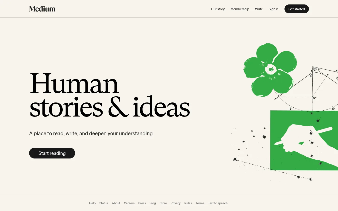
Medium 首页以留白充足的编辑式首屏呈现:暖白底色、醒目的黑色衬线标题与鲜绿色插画形成对比。精简导航、黑色圆角按钮和细分隔线让视觉重点回到阅读内容。
North star · Let warm paper, oversized literary typography, and one vivid editorial illustration carry the page, keeping controls and framing understated.
The page is built around a warm, paper-like canvas (#f7f4ed) rather than a stark white background. Nearly black text and rules provide firm contrast, while white appears in the measured surface and button treatment; the visible primary buttons are black pills with white labels. The hero headline uses gt-super, a large expressive serif that gives the page its literary character, while sohne handles navigation, supporting copy, and controls in a quieter sans-serif. A two-column composition places left-aligned copy and CTA against a right-side green editorial illustration. That illustration supplies the only strong chromatic interruption, so its green reads as artwork rather than a general interface accent. Generous open space surrounds the hero, with thin horizontal rules framing the header and footer. The result is flat and calm: typography, canvas, and illustration do the work instead of shadows or layered cards.
Navigation, supporting text, body copy, links, and buttons.
Aa 设计
gt-super
网络字体 · 字重 400 · 占比 10%
免费替代:DM Serif Display
Oversized hero display headline.
角色
示例
字号
字重
行高
字距
特大标题
Oversized serif hero headline, stacked across two lines.
Medium
120px
400
0.83
-0.055em
一级标题
Supporting page heading and primary introductory statement.
The quick brown fox 敏捷的狐狸
22px
400
1.27
0
二级标题
Secondary headings and supporting content titles.
The quick brown fox 敏捷的狐狸
20px
400
1.4
0
正文
Short explanatory hero copy and standard page text.
The quick brown fox 敏捷的狐狸
13px
400
1.54
0
按钮
Primary CTA labels, including Start reading.
The quick brown fox 敏捷的狐狸
14px
400
1.43
0
链接
Navigation items and footer links.
The quick brown fox 敏捷的狐狸
14px
400
1.43
0
间距与布局
基准单位 8px · 密度:适中
48px版块间距
—元素间距
—卡片内边距
1192px内容最大宽度
8px
16px
20px
24px
25px
48px
75px
The measured page max width is 1192px, with the hero organized as two columns and copy aligned to the left. At the 1440px screenshot width, the headline and CTA occupy the left half while the illustration sits on the right and is partly cropped by the viewport edge. The header and footer are separated from the hero by fine horizontal rules. The measured spacing scale runs from 8px to 75px, with a 48px section gap and comfortable density; preserve generous open space rather than adding dense modules.
圆角与层次
按钮 · 9999px
没有测到阴影:页面是扁平的,层次靠底色和描边区分。
The page reads as flat: no measured shadows or gradients define its hierarchy. Thin dark horizontal rules frame the header and footer, while the hero remains open without card containers. Layering comes from the illustration overlapping its own diagram-like marks, not from elevated UI surfaces.
组件
下面的预览按实测的按钮、输入框、徽标、卡片样式重建(字体用替代字体)。
Header navigation
A slim horizontal top bar places the Medium wordmark at left and compact story, membership, writing, and sign-in links at right, ending in a dark pill CTA.
Hero headline
Large black GT Super serif display type, left aligned and stacked into two compact lines.
Hero supporting copy
A single concise Sohne sentence sits beneath the headline in dark neutral text.
Primary CTA
Dark charcoal (#191919) pill with white text; the prominent Start reading button uses measured 20px Sohne text.
Editorial illustration
Right-side green artwork combines a flower, diagram annotations, and a graphic hand panel; it is the page's principal color accent.
Footer links
A compact centered row of muted utility links sits below a thin horizontal rule.
Imagery · The hero uses a distinctive flat editorial illustration rather than product photography or 3D. A vivid green flower, geometric diagram marks, and a green panel with a white hand motif sit on the right, partially extending beyond the visible edge. Keep the artwork loose and print-like against the warm canvas, and treat its green as an illustration color rather than a reusable interface accent.
Use the warm #f7f4ed canvas as the dominant page background.
Set the hero display in a high-contrast serif and keep its lines tightly stacked.
Align hero copy and its CTA to the left.
Reserve vivid green for editorial artwork, not routine controls.
Use dark pill-shaped CTAs with clear white labels.
Separate major bands with fine horizontal rules and ample whitespace.
✕ 不该做
Do not replace the paper-like canvas with a stark full-page white.
Do not use sans-serif display typography for the main hero headline.
Do not spread the illustration's green across unrelated UI elements.
Do not introduce heavy shadows, gradients, or layered card treatments.
Do not crowd the hero with extra content or competing calls to action.
Do not center the hero copy when the measured composition is left aligned.
给 AI 的提示词
想快速出一个同风格的新页面,把这段话连同 DESIGN.md 一起发给 AI。
Build a new editorial homepage in Medium's visual style. Use Reading Paper (#f7f4ed) as the broad canvas, Soft Ink (#242424) for navigation and rules, and Headline Black (#000000) for the main display headline. Set the hero in a large, tightly stacked serif similar to GT Super, with restrained sans-serif UI copy similar to Sohne. Use a left-aligned copy column and a right-side flat editorial illustration; allow the artwork to be partly cropped at the viewport edge. Treat any vivid green as illustration-only, not a general UI accent. Add a slim navigation bar, fine horizontal dividers, and a dark charcoal (#191919) rounded primary CTA with white text. Keep the composition spacious and flat, with no shadows or gradients.