North star · Anchor every section in evergreen, then use oversized editorial type and intentional lime panels to make the product story easy to scan.
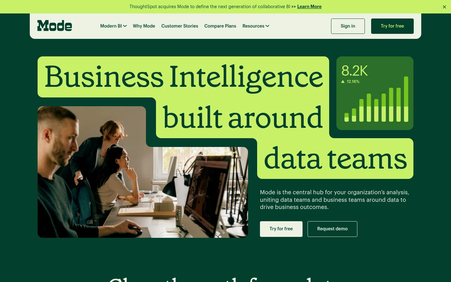
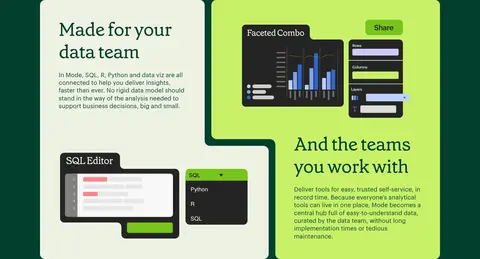
The page is built around a deep evergreen canvas (#043f2e), with warm pale surfaces and bright lime blocks providing strong contrast and a distinctive visual signature. Grenette supplies oversized, editorial serif headlines; Graphik keeps navigation, explanatory copy, and controls crisp and functional. The hero combines headline lettering with a photograph and a compact analytics card, then later sections alternate centered statements, paired feature panels, product artwork, customer logos, testimonials, and calls to action. Rounded lime panels often carry dark-green text, while the page’s broad green fields keep separate content blocks visually connected. Layout is spacious rather than dense, with a measured 1200px page maximum and 120px section gap. Product illustrations use extra colors, but the recurring brand identity comes from the evergreen-and-lime palette. Buttons stay simple, with thin borders and compact corner rounding.
Navigation, body copy, buttons, links, and small uppercase labels.
Aa 设计
Grenette
网络字体 · 字重 400 · 占比 11%
免费替代:Cormorant Garamond
Display headlines and prominent editorial statements.
角色
示例
字号
字重
行高
字距
特大标题
Oversized editorial statement or hero display headline.
Mode
96px
400
0.9
-0.02em
一级标题
Primary hero headline.
Mode
72px
400
1.1
-0.02em
二级标题
Major section headings and centered statements.
Mode
70px
400
1.1
-0.03em
三级标题
Feature and testimonial panel headings.
Mode
56px
400
1.2
-0.02em
四级标题
Smaller card or supporting section headings.
Mode
36px
400
1.03
-0.01em
正文
Explanatory paragraphs and product descriptions.
The quick brown fox 敏捷的狐狸
18px
400
1.3
0
辅助文字
Small supporting labels and attribution details.
The quick brown fox 敏捷的狐狸
14px
500
1.44
0
按钮
Primary and secondary call-to-action labels.
The quick brown fox 敏捷的狐狸
14px
500
1.1
0
导航
Header navigation labels.
The quick brown fox 敏捷的狐狸
14px
500
1.44
0
链接
Inline and standalone navigation links.
The quick brown fox 敏捷的狐狸
14px
600
1.3
0
眉题
Uppercase section labels and demo markers.
The quick brown fox 敏捷的狐狸
14px
500
1.2
0.06em
间距与布局
基准单位 4px · 密度:宽松
120px版块间距
16px元素间距
—卡片内边距
1200px内容最大宽度
2px
10px
12px
15px
16px
17px
18px
20px
22px
24px
30px
32px
36px
40px
56px
120px
Use a measured 1200px maximum page width with a spacious vertical rhythm and a measured 120px section gap. The opening hero is left-aligned and pairs a large headline composition with media and supporting copy. Follow it with centered statements, three-column feature content, and a long product-artwork region. Later, change the background in broad horizontal bands for customer proof, testimonials, and product panels. Use two-column compositions where imagery or product modules need room; keep text blocks short and easy to scan.
圆角与层次
按钮 · 4px
卡片 · 16px
链接 · 16px
没有测到阴影:页面是扁平的,层次靠底色和描边区分。
The visual system is mostly flat: broad color fields, crisp panel edges, and no measured shadows. Separate content through background bands and contrasting fills rather than floating cards. Buttons use thin borders and restrained corner rounding; larger feature and testimonial panels use more pronounced rounding. Layering comes from the stepped headline backplates, overlapping media, and illustrations.
组件
下面的预览按实测的按钮、输入框、徽标、卡片样式重建(字体用替代字体)。
Navigation bar
Pale rounded header panel over the evergreen canvas, with a wordmark, compact Graphik links, sign-in control, and lime-accented primary action.
Announcement strip
A narrow citrus-lime band at the top with centered update copy, an underlined learn-more link, and a close control.
Hero composition
Large Grenette headline sits on stepped lime backplates; pair workplace photography and an analytics visual with short copy and two calls to action.
Feature panels
Two-column rounded panels contrast warm pale and citrus-lime surfaces, combining Grenette titles, concise Graphik copy, and product-interface illustrations.
Customer proof
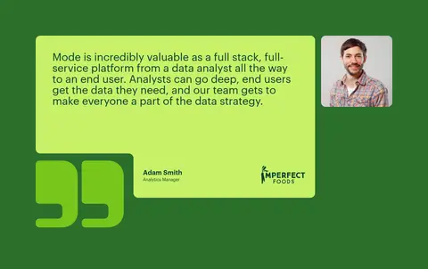
Forest-green band with a centered serif heading, customer logo grid, and a lime testimonial panel with portrait and attribution.
Demo and product cards
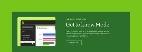
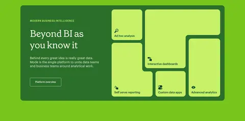
Bright leaf-green section containing a dark green demo panel and a second product-story panel with multiple rounded lime feature tiles.
Call-to-action buttons
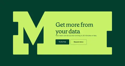
Compact rounded rectangles with thin borders; pair evergreen fills and citrus-lime text with pale filled or pale outlined alternatives.
Footer
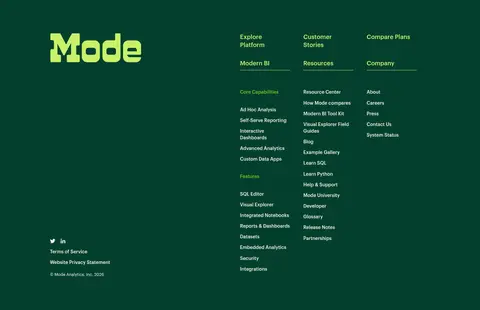
Multi-column link directory with a large lime wordmark, compact Graphik labels, and legal links on a distinct light canvas.
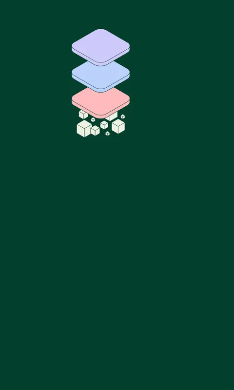
Imagery · The hero uses a candid workplace photograph alongside an analytics graphic, presenting both people and product. Further down, product-interface illustrations and a layered stack graphic explain the platform; their pastel and varied colors belong to the artwork, not the core brand palette. Customer logos and a portrait support the proof section. Favor contained, rounded image panels and clear separation from the evergreen canvas.
Use citrus lime for strong, deliberate focal panels.
Set major headlines in an expressive serif.
Use Graphik-style sans typography for functional copy.
Alternate centered statements with structured product panels.
Keep calls to action simple and clearly contrasted.
✕ 不该做
Do not replace the green palette with generic blue SaaS colors.
Do not make every section a white card.
Do not use heavy shadows to create hierarchy.
Do not crowd the spacious section rhythm.
Do not mistake illustration colors for core brand colors.
Do not set every headline in the sans-serif face.
给 AI 的提示词
想快速出一个同风格的新页面,把这段话连同 DESIGN.md 一起发给 AI。
Build a SaaS page using the Mode visual language. Make Evergreen Canvas (#043f2e) the dominant background, and use Citrus Lime (#c8f169) for headline backplates, feature panels, and high-contrast accents. Reserve Forest Green (#2a6f2b) and Leaf Green (#78c51c) for distinct section bands; use Warm Parchment (#eef2e3) for light panels and Clean White (#ffffff) sparingly. Pair Grenette-style editorial serif headlines with Graphik-style functional sans copy. Use a spacious 1200px maximum layout and 120px section rhythm, alternating centered statements, paired product panels, proof, and calls to action. Keep panels rounded, edges crisp, and elevation flat. Product imagery may have its own colors, but the surrounding interface should retain the measured brand palette.