North star · Keep the warm, open canvas and editorial serif headlines dominant; use mono interface text, fine rules, and gradients only as restrained product accents.
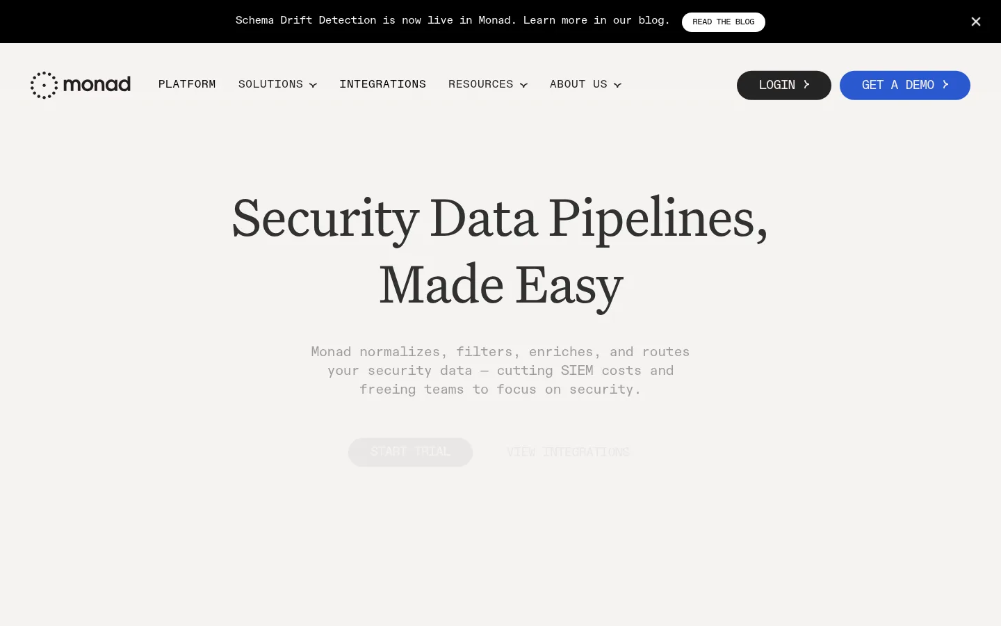
The page is built on a warm off-white canvas (#f6f3f1), with nearly every section retaining the same quiet background rather than switching between strong colour bands. Large, centered Untitled Serif headlines give the technical product an editorial voice; ABC Diatype Mono handles navigation, body copy, labels, and calls to action, often in uppercase for compact interface text. The first viewport stays spacious: a black announcement strip sits above a restrained navigation row, followed by a centered headline and subdued supporting copy. Rounded dark and blue CTA pills provide the clearest solid colour accents. Product diagrams, integration marks, and cards carry most of the visual detail. Soft blue, peach, yellow, and mint gradients appear as low-contrast glows around diagrams and in the closing CTA, not as broad brand backgrounds. Fine outlines and open page margins keep the long, multi-section page readable.
Navigation, body copy, labels, captions, and CTA text.
Aa 设计
Untitled Serif
网络字体 · 字重 400 · 占比 13%
免费替代:DM Serif Display
Display and section headings, including the hero and CTA title.
Aa 设计
Untitled Sans
网络字体 · 字重 400 · 占比 8%
免费替代:Inter
Minor supporting sans-serif usage where the measured page uses a neutral sans.
角色
示例
字号
字重
行高
字距
特大标题
Oversized editorial hero and major statement headlines.
Monad
80px
400
1.2
-0.02em
一级标题
Primary page headline, centered in the hero.
Monad
48px
400
1.2
-0.02em
二级标题
Section titles such as process and FAQ headings.
Monad
40px
400
1.2
-0.02em
三级标题
Feature-card titles and subordinate section headings.
Monad
32px
400
1.2
-0.02em
四级标题
Smaller feature headings and FAQ prompts.
The quick brown fox 敏捷的狐狸
24px
400
1.2
-0.02em
正文
Main explanatory copy and product descriptions.
The quick brown fox 敏捷的狐狸
16px
400
1.35
-0.025em
辅助文字
Small supporting notes, labels, and compact metadata.
The quick brown fox 敏捷的狐狸
14px
400
1.35
-0.02em
导航
Uppercase primary navigation links.
The quick brown fox 敏捷的狐狸
18px
400
normal
-0.022em
眉题
Small uppercase section labels and trust indicators.
The quick brown fox 敏捷的狐狸
16px
400
1.3
0.05em
代码
Technical-looking inline labels and data-oriented interface copy.
const style = 1;
16px
400
1.35
-0.025em
间距与布局
基准单位 8px · 密度:适中
40px版块间距
16px元素间距
40px卡片内边距
1352px内容最大宽度
8px
10px
12px
15px
16px
24px
32px
40px
50px
64px
100px
A broad centered content area organizes a long, comfortable-density page, with two-column arrangements for the hero, feature sections, and integration story. The hero headline and copy are centered; most later section headings and feature content align left. Content alternates between open text-and-visual compositions, outlined cards, a logo strip, and a single prominent blue-tinted integrations band. Section spacing feels generous and consistent, while the footer resolves into four columns. Preserve the measured max-width and spacing tokens when implementing rather than adding arbitrary values.
圆角与层次
按钮 · 50%
卡片 · 16px
导航 · 9999px
md · other
The design is mostly flat: cards rely on thin outlines and clear spacing instead of pronounced shadows. Rounded feature panels use measured card radii, while the CTA and navigation controls are pill-shaped. Gradient lighting provides the main sense of depth, especially behind diagrams and inside the closing CTA; use the measured subtle shadow only where appropriate.
组件
下面的预览按实测的按钮、输入框、徽标、卡片样式重建(字体用替代字体)。
Announcement bar
Black full-width strip with compact monospace announcement copy, a small light blog link, and a close control.
Primary navigation
Brand mark and uppercase monospace links on the warm canvas; login uses a dark pill and the demo action a blue pill.
Hero
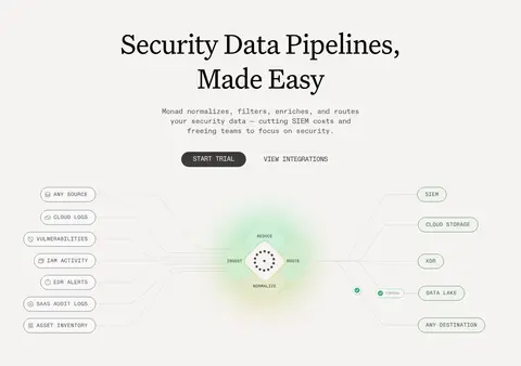
Centered serif headline, subdued monospace summary, paired CTA links, and a pipeline illustration showing sources flowing through Monad to destinations.
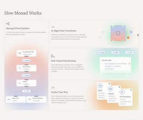
Feature cards
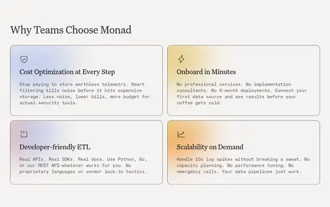
Open, outlined feature panels with 16px measured corner radius, generous internal spacing, mono copy, and product diagrams or gradient accents.
Integrations band
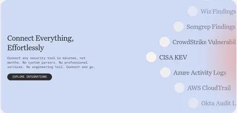
Prominent pale blue rounded panel pairing left-aligned serif copy and CTA with a vertically presented stream of security data sources.
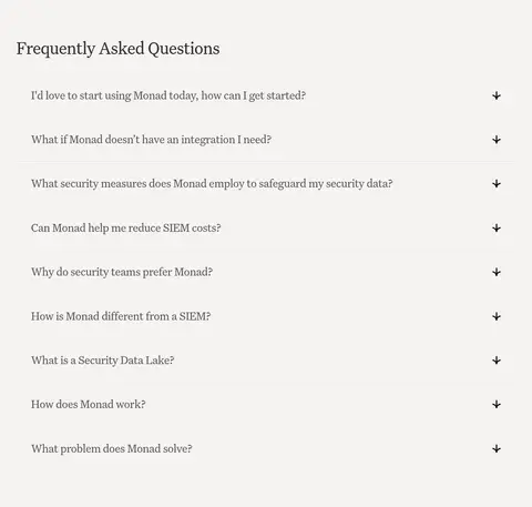
FAQ accordion
Single-column question list with serif prompts, plus-style expand controls, and fine horizontal separators.
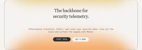
Closing CTA
Large outlined rounded panel with centered serif statement, short mono supporting copy, soft warm gradient glow, and paired pill actions.
Footer
Four-column link groups for platform, solutions, resources, and about, with social links and subdued supporting text.
Imagery · The page uses product diagrams, workflow illustrations, integration logos, and abstract gradient glows rather than lifestyle photography. Diagrams are presented as light, precise interface-like graphics, with fine connector lines and small labels. Soft blue, mint, peach, and gold colour blooms sit behind elements to add depth while keeping the overall imagery low-contrast and subordinate to the copy. The hero’s pipeline visualization communicates data flow through labeled sources, a central Monad mark, and destinations.
Use monospace for navigation, body copy, and labels.
Keep section layouts spacious and content-led.
Reserve gradients for product visuals and CTA atmosphere.
Use fine borders to define cards and separators.
✕ 不该做
Do not introduce saturated full-width colour bands.
Do not make gradients compete with the headline.
Do not use heavy shadows on feature cards.
Do not turn the page into a dense dashboard.
Do not replace serif display type with a generic sans.
Do not treat illustration-only colours as core UI fills.
给 AI 的提示词
想快速出一个同风格的新页面,把这段话连同 DESIGN.md 一起发给 AI。
Build a new SaaS page in Monad’s calm editorial style. Use Warm Canvas (#f6f3f1) as the dominant background, with Soft Graphite (#4e4d4d) for readable copy and Signal Black (#000000) for a compact announcement bar or selected controls. Use Untitled Serif-style headings and ABC Diatype Mono-style interface text; keep navigation labels compact and often uppercase. Organize content in a spacious centered max-width layout, mixing two-column feature sections, fine outlined cards, and clear left-aligned content. Use Powder Blue (#cfdaf5) sparingly for a section surface. Keep Apricot Glow (#f59f4f), Soft Marigold (#e2c161), Mist Blue (#b1c1ec), and Mint Light (#a7fccd) as subtle decorative gradients around diagrams, never as dominant blocks. Prefer thin borders, pill actions, and minimal shadow.