North star · Pair warm, spacious editorial layouts with crisp black typography and restrained botanical accents, keeping product proof easy to scan.
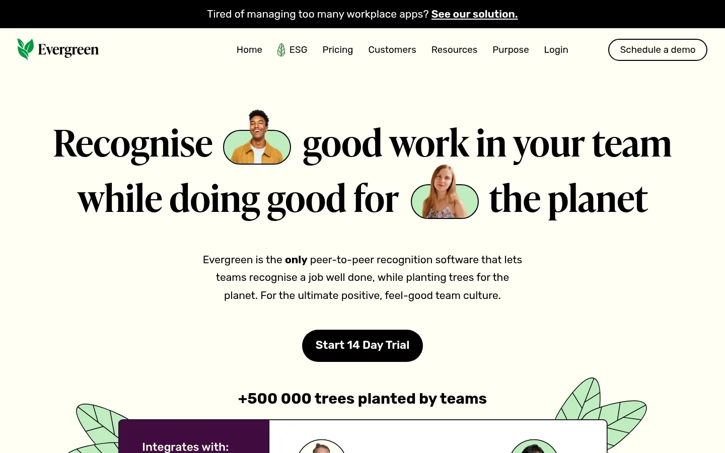
The page is anchored by a warm, nearly ivory canvas (#fffff3), with pale stone bands (#edede2) separating major feature and conversion sections. Black (#000000) supplies headline contrast, outlines and the main filled CTA; muted charcoal (#333333) softens supporting copy. White (#ffffff) is reserved for product and testimonial panels, while fresh mint (#beedc0) appears as a small accent and within the illustrated interface and leaf motifs. Typography sets the character: an expressive IvyPresto-style serif for large editorial headlines, balanced by Rubik for navigation, body copy, labels and controls. Centered hero messaging gives way to alternating two-column product explanations, compact statistics, logos, and testimonials. Generous vertical breathing room keeps this long page approachable. Botanical line drawings, portrait cutouts and interface mockups add personality without displacing the restrained palette. Borders are visible and crisp; elevation stays mostly flat, with rounded pills used selectively for actions and metrics.
Navigation, body copy, supporting headings, labels, buttons, and links.
Aa 设计
ivypresto-headline
网络字体 · 字重 600 · 占比 13%
免费替代:Bodoni Moda
Display and primary editorial headlines, especially the centered hero and major feature titles.
角色
示例
字号
字重
行高
字距
特大标题
Oversized editorial hero headline and other prominent brand statements.
Evergreen
73.5px
600
1.49
0
一级标题
Primary hero and top-level section headlines.
Evergreen
54px
600
1.48
0
二级标题
Major feature, pricing, and conversion headings in Rubik.
Evergreen
30px
600
1.54
0
三级标题
Supporting feature headings and card-level section titles.
The quick brown fox 敏捷的狐狸
27.5px
600
1.54
0
四级标题
Secondary explanatory headings and short supporting statements.
The quick brown fox 敏捷的狐狸
23.5px
400
1.41
0
正文
Main descriptive copy, product explanations, and proof-point captions.
The quick brown fox 敏捷的狐狸
18px
400
1
0
辅助文字
Testimonial attribution, small print, and supporting detail.
The quick brown fox 敏捷的狐狸
17.5px
400
1.7
0
按钮
Prominent trial and tree-planting action labels.
The quick brown fox 敏捷的狐狸
21px
700
1.7
0
导航
Top navigation labels and footer navigation group links.
The quick brown fox 敏捷的狐狸
20.5px
500
1
0
链接
Inline links, supporting actions, and footer destinations.
The quick brown fox 敏捷的狐狸
18px
400
1
0
间距与布局
基准单位 2px · 密度:适中
72px版块间距
—元素间距
35px卡片内边距
1296px内容最大宽度
2px
5px
10px
12px
14px
17px
18px
19px
20px
22px
24px
26px
29px
35px
36px
48px
Use a centered, comfortable-width page shell, with the measured maximum width of 1296px. The hero is centered and spacious; below it, shift between broad single-column proof sections and two-column product-feature layouts. Keep statistics in a concise horizontal row and testimonials in paired cards. Major section transitions are generous, using the measured 72px section gap as the rhythm reference; dense content belongs inside product mockups rather than the surrounding page. Alternate ivory and pale stone bands to distinguish long-page chapters.
圆角与层次
按钮 · 9999px
输入框 · 7px
卡片 · 50%
没有测到阴影:页面是扁平的,层次靠底色和描边区分。
The page is mostly flat: section bands, outlines, and clean panel contrast do the structural work instead of shadows. Use crisp black borders on cards and mockups, with white interiors against ivory or stone. Reserve rounded shapes for pill CTAs, metric chips, portrait cutouts, and illustration details; avoid adding unmeasured shadow effects.
组件
下面的预览按实测的按钮、输入框、徽标、卡片样式重建(字体用替代字体)。
Announcement strip
A black full-width bar above the navigation with centered white announcement copy and an underlined inline link.
Primary trial CTA
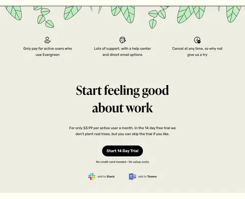
A black pill-shaped button with white, bold Rubik text; place it centrally in hero and conversion areas.
Outlined navigation action
A white or transparent rounded button with a crisp black outline for the Schedule a demo action.
Recognition mockup
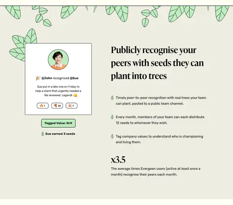
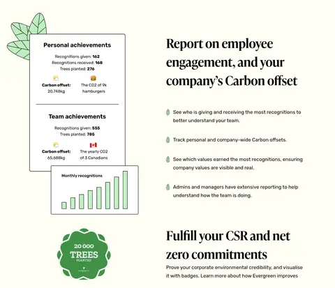
A bordered, mostly white product panel showing Slack or Teams integration and compact peer-recognition entries; foliage can frame the panel.
Metric chip
Short headline statistic inside a mint rounded capsule, paired with a small explanatory caption beneath.
Testimonial card
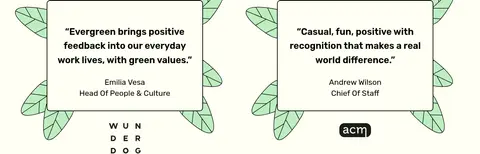
A white, black-outlined quote card with portrait, compact attribution, and leaf illustrations placed around its edges.
Newsletter signup
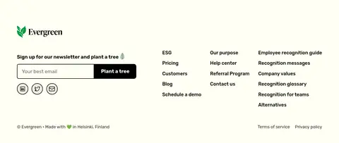
Footer email field with black outline and an adjacent black Plant a tree button, followed by compact link columns.
Imagery · Mix product-interface mockups, small portrait cutouts, partner logos, and hand-drawn foliage. Keep portraits framed as part of recognition examples rather than as oversized lifestyle photography. Botanical leaves use thin dark outlines and mint fills, often extending behind cards or peeking from section edges. Interface imagery is compact, legible, and contained in white bordered panels; the overall treatment is flat illustration rather than 3D or video.
Use Rubik for navigation, body copy, and controls.
Separate long-page chapters with Soft Stone #edede2.
Keep botanical mint accents selective and illustrative.
Use crisp black borders and high-contrast CTAs.
✕ 不该做
Do not replace the warm ivory canvas with pure white.
Do not use mint as a dominant full-page background.
Do not add gradients, glossy effects, or heavy shadows.
Do not make every section a centered card grid.
Do not crowd supporting copy around oversized headlines.
Do not let illustrations obscure product content.
给 AI 的提示词
想快速出一个同风格的新页面,把这段话连同 DESIGN.md 一起发给 AI。
Build a new page in Evergreen’s visual style using Warm Ivory #fffff3 as the primary canvas and Soft Stone #edede2 for occasional full-width section bands. Use Evergreen Ink #000000 for strong headlines, outlines, and filled CTAs; use Quiet Charcoal #333333 for softer supporting copy, Panel White #ffffff for mockup interiors, and Seedling Mint #beedc0 sparingly in metric chips or foliage. Pair an expressive high-contrast serif for display headings with Rubik for navigation, body, labels, and controls. Keep the main message spacious and editorial, then alternate concise proof sections with two-column product explanations. Use hand-drawn leaf motifs and compact product-interface panels as supporting imagery. Favor flat surfaces, visible borders, generous section breathing room, and rounded pill actions; avoid gradients and heavy shadows.