North star · Keep the interface quiet and near-black, then use precise typography, modular product evidence, and sparse lime accents to direct attention.
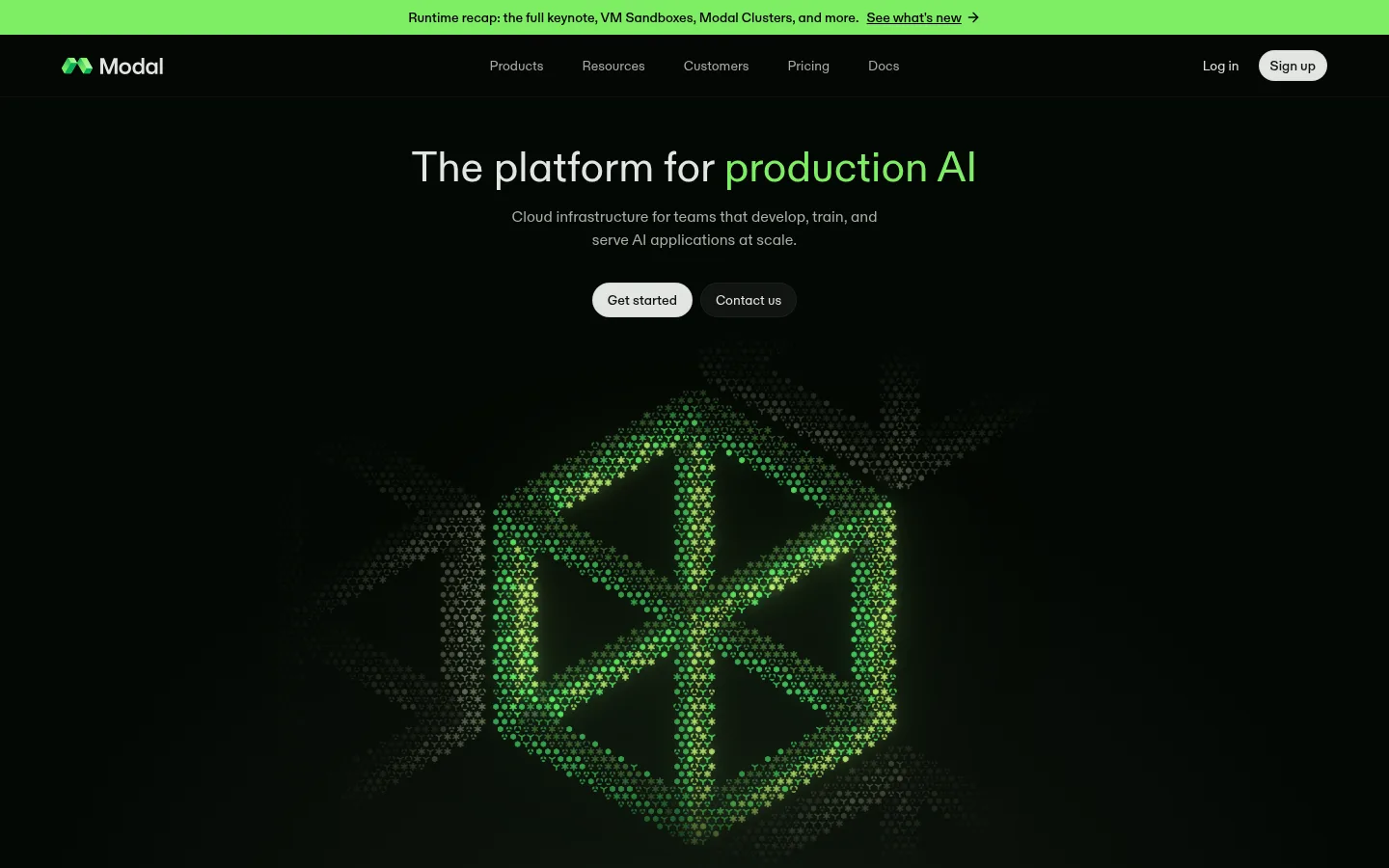
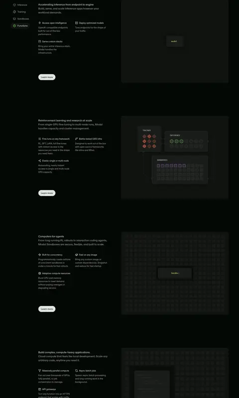
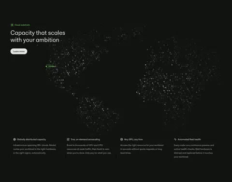
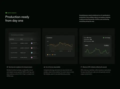
The homepage is built on a near-black green-tinted canvas, with subdued charcoal surfaces distinguishing product demonstrations and section bands. Soft off-white carries the main headings and primary pill buttons; muted gray supports navigation and explanatory copy, while vivid lime is reserved for selected words, small labels, and tiny status cues. Typography is clean and understated: ABC Diatype handles nearly all interface and editorial text in regular weights, with a mono face used for code-like labels and mock-interface details. The hero centers a concise headline above two compact actions, then gives a large glowing particle-like green mark room to dominate. Below, repeated two-column feature stories and compact cards pair short copy with dark interface illustrations. A pale customer and updates region deliberately reverses the palette before a dark closing CTA and multi-column footer. Broad section spacing keeps the dense technical content from feeling crowded.
Headings, body copy, navigation, links, and buttons
Aa 设计
DM Mono
网络字体 · 字重 400 · 占比 3%
免费替代:IBM Plex Mono
Code-like labels and technical product mockup details
角色
示例
字号
字重
行高
字距
一级标题
Centered hero headline and closing CTA headline.
Modal
44px
400
1.09
0
二级标题
Major section headlines introducing platform capabilities.
Modal
37px
400
1.19
0
三级标题
Feature-card and supporting content headings.
Modal
28px
400
1.29
0
正文
Explanatory feature copy, testimonials, and article summaries.
The quick brown fox 敏捷的狐狸
13px
400
1.54
0.01em
辅助文字
Compact labels, metadata, and supporting annotations.
The quick brown fox 敏捷的狐狸
10px
400
1.6
0.01em
按钮
Short pill-shaped primary and secondary actions.
The quick brown fox 敏捷的狐狸
14px
400
1.71
0
导航
Header navigation and footer link labels.
The quick brown fox 敏捷的狐狸
14px
400
1.71
0
链接
Inline editorial and customer-story links.
The quick brown fox 敏捷的狐狸
14px
500
1.43
0
代码
Technical labels inside product mockups.
const style = 1;
10px
400
1.85
0.03em
间距与布局
基准单位 4px · 密度:宽松
144px版块间距
6px元素间距
—卡片内边距
1312px内容最大宽度
4px
6px
8px
10px
12px
16px
20px
24px
32px
40px
48px
64px
Use a centered page frame with a measured maximum width of 1312px, while selected section bands and the capacity map run full bleed. The hero is centered; most capability sections switch to left-aligned headings and two-column copy-plus-visual layouts, followed by three- or four-column cards. Keep the measured spacious rhythm, including the large 144px section gap, and allow substantial breathing room around the hero artwork. The pale customer and updates sections form a deliberate contrast break before the final CTA and dense multi-column footer.
圆角与层次
按钮 · 9999px
卡片 · 7px
导航 · 7px
链接 · 7px
inset · other
inset · button
lg · button
lg · card
Surfaces are mostly flat and distinguished by subtle charcoal changes rather than heavy drop shadows. Product cards use restrained borders and low-contrast outlines; pill buttons may carry a soft dark shadow or inset edge. Layer mock interfaces and glow artwork selectively, keeping the rest of the page crisp and low-relief.
组件
下面的预览按实测的按钮、输入框、徽标、卡片样式重建(字体用替代字体)。
Announcement strip
A slim, bright green top band with centered update text, an underlined link, and a small directional arrow.
Primary action
Soft Porcelain fill (#e3e5e1), dark Graphite Moss text (#10120f), compact label, and fully rounded pill silhouette.
Secondary action
Dark filled pill with light text and a subtle inset edge; pair beside the primary CTA.
Capability feature
Left-aligned explanatory text and action paired with a dark technical illustration or product mockup.
Product card
Compact dark panel with a restrained outline and technical UI, chart, map, or line-diagram content.
Customer panel
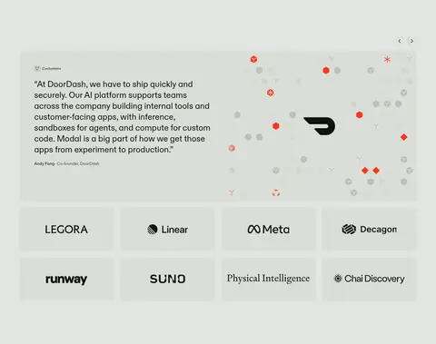
Pale inverse band featuring a testimonial and a tidy grid of customer marks.
Update card
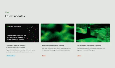
Editorial card with vivid image, concise headline, supporting summary, and small category label.
Footer
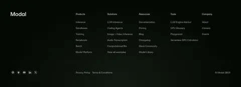
Near-black closing area with grouped product and resource links, small social icons, and fine-print links.
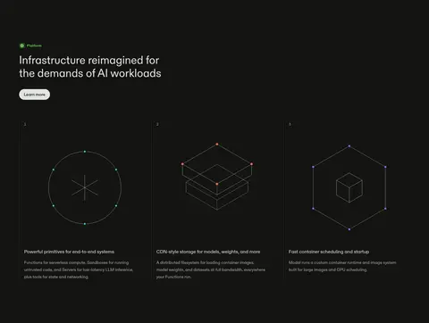
Imagery · The hero's defining visual is a large, luminous green particle-form mark against near-black, with a softer halo rather than a conventional product photo. Product areas use dark interface mockups, small technical diagrams, maps, charts, and symbolic line illustrations. Customer branding appears in the pale section; editorial update cards use vivid green imagery. Keep imagery framed as evidence of real infrastructure, not decorative lifestyle photography.
Reserve #7fee64 for sparse emphasis and status cues.
Set main text in #e3e5e1 and secondary copy in #a8aba6.
Use ABC Diatype for interface and editorial text.
Pair feature copy with concrete technical visuals.
Use pale bands to create clear narrative breaks.
✕ 不该做
Do not turn the green accent into a large solid page background.
Do not add strong gradients across ordinary content sections.
Do not use bright borders around every card.
Do not crowd the hero with extra copy or controls.
Do not replace the technical mockups with lifestyle photography.
Do not make every section use the same column layout.
给 AI 的提示词
想快速出一个同风格的新页面,把这段话连同 DESIGN.md 一起发给 AI。
Build a new Modal-style AI infrastructure page with a near-black #040804 canvas and quiet, carefully separated content bands. Use Graphite Moss #10120f for cards and controls, Soft Porcelain #e3e5e1 for primary text and pale CTA fills, and Ash Signal #a8aba6 for supporting copy. Apply Live Lime #7fee64 sparingly to selected words, labels, and status cues. Use an ABC Diatype-like sans-serif for headings, body, navigation, and buttons; reserve a DM Mono-like face for technical labels. Keep a centered hero with a concise headline, paired pill actions, and one distinctive technical visual. Structure the rest as spacious feature splits, compact product cards, and a contrasting pale customer or editorial band. Prefer thin subdued borders and flat surfaces over heavy shadows; preserve generous section breathing room and varied layouts.