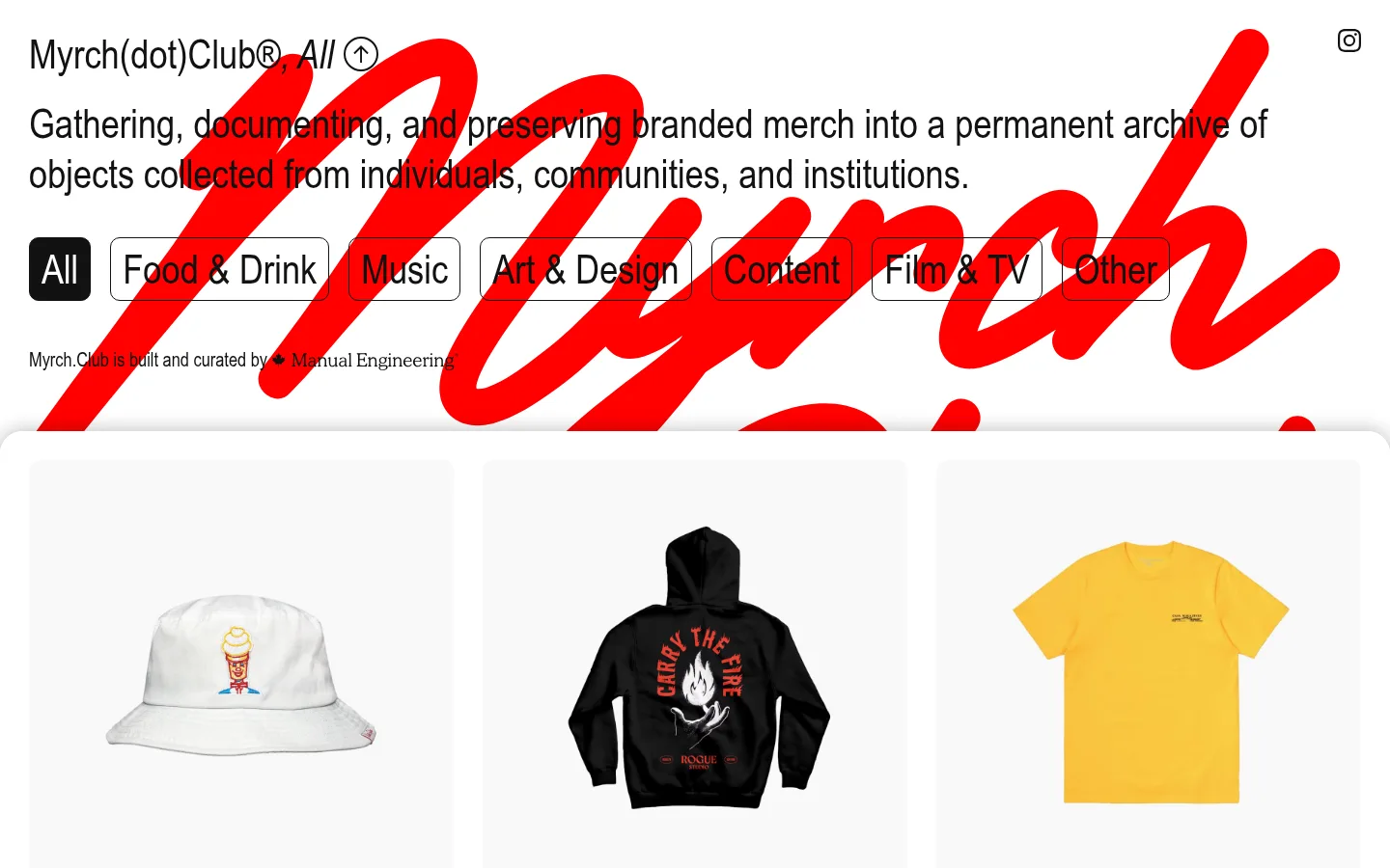
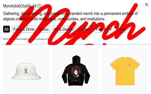
Myrch Club 以宽松、图片主导的目录形式,持续整理品牌周边档案。克制的字体与黑白灰页面框架,让各类物件及其品牌个性成为视觉焦点。
North star · Keep the interface quiet and gallery-like so the merchandise imagery—not decorative UI—carries the visual identity.
The page uses a near-white canvas (#f9f9f9) and white surfaces to create a quiet gallery backdrop for a large archive of merchandise. Near-black (#111111) carries the introductory copy, category controls, and crisp outlines; muted grays are reserved for low-emphasis catalog captions. Arial Narrow gives the oversized opening statement a compact, editorial character, while small labels remain understated. The header area layers a bold red handwritten mark behind the black text, but that saturated red belongs to a graphic treatment rather than the measured core palette. Below, products are arranged in a consistent three-column catalog with pale image fields, generous breathing room, and tiny brand and item captions. Product imagery supplies most of the color, so the interface itself stays neutral. Rounded category controls, fine dark borders, and a soft shadow separating the catalog from the introduction provide the limited moments of interface emphasis.
Introductory statement, headings, body copy, and category controls
角色
示例
字号
字重
行高
字距
一级标题
Large introductory statement beneath the site identity.
Myrch Club
42px
400
1.24
0
二级标题
Secondary headings or section-level labels where present.
The quick brown fox 敏捷的狐狸
20px
400
1.4
0
正文
Introductory copy and compact supporting text.
The quick brown fox 敏捷的狐狸
14px
400
1.43
0
按钮
Prominent category filter labels.
Myrch Club
42px
400
1.24
0
间距与布局
基准单位 2px · 密度:适中
60px版块间距
30px元素间距
30px卡片内边距
1380px内容最大宽度
6px
12px
20px
30px
38px
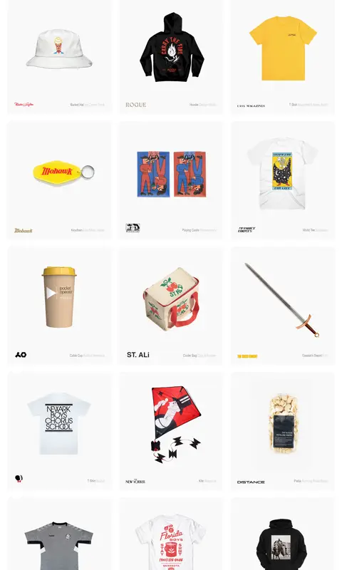
The opening content sits above a long, dense archive that dominates the page. The catalog uses three evenly repeated columns at the supplied desktop view, with aligned merchandise images and small captions toward the foot of each card. The measured page max width is 1380px. Introductory text and category controls are left aligned, followed by a clear transition into the grid. Comfortable spacing and repeated card padding make the many items feel cataloged rather than crowded.
圆角与层次
按钮 · 10px
卡片 · 10px
图片 · 50%
md · other, section
Most cards read as flat image fields, with no visible card outlines. A soft, broad shadow marks the top edge of the catalog where it overlaps the introductory area. Category controls use thin dark borders and rounded corners; the selected control switches to a dark fill. Avoid adding additional depth effects.
组件
下面的预览按实测的按钮、输入框、徽标、卡片样式重建(字体用替代字体)。
Category filters
Large Arial Narrow labels in rounded controls; inactive options are white with a #111111 outline, while the selected option is #111111 with white text.
Archive card
A pale #f9f9f9 image field with a centered merchandise image, generous inner spacing, and compact brand and category captions.
Introductory statement
Left-aligned editorial copy in regular Arial Narrow, layered over a large red handwritten graphic treatment.
Catalog surface
A broad white-backed collection area begins below the intro and is distinguished by a soft shadow along its upper edge.
Item captions
Small, quiet labels beneath each object use muted gray alongside the item's brand identity.
Imagery · The archive is built from isolated product photographs on pale, nearly white fields. Each object is presented clearly and mostly front-on, with its own brand mark and a restrained item caption. Apparel, accessories, printed matter, and unusual objects bring varied color and texture; the interface does not tint or heavily stylize them. The bold red handwritten header graphic is a distinct decorative layer, not a product-image treatment.
Use #f9f9f9 and #ffffff as quiet gallery surfaces.
Set primary copy and outlines in #111111.
Keep catalog captions visually secondary.
Repeat a consistent three-column product rhythm on desktop.
Give isolated merchandise images room to breathe.
Use the dark-filled style only for the active category.
✕ 不该做
Do not add a saturated interface palette.
Do not let decorative graphics obscure the introductory copy.
Do not add heavy borders around every archive card.
Do not give captions equal prominence to merchandise.
Do not crop product images so tightly that the object loses context.
Do not invent extra shadows, gradients, or ornamental UI.
给 AI 的提示词
想快速出一个同风格的新页面,把这段话连同 DESIGN.md 一起发给 AI。
Build a new Myrch Club page as a quiet, image-led merchandise archive. Use Archive Mist (#f9f9f9) for catalog image fields, Paper White (#ffffff) for the page surface, and Gallery Ink (#111111) for copy, borders, and selected controls. Keep Faint Graphite (#cfcfcf) and Caption Gray (#888888) for secondary catalog details only. Use a condensed sans-serif close to Arial Narrow, with regular weights and compact editorial character. Place a left-aligned introduction and category filters above a consistent three-column desktop product grid. Center isolated merchandise images in pale fields; keep brand and item captions small and unobtrusive. Use restrained rounded outlined filters and a subtle shadow only at the catalog transition. Let product imagery supply the color, and preserve a spacious, gallery-like cadence.