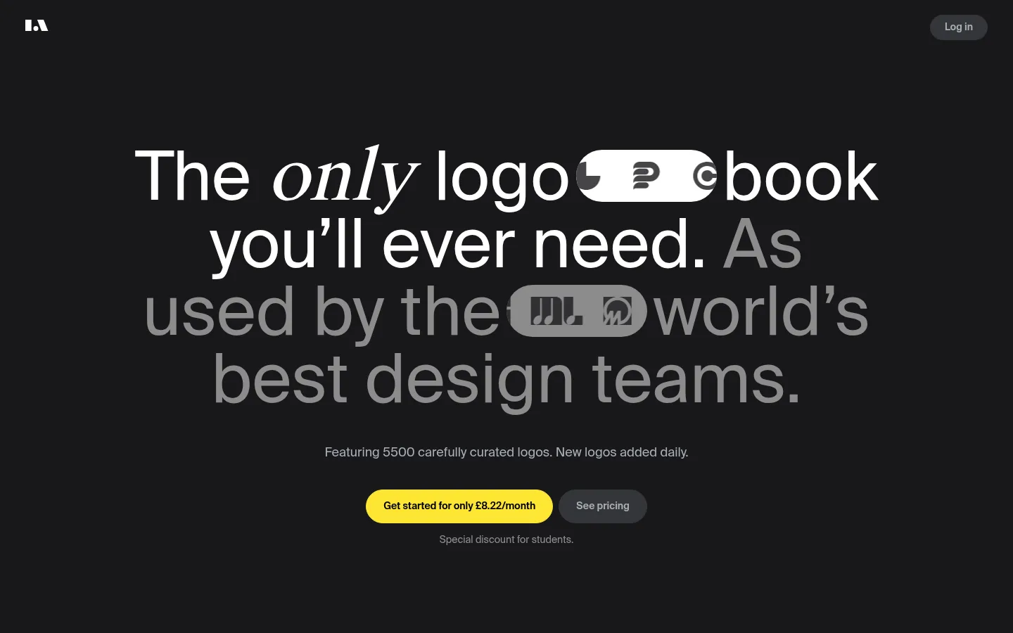
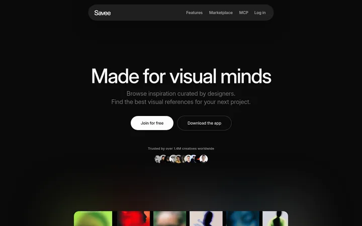
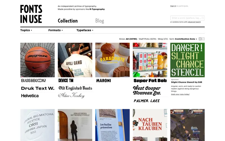
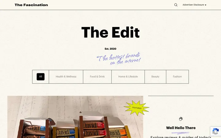
North star · Keep the interface almost monochrome and let oversized editorial type, curated logo imagery, and a single yellow action carry the hierarchy.
The page is built around a near-black canvas (#18181b) with charcoal bands and cards (#27272a), creating a quiet frame for the logo collection rather than competing with it. White carries the primary message and controls; muted gray is reserved for secondary statements and supporting copy. Bright yellow (#fde533) is deliberately scarce and appears as the high-contrast primary action and small section labels. Suisse International drives the experience: large, regular-weight headlines are centered in the hero, with occasional italic editorial emphasis, while compact supporting text stays understated. Suisse Works Book appears as a minor supporting serif accent. The layout alternates open, centered storytelling with broad, rounded product panels, testimonials, a dark logo showcase, and pricing cards. Product screenshots and logo marks are presented largely in monochrome, preserving their character while keeping the overall page cohesive. Generous section breathing room contrasts with dense logo grids and plan details.
配色
点色块复制色值。用途说明来自对页面的实测位置(背景、文字、描边、按钮)与截图判读。
品牌色
强调色
表层色
中性色
功能色
页面底色 · Night Canvas表层 · Archive Charcoal表层 2 · Deep Black表层 3 · Slate Panel主文字 · Paper White次要文字 · Quiet Silver弱文字 · Deep Black描边 · Archive Charcoal强调 · Archive Yellow
Nearly all interface text, from display headlines and body copy to navigation and buttons.
Aa 设计
Suisse Works Book
网络字体 · 字重 400 · 占比 2%
免费替代:Cormorant Garamond
Small editorial serif accent, notably italicized phrase emphasis in display copy.
角色
示例
字号
字重
行高
字距
特大标题
Oversized editorial hero statement.
LogoArchive
96px
400
1
0
一级标题
Primary hero headline and major statement headings.
LogoArchive
65px
400
0.9
0
二级标题
Section headings introducing the logo book and content.
LogoArchive
37.5px
400
0.95
0
三级标题
Subsection or card group headings.
LogoArchive
28px
400
1.2
0
四级标题
Smaller card and pricing plan headings.
The quick brown fox 敏捷的狐狸
24px
400
1.2
0
正文
General explanatory copy and plan details.
The quick brown fox 敏捷的狐狸
14px
400
1.2
0
辅助文字
Fine print, small labels, and image captions.
The quick brown fox 敏捷的狐狸
12px
400
1.2
0
按钮
CTA and pricing control labels.
The quick brown fox 敏捷的狐狸
14px
400
1.2
0
导航
Header navigation links and account action.
The quick brown fox 敏捷的狐狸
14px
500
1
0
间距与布局
基准单位 4px · 密度:宽松
118px版块间距
8px元素间距
32px卡片内边距
744px内容最大宽度
2px
4px
6px
8px
10px
14px
16px
20px
32px
36px
The measured content frame is capped at 744px, with the hero centered and the later content arranged as broad single-column bands and paired feature areas. A 12-column structure is reported for the opening section, while subsequent blocks read as one-column compositions. The page uses spacious separation between major sections and tighter internal groupings for card content. Rounded panels organize the product preview, testimonial, submission feature, and pricing plans. The overall rhythm alternates large empty dark areas with denser visual or pricing blocks.
圆角与层次
按钮 · 9999px
卡片 · 28px
徽标 · 3px
导航 · 9999px
没有测到阴影:页面是扁平的,层次靠底色和描边区分。
The interface is mostly flat, with no measured shadows. Separation comes from changes between the near-black canvas, charcoal bands, and slate inset panels, plus occasional borders matching the card surface. Large rounded corners soften the panels, while the logo showcase remains an intentionally stark black field.
组件
下面的预览按实测的按钮、输入框、徽标、卡片样式重建(字体用替代字体)。
Hero headline
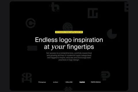
Centered, oversized Suisse International copy with white primary words, muted-gray supporting emphasis, and occasional italic serif styling.
Primary and secondary CTAs
A yellow pill-shaped subscription action sits beside a charcoal pricing action; use dark text on the yellow button and white on charcoal.
Account navigation
Minimal top bar with a small white mark at left and a rounded slate Log in control at right.
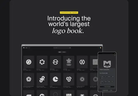
Product preview panel
Large charcoal rounded panel with a centered heading above a desktop logo-library screenshot and overlapping mobile view.
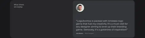
Testimonial card
A slate-gray rounded testimonial inset combines a small portrait, subdued quote copy, and compact attribution.
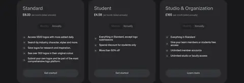
Pricing cards
Three dark plan cards use white headings, compact plan details, feature lists, and monthly/annual pill controls.
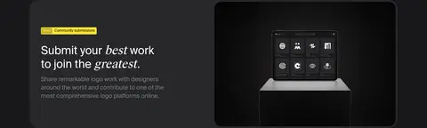
Imagery · Imagery is product-led rather than photographic: a desktop interface preview and overlapping mobile screen demonstrate the logo archive, while curated logo marks appear in grids and as a dark decorative backdrop. Keep screenshots framed inside charcoal panels and preserve the mostly monochrome treatment. The submission feature includes a product display image. Avoid adding colorful photography that would compete with the logos.
Reserve #fde533 for the primary action and small labels.
Set oversized, regular-weight sans-serif headlines with editorial line breaks.
Use white for primary copy and muted gray for secondary messaging.
Group content in rounded charcoal panels with restrained borders.
Keep logo imagery predominantly monochrome.
✕ 不该做
Do not introduce gradients or decorative shadows.
Do not spread yellow across large surfaces.
Do not use bright, unrelated colors in the logo showcase.
Do not center every section; vary alignment for feature content.
Do not make supporting copy as prominent as the hero.
Do not add dense ornamental UI around product imagery.
给 AI 的提示词
想快速出一个同风格的新页面,把这段话连同 DESIGN.md 一起发给 AI。
Build a new page in LogoArchive’s restrained editorial style. Use Night Canvas (#18181b) as the base, Archive Charcoal (#27272a) for broad panels and cards, and Slate Panel (#343538) for selected insets. Set most text in Suisse International or a close clean sans-serif; keep headlines large, regular, and occasionally punctuated with a restrained italic serif phrase. Use Paper White (#ffffff) for primary content and Quiet Silver (#a8afb7) for secondary copy. Make Archive Yellow (#fde533) a rare, high-contrast accent for the primary CTA and small labels. Organize the page with generous section breathing room, centered statement blocks, rounded product panels, and compact card details. Present logos and product screenshots in subdued, largely monochrome treatments. Favor flat surfaces and clear hierarchy over effects.