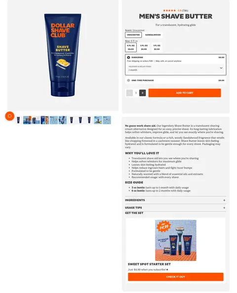
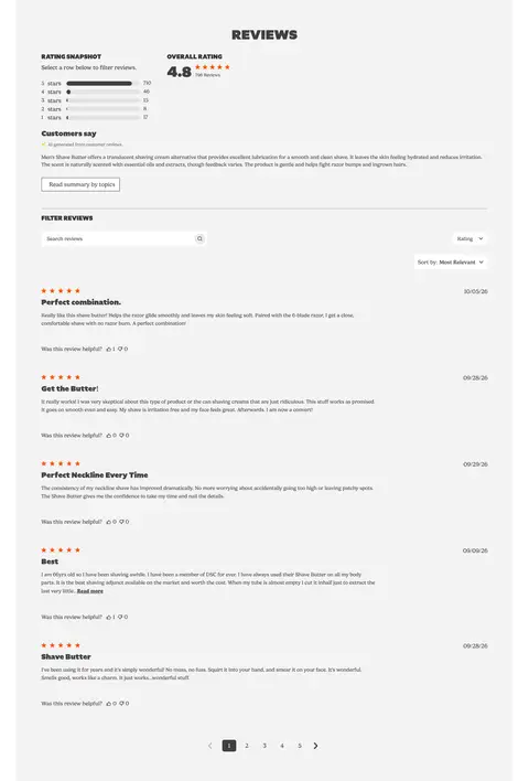
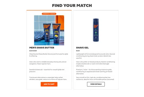
North star · Use deep blue as the continuous storefront canvas, reserving orange for decisive shopping actions and letting product imagery supply variety.
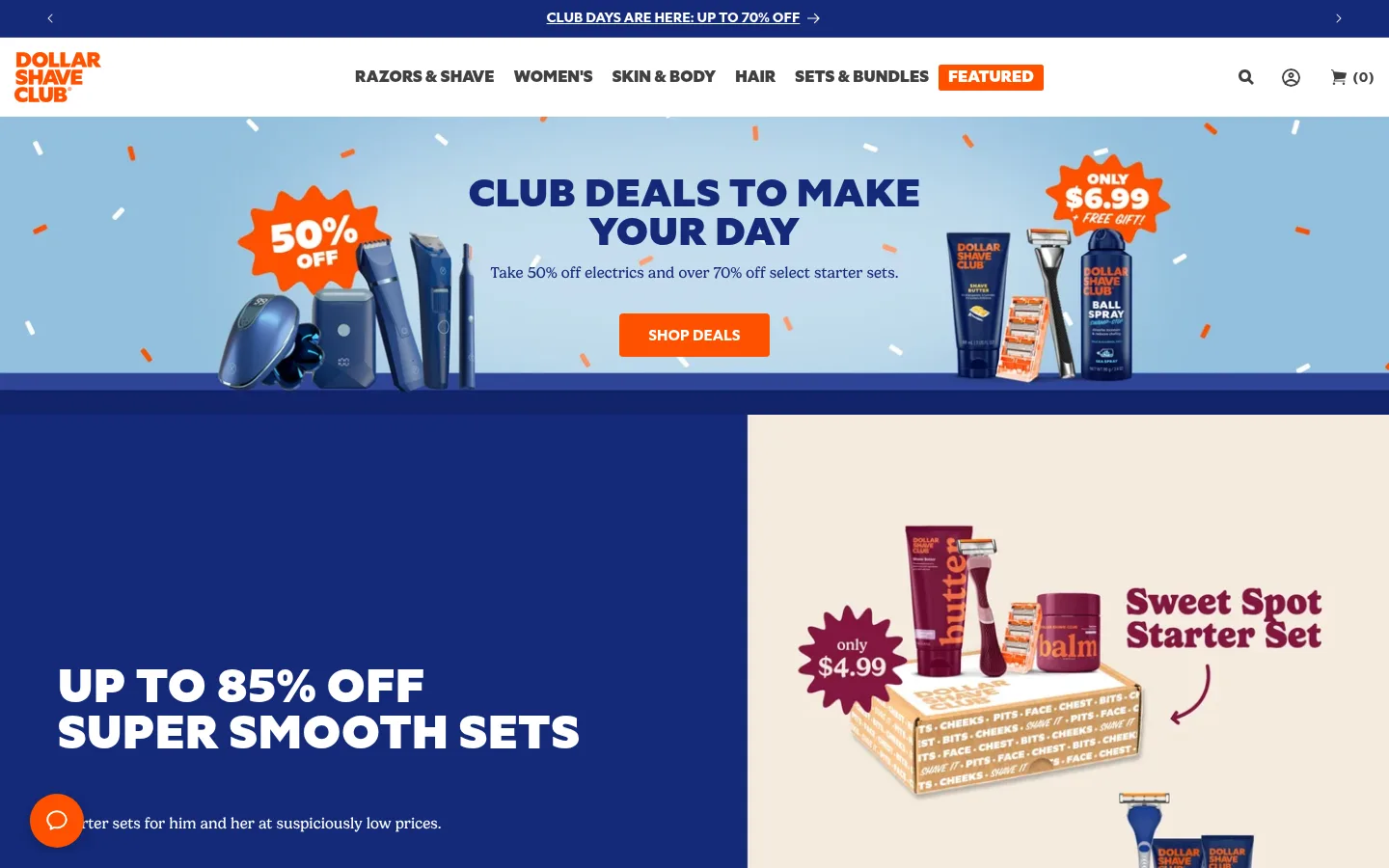
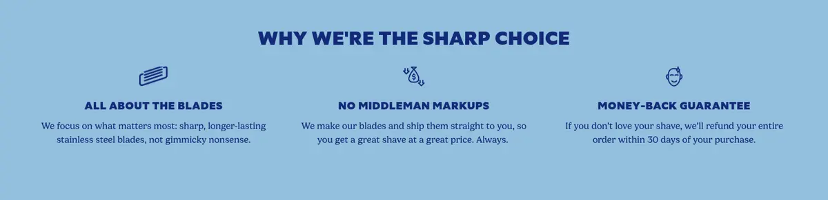
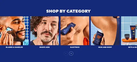
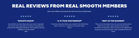
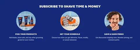
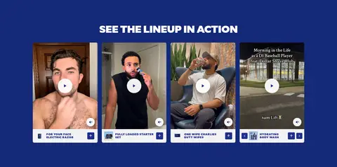
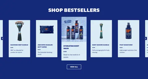
The visual identity is anchored by a saturated deep blue canvas (#142978), repeated across most content sections to make the store feel cohesive and recognizable. Crisp white type provides contrast, while vivid orange (#fe5000) marks key shopping actions and promotional badges. Pale blue section and card surfaces add contrast without disrupting the palette; the white newsletter footer provides a deliberate visual reset. Headlines use DSC Specter in heavy, uppercase display styling, set against Gelica’s more readable, approachable body copy. The layout alternates full-bleed promotional imagery and split campaign panels with centered benefit, review, and subscription sections. Category photography and product imagery are tightly integrated into browsing and shopping cards; video tiles add customer-facing product context. The page is compact and conversion-oriented, with clear paths from campaign messaging to category discovery and bestseller cards. Rounded controls are used sparingly; flat color fields and thin borders do most of the structural work.
配色
点色块复制色值。用途说明来自对页面的实测位置(背景、文字、描边、按钮)与截图判读。
品牌色
强调色
表层色
中性色
功能色
页面底色 · Clubhouse Blue表层 · Clean White表层 2 · Pale Sky表层 3 · Powder Blue表层 4 · Soft Gray主文字 · Clean White次要文字 · Graphite Text描边 · Blue Hairline强调 · Clubhouse Blue强调 2 · Night Indigo强调 3 · Club Orange
Body copy, descriptions, captions, and navigation text
Aa 设计
DSC Specter
网络字体 · 字重 800 / 900 / 400 / 700 · 占比 27%
免费替代:Montserrat
Display headings, CTAs, prominent links, and promotional labels
角色
示例
字号
字重
行高
字距
一级标题
Primary campaign headline in oversized uppercase display type.
Dollar Shave Club
48px
800
1
-0.01em
二级标题
Section titles such as category, reviews, and bestseller headings.
Dollar Shave Club
40px
800
1
0.015em
三级标题
Subsection and feature titles, usually bold uppercase.
Dollar Shave Club
32px
800
1.2
0.019em
四级标题
Smaller supporting display headings and card titles.
The quick brown fox 敏捷的狐狸
20px
400
0.98
0
正文
Product descriptions, campaign explanations, and FAQ answers.
The quick brown fox 敏捷的狐狸
16px
400
1.5
0
辅助文字
Compact product details and supporting image labels.
The quick brown fox 敏捷的狐狸
13px
400
1.5
0
按钮
Uppercase shopping and subscription actions.
The quick brown fox 敏捷的狐狸
16px
800
1
0
导航
Small, restrained navigation and utility labels.
The quick brown fox 敏捷的狐狸
12px
400
1.2
0
链接
Bold uppercase product and category links.
The quick brown fox 敏捷的狐狸
16px
800
1.5
0
眉题
Uppercase lead-in labels above key headings.
The quick brown fox 敏捷的狐狸
18px
800
1.5
0.033em
间距与布局
基准单位 2px · 密度:紧凑
36px版块间距
10px元素间距
—卡片内边距
1030px内容最大宽度
4px
5px
8px
10px
12px
15px
18px
20px
25px
30px
36px
40px
48px
50px
60px
The page uses a compact, full-width storefront composition with a measured content max width of 1030px for contained content. Full-bleed campaigns alternate with centered sections and split layouts, including a two-column offer panel and multi-column benefits, category, review, and subscription areas. Section spacing follows a measured 36px rhythm, with compact element gaps. Align headings to the content pattern: centered for browsing and proof sections, left-aligned in campaign splits. A white footer breaks the continuous blue field.
圆角与层次
按钮 · 9999px
输入框 · 4px
卡片 · 4px
图片 · 4px
导航 · 4px
链接 · 2px
md · button
md · button
hairline · card
md · button
The interface is mostly flat: broad color fields, pale card surfaces, and thin borders create structure. Measured product cards have subtle corner rounding, while buttons are more rounded in the component data than the screenshot’s prominent rectangular orange CTA suggests. Shadows are occasional button-level details, not a general card treatment. Keep layering for campaign artwork and floating product imagery.
组件
下面的预览按实测的按钮、输入框、徽标、卡片样式重建(字体用替代字体)。
Promotional strip
A slim deep-blue announcement band with centered, underlined offer copy and small directional chevrons.
Main navigation
White header with orange stacked wordmark, compact category links, an orange FEATURED label, and utility icons.
Campaign CTA
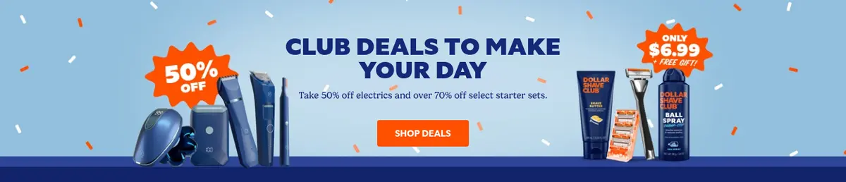
Orange SHOP DEALS button with white uppercase DSC Specter lettering; measured buttons include small-radius variants.
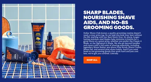
Split sale feature
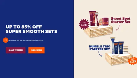
Deep-blue text panel beside pale campaign artwork; pairs oversized white uppercase headline, short copy, and shopping links.
Product card
Pale-blue card surface with blue uppercase product name, product image, price, short benefit copy, and shopping affordance.
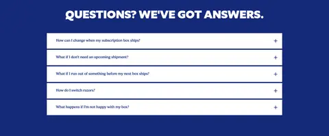
FAQ accordion
Centered question list on the blue canvas with white horizontal rows, dark text, and plus icons.
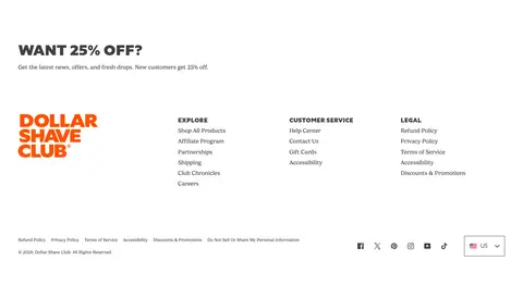
Newsletter footer
White footer begins with an offer-led signup prompt, then stacks brand mark, link columns, legal details, and social icons.
Imagery · Use product photography, lifestyle grooming images, and campaign artwork as key browsing and promotional content. The hero pairs a pale-blue illustrated/product backdrop with floating offer graphics and product cutouts; the next campaign uses a split layout with product-set artwork. Category tiles use cropped lifestyle photos, while video cards show people using products. Keep photography vivid and integrated with the blue canvas rather than adding decorative illustration beyond offer artwork.
Use orange for the primary shopping action and featured offers.
Set major headings in heavy uppercase display type.
Use approachable body text for descriptions and answers.
Give campaign sections strong imagery and clear shopping links.
Create contrast with pale-blue cards and white surfaces.
✕ 不该做
Do not make every section a different bright color.
Do not use orange for long paragraphs or large text blocks.
Do not replace product imagery with generic abstract decoration.
Do not center every content block; preserve split-panel alignment.
Do not add heavy shadows to every card.
Do not let utility navigation compete with campaign headlines.
给 AI 的提示词
想快速出一个同风格的新页面,把这段话连同 DESIGN.md 一起发给 AI。
Build a new ecommerce page in the Dollar Shave Club visual style. Use Clubhouse Blue (#142978) as the dominant canvas, Clean White (#ffffff) for high-contrast text and bright surfaces, and Club Orange (#fe5000) for the primary CTA and promotional labels. Use pale surfaces such as Pale Sky (#dbebf5) and Powder Blue (#93c0de) for product cards or section contrast. Set display headings in heavy uppercase DSC Specter-style typography, with readable Gelica-style body copy. Use a compact storefront header, clear split campaign layouts, product photography, and direct shopping links. Keep cards and borders restrained, with mostly flat surfaces and subtle rounding. Preserve a clear browsing sequence from offer to categories, products, FAQs, and a distinct white footer.