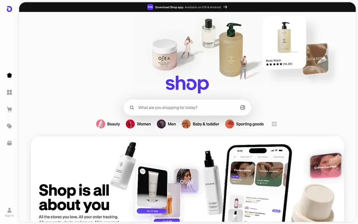
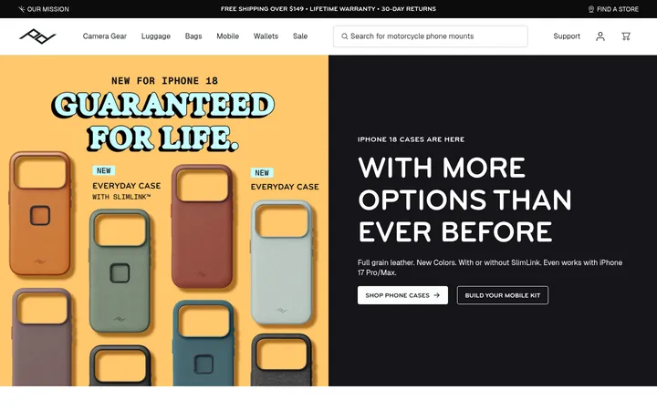
North star · Keep the interface quiet and sharply legible so curated product photography—not decorative UI—sets the visual tone.
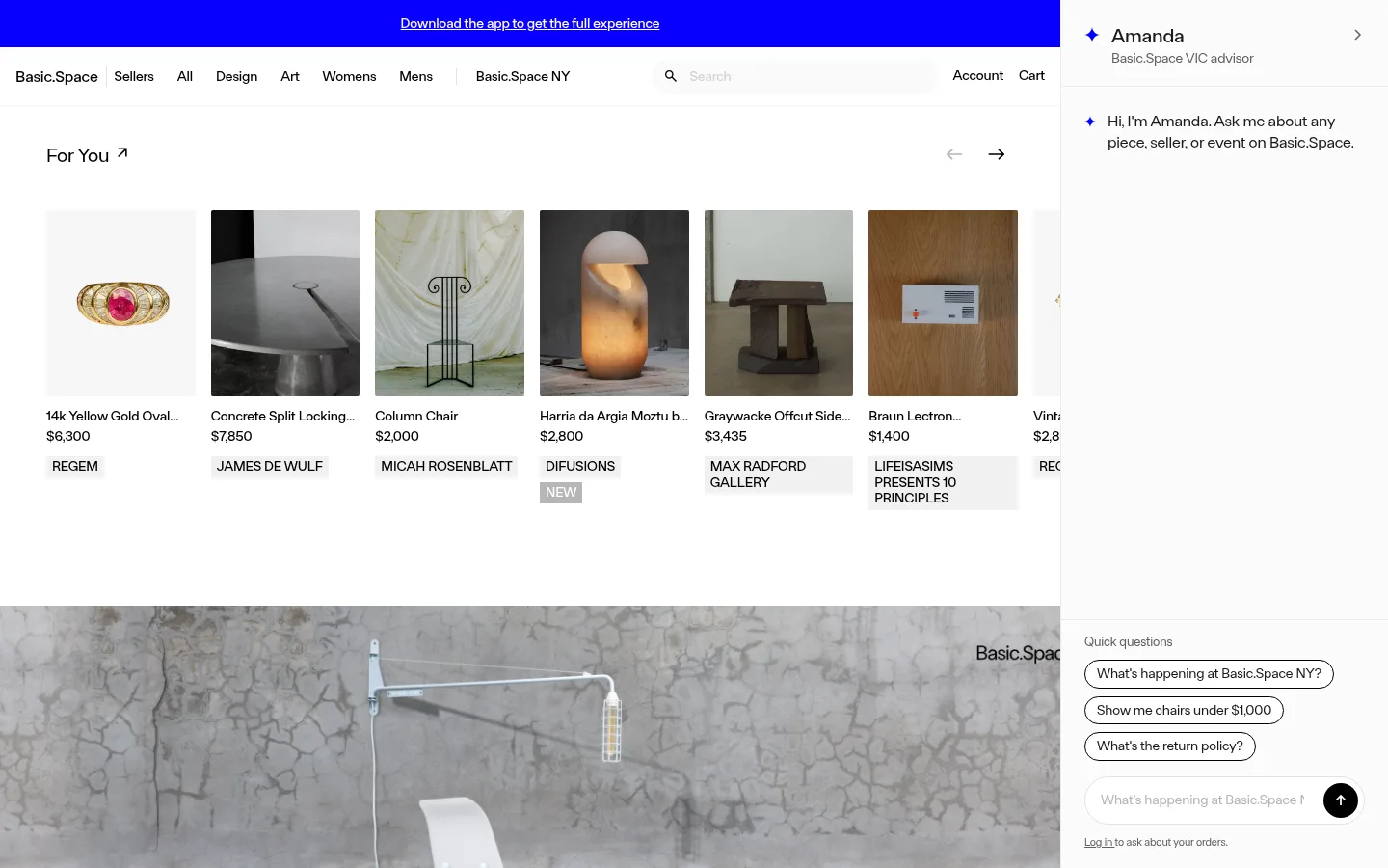
Basic.Space uses a predominantly white canvas and black typography to keep attention on merchandise, with pale gray card fields and fine hairlines separating content without heavy containers. A vivid electric blue announcement strip is the strongest interface accent; blue also appears as a small advisor marker, while the larger blue areas in the screenshot belong to that announcement rather than the product palette. FTBasicSpace is used throughout, with compact, closely tracked navigation and product metadata balanced against oversized campaign lettering. The page is image-led: isolated objects sit in a horizontal recommendation rail, while collection cards and the luxury draw campaign use full-bleed photography with text overlaid. The desktop layout leaves generous white intervals between major modules, then tightens information inside product cards and the fixed right-side advisor panel. Borders and pills define controls; the rest stays notably flat.
配色
点色块复制色值。用途说明来自对页面的实测位置(背景、文字、描边、按钮)与截图判读。
品牌色
强调色
表层色
中性色
功能色
页面底色 · Gallery White表层 · Stone Gray表层 2 · Soft Concrete表层 3 · Cloud Tint主文字 · Display Ink次要文字 · Gallery White弱文字 · Muted Silver描边 · Hairline Gray强调 · Electric Signal
Site-wide display, navigation, product information, controls, and supporting copy.
角色
示例
字号
字重
行高
字距
一级标题
Large campaign and primary editorial headings.
Basic.Space
40px
500
1.13
-0.022em
二级标题
Secondary campaign or major section headings.
Basic.Space
38.5px
500
1.12
-0.022em
三级标题
Collection titles and prominent module headings.
The quick brown fox 敏捷的狐狸
20px
400
1.2
-0.01em
四级标题
Product group or supporting section headings.
The quick brown fox 敏捷的狐狸
18px
500
1.22
-0.01em
正文
Product details and standard descriptive copy.
The quick brown fox 敏捷的狐狸
14px
500
1.2
-0.01em
辅助文字
Seller labels, badges, and compact metadata.
The quick brown fox 敏捷的狐狸
11px
400
1.38
-0.01em
按钮
Pill actions and compact CTA labels.
The quick brown fox 敏捷的狐狸
14px
400
1.25
-0.01em
导航
Header links and interface navigation.
The quick brown fox 敏捷的狐狸
14px
400
1.2
-0.01em
链接
Account, seller, and inline navigation links.
The quick brown fox 敏捷的狐狸
14px
500
1.2
-0.01em
间距与布局
基准单位 4px · 密度:适中
48px版块间距
4px元素间距
—卡片内边距
—内容最大宽度
2px
4px
6px
8px
12px
16px
24px
32px
48px
112px
The desktop page uses a wide primary storefront column beside a persistent, narrow advisor panel on the right. Within the storefront, navigation spans the top, followed by a horizontal product rail, a broad campaign image, a three-card collection row, a full-width event image, service-benefit notes, and footer. Content aligns to the main column edges; cards form compact horizontal groups while campaign sections expand to fill the available width. Preserve generous white intervals between major sections and tighter spacing within merchandise metadata. Measurements do not establish a fixed maximum width.
圆角与层次
按钮 · 50%
输入框 · 16px
图片 · 2px
没有测到阴影:页面是扁平的,层次靠底色和描边区分。
The interface is mostly flat, with no measured shadows. Separate white modules through whitespace and fine light-gray borders; product and campaign images provide the visual depth. Use black outlines on selected pill controls and a solid black circular submit control rather than floating shadowed cards.
组件
下面的预览按实测的按钮、输入框、徽标、卡片样式重建(字体用替代字体)。
Announcement strip
A saturated #0700ff band above the main navigation, carrying a centered, underlined white app-download link.
Store navigation
Compact black wordmark and category links on white, with search, account, and cart actions; fine gray rules mark boundaries.
Recommended product rail
A horizontal carousel of rectangular object photos, concise product names and prices, seller labels, and compact uppercase badges.
Advisor panel
A persistent right-side white panel with advisor identity, a brief greeting, quick-question outline pills, and a message input.
Campaign banner
A wide editorial photograph with short overlaid draw messaging and a compact pill-shaped shop action.
Collection cards
Large rectangular image cards with centered collection titles and small pill CTAs, presented as a horizontal browseable row.
Event feature
A full-bleed event photograph with oversized white Basic.Space lettering, location and date copy, and a small RSVP pill.
Footer
A restrained white closing area with service-benefit notes, legal and account links, and newsletter signup.
Imagery · Use real product and lifestyle photography rather than decorative illustration. Product thumbnails show individual objects against simple or softly colored backdrops; collection cards and the campaign banner use larger atmospheric interiors and editorial scenes. Images are rectangular and closely cropped, with minimal interface framing. Overlay concise white or dark text where contrast permits, and keep image color variation as content rather than extending it into the UI palette.
该做与不该做
✓ 该做
Keep the main canvas white and let product imagery provide most color.
Reserve Electric Signal #0700ff for high-attention interface moments.
Use fine light-gray rules instead of heavy panels.
Set navigation and merchandise metadata compactly.
Use strong editorial photography in campaign and collection modules.
Keep primary controls rounded and plainly outlined or solid black.
✕ 不该做
Do not apply the blue accent broadly to cards or product imagery.
Do not add shadows to otherwise flat content modules.
Do not wrap every section in a visible container.
Do not crowd major campaign sections together.
Do not replace product photography with decorative gradients.
Do not make badges or metadata visually louder than the products.
给 AI 的提示词
想快速出一个同风格的新页面,把这段话连同 DESIGN.md 一起发给 AI。
Build a new Basic.Space-style storefront page with a quiet white canvas (#ffffff) and crisp black text (#000000). Use Electric Signal (#0700ff) sparingly for a top announcement or a small interface marker, not as a broad background theme. Set a clean sans-serif close to DM Sans, with compact, slightly tight navigation and product metadata, and larger restrained editorial headings. Organize the page into clear image-led modules: a product rail, campaign feature, collection cards, and a simple footer. Keep merchandise photography rectangular and prominent; use white space and Hairline Gray (#ebebeb) rules for separation. Controls should be simple black or outlined pills. Maintain a persistent advisor or utility area where appropriate, but keep its text and controls secondary to browsing.