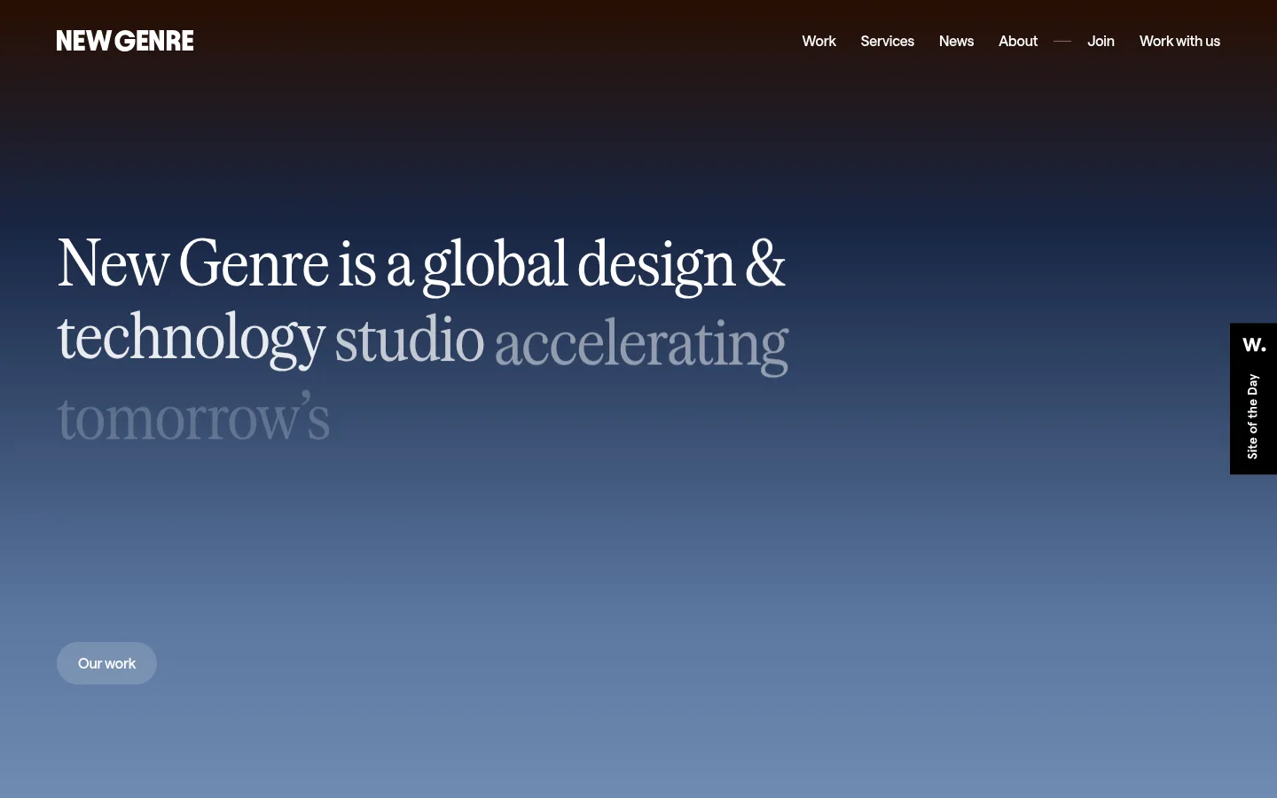
New Genre以克制的编辑式作品集排版,搭配沉浸式的电影感色彩渐变。清晰的字体与充足留白,让项目视觉和少数大幅渐变成为页面的视觉焦点。
North star · Keep the editorial content calm and legible, reserving immersive gradients for moments that mark the beginning, signup, and closing contact.
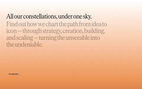
The page alternates between a clean white canvas and a small number of expansive gradient moments. The opening hero moves from deep brown and midnight blue into the studio’s signature muted blue, with pale text layered over it; the long closing contact field shifts through warm cream and orange into near-black. These gradients are defining visual treatments, while the many portfolio and editorial sections stay white. Saans handles compact navigation, supporting copy, and links; the high-contrast serif display face gives the main statements a literary, editorial character. A wide, left-aligned composition keeps headlines and project descriptions readable while image-led case studies occupy a distinct neighboring column. Partner marks form a compact grid, process imagery uses quiet card framing, and news content becomes a tiled feed. Comfortable spacing and minimal decoration keep the long page coherent without making it feel dense.
Navigation, body copy, supporting headings, links, captions, and form controls.
Aa 设计
serrif
网络字体 · 字重 400 · 占比 13%
免费替代:Cormorant Garamond
Display statements and large editorial headings, especially the hero and closing message.
角色
示例
字号
字重
行高
字距
特大标题
Oversized editorial statements and standout closing message.
New Genre
72px
400
1.05
-0.02em
一级标题
Primary hero statement introducing the studio.
New Genre
64px
400
1.05
-0.02em
二级标题
Section headings for partners, process, and signup.
New Genre
32px
450
1.1
-0.01em
三级标题
Project names and individual content-card titles.
The quick brown fox 敏捷的狐狸
24px
450
1.15
-0.01em
正文
Descriptions, supporting statements, and longer explanatory copy.
The quick brown fox 敏捷的狐狸
20px
450
1.15
-0.01em
辅助文字
Compact project labels, image captions, and secondary metadata.
The quick brown fox 敏捷的狐狸
12px
450
1.4
-0.01em
按钮
Signup and prominent action labels.
The quick brown fox 敏捷的狐狸
16px
570
1
-0.01em
导航
Header navigation links and work/contact destinations.
The quick brown fox 敏捷的狐狸
16px
570
1
-0.01em
链接
Inline editorial links and project or category links.
The quick brown fox 敏捷的狐狸
16px
570
1
-0.01em
间距与布局
基准单位 4px · 密度:适中
64px版块间距
4px元素间距
—卡片内边距
1312px内容最大宽度
2px
4px
6px
8px
10px
12px
16px
24px
32px
64px
96px
128px
A wide, left-aligned editorial composition fits within the measured 1312px maximum page width, with a comfortable rather than dense rhythm. The opening hero gives its headline room against a full-field gradient; partner logos sit in a compact multi-column grid. Portfolio entries pair short left-side text with larger right-side media, then process cards and a two-column editorial feed vary the cadence. The newsletter and closing contact area act as distinct end-of-page bands.
圆角与层次
按钮 · 9999px
输入框 · 8px
导航 · 8px
链接 · 16px
没有测到阴影:页面是扁平的,层次靠底色和描边区分。
The interface is mostly flat: white canvas, restrained pale surfaces, and quiet hairlines separate content rather than heavy shadows. Media cards provide the strongest visual layering through their own imagery and modest rounded framing. Keep buttons pill-shaped and inputs softly rounded, without adding unmeasured shadow treatments.
组件
下面的预览按实测的按钮、输入框、徽标、卡片样式重建(字体用替代字体)。
Header navigation
Compact white navigation sits over the hero gradient; labels use measured 16px Saans nav styling with simple text links.
Hero action
A small pill-shaped work link sits below the large serif statement; white text and a translucent pale treatment keep it integrated with the gradient.
Partner logo grid
A multi-column cluster of partner marks beneath a short heading; pale surfaces and white space let varied logo artwork remain distinct.
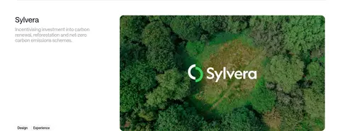
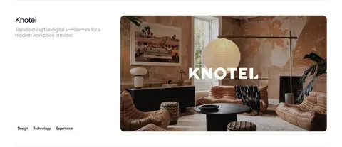
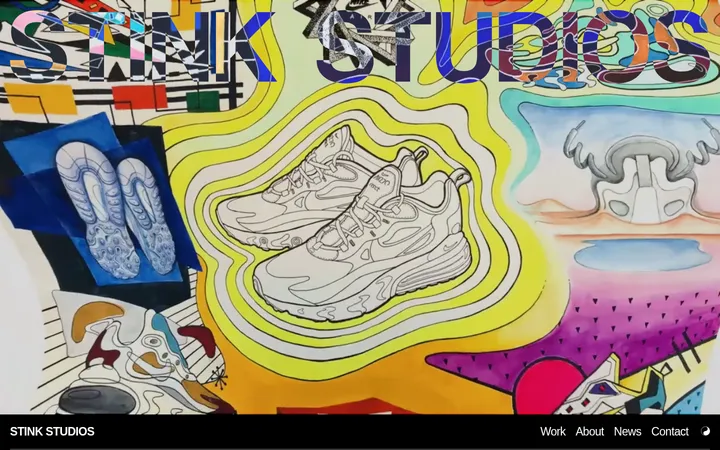
Project case study
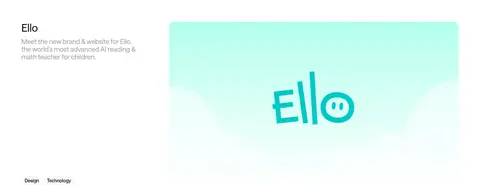
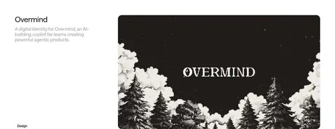
Each portfolio row pairs a left-aligned title, muted description, and compact service labels with large neighboring project media.
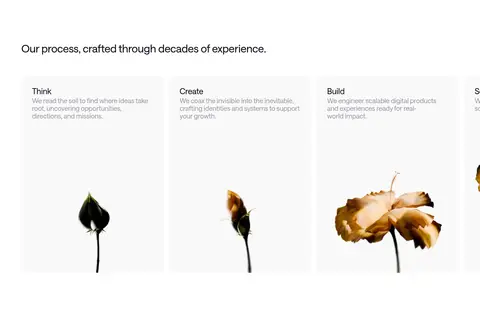
Process cards
A row of pale, image-led cards combines a short process title and description with isolated botanical imagery.
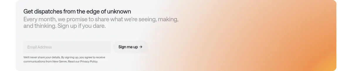
Newsletter form
A pale newsletter band pairs concise explanatory copy with a soft-filled rounded input and the measured pill CTA style.
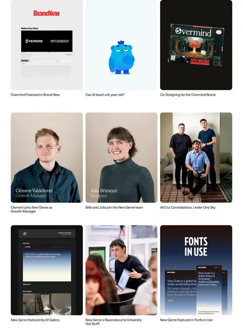
Editorial feed
A two-column news area presents tiled image-led stories with compact titles and understated read-all links.
Contact footer
A dark-to-warm gradient close contains a prominent work-with-us link and two studio contact blocks.
Imagery · Use project photography, motion stills, and brand artwork as the main visual material in portfolio and editorial sections. Case-study images are large, rectangular, and neatly framed; news thumbnails form a consistent tile grid. Process imagery includes isolated botanical subjects on pale backgrounds. The coloured hero and contact fields are gradient-led, not photographic.
Use white as the default canvas for portfolio and editorial content.
Reserve large gradients for the hero and closing brand moments.
Set display statements in the measured serif style.
Pair concise project details with large neighboring imagery.
Use muted gray for supporting copy rather than competing black.
Keep dividers, surfaces, and card framing visually quiet.
✕ 不该做
Do not turn gradient colours into a full-site UI palette.
Do not crowd the page with dense card chrome or heavy shadows.
Do not replace the editorial serif headlines with generic sans typography.
Do not make every section a coloured band.
Do not overpower project imagery with decorative borders.
Do not add bright accents that compete with the muted blue hero.
给 AI 的提示词
想快速出一个同风格的新页面,把这段话连同 DESIGN.md 一起发给 AI。
Build a new page in New Genre’s restrained editorial studio style. Use Gallery White (#ffffff) as the main canvas, Studio Ink (#0c1018) for primary text, and Soft Slate (#535a65) for supporting copy. Set major statements in an elegant serif similar to Cormorant Garamond, with DM Sans-like sans-serif for navigation, body text, and controls. Keep the layout wide, left-aligned, and comfortably spaced; pair concise project descriptions with large image-led case studies. Use Quiet Divider (#e8eaed) sparingly. Reserve the cinematic gradient palette—Roasted Umber (#280e01), Midnight Navy (#182644), Horizon Blue (#5a769f), and its pale transitions—for a hero or closing moment. Avoid heavy shadows and excessive card decoration; let typography, imagery, and whitespace establish hierarchy.