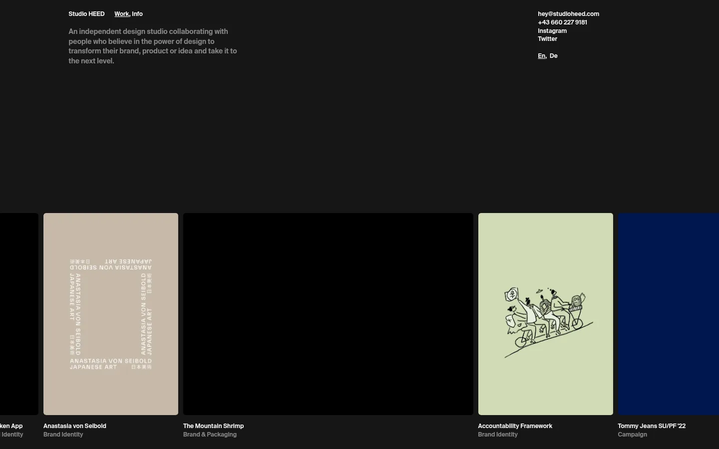
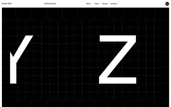
Studio HEED 以克制的暗色工作室介绍,衬托横向铺展的作品集。紧凑的白色文字与低调底色让每个项目展现各自的视觉个性。
North star · Keep the interface quiet and compact so the project imagery, not decorative UI, carries the page.
The page uses a nearly black canvas as a quiet frame for a horizontally arranged portfolio. White is reserved for compact navigation, contact details, and project labels, while the opening studio description appears in a softer gray. Portfolio media introduces restrained beige and pale green alongside deep blue and black; these are project-specific colors, not a broader interface palette. Suisse Intl appears in a consistent semibold weight, with small navigation and caption text supporting the work rather than competing with it. The layout is intentionally asymmetric: a compact text block sits near the upper left, contact links align at the upper right, and a broad band of project tiles runs below. Generous dark negative space separates the introduction from the imagery. Media corners are subtly rounded, while labels sit directly beneath each tile. The overall effect is an editorial portfolio that keeps interface chrome minimal and gives the showcased work the strongest visual presence.
配色
点色块复制色值。用途说明来自对页面的实测位置(背景、文字、描边、按钮)与截图判读。
强调色
表层色
中性色
页面底色 · Pure Black表层 · Soft Stone表层 2 · Studio Charcoal表层 3 · Deep Navy主文字 · Studio White
Navigation, introduction, contact information, and project captions.
角色
示例
字号
字重
行高
字距
正文
Studio introduction and supporting copy.
The quick brown fox 敏捷的狐狸
14px
600
1.4
0
辅助文字
Project names and category labels beneath portfolio media.
The quick brown fox 敏捷的狐狸
12px
600
1.4
0
导航
Studio name, Work and Info links, and contact navigation.
The quick brown fox 敏捷的狐狸
12px
600
1.4
0
间距与布局
基准单位 2px · 密度:适中
54px版块间距
14px元素间距
—卡片内边距
—内容最大宽度
10px
14px
17px
20px
54px
Use a broad, dark canvas with a compact introduction aligned toward the upper left and contact details aligned toward the upper right. The portfolio forms a wide horizontal sequence of differently sized media tiles, with captions directly below. Preserve the strong asymmetry and substantial negative space between the top information and project band. The measured grid has 12 columns, but no maximum content width was captured; follow the screenshot’s expansive, edge-spanning composition rather than inventing a fixed width.
圆角与层次
图片 · 5px
没有测到阴影:页面是扁平的,层次靠底色和描边区分。
The page is visually flat: no shadows were measured, and the dark canvas provides separation through contrast and open space. Keep navigation and captions unboxed. Media has a subtle measured corner radius, while project bands and image edges should not gain invented borders or layered card treatments.
组件
下面的预览按实测的按钮、输入框、徽标、卡片样式重建(字体用替代字体)。
Top navigation
Compact white Suisse Intl semibold links for the studio identity and Work, Info navigation, positioned at the upper left.
Studio introduction
Short, muted-gray statement beneath the top-left navigation; keep it visually secondary to the portfolio.
Contact block
White email, phone, social links, and language options grouped at the upper right in compact stacked text.
Portfolio media tile
Rectangular, subtly rounded project media tile; widths and imagery vary across the horizontal sequence.
Project caption
White project name followed by a muted category label directly below each media tile.
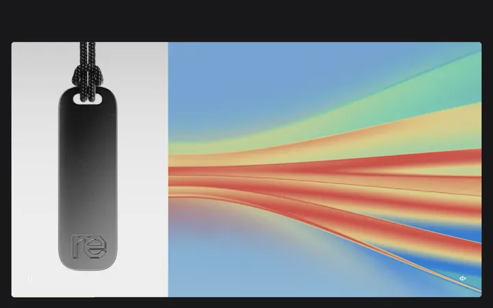
Imagery · The portfolio is media-led, combining project imagery, video, graphic artwork, and occasional illustration. Present items as a horizontally flowing row of rectangular tiles with restrained rounding and varied visual content. Keep project-specific pale neutrals, green, blue, and black confined to the artwork; avoid applying them as global interface decoration.
Use Studio Charcoal #161616 as the dominant canvas.
Keep interface text compact and semibold in Suisse Intl or a close substitute.
Align studio details left and contact information right.
Give portfolio media more visual weight than the surrounding interface.
Place project names and categories directly below their imagery.
Keep artwork-specific colors within their respective project tiles.
✕ 不该做
Do not add gradients or decorative shadows.
Do not turn project-specific colors into global interface accents.
Do not add prominent button treatments absent from the reference.
Do not center the entire layout or force symmetrical columns.
Do not crowd the media with extra labels or interface chrome.
Do not invent borders, spacing values, or a fixed maximum width.
给 AI 的提示词
想快速出一个同风格的新页面,把这段话连同 DESIGN.md 一起发给 AI。
Build a new page in the Studio HEED visual style: a restrained, media-led design studio portfolio on Studio Charcoal #161616, with a compact upper information area and a broad sequence of project tiles. Use Studio White #ffffff for navigation, contact details, and project names; make introductory copy quieter than the navigation. Set all text in a Suisse Intl-like semibold sans serif, with small, concise labels. Keep the composition asymmetric, leaving substantial dark negative space between the introduction and imagery. Use varied project artwork in rectangular tiles with subtle rounding and captions immediately beneath. Soft Stone #c2c1bf and Deep Navy #00174f may appear inside project artwork, not as recurring UI accents. Avoid shadows, gradients, heavy borders, oversized controls, and ornamental effects. Let the showcased work define each tile’s color and character.