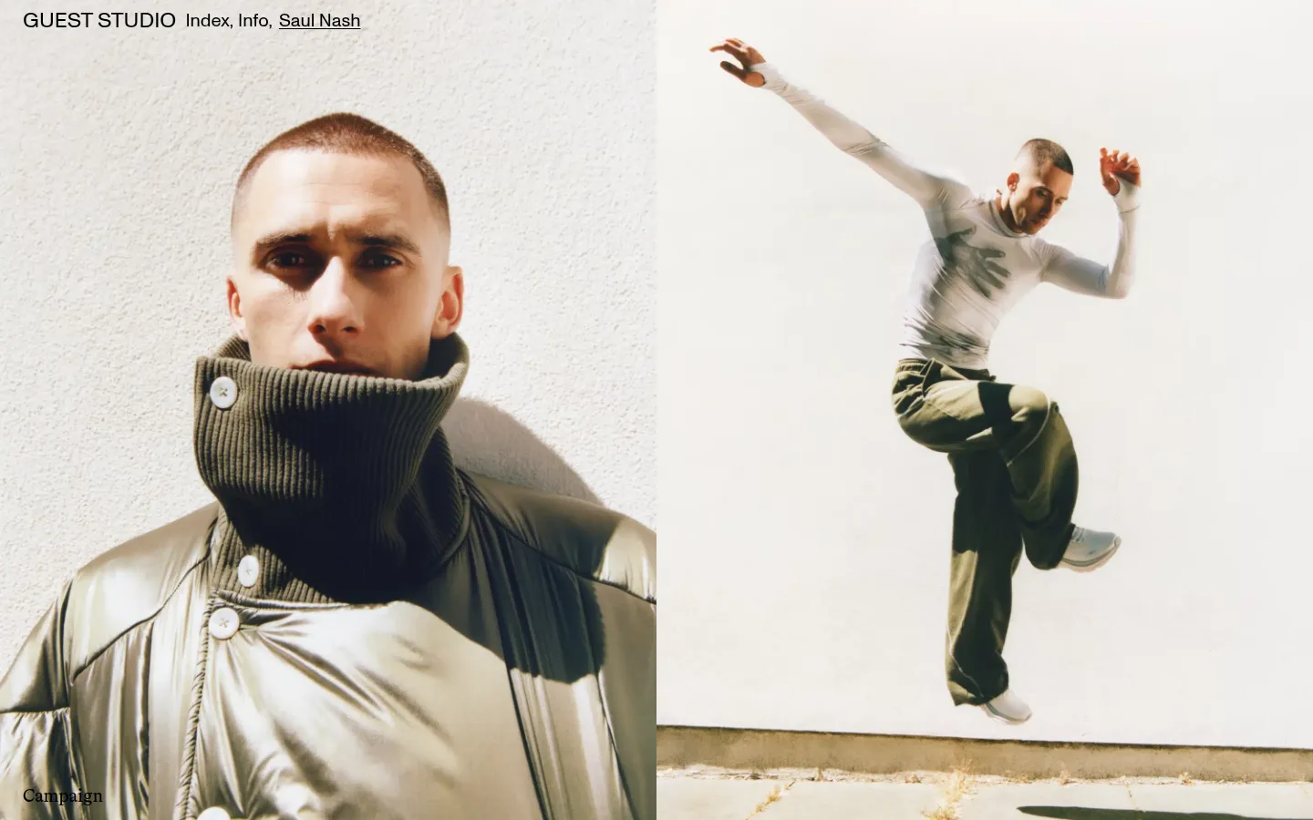
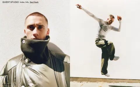
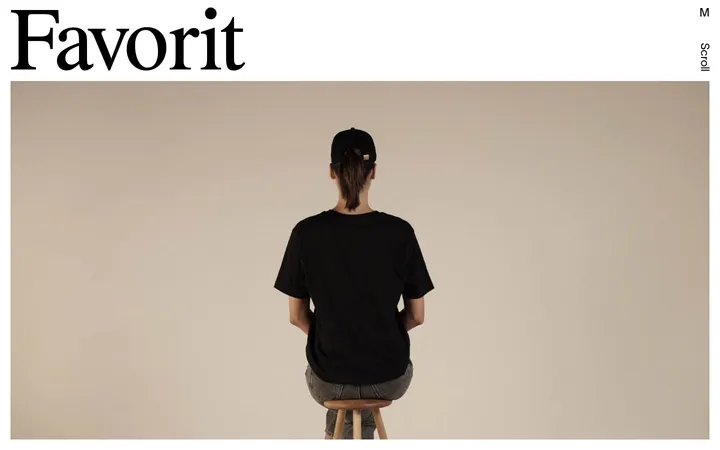
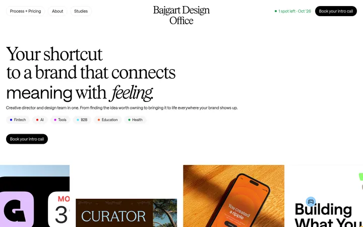
Guest Studio 首页以通栏广告影像开场,顶部叠放简洁的作品索引导航。黑色文字与白色画布保持克制,让摄影作品成为视觉焦点。
North star · Keep the interface nearly invisible so full-bleed campaign imagery and quietly typeset project labels lead the experience.
The visual strategy is image-first and deliberately restrained. White (#ffffff) is the measured canvas, while black (#000000) supplies the key navigation and editorial text; the warm neutrals and deep tones visible in the opening frame belong to the campaign photography, not the interface palette. A compact sans-serif wordmark and index navigation sit over the top edge of the imagery, while refined book-style serif text labels the featured work. The opening composition uses full-bleed, side-by-side campaign photographs as its dominant content, with sparse labels placed directly over the images. The measured page uses a 12-column structure and reports a maximum width of 1123px, though the first viewport’s media fills the screen. Comfortable spacing and very few visible interface treatments allow the images to carry the page. The effect is closer to an art-directed studio portfolio than a conventional service-site landing page.
Wordmark, compact navigation, and uppercase headings
角色
示例
字号
字重
行高
字距
一级标题
Uppercase section or project headings, set in ABCROM.
The quick brown fox 敏捷的狐狸
24px
400
1
0
正文
Editorial descriptions in BradfordLLWeb-Book.
The quick brown fox 敏捷的狐狸
20px
400
1.2
0
导航
Compact index and studio navigation in ABCROM.
The quick brown fox 敏捷的狐狸
20px
400
1
0
链接
Project names and service labels in BradfordLLWeb-Book.
The quick brown fox 敏捷的狐狸
20px
400
1.2
0
间距与布局
基准单位 1px · 密度:适中
—版块间距
4px元素间距
—卡片内边距
1123px内容最大宽度
4px
10px
15px
25px
Use a 12-column composition with full-bleed media in the opening viewport. The measured page maximum width is 1123px, but the campaign imagery visibly spans the screen; reserve the constrained width for content that needs it. Align navigation and image labels to clear edges, keeping text sparse and left-aligned. Comfortable spacing supports an unhurried portfolio rhythm, while project media remains dense and visually dominant. Avoid conventional cards or boxed content bands.
圆角与层次
没有测到阴影:页面是扁平的,层次靠底色和描边区分。
The measured interface has no shadow system, card treatment, or radius scale. Keep elements visually flat: rely on the photograph, white canvas, and precise text placement for hierarchy. Avoid adding borders or elevated panels unless a new page has a clear functional need.
组件
下面的预览按实测的按钮、输入框、徽标、卡片样式重建(字体用替代字体)。
Overlaid studio navigation
Place the studio wordmark and index links at the top edge of the hero media; measured navigation uses ABCROM, with white detected on the nav component.
Project image panels
Use expansive campaign photography in adjacent columns, with minimal framing and no measured card radius or shadow.
Project label
Set the project name or category directly over the image in BradfordLLWeb-Book, using a restrained editorial treatment.
Project and service links
Use black, unboxed text links in BradfordLLWeb-Book; measured link labels include Brand Design and Campaign.
Imagery · Use large, art-directed campaign photography as the primary content, preferably arranged in adjacent full-height frames. The reference features fashion and movement against light, textured settings, with warm natural tones and dark clothing. Keep imagery photographic and editorial rather than adding illustration, 3D decoration, or interface overlays that compete with the subject.
Keep navigation compact and close to the top edge.
Use white and black as the interface palette.
Set project labels directly on or beside the imagery.
Preserve a clear, left-aligned editorial reading order.
Let generous open space balance dense photography.
✕ 不该做
Add decorative colours to the measured interface palette.
Put every project inside a card or bordered panel.
Cover photography with persistent, heavy interface chrome.
Use shadows or rounded corners as default styling.
Turn the portfolio into a conventional marketing dashboard.
Treat colours inside campaign images as brand UI colours.
给 AI 的提示词
想快速出一个同风格的新页面,把这段话连同 DESIGN.md 一起发给 AI。
Build a new Guest Studio-style page as an image-led creative portfolio. Use Gallery White (#ffffff) as the measured canvas and Editorial Ink (#000000) for interface text and links; do not promote colours found only in photography into UI tokens. Lead with full-bleed, art-directed campaign imagery in a 12-column composition, and place compact studio navigation over its top edge. Use ABCROM or a close sans-serif alternative for the wordmark and navigation, and BradfordLLWeb-Book or a refined book-style serif alternative for project labels and editorial copy. Keep headings restrained, labels sparse, and alignment precise. Prefer open spacing and flat presentation over cards, borders, shadows, or rounded surfaces. Make the photography carry the visual identity, with minimal interface chrome.