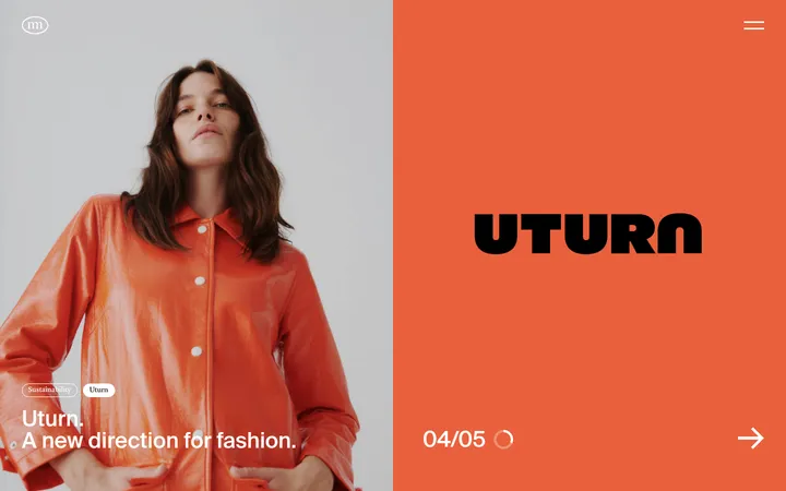
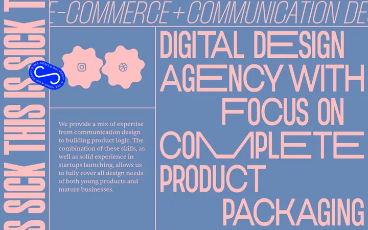
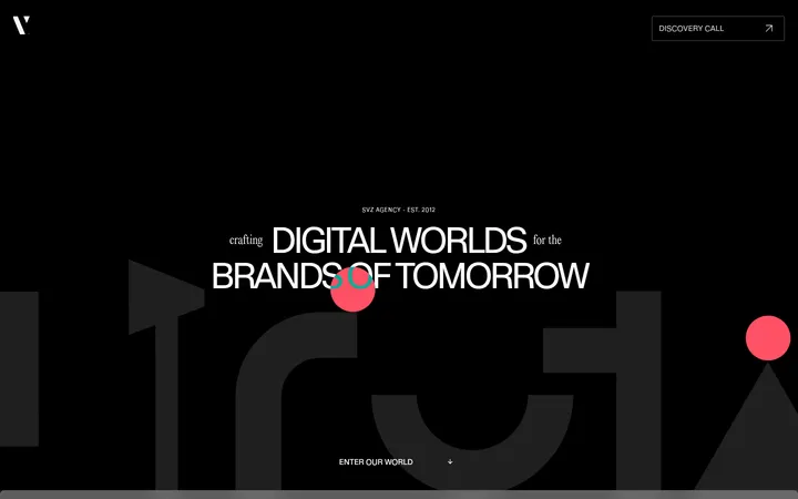
North star · Let warm-white space and oversized light typography frame real-world imagery, reserving solid black for focused, high-impact sections.
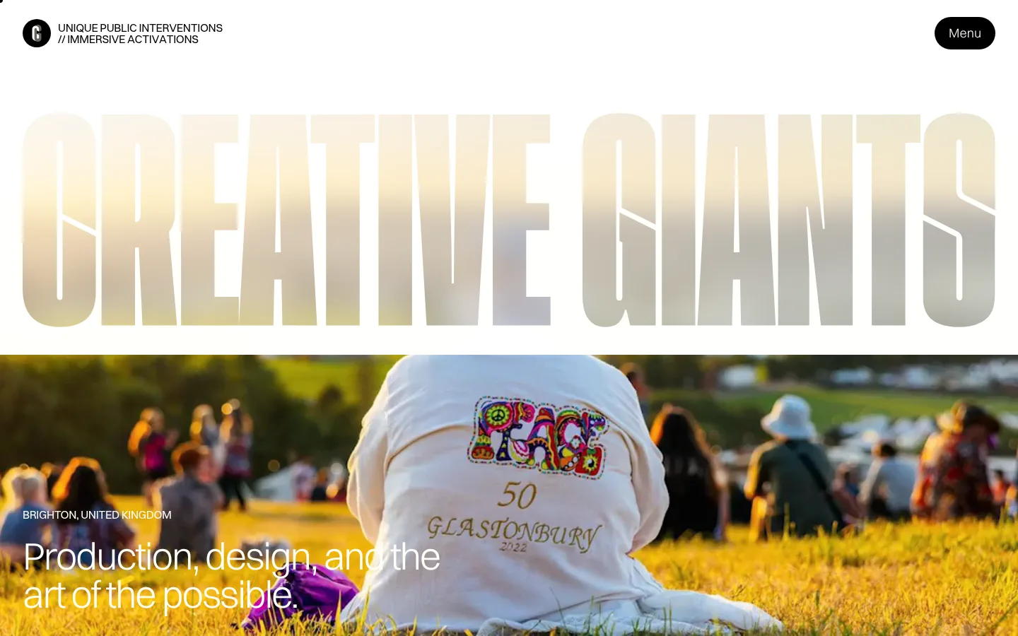
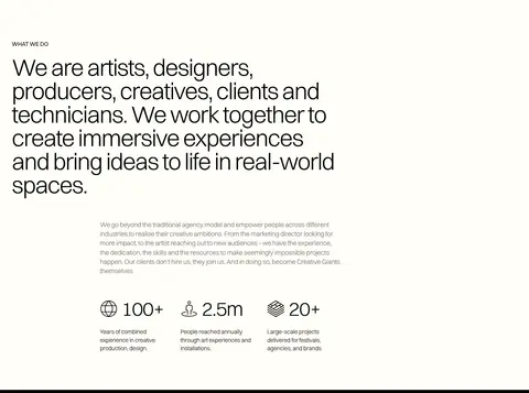
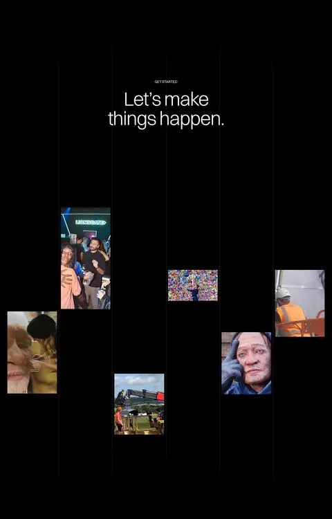
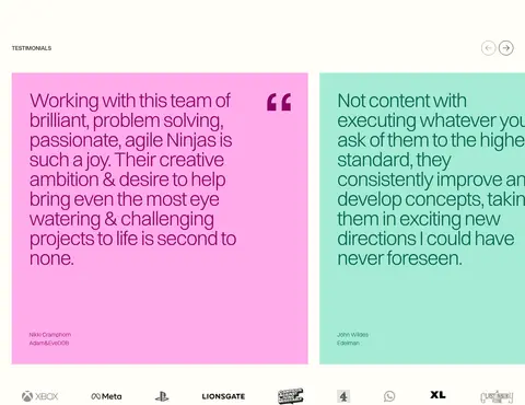
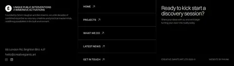
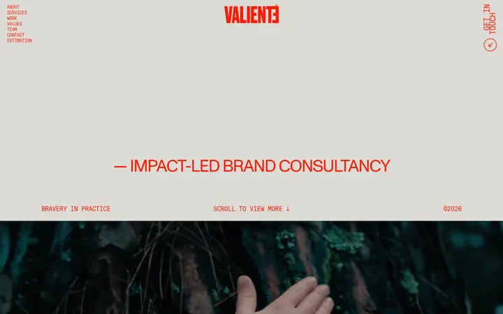
The visual system is built around a warm off-white canvas (#fffef7) and near-total black (#000000), alternating light editorial sections with dramatic dark project and CTA bands. Text is mostly black, with muted gray for supporting copy; bright pink and mint testimonial cards provide controlled color breaks, while berry, green, and pale blue appear as accent text or within specific content rather than defining the whole interface. Switzer’s light sans-serif voice keeps copy airy, while the enormous narrow “CREATIVE GIANTS” wordmark acts as a graphic headline and footer signature. Layouts shift between open, multi-column introductions and tightly framed project imagery, with generous blank intervals separating major blocks. Photography and video show real public activations, installations, and audiences; they are presented directly, not enclosed in decorative frames. Hairline rules and minimal elevation keep the interface flat, while rounded black controls provide small, high-contrast interaction points.
Headlines, body copy, navigation, controls, and form text
角色
示例
字号
字重
行高
字距
特大标题
Oversized Creative Giants wordmark and major display moments.
Creative Giants
84px
300
1
-0.04em
一级标题
Primary hero and large section headlines.
Creative Giants
64px
300
1
-0.04em
二级标题
Secondary section headings and prominent editorial statements.
Creative Giants
54px
300
1
-0.04em
三级标题
Project names and supporting section titles.
Creative Giants
34px
300
1
-0.04em
四级标题
Smaller feature and card headings.
The quick brown fox 敏捷的狐狸
20px
300
1.4
-0.04em
正文
Descriptions, supporting copy, and form content.
The quick brown fox 敏捷的狐狸
14px
300
1.4
-0.023em
辅助文字
Compact uppercase section labels, project metadata, and location.
The quick brown fox 敏捷的狐狸
12px
400
1.4
-0.027em
间距与布局
基准单位 8px · 密度:紧凑
32px版块间距
12px元素间距
48px卡片内边距
1376px内容最大宽度
1px
2px
6px
8px
10px
12px
16px
24px
32px
48px
64px
80px
112px
The page uses a broad, centered canvas with a measured maximum width of 1376px, but switches to full-bleed media and dark bands where impact matters. Sections alternate between one-column statements, three-column introductory content, project layouts, and split contact/footer arrangements. Alignment is intentionally varied: left-aligned editorial copy contrasts with a centered dark CTA. The overall density is compact within content groups, yet large blank intervals create a slow, cinematic scroll rhythm.
圆角与层次
按钮 · 50%
hairline · other, button
The interface is predominantly flat: no prominent card shadows or raised surfaces. Separate content through sharp color changes, whitespace, and fine hairline rules. Use the measured subtle white hairline shadow on the dark pill control only where needed; avoid adding depth effects to media or testimonial panels.
组件
下面的预览按实测的按钮、输入框、徽标、卡片样式重建(字体用替代字体)。
Pill menu control
A compact black, fully rounded control with warm-white text; use the measured subtle white hairline shadow where applicable.
Wordmark display
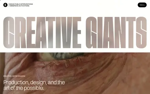
Huge, narrow uppercase lettering spans the page width on warm white and returns as a reversed signature across the black footer.
Project showcase
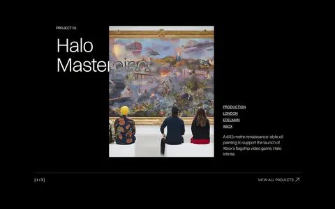
Dark section with project numbering, large titles, rectangular documentary imagery, metadata, and concise descriptions.
Testimonial cards
Flat, square-corner pink and mint panels with matching berry and teal text; keep generous internal breathing room.
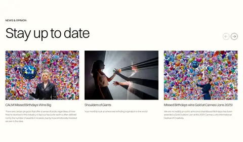
News cards
Editorial image-led cards with concise headlines and muted supporting summaries on the warm-white canvas.
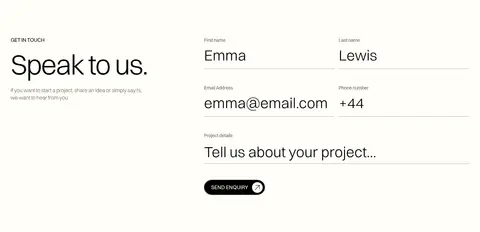
Contact form
Open two-column contact layout with minimal fields, black text, restrained gray rules, and a simple text-led submit action.
Imagery · Use documentary-style photography and video of installations, public interventions, crowds, and cultural events. The hero uses full-width moving or still imagery beneath the oversized wordmark, while project and news areas use direct rectangular image crops. Keep the media vivid and authentic; avoid decorative filters, illustrations, or product-render styling. Testimonial cards add flat color fields rather than image-led backgrounds.
Use #fffef7 as the default canvas rather than pure white.
Alternate light editorial areas with purposeful #000000 sections.
Set most typography in a light Switzer-like sans-serif.
Treat the oversized wordmark as a major graphic element.
Use real event photography and full-bleed video where appropriate.
Keep testimonial colors limited to distinct flat panels.
Separate sections with whitespace and fine rules instead of shadows.
✕ 不该做
Do not introduce gradients as a general page background.
Do not make every section a card or boxed panel.
Do not add heavy shadows, borders, or rounded containers.
Do not use saturated accents across the whole interface.
Do not center-align all editorial copy.
Do not replace documentary imagery with generic stock-style renders.
给 AI 的提示词
想快速出一个同风格的新页面,把这段话连同 DESIGN.md 一起发给 AI。
Build a new agency page in the Creative Giants visual style. Use Gallery Ivory (#fffef7) as the main canvas and Stage Black (#000000) for focused project, CTA, and footer sections. Set a light, tightly tracked sans-serif close to Switzer; pair small uppercase labels with oversized, narrow-feeling display lettering. Organize content into open editorial layouts, split project showcases, and occasional full-bleed photography or video of real events. Keep surfaces flat and use whitespace, sharp color transitions, and subtle hairlines for separation. Reserve Electric Rose (#ffacea) and Mint Panel (#a5ebd6) for limited testimonial or highlight panels, with Berry Ink (#8a0467) and Deep Teal (#03624c) as their text accents. Use simple black pill controls sparingly, and preserve an unhurried, cinematic section rhythm.