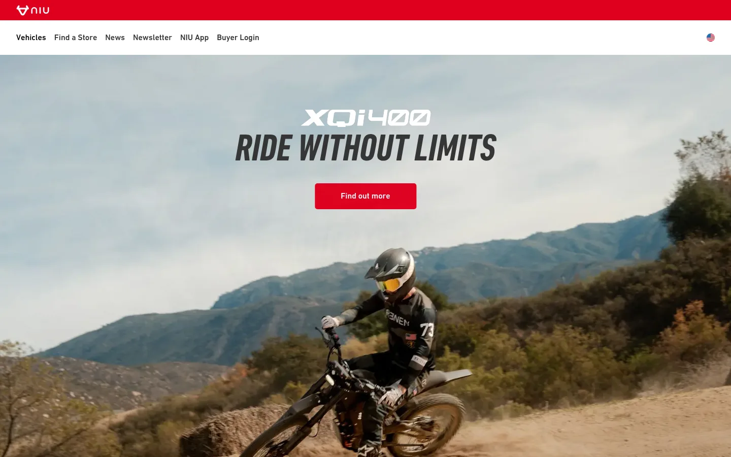
NIU 首页以克制的导航和杂志式内容编排,搭配富有动感的骑行大图。品牌红、窄体大标题与明暗交替的区块,共同营造鲜明而强调性能的视觉风格。
North star · Let bold riding photography and condensed headlines lead, using NIU red as a precise accent across clean, alternating light and dark sections.
The page uses white as its main canvas, letting large riding and product photographs carry much of the visual impact. NIU red (#df001f) is the signature cue: it marks the top brand strip, primary buttons, eyebrow labels, and the blog band, rather than covering every section. Dark service and footer areas provide contrast, while pale gray bands separate finder and app content. DIN supplies the readable navigation and body copy; DIN Condensed gives the uppercase display headlines their fast, athletic character. Layout alternates centered, full-bleed hero imagery with split feature blocks, compact forms, stats, and a card-led content feed. Spacing feels open around major messages, but information-heavy forms and footer links stay compact. Borders are subdued hairlines; the visual hierarchy comes from photography, color blocks, and typographic scale rather than shadows.
配色 点色块复制色值。用途说明来自对页面的实测位置(背景、文字、描边、按钮)与截图判读。
品牌色
NIU Signal
#df001f
Brand strip, primary CTAs, blog background, and small section labels.
表层色
Gallery White
#ffffff
Main canvas, light cards, form fields, and reversed text on dark or red areas.
Mist Gray
#ececec
Soft neutral section band, notably behind the NIU Finder content.
Night Panel
#1a1a1a
Near-black feature cards, including service and rider-benefit panels.
中性色
Carbon Ink
#242424
Primary dark text and charcoal inverse sections, including service content and footer areas.
Steel Line
#979797
Input and navigation hairlines, plus muted footer and interface details.
Rider Black
#000000
Deep inverse surfaces and occasional white-on-black links, buttons, or text.
Graphite Copy
#4a4a4a
Secondary text where softer contrast is needed against light surfaces.
Pale Type
#d8d8d8
Low-emphasis text detail; use sparingly for subdued supporting information.
Quiet Gray
#cdcdcd
Low-priority text detail within dense secondary content.
Footer Slate
#444444
Subtle footer dividers and borders on dark surfaces.
Cool Alloy
#a4a9ad
Muted secondary copy and small interface details.
Navigation Charcoal
#333333
Primary navigation text and dark headline details on white.
Ash Copy
#6b6b6b
Occasional subdued supporting text on light areas.
功能色
Soft Signal
#f5b3bc
Measured faint button-related tint; keep limited to subtle control states, not a dominant brand color.
Deep Blue Steel
#1a2530
Measured isolated non-core detail; not a defining page surface or brand color.
文字 背景 对比度 WCAG #242424 Carbon Ink#ffffff Gallery White15.52:1 AAA #242424 Carbon Ink#ececec Mist Gray13.14:1 AAA #242424 Carbon Ink#000000 Rider Black1.35:1 不达标 #ffffff Gallery White#ececec Mist Gray1.18:1 不达标 #ffffff Gallery White#000000 Rider Black21:1 AAA #ffffff Gallery White#242424 Carbon Ink15.52:1 AAA
字体 字号阶梯:Perfect Fourth(比例约 1.362,正文 16px)。示例用免费替代字体渲染,数值为实测。
Aa 设计
din 网络字体 · 字重 400 / 700 / 500 / 300 / 600 · 占比 80%
免费替代:Barlow
Navigation, body copy, buttons, forms, and general interface text.
Aa 设计
din-condensed 网络字体 · 字重 700 / 600 / 400 · 占比 11%
免费替代:Roboto Condensed
Display headlines and emphatic section titles.
Aa 设计
Roboto 网络字体 · 字重 400 / 700 · 占比 9%
免费替代:Roboto
Form input text and small field details.
角色 示例 字号 字重 行高 字距 特大标题 Large uppercase campaign statements and hero display copy.
NIU
75px 600 1 0 一级标题 Primary uppercase hero or major section headline.
NIU
60px 700 1.02 0.005em 二级标题 Section headings with a less forceful display treatment.
NIU
40px 400 1.05 0.005em 三级标题 Uppercase feature and content-section headlines.
NIU
37.5px 700 1.02 0.005em 四级标题 Bold card titles and secondary headings.
The quick brown fox 敏捷的狐狸
22px 700 1.15 0 正文 Paragraphs, explanatory copy, and general page text.
The quick brown fox 敏捷的狐狸
16px 400 1.55 0 辅助文字 Small dates, fine print, and image or content metadata.
The quick brown fox 敏捷的狐狸
12px 400 1.2 0 按钮 Primary action labels, including red CTA buttons.
The quick brown fox 敏捷的狐狸
16px 500 1 0 导航 Header links and primary navigation labels.
The quick brown fox 敏捷的狐狸
16px 500 3.25 0 眉题 Compact uppercase section identifiers above headlines.
The quick brown fox 敏捷的狐狸
12px 700 1.2 0.125em
间距与布局 基准单位 4px · 密度:适中
56px 版块间距
16px 元素间距
30px 卡片内边距
600px 内容最大宽度
3px
4px
5px
6px
8px
10px
12px
14px
16px
17px
18px
20px
22px
23px
24px
28px
A long, single-page layout uses full-width section bands with content arranged in centered containers and two-column splits. The measured content maximum is 600px; the screenshots show wider visual compositions around that content, especially for full-bleed photography and multi-column sections. Sections alternate between open white space, pale gray, red, and dark backgrounds. The page moves from a centered hero to a narrow form, finder cards, feature splits, stats, and a horizontal content feed. Comfortable section spacing contrasts with dense form controls and footer navigation.
圆角与层次 没有测到阴影:页面是扁平的,层次靠底色和描边区分。
The interface is mostly flat, with no measured shadows. Separation comes from alternating white, pale gray, red, and dark section backgrounds. Cards use restrained borders or simple fills, with measured rounded card and media corners; form fields rely on thin gray outlines rather than raised surfaces.
组件 下面的预览按实测的按钮、输入框、徽标、卡片样式重建(字体用替代字体)。
Primary CTA NIU red (#df001f) fill with white text; DIN medium or bold label and compact rounded corners. Examples include Find out more and Connect Now.
Header navigation White horizontal navigation with dark DIN links, a red brand strip, and understated spacing between utility links.
Hero campaign Full-bleed rider image with centered condensed uppercase headline and a red CTA overlaid near the top-center.
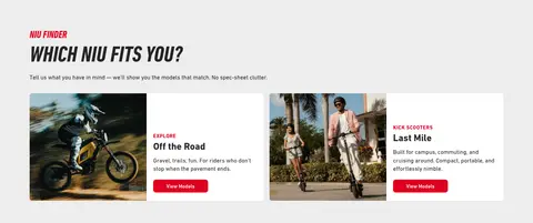
Finder cards Pale gray section with image-and-copy category cards, dark text, small red labels, and red View Models actions.
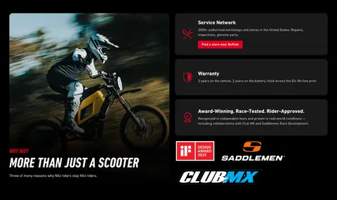
Benefit panel Near-black service and warranty cards with red icon accents, white headings, and compact supporting copy.
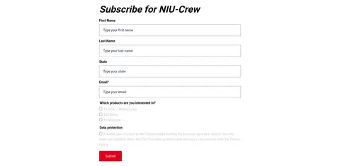
Newsletter form Narrow single-column signup form with stacked labeled fields, gray hairline borders, and a red submit action.
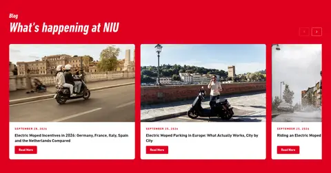
Blog feed Red content band featuring a horizontal row of white image-led article cards with dates and compact read actions.
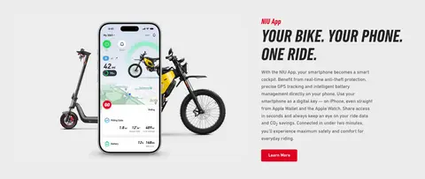
Imagery · Photography defines the page: action shots of riders, scooters, and urban or off-road settings appear as large, cinematic panels and split-section images. The hero is full-bleed, with campaign text and CTA over the image. Product and app imagery is presented clearly within lighter sections. Small icons and brand marks support statistics and service claims; they are secondary to the photography.
页面版块 共 9 个版块,按页面从上到下排列,每个都标了类型、布局和交互套路。
该做与不该做 ✓ 该做 Use NIU red (#df001f) for prominent actions and selective brand accents. Let high-quality rider and product photography dominate hero and feature areas. Use DIN for interface and body text, and DIN Condensed for emphatic headlines. Alternate light, gray, red, and dark section bands to structure the long page. Keep headlines bold, uppercase, and concise in campaign-led sections. Use flat cards and thin borders instead of decorative shadows. ✕ 不该做 Do not spread red across every section or use it as a constant background. Do not replace the photographic hero with a small decorative illustration. Do not use rounded, playful typography in place of the condensed headline style. Do not add prominent shadows or glossy gradients. Do not crowd major headlines with dense body copy. Do not treat measured incidental colors in photos as core brand colors. 给 AI 的提示词 想快速出一个同风格的新页面,把这段话连同 DESIGN.md 一起发给 AI。
复制 Build a new NIU-style page around Gallery White (#ffffff), with NIU Signal (#df001f) reserved for the brand strip, key CTAs, and selective labels. Use Carbon Ink (#242424) or Night Panel (#1a1a1a) for high-contrast feature areas, and Mist Gray (#ececec) for quiet section breaks. Set navigation and body copy in DIN or a close sans substitute; use bold condensed uppercase headlines for campaign moments. Lead with dramatic rider or product photography, then alternate clean split layouts, compact cards, and spacious content bands. Keep controls simple, with Steel Line (#979797) hairlines, minimal rounding, and no shadow-heavy elevation. Maintain clear hierarchy, readable supporting copy, and a deliberate rhythm between full-width imagery and concise editorial sections.
DESIGN.md Tailwind v4 CSS 变量 Design Tokens
---
title: "NIU design system"
variant: extended
source: https://global.niu.com/en-us
captured_at: 2026-10-12
theme: light
industry: automotive
generator: Design DNA (https://four.wiralomi.com/style/niu-com)
ai_generated: true
ai_label: "本文件由 AI 辅助生成:数值取自公开网页的实测样式,命名、用途说明与建议为模型解读。商标归原所有者。 / AI-assisted content"
---
# NIU · Design System
> Electric mobility with a bold, red pulse
**Theme:** light · **Industry:** automotive · **Source:** https://global.niu.com/en-us · **Captured:** 2026-10-12 (1440×900 desktop)
_AI-assisted content: values are measured from the public page at capture time; names, roles and guidance are model-written interpretations. Trademarks belong to their owners._
NIU’s homepage pairs a restrained navigation and editorial structure with dramatic, full-bleed riding photography. Signal red, condensed display headlines, and alternating light and dark sections create a confident, performance-led identity.
## North star
Let bold riding photography and condensed headlines lead, using NIU red as a precise accent across clean, alternating light and dark sections.
## Overview
The page uses white as its main canvas, letting large riding and product photographs carry much of the visual impact. NIU red (## Colors
| Name | Hex | Token | Group | Role |
|---|---|---|---|---|
| Gallery White | ` | `--color-gallery-white` | surface | Main canvas, light cards, form fields, and reversed text on dark or red areas. |
| NIU Signal | ` | `--color-niu-signal` | brand | Brand strip, primary CTAs, blog background, and small section labels. |
| Soft Signal | ` | `--color-soft-signal` | semantic | Measured faint button-related tint; keep limited to subtle control states, not a dominant brand color. |
| Carbon Ink | ` | `--color-carbon-ink` | neutral | Primary dark text and charcoal inverse sections, including service content and footer areas. |
| Steel Line | ` | `--color-steel-line` | neutral | Input and navigation hairlines, plus muted footer and interface details. |
| Mist Gray | ` | `--color-mist-gray` | surface | Soft neutral section band, notably behind the NIU Finder content. |
| Rider Black | ` | `--color-rider-black` | neutral | Deep inverse surfaces and occasional white-on-black links, buttons, or text. |
| Graphite Copy | ` | `--color-graphite-copy` | neutral | Secondary text where softer contrast is needed against light surfaces. |
| Pale Type | ` | `--color-pale-type` | neutral | Low-emphasis text detail; use sparingly for subdued supporting information. |
| Night Panel | ` | `--color-night-panel` | surface | Near-black feature cards, including service and rider-benefit panels. |
| Quiet Gray | ` | `--color-quiet-gray` | neutral | Low-priority text detail within dense secondary content. |
| Footer Slate | ` | `--color-footer-slate` | neutral | Subtle footer dividers and borders on dark surfaces. |
| Cool Alloy | ` | `--color-cool-alloy` | neutral | Muted secondary copy and small interface details. |
| Navigation Charcoal | ` | `--color-navigation-charcoal` | neutral | Primary navigation text and dark headline details on white. |
| Deep Blue Steel | ` | `--color-deep-blue-steel` | semantic | Measured isolated non-core detail; not a defining page surface or brand color. |
| Ash Copy | ` | `--color-ash-copy` | neutral | Occasional subdued supporting text on light areas. |
### Semantic aliases
`--color-canvas` → ` (Gallery White) · `--color-surface` → ` (Mist Gray) · `--color-surface-2` → ` (Rider Black) · `--color-surface-3` → ` (Carbon Ink) · `--color-surface-4` → ` (Night Panel) · `--color-text` → ` (Carbon Ink) · `--color-text-muted` → ` (Gallery White) · `--color-text-subtle` → ` (Graphite Copy) · `--color-border` → ` (Steel Line) · `--color-accent` → ` (NIU Signal) · `--color-on-accent` → ` (Gallery White)
### Contrast (WCAG 2.x)
| Text | Background | Ratio | Level |
|---|---|---|---|
| ` | ` | 15.52:1 | AAA |
| ` | ` | 13.14:1 | AAA |
| ` | ` | 1.35:1 | fail |
| ` | ` | 1.18:1 | fail |
| ` | ` | 21:1 | AAA |
| ` | ` | 15.52:1 | AAA |
| ` | ` | 8.86:1 | AAA |
| ` | ` | 7.5:1 | AAA |
| ` | ` | 2.37:1 | fail |
| ` | ` | 1.75:1 | fail |
## Typography
| Family | Token | Source | Weights | Role | Free substitute |
|---|---|---|---|---|---|
| din | `--font-body` | webfont | 400, 700, 500, 300, 600 | Navigation, body copy, buttons, forms, and general interface text. | Barlow |
| din-condensed | `--font-display` | webfont | 700, 600, 400 | Display headlines and emphatic section titles. | Roboto Condensed |
| Roboto | `--font-roboto` | webfont | 400, 700 | Form input text and small field details. | Roboto |
- **din:** Workhorse sans with regular-to-bold weights; sentence case for copy and labels, medium-weight controls.
- **din-condensed:** Bold condensed forms, frequently uppercase; creates the page’s athletic editorial voice.
- **Roboto:** Regular and bold weights; restrained use within form controls.
### Type scale — Perfect Fourth (ratio ≈ 1.362, base 16px)
| Role | Size | Weight | Line height | Letter spacing | Case | Family | Used for |
|---|---|---|---|---|---|---|---|
| display | 75px | 600 | 1 | 0 | uppercase | din-condensed | Large uppercase campaign statements and hero display copy. |
| h1 | 60px | 700 | 1.02 | 0.005em | uppercase | din-condensed | Primary uppercase hero or major section headline. |
| h2 | 40px | 400 | 1.05 | 0.005em | — | din-condensed | Section headings with a less forceful display treatment. |
| h3 | 37.5px | 700 | 1.02 | 0.005em | uppercase | din-condensed | Uppercase feature and content-section headlines. |
| h4 | 22px | 700 | 1.15 | 0 | — | din | Bold card titles and secondary headings. |
| body | 16px | 400 | 1.55 | 0 | — | din | Paragraphs, explanatory copy, and general page text. |
| caption | 12px | 400 | 1.2 | 0 | — | din | Small dates, fine print, and image or content metadata. |
| button | 16px | 500 | 1 | 0 | — | din | Primary action labels, including red CTA buttons. |
| nav | 16px | 500 | 3.25 | 0 | — | din | Header links and primary navigation labels. |
| eyebrow | 12px | 700 | 1.2 | 0.125em | uppercase | din | Compact uppercase section identifiers above headlines. |
OpenType features in use: `"tnum"` .
## Spacing & layout
- Base unit **4px**, density **comfortable**.
- Scale (most used values): 3, 4, 5, 6, 8, 10, 12, 14, 16, 17, 18, 20, 22, 23, 24, 28 px.
- Section rhythm 56px · element gap 16px · card padding 30px · max content width 600px.
A long, single-page layout uses full-width section bands with content arranged in centered containers and two-column splits. The measured content maximum is 600px; the screenshots show wider visual compositions around that content, especially for full-bleed photography and multi-column sections. Sections alternate between open white space, pale gray, red, and dark backgrounds. The page moves from a centered hero to a narrow form, finder cards, feature splits, stats, and a horizontal content feed. Comfortable section spacing contrasts with dense form controls and footer navigation.
## Shape & elevation
- Radius: button `4px` · card `14px` · media `14px` · nav `50%` · link `8px` · xs `4px` · sm `5px` · md `7px` · lg `8px` · xl `14px`
- No box shadows measured: the page is flat.
- Motion: standard transition `0.2s ease` on interactive elements.
The interface is mostly flat, with no measured shadows. Separation comes from alternating white, pale gray, red, and dark section backgrounds. Cards use restrained borders or simple fills, with measured rounded card and media corners; form fields rely on thin gray outlines rather than raised surfaces.
## Imagery
Photography defines the page: action shots of riders, scooters, and urban or off-road settings appear as large, cinematic panels and split-section images. The hero is full-bleed, with campaign text and CTA over the image. Product and app imagery is presented clearly within lighter sections. Small icons and brand marks support statistics and service claims; they are secondary to the photography.
## Components
### Primary CTA
NIU red (### Header navigation
White horizontal navigation with dark DIN links, a red brand strip, and understated spacing between utility links.
### Hero campaign
Full-bleed rider image with centered condensed uppercase headline and a red CTA overlaid near the top-center.
### Finder cards
Pale gray section with image-and-copy category cards, dark text, small red labels, and red View Models actions.
### Benefit panel
Near-black service and warranty cards with red icon accents, white headings, and compact supporting copy.
### Newsletter form
Narrow single-column signup form with stacked labeled fields, gray hairline borders, and a red submit action.
### Blog feed
Red content band featuring a horizontal row of white image-led article cards with dates and compact read actions.
### Measured component styles
- **Primary button** (“Find out more”): background ## Do
- Use NIU red (## Don't
- Do not spread red across every section or use it as a constant background.
- Do not replace the photographic hero with a small decorative illustration.
- Do not use rounded, playful typography in place of the condensed headline style.
- Do not add prominent shadows or glossy gradients.
- Do not crowd major headlines with dense body copy.
- Do not treat measured incidental colors in photos as core brand colors.
## Agent prompt
Build a new NIU-style page around Gallery White (## Page sections (top to bottom)
| # | Type | Layout | UX patterns | UI patterns |
|---|---|---|---|---|
| 1 | hero | Full-bleed campaign imagery with centered headline and CTA. | campaign CTA, multiple campaign messages | full-bleed photography, condensed headline, red button |
| 2 | newsletter | Narrow, single-column form centered within a white section. | email signup, interest selection, consent capture | stacked inputs, hairline field borders, red submit button |
| 3 | category-nav | Pale gray band with two side-by-side image-and-copy category cards. | model discovery, category browsing | paired image cards, red category labels, View Models actions |
| 4 | feature-grid | Dark two-column section with large feature image and stacked benefit panels. | service reassurance, warranty information | near-black background, red icons, compact benefit cards |
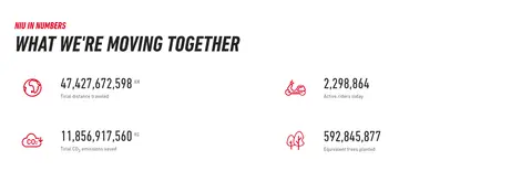
| 5 | stats | White two-column stats layout with paired rows and icon labels. | impact metrics, quick scanning | red line icons, large figures, muted captions |
| 6 | content-feed | Red full-width band with a horizontal row of article cards. | article discovery, carousel browsing | white image cards, date labels, compact read buttons |
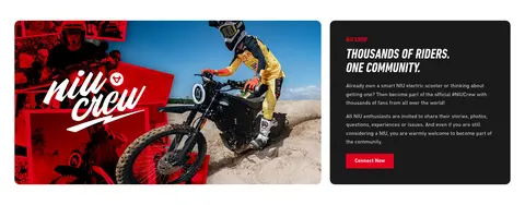
| 7 | feature-split | Two-column white section pairing a wide community image with dark copy panel. | community invitation, membership CTA | rider collage, dark text card, red action button |
| 8 | feature-split | Light gray split section with app-and-vehicle imagery opposite copy. | app feature explanation, learn more CTA | product mockup, condensed headline, red button |
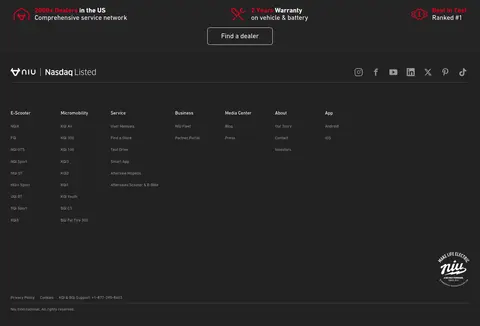
| 9 | footer | Dense, dark multi-column footer with service highlights, social links, and product navigation. | dealer discovery, product navigation, social follow | dark footer, small links, brand and social marks |
## Source CSS custom properties (selected)
```css
--color--black: #000;
--color--primary: