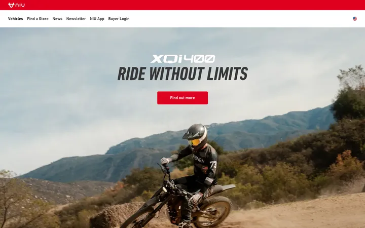
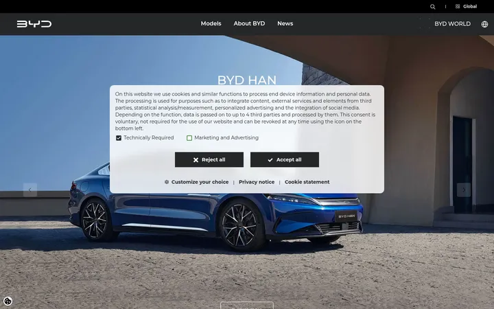
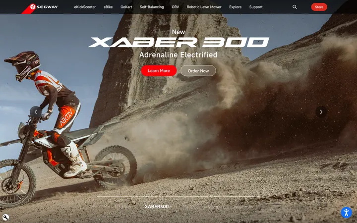
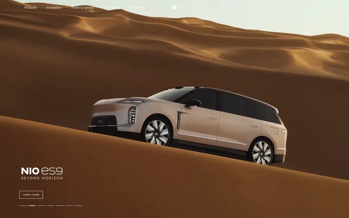
North star · Let cinematic vehicle photography lead, and keep the surrounding interface quiet, sharp, and mostly monochrome.
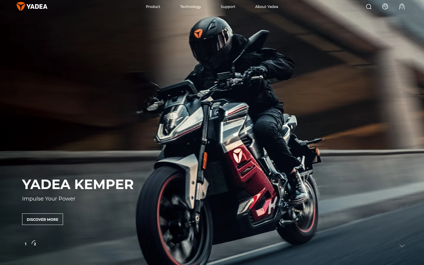
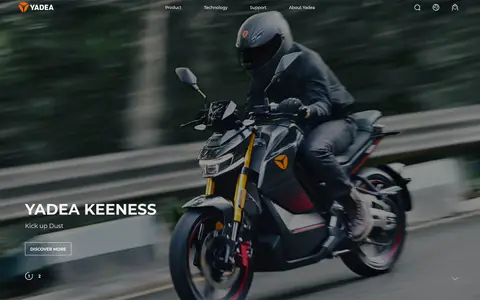
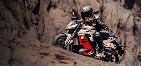
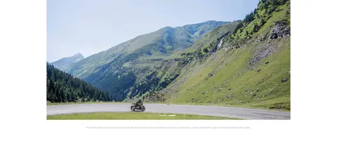
The visual strategy contrasts a clean, mostly white interface with immersive, full-bleed motorcycle photography. Near-black text carries the navigation, product labels, and editorial content, while Yadea orange is reserved for the logo and small brand signals rather than broad colour fields. Montserrat supplies a consistent geometric sans-serif voice: bold, compact headings establish hierarchy, while medium-weight body copy and small links keep supporting information quiet. The layout alternates cinematic product imagery with open white intervals, a sustainability story, and a pale-gray news band. Images do most of the expressive work, with riders and vehicles framed in motion or against scenic landscapes. Content sections feel spacious and restrained, while the footer shifts to a dark surface and dense, clearly grouped link columns. Borders and controls are flat and rectangular, keeping attention on the photography rather than decorative UI.
Primary interface and editorial type across navigation, headings, body copy, and links.
Aa 设计
Montserrat-Medium
网络字体 · 字重 500 · 占比 3%
免费替代:Montserrat
Medium-weight display or product text where the measured page uses this separately named face.
角色
示例
字号
字重
行高
字距
一级标题
Hero product name and principal display headline.
Yadea
45px
600
1.22
0
二级标题
Major section headings, including News & Events.
Yadea
30px
700
1.23
0
三级标题
Product-feature titles and secondary display headings.
Yadea
29px
500
1.02
0
四级标题
Supporting section or card headings.
The quick brown fox 敏捷的狐狸
22.5px
700
1.23
0
正文
Explanatory copy and supporting product or sustainability text.
The quick brown fox 敏捷的狐狸
15px
500
1.7
0
辅助文字
News dates, image notes, and fine-print details.
The quick brown fox 敏捷的狐狸
12px
400
2
0
链接
Compact navigation, calls to action, and editorial links.
The quick brown fox 敏捷的狐狸
12px
500
1.25
0
间距与布局
基准单位 2px · 密度:适中
90px版块间距
11px元素间距
—卡片内边距
720px内容最大宽度
3px
4px
5px
8px
9px
11px
16px
18px
27px
28px
30px
32px
38px
56px
57px
75px
Use a broad, media-first page structure with full-bleed hero and product imagery alternating with centered content and open white sections. The measured page max-width is 720px for constrained content; keep smaller editorial and footer groupings aligned consistently within their wider bands. Section rhythm is spacious, with clear transitions between product storytelling, sustainability, news, and footer. The news area uses a three-column card presentation; the footer organizes links into multiple columns. Keep the overall density comfortable and let blank space separate stories rather than relying on boxes.
圆角与层次
没有测到阴影:页面是扁平的,层次靠底色和描边区分。
The interface is predominantly flat: measured cards have no shadow and no rounded corners, and the card treatment relies on spacing and background contrast. Use thin, rectangular outlines for outlined calls to action. Layer navigation and hero copy directly over photography with sufficient contrast; use the dark footer as a distinct closing plane rather than adding ornamental elevation.
组件
下面的预览按实测的按钮、输入框、徽标、卡片样式重建(字体用替代字体)。
Overlay navigation
Place the logo and compact navigation over the full-bleed hero; use light navigation text and restrained icon controls.
Hero call to action
Pair a product title and short supporting line with a compact, rectangular outlined link; measured CTA text is bold Montserrat.
Product showcase
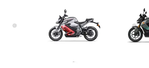
Alternate large riding imagery with isolated vehicle views on white, supported by concise product labels and learn-more links.
Sustainability figures
Present three prominent impact metrics with simple orange line icons and short explanatory captions on a light background.
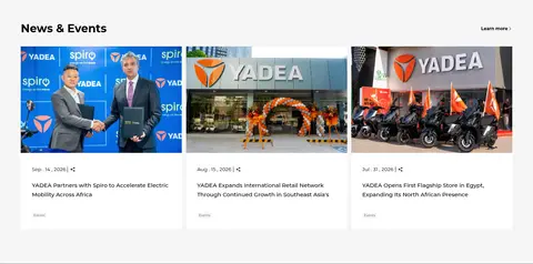
News cards
Use a pale-gray section band and a three-column editorial card row with image, date, headline, and small category text.
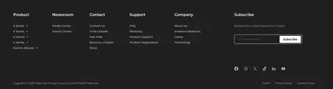
Multi-column footer
Use a #1f1f1f surface for grouped product and support links, social icons, and a compact email subscription control.
Imagery · Use high-quality, cinematic photography of electric motorcycles and riders, often captured in motion or against roads and natural landscapes. The hero is full-bleed with dark tonal treatment that keeps white navigation and copy legible. Product panels also use isolated vehicle photography against white, while sustainability content pairs scenic landscapes with simple data graphics. The measured palette’s cinematic darks largely come from photography, not interface colours.
Lead with a full-bleed, cinematic electric-motorcycle image.
Keep interface surfaces predominantly white and typography black.
Reserve Yadea Orange for small, high-signal brand details.
Use Montserrat with clear weight-based hierarchy.
Alternate immersive photography with calm, open content sections.
Use pale gray to distinguish the news band and dark graphite for the footer.
✕ 不该做
Do not add gradients or decorative shadows to flat components.
Do not make orange the dominant page background.
Do not box every section or card with heavy borders.
Do not compete with product photography using dense interface decoration.
Do not round rectangular controls or cards without measured evidence.
Do not use saturated colours as interface accents beyond the measured palette.
给 AI 的提示词
想快速出一个同风格的新页面,把这段话连同 DESIGN.md 一起发给 AI。
Build a new Yadea-style page around cinematic electric-mobility photography and a restrained interface. Use Gallery White (#ffffff) as the main canvas, Carbon Ink (#000000) for primary text, Mist Gray (#f6f6f6) for a quiet editorial band, and Night Graphite (#1f1f1f) for the footer. Treat Yadea Orange (#ff5f00) as a small logo or link accent, not a large colour block. Set type in Montserrat, using weight and scale for hierarchy rather than tracking or decorative effects. Give the hero and product stories room to breathe; alternate full-width imagery with clean content areas. Use simple rectangular outlined calls to action, flat news cards, and an organized multi-column footer. Keep the overall rhythm spacious and let photography carry the emotion.