North star · Let oversized black type and open white space lead; use rounded pastel accents only to identify services and guide action.
The page builds its identity from a restrained palette: white canvas and warm off-white surfaces carry most of the content, while black anchors headings, navigation, and pill-shaped calls to action. Lavender and acid lime act as recognizable service markers, with blue appearing in category cues and map media rather than as a dominant interface colour. Founders Grotesk gives the page a distinctive, compact sans-serif voice: very large, lightweight display text contrasts with bold headings and plain, readable body copy. Layout alternates centered brand statements with left-aligned, two-column feature compositions and broad media areas. Rounded corners soften the otherwise crisp typography, from small controls to large feature panels. Imagery mixes charging-related video, a map visualization, app-store badges, and real-world photography. Generous gaps separate sections, while subtle lavender-tinted shadows give selected pills and cards a gentle lift without making the page feel glossy or layered.
配色
点色块复制色值。用途说明来自对页面的实测位置(背景、文字、描边、按钮)与截图判读。
品牌色
强调色
表层色
中性色
功能色
页面底色 · Open Canvas表层 · Warm Mist表层 2 · Stone Haze表层 3 · Eddie Lavender主文字 · Charging Ink描边 · Quiet Line强调 · Eddie Lavender强调 2 · Charge Lime
Display, headings, body copy, navigation, and links throughout the page.
角色
示例
字号
字重
行高
字距
特大标题
Oversized brand wordmark and primary hero statement.
Eddie
119px
400
0.8
0
一级标题
Main page or feature headline, including prominent hero messaging.
Eddie
67.5px
600
0.8
0
二级标题
Major section titles and bold, high-priority feature headings.
Eddie
66.5px
700
0.8
0
三级标题
Supporting feature headings and secondary editorial statements.
Eddie
30px
400
1.1
0
四级标题
Compact card titles and smaller bold content headings.
The quick brown fox 敏捷的狐狸
26.5px
700
1
0
正文
Explanatory copy, solution descriptions, and service details.
The quick brown fox 敏捷的狐狸
18px
400
1.1
0
辅助文字
Small labels, category cues, and supporting interface text.
The quick brown fox 敏捷的狐狸
16px
400
0.8
0
导航
Primary navigation links and emphasized current destinations.
The quick brown fox 敏捷的狐狸
18px
600
1.1
0
链接
Strong inline or card links, including solution calls to action.
The quick brown fox 敏捷的狐狸
18px
700
1.1
0
间距与布局
基准单位 2px · 密度:适中
60px版块间距
10px元素间距
10px卡片内边距
1360px内容最大宽度
1px
5px
7px
10px
13px
15px
20px
30px
40px
60px
100px
Use a centered content area capped at the measured 1360px page width, with broad white margins and a comfortable, low-density rhythm. The navigation and hero center the brand; subsequent sections alternate between full-width media and two-column feature layouts. Large centered section headings create pauses between content groups. Use the measured 60px section gap as the rhythm reference and the 10px element gap for compact clusters. Keep card interiors relaxed, with measured 30px padding where appropriate.
圆角与层次
按钮 · 15px
卡片 · 40px
图片 · 15px
导航 · 9999px
链接 · 25px
md · link, card, button
sm · other
sm · button
Most sections are flat, separated by whitespace and occasional pale surface changes rather than borders or heavy shadows. Use the measured lavender-tinted shadow sparingly on select links, cards, and contact controls. Rounded card corners create the main sense of layering; keep borders fine and neutral.
组件
下面的预览按实测的按钮、输入框、徽标、卡片样式重建(字体用替代字体)。
Announcement bar
A slim white strip at the top with centered acquisition news, compact bold press-release link, and a fine neutral divider.
Pill navigation
A spacious white header with the Eddie/home mark at left and compact menu and black interest controls at right; use rounded control silhouettes.
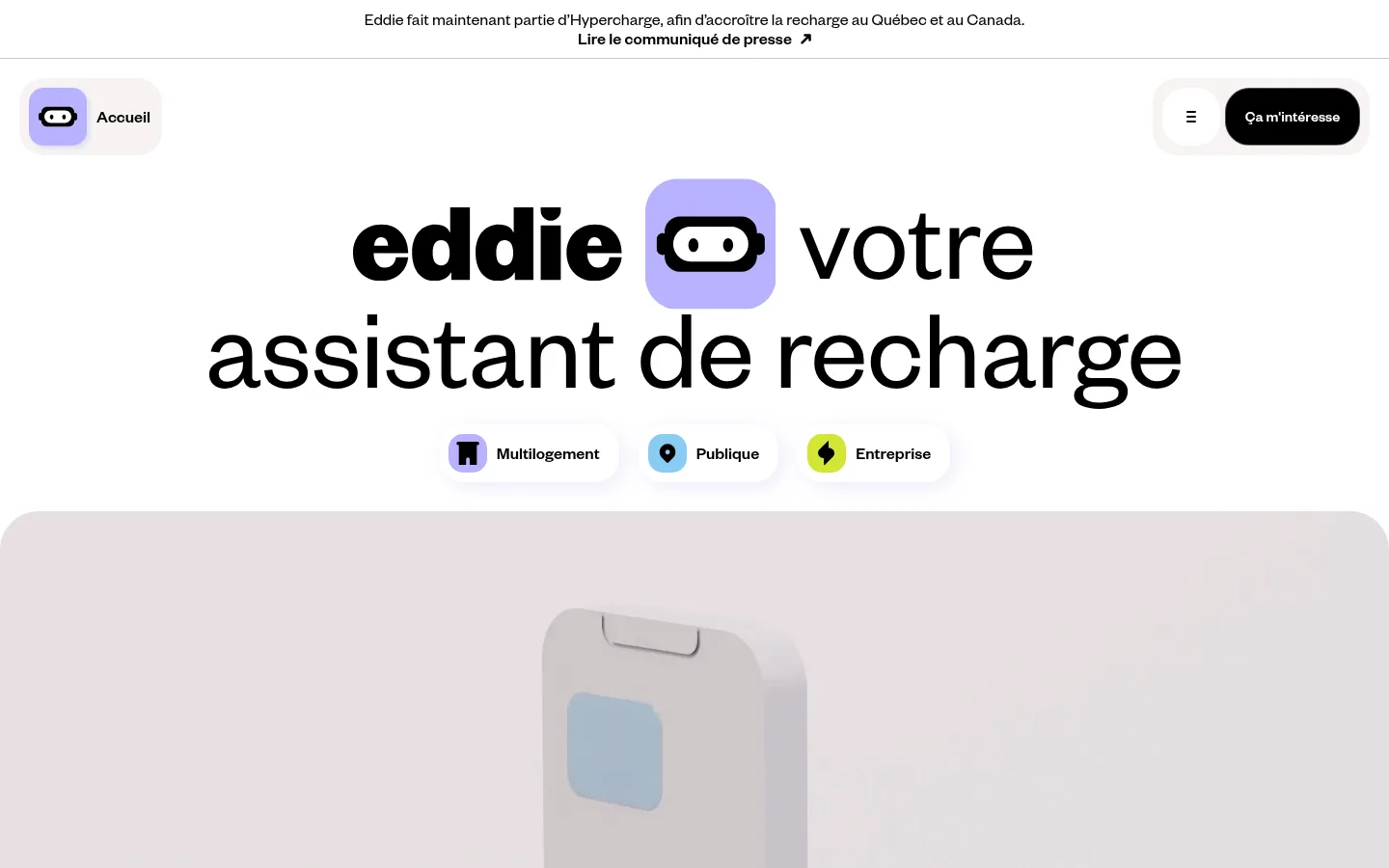
Hero identity
Center a large black Eddie wordmark and assistant statement; place a lavender Eddie mark inline and a row of small service-category pills beneath.
Service category cues
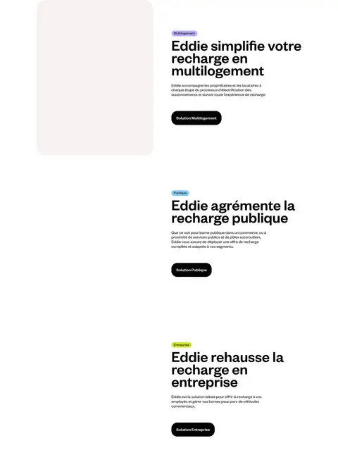
Use compact rounded white pills with lavender, blue, or lime icon tiles to distinguish Multilogement, Publique, and Entreprise.
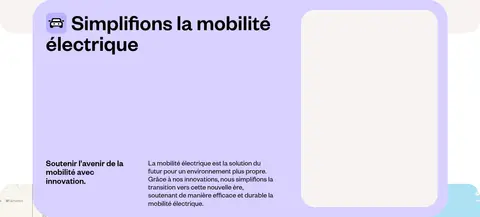
Feature panel
Pair a strong heading and concise explanatory copy with video or media in a two-column composition; use a lavender feature surface where shown.
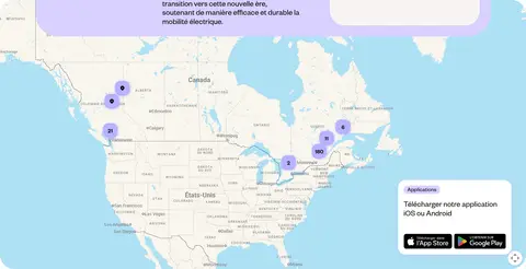
Applications card
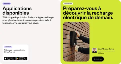
Place download messaging and Apple/Google store badges in a warm off-white rounded panel, paired with a bright lime promotional card.
Footer identity
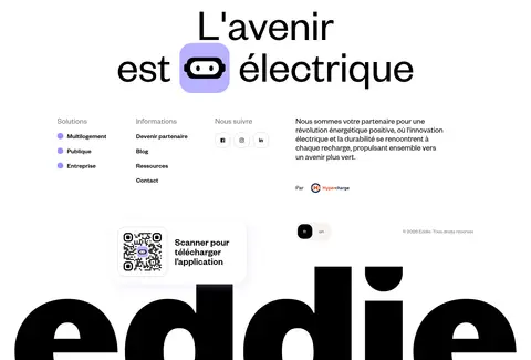
Finish with a centered electric-future statement and Eddie mark, followed by compact link groups, social icons, partner note, and oversized wordmark artwork.
Imagery · Use charging-related video as broad, immersive media, with softly rounded edges where the media sits inside a panel. Support the story with map imagery and small service illustrations, app-store badges, and a real-world charging photograph. Keep image colour natural and subdued; lavender, blue, and lime icon backgrounds should read as interface markers rather than filters over photography.
Pair oversized headlines with concise supporting copy.
Use rounded corners on pills and feature cards.
Give each section generous breathing room.
✕ 不该做
Do not fill every section with colour.
Do not use gradients as a substitute for the flat palette.
Do not crowd the hero with extra copy or controls.
Do not add heavy shadows to every card.
Do not recolour photography with strong brand tints.
Do not use rigid, sharp-cornered card styling.
给 AI 的提示词
想快速出一个同风格的新页面,把这段话连同 DESIGN.md 一起发给 AI。
Build a new Eddie-style page with Founders Grotesk or a close sans-serif substitute. Start with an open white canvas (#ffffff), Charging Ink (#000000) typography, and a sparse rounded header. Use Warm Mist (#f7f4f2) for quiet panels; reserve Eddie Lavender (#d8d1ff) and Charge Lime (#d2e534) for service markers and selected feature surfaces. Organize content into spacious sections: a bold centered introduction, clear feature blocks, and practical actions. Alternate centered statements with two-column media and copy layouts. Use natural charging photography, map visuals, or video without heavy colour treatment. Keep corners rounded, borders discreet, and lavender-tinted shadows limited to a few controls. Prioritize readable copy, clear calls to action, generous whitespace, and a friendly rather than technical tone.