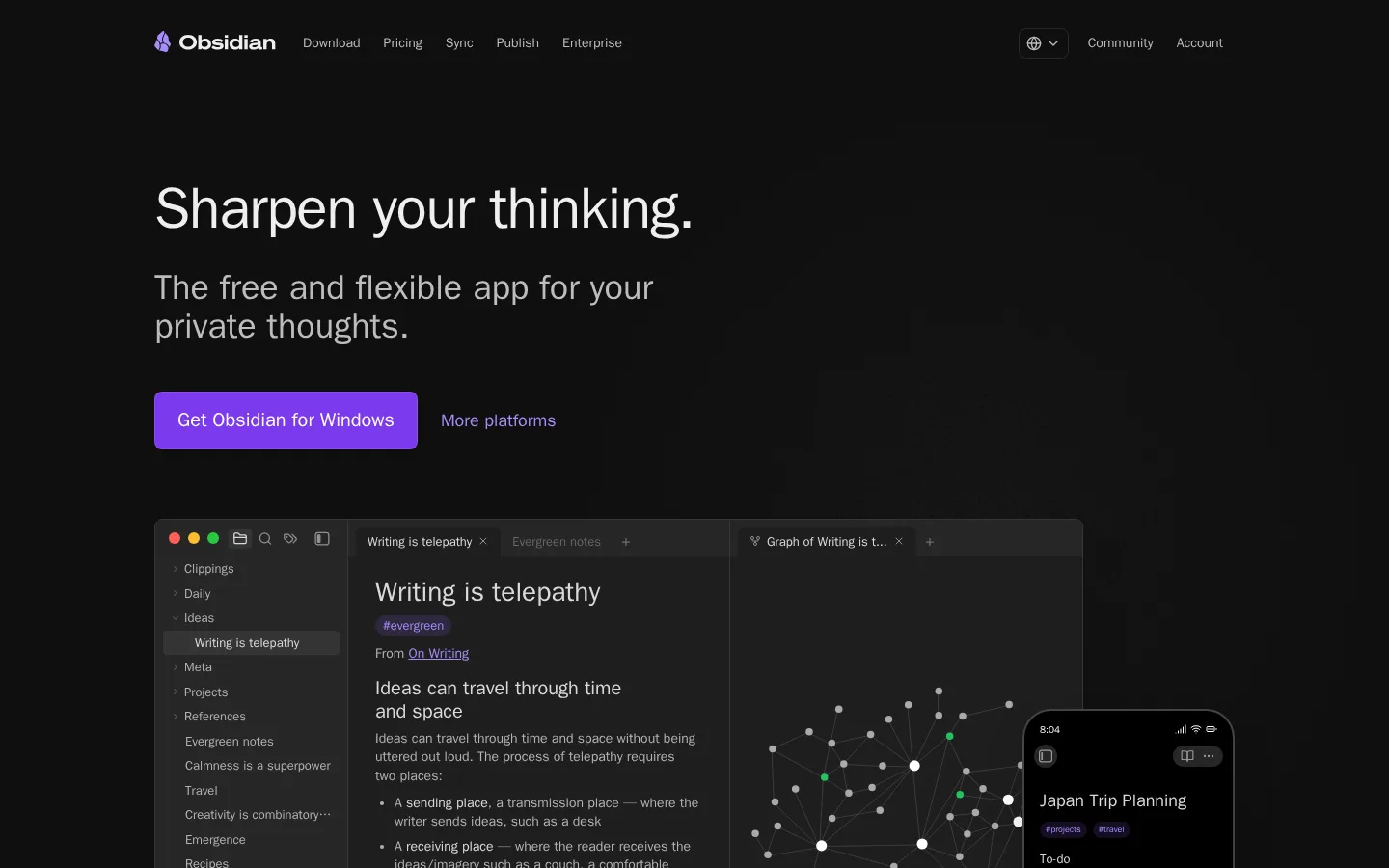
Obsidian 首页以近黑色画布和克制的紫色点缀,直接展示产品界面。宽松的分区与简洁文案,突出它作为私密灵活思考空间的定位。
North star · Keep the canvas nearly black and spacious; use violet sparingly to direct attention toward actions and meaningful links.
The page is built on a nearly black canvas, with subtle charcoal bands and cards creating contrast without breaking the dark, quiet mood. Off-white headings and two close shades of gray carry most of the reading; violet is reserved for the primary download action, selected links, and small interface details. System sans-serif typography keeps the page crisp and familiar, moving from a large, tightly tracked hero headline to compact descriptive copy. A centered, constrained content area alternates between product-led showcases and feature sections, with generous vertical pauses between them. Screenshots of the desktop and mobile app do most of the storytelling: they are framed as dark interface surfaces rather than decorative lifestyle imagery. Rounded cards, fine borders, and restrained inset highlights establish depth, while the mostly flat canvas prevents the long page from feeling crowded. The overall effect is calm, technical, and focused on the product itself.
配色 点色块复制色值。用途说明来自对页面的实测位置(背景、文字、描边、按钮)与截图判读。
品牌色
Obsidian Canvas
#0f0f0f
Dominant page background across the hero and all major sections.
强调色
Lavender Signal
#a78bfa
Prominent text links and small violet accents.
Violet Edge
#8a5cf5
Sparse badge and decorative details; not a dominant page color.
Action Violet
#7c3aed
Primary download buttons with white text.
表层色
Charcoal Panel
#1f1f1f
Feature cards and community link panels.
Deep Panel
#171717
Subtle card and inset surface variation.
Divider Charcoal
#262626
Fine card borders and understated content separators.
中性色
Soft Ash
#bcbcbc
Muted navigation, footer, and link text against the dark canvas.
Cloud Text
#eeeeee
Headings, card copy, and high-contrast interface text.
Muted Silver
#b3b3b3
Supporting body copy and secondary information.
Graphite Line
#404040
Hairline borders and subdued control backgrounds.
Slate Border
#363636
Occasional outlines and media boundaries.
Paper White
#ffffff
Light surfaces within interface previews and badge details.
功能色
Graph Green
#22c55e
Small status badges and green nodes inside product interface imagery.
Graph Gold
#eab308
Badge color appearing in embedded product content, not core branding.
Interface Indigo
#6366f1
Minor badge or UI detail; keep limited to product imagery.
Interface Coral
#f87171
Minor badge or UI detail; not a defining page color.
Earth Accent
#713f12
Color found in embedded product content; avoid using as a page-level brand accent.
文字 背景 对比度 WCAG #eeeeee Cloud Text#0f0f0f Obsidian Canvas16.52:1 AAA #eeeeee Cloud Text#1f1f1f Charcoal Panel14.21:1 AAA #eeeeee Cloud Text#171717 Deep Panel15.45:1 AAA #eeeeee Cloud Text#ffffff Paper White1.16:1 不达标 #bcbcbc Soft Ash#0f0f0f Obsidian Canvas10.09:1 AAA #bcbcbc Soft Ash#1f1f1f Charcoal Panel8.68:1 AAA
字体 字号阶梯:Perfect Fourth(比例约 1.338,正文 14px)。示例用免费替代字体渲染,数值为实测。
Aa 设计
ui-sans-serif 系统字体 · 字重 400 / 500 / 600 / 700 · 占比 100%
免费替代:Inter
Navigation, hero and section headings, body copy, links, and buttons.
角色 示例 字号 字重 行高 字距 特大标题 Oversized hero headline, set compactly with slightly tight tracking.
Obsidian
60px 600 1 -0.02em 一级标题 Primary section headings and large feature titles.
Obsidian
36px 400 1.11 0 二级标题 Secondary feature headings and prominent supporting copy.
The quick brown fox 敏捷的狐狸
24px 400 1.33 0 三级标题 Card titles and smaller feature headings.
The quick brown fox 敏捷的狐狸
20px 400 1.25 0 四级标题 Tertiary headings and compact content group labels.
The quick brown fox 敏捷的狐狸
18px 400 1.33 0 正文 Main descriptive copy and supporting feature text.
The quick brown fox 敏捷的狐狸
14px 400 1.4 0 辅助文字 Small labels and secondary interface-like details.
The quick brown fox 敏捷的狐狸
13px 400 1.5 0 按钮 Primary download call-to-action labels.
The quick brown fox 敏捷的狐狸
20px 500 1.4 0 导航 Header links and compact navigation controls.
The quick brown fox 敏捷的狐狸
14px 500 1.43 0 链接 Large standalone action links such as download prompts.
The quick brown fox 敏捷的狐狸
24px 500 1.33 0
间距与布局 基准单位 4px · 密度:宽松
96px 版块间距
6px 元素间距
— 卡片内边距
1120px 内容最大宽度
2px
3px
4px
6px
8px
12px
16px
23px
24px
32px
48px
96px
Use a centered content frame with a measured maximum width of 1120px and generous side margins. The hero is left-aligned, with headline and download actions above a large product preview. Lower sections alternate between single-column narratives, two-column feature splits, and card grids; the final CTA is centered. Preserve the spacious rhythm: the measured section gap is 96px, while compact text and card groupings sit closer together. Keep overall density low and avoid introducing strong background bands, since the page sections share one canvas.
圆角与层次 inset · card, link
lg · card
inset · button, footer
inset · button
The canvas is mostly flat. Cards gain separation through charcoal fills, subtle borders, and faint inset highlights rather than strong outlines. Layer product screenshots and small device previews over dark surfaces; reserve deeper shadows for media and card emphasis, keeping them understated.
组件 下面的预览按实测的按钮、输入框、徽标、卡片样式重建(字体用替代字体)。
Header navigation Compact horizontal navigation on the dark canvas, with subdued links and brand mark; selected controls use a quiet outlined treatment.
Hero download action Violet button with white text, an 8px radius, and generous horizontal padding; a muted text link sits alongside it.
Product showcase Large desktop app preview with a smaller mobile screen layered near its lower edge, both set against the dark canvas.
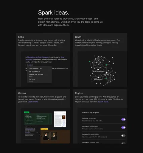
Feature card Charcoal card with a rounded 12px corner, product-focused title and copy, and an embedded interface image.
Feature split Text and feature details share a broad two-column composition with a prominent app or sync interface preview.
Community link card Dark rounded panel with a concise destination title and explanatory copy, presented as a clickable support resource.
Footer Dense multi-column directory on the dark canvas, with a brand and social area beside grouped navigation links.
Imagery · Lead with detailed desktop and mobile screenshots of the app, showing notes, graph views, and real interface content. Feature cards use cropped interface previews as evidence of functionality rather than decorative photography. Product imagery stays dark and framed within rounded media surfaces, with occasional violet or green interface details. No prominent photography or video-led treatment is visible.
页面版块 共 7 个版块,按页面从上到下排列,每个都标了类型、布局和交互套路。
该做与不该做 ✓ 该做 Use #0f0f0f as the continuous page canvas. Reserve #7c3aed for the primary download action. Use #a78bfa for select text links and accents. Show realistic product interfaces as the main visual proof. Leave generous vertical pauses between major sections. Use charcoal surfaces and fine borders to define cards. ✕ 不该做 Do not introduce bright section backgrounds. Do not use violet as a large decorative field. Do not replace product screenshots with lifestyle photography. Do not crowd the page with dense copy or controls. Do not add heavy shadows or thick borders. Do not treat illustration-only badge colors as core brand colors. 给 AI 的提示词 想快速出一个同风格的新页面,把这段话连同 DESIGN.md 一起发给 AI。
复制 Build a new page in Obsidian’s restrained dark product style. Use Obsidian Canvas (#0f0f0f) as the continuous background, Cloud Text (#eeeeee) for headings, and Soft Ash (#bcbcbc) or Muted Silver (#b3b3b3) for supporting copy. Use Action Violet (#7c3aed) only for the main CTA, with Lavender Signal (#a78bfa) on selected text links. Keep content within a centered 1120px maximum-width frame and preserve spacious section breaks. Use system sans-serif typography, crisp headings, and compact readable body copy. Make product screenshots or interface mockups the primary imagery. Build cards from Charcoal Panel (#1f1f1f) and Deep Panel (#171717), with subtle borders and rounded corners. Keep the overall page calm, technical, and uncluttered; avoid loud gradients, decorative photography, and excessive shadows.
DESIGN.md Tailwind v4 CSS 变量 Design Tokens
---
title: "Obsidian design system"
variant: extended
source: https://obsidian.md/
captured_at: 2026-10-12
theme: dark
industry: productivity
generator: Design DNA (https://four.wiralomi.com/style/obsidian-md)
ai_generated: true
ai_label: "本文件由 AI 辅助生成:数值取自公开网页的实测样式,命名、用途说明与建议为模型解读。商标归原所有者。 / AI-assisted content"
---
# Obsidian · Design System
> A quiet dark canvas for connected thinking.
**Theme:** dark · **Industry:** productivity · **Source:** https://obsidian.md/ · **Captured:** 2026-10-12 (1440×900 desktop)
_AI-assisted content: values are measured from the public page at capture time; names, roles and guidance are model-written interpretations. Trademarks belong to their owners._
Obsidian’s homepage pairs a near-black canvas with restrained violet accents and direct views of the product. Spacious sections and concise copy frame the app as a private, flexible workspace for thinking.
## North star
Keep the canvas nearly black and spacious; use violet sparingly to direct attention toward actions and meaningful links.
## Overview
The page is built on a nearly black canvas, with subtle charcoal bands and cards creating contrast without breaking the dark, quiet mood. Off-white headings and two close shades of gray carry most of the reading; violet is reserved for the primary download action, selected links, and small interface details. System sans-serif typography keeps the page crisp and familiar, moving from a large, tightly tracked hero headline to compact descriptive copy. A centered, constrained content area alternates between product-led showcases and feature sections, with generous vertical pauses between them. Screenshots of the desktop and mobile app do most of the storytelling: they are framed as dark interface surfaces rather than decorative lifestyle imagery. Rounded cards, fine borders, and restrained inset highlights establish depth, while the mostly flat canvas prevents the long page from feeling crowded. The overall effect is calm, technical, and focused on the product itself.
## Colors
| Name | Hex | Token | Group | Role |
|---|---|---|---|---|
| Obsidian Canvas | ` | `--color-obsidian-canvas` | brand | Dominant page background across the hero and all major sections. |
| Soft Ash | ` | `--color-soft-ash` | neutral | Muted navigation, footer, and link text against the dark canvas. |
| Lavender Signal | ` | `--color-lavender-signal` | accent | Prominent text links and small violet accents. |
| Charcoal Panel | ` | `--color-charcoal-panel` | surface | Feature cards and community link panels. |
| Cloud Text | ` | `--color-cloud-text` | neutral | Headings, card copy, and high-contrast interface text. |
| Muted Silver | ` | `--color-muted-silver` | neutral | Supporting body copy and secondary information. |
| Violet Edge | ` | `--color-violet-edge` | accent | Sparse badge and decorative details; not a dominant page color. |
| Action Violet | ` | `--color-action-violet` | accent | Primary download buttons with white text. |
| Graph Green | ` | `--color-graph-green` | semantic | Small status badges and green nodes inside product interface imagery. |
| Deep Panel | ` | `--color-deep-panel` | surface | Subtle card and inset surface variation. |
| Divider Charcoal | ` | `--color-divider-charcoal` | surface | Fine card borders and understated content separators. |
| Graph Gold | ` | `--color-graph-gold` | semantic | Badge color appearing in embedded product content, not core branding. |
| Interface Indigo | ` | `--color-interface-indigo` | semantic | Minor badge or UI detail; keep limited to product imagery. |
| Interface Coral | ` | `--color-interface-coral` | semantic | Minor badge or UI detail; not a defining page color. |
| Graphite Line | ` | `--color-graphite-line` | neutral | Hairline borders and subdued control backgrounds. |
| Slate Border | ` | `--color-slate-border` | neutral | Occasional outlines and media boundaries. |
| Paper White | ` | `--color-paper-white` | neutral | Light surfaces within interface previews and badge details. |
| Earth Accent | ` | `--color-earth-accent` | semantic | Color found in embedded product content; avoid using as a page-level brand accent. |
### Semantic aliases
`--color-canvas` → ` (Obsidian Canvas) · `--color-surface` → ` (Charcoal Panel) · `--color-surface-2` → ` (Deep Panel) · `--color-surface-3` → ` (Paper White) · `--color-surface-4` → ` (Earth Accent) · `--color-text` → ` (Cloud Text) · `--color-text-muted` → ` (Soft Ash) · `--color-text-subtle` → ` (Muted Silver) · `--color-border` → ` (Graphite Line) · `--color-accent` → ` (Lavender Signal) · `--color-accent-2` → ` (Action Violet) · `--color-accent-3` → ` (Earth Accent) · `--color-on-accent` → ` (Paper White)
### Contrast (WCAG 2.x)
| Text | Background | Ratio | Level |
|---|---|---|---|
| ` | ` | 16.52:1 | AAA |
| ` | ` | 14.21:1 | AAA |
| ` | ` | 15.45:1 | AAA |
| ` | ` | 1.16:1 | fail |
| ` | ` | 10.09:1 | AAA |
| ` | ` | 8.68:1 | AAA |
| ` | ` | 9.44:1 | AAA |
| ` | ` | 1.9:1 | fail |
| ` | ` | 9.14:1 | AAA |
| ` | ` | 7.86:1 | AAA |
### Gradients
- `linear-gradient(to top, rgb(15, 15, 15), rgba(15, 15, 15, 0))`
## Typography
| Family | Token | Source | Weights | Role | Free substitute |
|---|---|---|---|---|---|
| ui-sans-serif | `--font-body` | system | 400, 500, 600, 700 | Navigation, hero and section headings, body copy, links, and buttons. | Inter |
- **ui-sans-serif:** System sans-serif throughout; use regular to semibold weights, with slight negative tracking on display text and no forced uppercase.
### Type scale — Perfect Fourth (ratio ≈ 1.338, base 14px)
| Role | Size | Weight | Line height | Letter spacing | Case | Family | Used for |
|---|---|---|---|---|---|---|---|
| display | 60px | 600 | 1 | -0.02em | — | ui-sans-serif | Oversized hero headline, set compactly with slightly tight tracking. |
| h1 | 36px | 400 | 1.11 | 0 | — | ui-sans-serif | Primary section headings and large feature titles. |
| h2 | 24px | 400 | 1.33 | 0 | — | ui-sans-serif | Secondary feature headings and prominent supporting copy. |
| h3 | 20px | 400 | 1.25 | 0 | — | ui-sans-serif | Card titles and smaller feature headings. |
| h4 | 18px | 400 | 1.33 | 0 | — | ui-sans-serif | Tertiary headings and compact content group labels. |
| body | 14px | 400 | 1.4 | 0 | — | ui-sans-serif | Main descriptive copy and supporting feature text. |
| caption | 13px | 400 | 1.5 | 0 | — | ui-sans-serif | Small labels and secondary interface-like details. |
| button | 20px | 500 | 1.4 | 0 | — | ui-sans-serif | Primary download call-to-action labels. |
| nav | 14px | 500 | 1.43 | 0 | — | ui-sans-serif | Header links and compact navigation controls. |
| link | 24px | 500 | 1.33 | 0 | — | ui-sans-serif | Large standalone action links such as download prompts. |
## Spacing & layout
- Base unit **4px**, density **spacious**.
- Scale (most used values): 2, 3, 4, 6, 8, 12, 16, 23, 24, 32, 48, 96 px.
- Section rhythm 96px · element gap 6px · card padding — · max content width 1120px.
Use a centered content frame with a measured maximum width of 1120px and generous side margins. The hero is left-aligned, with headline and download actions above a large product preview. Lower sections alternate between single-column narratives, two-column feature splits, and card grids; the final CTA is centered. Preserve the spacious rhythm: the measured section gap is 96px, while compact text and card groupings sit closer together. Keep overall density low and avoid introducing strong background bands, since the page sections share one canvas.
## Shape & elevation
- Radius: button `8px` · card `12px` · media `4px` · badge `2px` · nav `8px` · link `12px` · xs `2px` · sm `4px` · md `6px` · lg `8px` · xl `12px` · pill `9999px`
- Shadow `inset` (card, link): `rgb(255, 255, 255) 0px 0px 0px 0px inset, rgba(255, 255, 255, 0.05) 0px 0px 0px 1px inset, rgba(0, 0, 0, 0) 0px 0px 0px 0px`
- Shadow `lg` (card): `rgba(0, 0, 0, 0) 0px 0px 0px 0px, rgba(0, 0, 0, 0) 0px 0px 0px 0px, rgba(0, 0, 0, 0.1) 0px 20px 25px -5px, rgba(0, 0, 0, 0.1) 0px 8px 10px -6px`
- Shadow `inset-2` (button, footer): `rgb(255, 255, 255) 0px 0px 0px 0px inset, rgba(255, 255, 255, 0.1) 0px 0px 0px 1px inset, rgba(0, 0, 0, 0) 0px 0px 0px 0px`
- Shadow `inset-3` (button): `rgb(255, 255, 255) 0px 0px 0px 0px inset, rgba(255, 255, 255, 0.1) 0px 0px 0px 1px inset, rgba(0, 0, 0, 0.1) 0px 1px 3px 0px, rgba(0, 0, 0, 0.1) 0px 1px 2px -1px`
- Shadow `xl` (card): `rgba(0, 0, 0, 0) 0px 0px 0px 0px, rgba(0, 0, 0, 0) 0px 0px 0px 0px, rgba(0, 0, 0, 0.25) 0px 25px 50px -12px`
- Shadow `inset-4` (card): `rgba(255, 255, 255, 0.024) 0px 1px 0px 1px inset, rgba(0, 0, 0, 0.05) 0px 5px 10px 5px`
- Motion: standard transition `0.15s cubic-bezier(0.4, 0, 0.2, 1)` on interactive elements.
The canvas is mostly flat. Cards gain separation through charcoal fills, subtle borders, and faint inset highlights rather than strong outlines. Layer product screenshots and small device previews over dark surfaces; reserve deeper shadows for media and card emphasis, keeping them understated.
## Imagery
Lead with detailed desktop and mobile screenshots of the app, showing notes, graph views, and real interface content. Feature cards use cropped interface previews as evidence of functionality rather than decorative photography. Product imagery stays dark and framed within rounded media surfaces, with occasional violet or green interface details. No prominent photography or video-led treatment is visible.
## Components
### Header navigation
Compact horizontal navigation on the dark canvas, with subdued links and brand mark; selected controls use a quiet outlined treatment.
### Hero download action
Violet button with white text, an 8px radius, and generous horizontal padding; a muted text link sits alongside it.
### Product showcase
Large desktop app preview with a smaller mobile screen layered near its lower edge, both set against the dark canvas.
### Feature card
Charcoal card with a rounded 12px corner, product-focused title and copy, and an embedded interface image.
### Feature split
Text and feature details share a broad two-column composition with a prominent app or sync interface preview.
### Community link card
Dark rounded panel with a concise destination title and explanatory copy, presented as a clickable support resource.
### Footer
Dense multi-column directory on the dark canvas, with a brand and social area beside grouped navigation links.
### Measured component styles
- **Primary button** (“Get Obsidian for Windows”): background ## Do
- Use ## Don't
- Do not introduce bright section backgrounds.
- Do not use violet as a large decorative field.
- Do not replace product screenshots with lifestyle photography.
- Do not crowd the page with dense copy or controls.
- Do not add heavy shadows or thick borders.
- Do not treat illustration-only badge colors as core brand colors.
## Agent prompt
Build a new page in Obsidian’s restrained dark product style. Use Obsidian Canvas (## Page sections (top to bottom)
| # | Type | Layout | UX patterns | UI patterns |
|---|---|---|---|---|
| 1 | hero | Left-aligned headline and copy above download actions, followed by a wide desktop and mobile product showcase. | Primary download action, Secondary platform link, Product preview | Dark canvas, Large headline, Violet CTA, Layered app screenshots |
| 2 | feature-split | Single-column section with explanatory text and a separate product identity panel. | Privacy reassurance, Offline access, Learn-more links | Muted copy, Fine separators, Product mark panel |
| 3 | feature-grid | Section heading and intro above a two-column grid of four feature cards. | Feature discovery, Interface previews, Links to more details | Charcoal rounded cards, Compact descriptions, Embedded app screenshots |
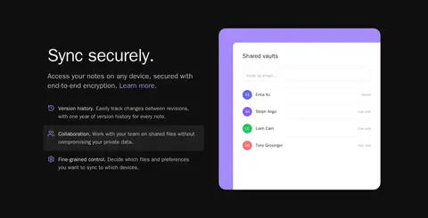
| 4 | feature-split | Feature copy and stacked benefits on one side, with a large sync interface preview on the other. | Security explanation, Feature list, Learn-more link | Dark feature copy, Violet-framed media, Compact benefit rows |
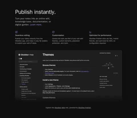
| 5 | product-showcase | Section introduction and three short benefits lead into a wide documentation-site preview. | Learn-more link, Benefit scan, Explore published example | Feature labels, Wide dark browser preview, Subtle text links |
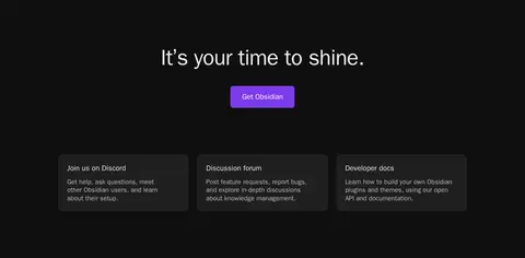
| 6 | cta | Centered closing headline and download action above three resource cards, followed by a multi-column footer. | Final download action, Community destinations, Footer navigation | Centered CTA, Rounded resource cards, Grouped footer links |
## Source CSS custom properties (selected)
```css
--color-red: