North star · Keep the dark canvas quiet and let confident type, coral emphasis, and vivid product media do the storytelling.
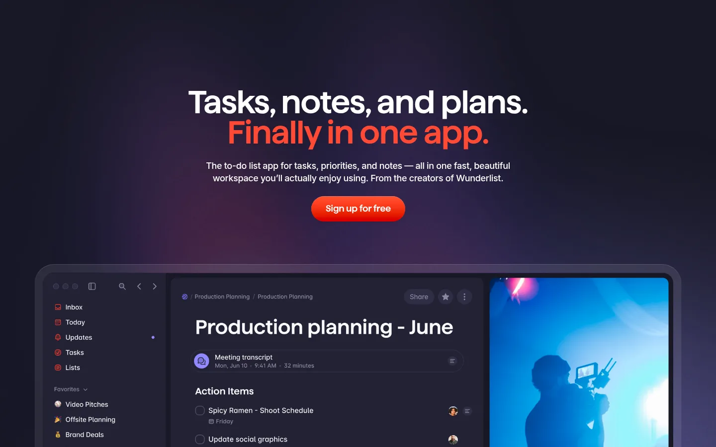
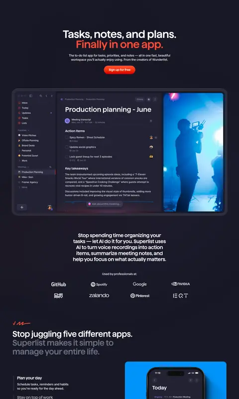
The page is built on a nearly uniform dark violet canvas, with white headlines and restrained muted text creating a clear reading hierarchy. A vivid warm coral accent highlights the hero’s second headline line and signup CTA; its measured appearance is limited, so keep it as a focal signal rather than a broad surface colour. Haffer XH SemiBold gives display and heading text a compact, confident shape, while Blender Medium and Inter support body copy, navigation, and links. The centered opening has generous breathing room above a large, rounded application preview. Farther down, alternating centered statements, split feature sections, and paired interface cards keep the long scroll varied without changing the dark foundation. Product screenshots and bright blue or violet backplates carry most of the colour variation; treat those as media, not core interface tokens. Softly rounded media, understated elevation, and ample section pauses preserve a polished, product-led feel.
Navigation, captions, and medium-weight link text.
Aa 设计
Haffer XH SemiBold
网络字体 · 字重 600 / 400 · 占比 14%
免费替代:Manrope
Display headlines and section headings.
Aa 设计
Satoshi
网络字体 · 字重 500 · 占比 2%
免费替代:Inter
Small supporting interface or text details.
Aa 设计
Jersey 10
网络字体 · 字重 400 · 占比 1%
免费替代:Jersey 10
Occasional decorative or product-specific microcopy.
角色
示例
字号
字重
行高
字距
特大标题
Large, centered hero headline and standout campaign statements.
Superlist
64px
600
0.95
-0.02em
一级标题
Primary hero and major page-level headings.
Superlist
51px
600
1.2
-0.02em
二级标题
Feature-section headlines and prominent mid-page statements.
Superlist
48px
600
1.1
-0.02em
三级标题
Feature titles and secondary content headings.
Superlist
30px
600
1.2
-0.02em
四级标题
Smaller feature headings and supporting section labels.
The quick brown fox 敏捷的狐狸
24px
400
1.2
-0.02em
正文
Main explanatory copy and product feature descriptions.
The quick brown fox 敏捷的狐狸
16px
400
1.3
0
辅助文字
Compact interface notes, product details, and minor annotations.
The quick brown fox 敏捷的狐狸
14px
400
1.3
-0.005em
导航
Header navigation and compact footer link labels.
The quick brown fox 敏捷的狐狸
14px
400
1.3
-0.005em
链接
Prominent inline links and calls to explore or sign up.
The quick brown fox 敏捷的狐狸
18px
500
1.4
-0.02em
间距与布局
基准单位 4px · 密度:紧凑
40px版块间距
10px元素间距
40px卡片内边距
1390px内容最大宽度
8px
10px
16px
20px
25px
30px
40px
50px
60px
64px
The measured page uses a wide canvas with a 1390px maximum content width and a compact density. Its hero is centered, followed by a broad, full-bleed product preview; lower sections mix centered statements with split feature layouts and paired showcase cards. Keep text blocks narrower than the surrounding media, and use the measured 40px section gap and 10px element gap as rhythm references. The long single-page sequence relies on generous visual pauses between content groups rather than distinct background bands.
圆角与层次
卡片 · 20px
图片 · 20px
导航 · 10px
链接 · 8px
md · card
inset · other
hairline · section
The page is mostly flat: dark sections blend into the shared canvas, with no measured border colour defining a card system. Media and testimonial cards use rounded framing and modest shadowing, while a subtle inset highlight can separate layered interface surfaces. Keep elevation restrained and let contrast, imagery, and spacing create depth.
组件
下面的预览按实测的按钮、输入框、徽标、卡片样式重建(字体用替代字体)。
Hero headline
Centered Haffer XH SemiBold statement with white opening text and a coral-emphasized second line.
Signup CTA
Compact centered signup action; the screenshot shows a bright coral-red gradient against the dark canvas.
Application preview
Wide desktop interface demonstration with rounded media framing and a bright video panel embedded at the right.
Feature split
Alternating text-and-media storytelling, with subdued supporting copy and product imagery on a blue or violet field.
Product card
Rounded interface screenshot card; measured card radius is 20px, with modest shadowing on selected cards.
Footer link columns
Dense multi-column navigation on the dark canvas, using muted labels and restrained colour accents for column headings.
Imagery · Large product-interface screenshots are the primary visual content, including a desktop workspace with a vivid video pane and phone mockups on bright blue or violet backplates. The hero preview is wide and framed with rounded corners; lower feature media alternates between paired screens and device-led demonstrations. Bright colours inside screenshots and backplates belong to the product imagery, not the restrained site palette.
Use Midnight Violet #181824 as the dominant page canvas.
Set primary headlines in bold, tightly tracked display type.
Reserve Signal Coral #ff5231 for small, high-attention moments.
Give product screenshots room to act as the page’s visual colour.
Alternate centered messaging with product-led feature layouts.
Use rounded media framing and restrained shadows.
✕ 不该做
Do not introduce broad light-coloured section bands.
Do not use coral as a large background surface.
Do not treat screenshot blues and violets as brand tokens.
Do not crowd the hero headline, copy, CTA, and preview together.
Do not add heavy borders or deep, dramatic shadows.
Do not turn muted text into a competing headline colour.
给 AI 的提示词
想快速出一个同风格的新页面,把这段话连同 DESIGN.md 一起发给 AI。
Build a new productivity homepage in Superlist’s visual language. Use Midnight Violet (#181824) as the continuous canvas, Bright Paper (#ffffff) for primary text, Slate Hush (#696f81) and Lavender Ash (#8e8da0) for secondary hierarchy, and sparse Signal Coral (#ff5231) for emphasis. Set large, tightly tracked headlines in a Haffer-like semibold sans; use clean sans-serif body copy and compact navigation. Start with centered messaging and a focused signup action, then give product screenshots a prominent, rounded showcase. Build later sections from alternating text-and-media stories and paired interface previews, leaving clear pauses between them. Keep the layout wide but content-focused, elevation subtle, and interface framing clean. Treat vivid colours inside product screenshots as media, not as additional site palette colours.