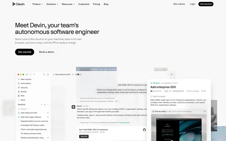
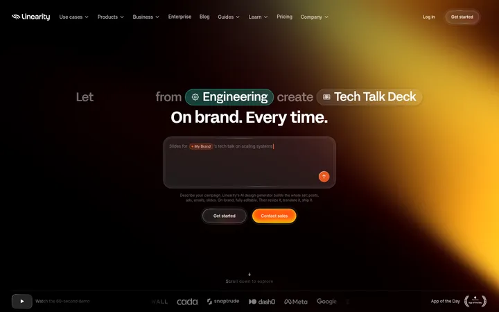
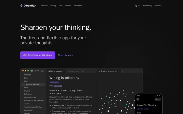
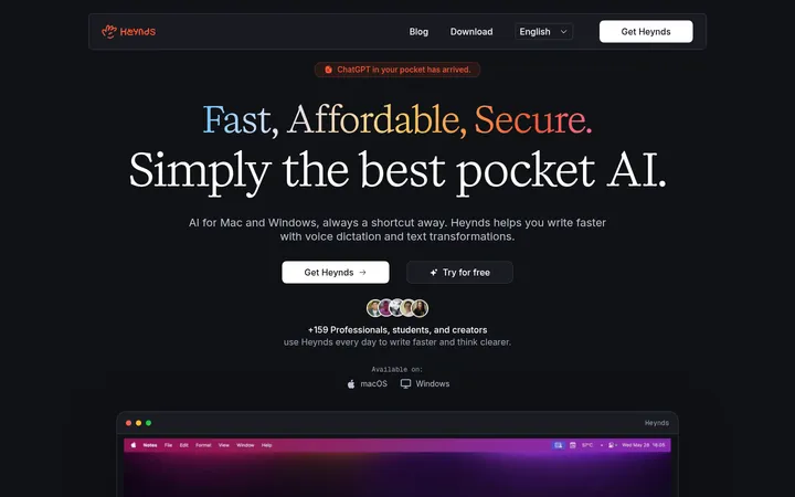
North star · Keep the interface quiet and near-black, letting one expansive, softly colored product preview carry the visual energy.
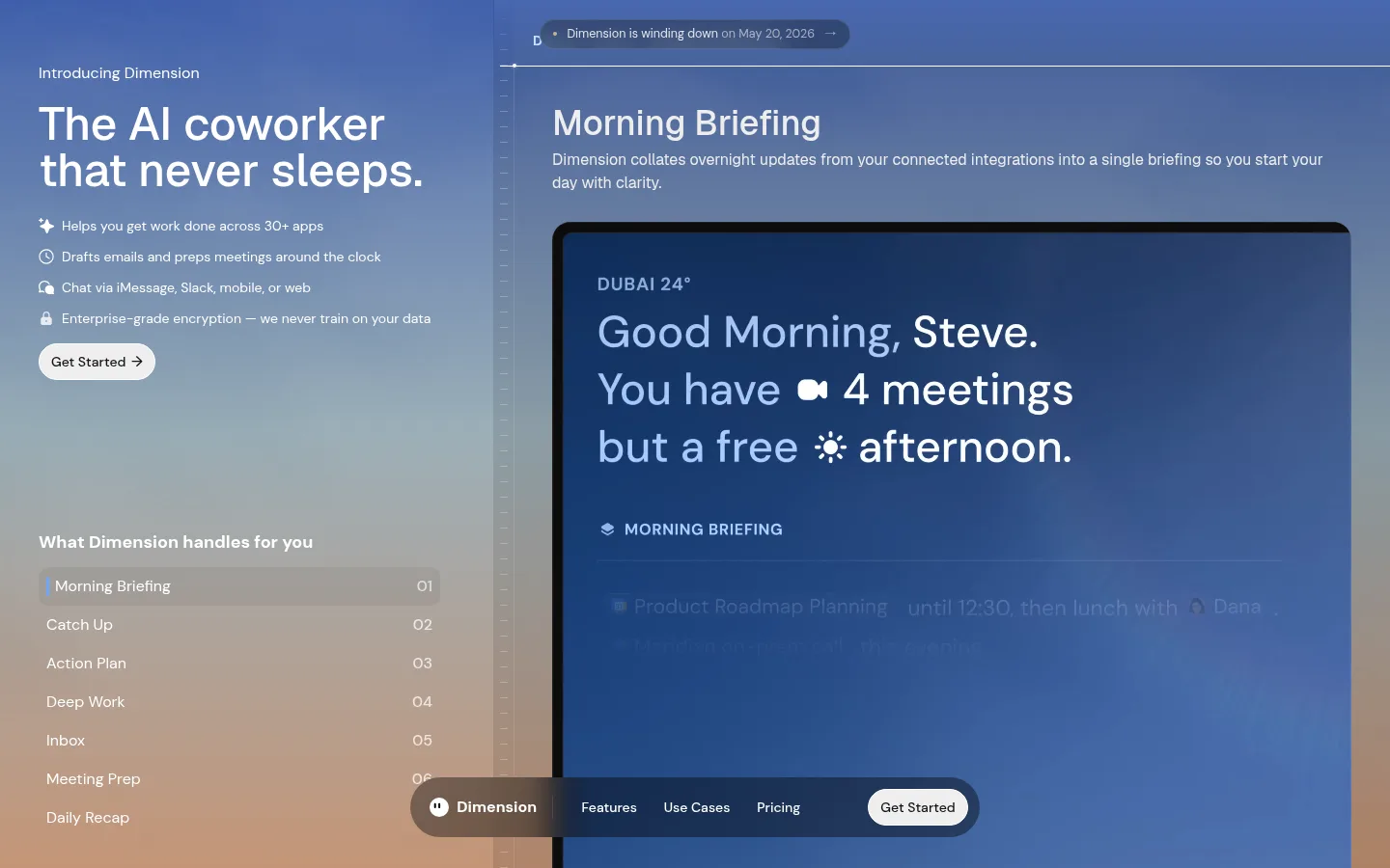
The page uses a near-black canvas as its structural base, while the hero is dominated by a softly blended blue, slate, and warm sand visual field from the product media. White and pale gray carry the main message and interface text; subdued gray is reserved for secondary copy. Blue, muted steel, and clay tones should be treated as imagery-led accents rather than flat, repeated UI fills. Geist gives the large, sentence-case hero headings a clean, composed shape, while DM Sans handles navigation, utility copy, and controls. The desktop composition is split: a narrow information rail sits beside a much larger live-workspace preview. Lists and labels stay compact, leaving the preview room to communicate the product. Rounded pill controls and discreet hairlines soften the dark frame; avoid heavy shadows or decorative surfaces that compete with the app imagery.
Navigation, body copy, feature lists, buttons, captions, and product-interface text.
Aa 设计
Geist
网络字体 · 字重 400 / 500 · 占比 29%
免费替代:Inter
Large hero and section headings.
角色
示例
字号
字重
行高
字距
一级标题
Primary hero headline introducing the AI coworker.
Dimension
48px
500
1
0
二级标题
Section-level product or feature headings.
Dimension
36px
500
1.11
0
三级标题
Compact feature-group and interface subheadings.
The quick brown fox 敏捷的狐狸
18px
700
1.11
0
正文
Feature descriptions and explanatory product copy.
The quick brown fox 敏捷的狐狸
14px
400
1.43
0
辅助文字
Announcement pill and small supporting labels.
The quick brown fox 敏捷的狐狸
12.5px
400
1.5
0
按钮
Primary CTA and other concise action controls.
The quick brown fox 敏捷的狐狸
14px
500
1
0
导航
Header and floating navigation links.
The quick brown fox 敏捷的狐狸
14px
500
1
0
间距与布局
基准单位 4px · 密度:适中
64px版块间距
8px元素间距
—卡片内边距
—内容最大宽度
2px
4px
6px
8px
10px
12px
14px
16px
20px
22px
24px
28px
32px
40px
At desktop width, the first screen is a full-bleed split composition: a narrower left rail carries brand introduction, headline, benefits, CTA, and feature navigation; the wider right side presents the app preview. Align text to the start and keep supporting lists vertically compact. A floating, centered pill navigation overlays the lower viewport. The measured spacing follows a comfortable rhythm, with distinct larger section separation; avoid adding an unmeasured fixed max-width or rigid column dimensions.
圆角与层次
按钮 · 10px
图片 · 24px
导航 · 9999px
链接 · 9999px
hairline · button
inset · link
The composition is mostly flat, relying on contrast and full-bleed media rather than pronounced shadows. Fine dark dividers structure the preview, while rounded controls and the floating nav sit above the background. Keep layering restrained; the link treatment uses a subtle inset white edge rather than a strong drop shadow.
组件
下面的预览按实测的按钮、输入框、徽标、卡片样式重建(字体用替代字体)。
Primary CTA
White pill-shaped Get Started button with dark text; measured button styling uses DM Sans at 14px and a compact 8px by 12px padding.
Announcement pill
Small outlined capsule announcing the wind-down date, with white text and a subtle inset edge treatment.
Feature rail
Left-side list of product capabilities; active Morning Briefing row uses a dark backing and a narrow blue marker.
Floating navigation
Low-profile dark translucent pill centered near the viewport bottom, combining brand, links, and a contrasting CTA.
Workspace preview
Large rounded product-media panel with a dark perimeter, fine dividers, and luminous blue-toned interface content.
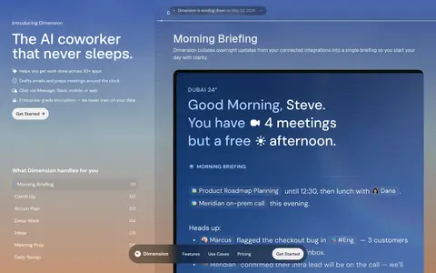
Imagery · A large product-interface preview is the primary visual, framed like a desktop workspace with visible content, thin dividers, and a dark edge. Its blue-to-slate-to-clay atmosphere fills the background and provides most of the page's color. Treat it as product media rather than decorative illustration; preserve legibility and keep the surrounding text crisp.
Use a split hero with a compact information rail and generous product preview.
Set display headings in Geist and utility text in DM Sans.
Keep primary copy white and supporting copy muted.
Reserve blue, slate, and clay for the product-media gradient.
Use rounded pills for navigation and the primary action.
✕ 不该做
Do not turn the hero gradient into repeated solid UI cards.
Do not add strong drop shadows or ornamental elevation.
Do not overcrowd the workspace preview with extra interface chrome.
Do not use red as a prominent brand accent.
Do not center the left-rail headline or feature list.
Do not introduce unmeasured spacing or color values.
给 AI 的提示词
想快速出一个同风格的新页面,把这段话连同 DESIGN.md 一起发给 AI。
Build a new Dimension-style AI product page with a near-black Night Canvas (#0b0b0b) and crisp Clear White (#ffffff) typography. Use Geist for prominent sentence-case headings and DM Sans for navigation, body copy, and controls. Favor a desktop split composition: concise, left-aligned product messaging beside a large, rounded workspace preview. Let the preview carry the atmospheric gradient using Dusk Blue (#4867af), Slate Mist (#9cafb8), and Warm Clay (#c49577); keep these tones tied to media rather than spreading them across UI surfaces. Use Quiet Gray (#858585) for secondary copy, Graphite Line (#242424) for discreet dividers, and a white pill CTA with dark text. Keep layering restrained, spacing comfortable, and the interface legible. Do not invent additional palette values or decorative effects.