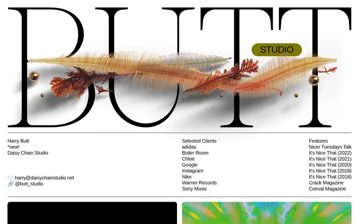
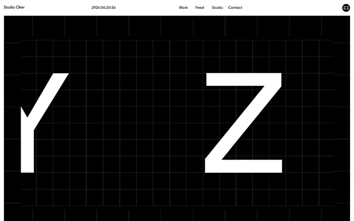
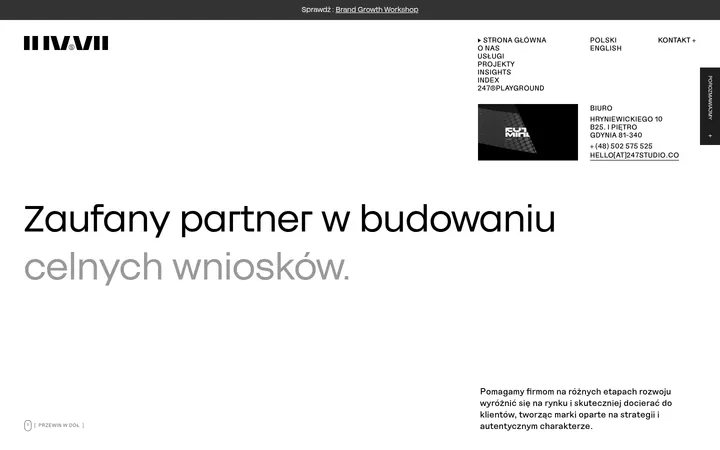
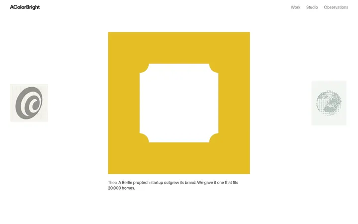
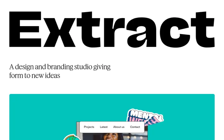
North star · Keep the interface quiet and editorial so the studio’s oversized typography and diverse project imagery carry the personality.
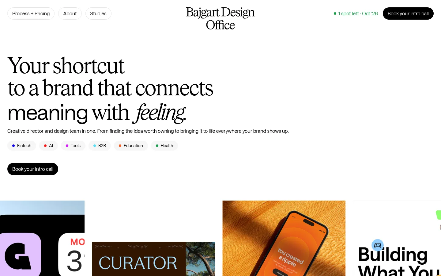
The page is built on a nearly white canvas, with black typography and compact black pill CTAs establishing a restrained identity. The palette stays intentionally narrow: the quiet interface gives the portfolio imagery room to introduce vivid colors, photography, mockups, and graphic compositions without turning the surrounding layout into a competing brand system. A refined light serif brings an editorial character to the hero and selected headings, while a clean sans-serif handles navigation, supporting copy, labels, and controls. The opening headline is large, left-aligned, and broken into short lines, with italic emphasis adding a subtle moment of contrast. Below it, project work is presented as a long, spacious sequence of varied image arrangements rather than uniform product cards. Generous white gaps separate the introductory copy, work, FAQ, testimonials, and closing studies feature. The effect is polished and image-led, but remains approachable through concise copy, rounded controls, and clear navigation.
配色
点色块复制色值。用途说明来自对页面的实测位置(背景、文字、描边、按钮)与截图判读。
品牌色
表层色
中性色
页面底色 · Soft Canvas表层 · Gallery White表层 2 · Studio Ink主文字 · Studio Ink
Navigation, body copy, labels, buttons, and sans-serif headings.
Aa 设计
Rhymes Text Light
网络字体 · 字重 300 · 占比 3%
免费替代:Cormorant Garamond
Editorial display headlines and selected section headings.
Aa 设计
Saans Medium
网络字体 · 字重 500 · 占比 2%
免费替代:Inter
Small emphasized interface text and labels.
角色
示例
字号
字重
行高
字距
特大标题
Editorial serif display lines and expressive closing-section title.
Bajgart Office
72px
300
1
-0.06em
一级标题
Large hero headline, broken into short left-aligned lines.
Bajgart Office
70px
400
1.03
-0.02em
二级标题
Editorial section headings for portfolio and FAQ content.
Bajgart Office
56px
300
1.05
-0.06em
三级标题
Compact project or supporting section headings.
The quick brown fox 敏捷的狐狸
24px
400
1.33
-0.01em
正文
Introductory paragraph, project descriptions, and testimonial copy.
The quick brown fox 敏捷的狐狸
16px
400
1.5
0
辅助文字
Navigation labels, metadata, tags, and compact interface text.
The quick brown fox 敏捷的狐狸
14px
400
1
0
间距与布局
基准单位 8px · 密度:适中
64px版块间距
24px元素间距
—卡片内边距
1392px内容最大宽度
4px
8px
10px
12px
16px
18px
24px
32px
40px
Use a broad, centered page frame with a measured maximum width of 1392px, while the hero content itself stays left aligned. The header distributes navigation, centered wordmark, and availability/CTA across the top. Allow the hero to breathe before a wide, varied portfolio sequence. Projects use changing columns and image proportions, with explanatory copy often offset from the work. Keep comfortable density and substantial section pauses; the FAQ and testimonials simplify into text-led layouts before the centered closing showcase.
圆角与层次
按钮 · 9999px
图片 · 50%
链接 · 9999px
没有测到阴影:页面是扁平的,层次靠底色和描边区分。
The interface is predominantly flat, with little evidence of shadow or decorative borders. Use white space and image composition to establish separation. Navigation links and CTA buttons use rounded pill silhouettes; portfolio media can have soft rounded corners where visible, without adding a generic elevated-card treatment.
组件
下面的预览按实测的按钮、输入框、徽标、卡片样式重建(字体用替代字体)。
Header navigation
Place compact rounded links at the left, a centered two-line serif wordmark, and a green availability note with a black pill CTA at the right.
Hero introduction
Use a large, left-aligned editorial headline with selective italic emphasis, one concise supporting paragraph, compact industry tags, and a black booking CTA.
Project gallery
Build a long portfolio showcase from varied image sizes and alignments; preserve each project’s own color and graphic identity.
Service introduction
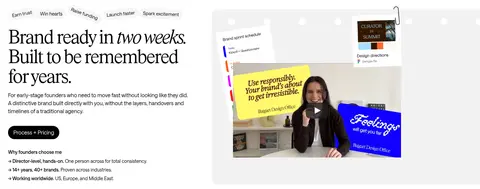
Pair a serif promise and compact explanatory copy with a large studio image or video preview, leaving generous white separation.
FAQ
Set a serif question heading and intro on the left, with a simple right-side list of questions and understated expand indicators.
Testimonials
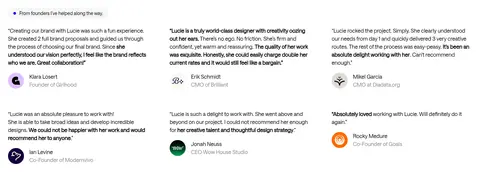
Arrange founder quotes in a quiet multi-column text layout, with small client names, roles, and portrait or brand marks.
Closing studies feature
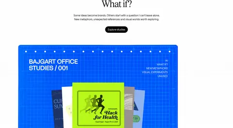
Center a short editorial title, explanatory copy, and black Explore studies pill above a prominent, vivid featured image.
Imagery · Treat project imagery as the page’s main color source: combine brand identity boards, digital mockups, packaging, product photography, websites, and occasional video-like studio content. Show work at varied scales and aspect ratios rather than forcing a uniform card crop. Keep the surrounding page white and avoid heavy image frames, allowing each project’s own visual language to remain distinct.
Keep the main interface white, black, and visually quiet.
Use the measured serif for expressive display moments.
Set hero and section copy flush left where shown.
Let portfolio artwork introduce its own color palettes.
Vary project image size and arrangement across the page.
Use black rounded pills for prominent calls to action.
✕ 不该做
Do not add bright interface accents absent from the measured palette.
Do not place every project inside an identical card.
Do not make the page feel dense or dashboard-like.
Do not use heavy shadows or decorative borders as default.
Do not center-align the hero headline.
Do not let secondary copy compete with the portfolio imagery.
给 AI 的提示词
想快速出一个同风格的新页面,把这段话连同 DESIGN.md 一起发给 AI。
Build a new page in the Bajgart Office visual style: a quiet, spacious design-studio canvas with editorial typography and image-led work. Use Gallery White (#ffffff) as the dominant background and Studio Ink (#000000) for text and rounded CTA fills; Soft Canvas (#f6f6f6) may appear as a subtle neutral, while Quiet Gray (#878787) is reserved for minor secondary text. Pair an expressive light serif display face with a clean sans-serif for navigation, body copy, labels, and controls. Lead with a large, left-aligned headline, concise supporting copy, compact tags, and a clear booking action. Build portfolio sections from varied image scales and alignments, letting each project provide its own color. Preserve generous white gaps, flat surfaces, and a restrained, editorial rhythm. Include simple FAQ and testimonial sections, then finish with a centered studies showcase.