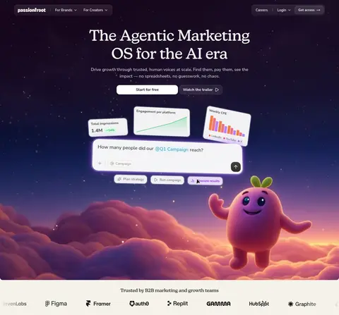
Passionfroot以克制温暖的SaaS界面,搭配电影感夜空首屏与轻松的产品视觉。衬线大标题塑造编辑气质,紧凑的无衬线控件则让产品信息清晰易读。
North star · Keep product content calm and legible, then let a cinematic illustrated hero provide the page’s memorable contrast.
The page contrasts a pale, warm canvas (#f8f7f2) with a full-bleed, deep night-sky hero. The dark hero is led by a centered, off-white serif headline, while a concise muted sans-serif paragraph and paired calls to action sit directly beneath it. Product UI cards float across the lower hero area, surrounded by atmospheric stars, clouds, and a character illustration; these vivid media colors belong to the artwork, not the core interface palette. Across the broader page, measured section backgrounds remain warm and light, with white cards, fine neutral borders, and near-black text. New Kansas supplies the expressive display voice; Nunito Sans handles navigation, body copy, and controls. Generous open space separates content blocks, while compact controls and softly rounded cards keep interactions approachable. Use pink, violet, and orange as selective brand accents rather than large interface fills.
配色 点色块复制色值。用途说明来自对页面的实测位置(背景、文字、描边、按钮)与截图判读。
品牌色
Oat Canvas
#f8f7f2
Warm page canvas and hero base; also appears in pale badge backgrounds.
强调色
Lilac Glint
#dab2ff
Sparse button detail; treat as a restrained interface accent, not a dominant fill.
Violet Thread
#b775f5
Isolated card-border accent; use sparingly rather than as a broad background.
Bloom Pink
#f788d2
Brand accent in small visual details and artwork.
Orbit Violet
#b26bf5
Brand accent in small visual details and decorative elements.
Tangerine Spark
#ff9147
Selective brand accent; brighter appearances also occur in product chart artwork.
表层色
Porcelain Surface
#fdfdfa
Light card and control surfaces against the warm canvas.
Cosmic Plum
#190922
Dark inverse section surface and a close measured anchor for the night-sky hero.
中性色
Soft Ink
#1d1d1c
Primary headings, body text, dark button text, and navigation labels.
Warm Graphite
#43423e
Secondary copy and muted interface text; some measured gradient usage is not a defining page treatment.
Stone Muted
#99978f
Low-emphasis copy, footer text, and badge labels.
Quiet Pebble
#d8d6ce
Low-contrast text and minor interface details.
功能色
Linen Rule
#edeae4
Default card borders and subtle separators.
Mist Border
#f2f1ec
Subtle control outlines and pale navigation or button details.
Deep Charcoal
#2c2b29
Measured button gradient detail; secondary to the page’s mostly light UI.
文字 背景 对比度 WCAG #1d1d1c Soft Ink#f8f7f2 Oat Canvas15.73:1 AAA #1d1d1c Soft Ink#fdfdfa Porcelain Surface16.56:1 AAA #1d1d1c Soft Ink#190922 Cosmic Plum1.13:1 不达标 #43423e Warm Graphite#f8f7f2 Oat Canvas9.38:1 AAA #43423e Warm Graphite#fdfdfa Porcelain Surface9.87:1 AAA #43423e Warm Graphite#190922 Cosmic Plum1.89:1 不达标
字体 字号阶梯:Perfect Fourth(比例约 1.355,正文 14px)。示例用免费替代字体渲染,数值为实测。
Aa 设计
Nunito Sans 网络字体 · 字重 400 / 700 / 600 / 500 · 占比 77%
免费替代:Nunito Sans
Body copy, navigation, buttons, captions, and product UI labels.
Aa 设计
new-kansas 网络字体 · 字重 400 / 500 · 占比 23%
免费替代:Lora
Display headlines and section headings.
角色 示例 字号 字重 行高 字距 特大标题 Oversized editorial hero headline.
Passionfroot
64px 500 1.2 -0.01em 一级标题 Primary page or section headline.
Passionfroot
48px 500 1.2 -0.013em 二级标题 Prominent section headings.
Passionfroot
28px 500 1.2 -0.023em 三级标题 Supporting feature and content headings.
The quick brown fox 敏捷的狐狸
20px 400 1.45 0 四级标题 Smaller explanatory subheadings.
The quick brown fox 敏捷的狐狸
18px 400 1.56 0 正文 Main paragraphs and product interface copy.
The quick brown fox 敏捷的狐狸
14px 400 1.43 0 辅助文字 Badges, metadata, and fine print.
The quick brown fox 敏捷的狐狸
12px 400 1.33 0 按钮 Primary and secondary action labels.
The quick brown fox 敏捷的狐狸
16px 700 1.5 0 导航 Top navigation and menu labels.
The quick brown fox 敏捷的狐狸
14px 700 1.43 0
间距与布局 基准单位 4px · 密度:适中
48px 版块间距
8px 元素间距
10px 卡片内边距
1280px 内容最大宽度
1px
2px
3px
4px
6px
8px
10px
12px
16px
24px
48px
The hero uses full-bleed media behind a centered headline, description, and paired actions; floating product cards occupy the lower visual field. Navigation is arranged in two compact rounded groups near opposite sides of the top edge. Measured content width reaches 1280px, with a comfortable overall density and broad section gaps. Subsequent measured sections retain the warm canvas, leaving substantial negative space around content. Use centered alignment for the hero and logo strip, then allow later content to align to its own feature or footer composition.
圆角与层次 sm · card, other, button
sm · other, button, card
sm · other, card
md · button
Use mostly flat surfaces with thin warm-gray borders and very restrained soft shadows. Product cards float above the hero artwork through contrast and layering, not heavy interface elevation. Rounded card and button silhouettes soften the composition; reserve stronger glow effects for the hero artwork and its product mockups.
组件 下面的预览按实测的按钮、输入框、徽标、卡片样式重建(字体用替代字体)。
Split navigation Two compact translucent dark groups at the hero top: brand and audience links on one side, Careers, Login, and a highlighted access action on the other.
Hero headline and actions Centered New Kansas headline, short Nunito Sans supporting copy, a white primary action, and a subdued secondary trailer action.
Floating product cards Pale rounded analytics panels overlap the hero illustration, showing metrics and charts with dark labels and selective color.
AI prompt panel Large white rounded product input mockup with a campaign question, compact controls, and a dark circular submit affordance.
Brand logo strip A light horizontal trust band with a short centered label and a row of customer logos.
Neutral content cards Light card surfaces on the warm canvas, defined by subtle borders and restrained shadow rather than dramatic elevation.
Imagery · The first screen is defined by cinematic digital illustration rather than conventional photography: a star-speckled plum-to-blue sky, glowing cloudscape, and friendly character sit behind product UI mockups. Keep the hero media edge-to-edge and let the floating interface cards remain crisp, pale, and legible. The illustration’s vivid palette is artwork-specific; do not spread its colors across generic controls.
页面版块 共 6 个版块,按页面从上到下排列,每个都标了类型、布局和交互套路。
该做与不该做 ✓ 该做 Use the warm canvas as the default for non-hero sections. Set major headlines in an editorial serif. Keep body text and controls in a friendly sans-serif. Make the hero media full-bleed and cinematic. Keep product mockups bright and readable over dark artwork. Reserve pink, violet, and orange for selective accents. ✕ 不该做 Do not turn illustration colors into broad interface fills. Do not use heavy shadows on ordinary cards. Do not crowd the hero with extra copy or controls. Do not replace the serif display voice with generic geometric type. Do not make navigation or body copy compete with the headline. Do not invent palette values or spacing measurements. 给 AI 的提示词 想快速出一个同风格的新页面,把这段话连同 DESIGN.md 一起发给 AI。
复制 Build a new Passionfroot page with a calm, warm SaaS foundation and one distinctive cinematic moment. Use Oat Canvas (#f8f7f2) for light sections, Porcelain Surface (#fdfdfa) for cards, Soft Ink (#1d1d1c) for primary text, and Linen Rule (#edeae4) for subtle borders. Set editorial headlines in New Kansas or a close serif alternative, pairing them with Nunito Sans for body copy, navigation, and actions. If the page has a hero, use a deep Cosmic Plum (#190922) night-sky treatment with full-bleed artwork and legible floating product panels. Keep the layout spacious, hero content centered, and controls compact and rounded. Apply Bloom Pink (#f788d2), Orbit Violet (#b26bf5), and Tangerine Spark (#ff9147) sparingly. Favor flat surfaces and restrained shadows.
DESIGN.md Tailwind v4 CSS 变量 Design Tokens
---
title: "Passionfroot design system"
variant: extended
source: https://www.passionfroot.me/
captured_at: 2026-10-12
theme: light
industry: ai
generator: Design DNA (https://four.wiralomi.com/style/passionfroot-me)
ai_generated: true
ai_label: "本文件由 AI 辅助生成:数值取自公开网页的实测样式,命名、用途说明与建议为模型解读。商标归原所有者。 / AI-assisted content"
---
# Passionfroot · Design System
> Warm editorial typography meets a cosmic AI product world.
**Theme:** light · **Industry:** ai · **Source:** https://www.passionfroot.me/ · **Captured:** 2026-10-12 (1440×900 desktop)
_AI-assisted content: values are measured from the public page at capture time; names, roles and guidance are model-written interpretations. Trademarks belong to their owners._
Passionfroot pairs a warm, restrained SaaS interface with a cinematic night-sky hero and playful product imagery. Serif headlines and compact sans-serif controls give the page an editorial voice without obscuring the product story.
## North star
Keep product content calm and legible, then let a cinematic illustrated hero provide the page’s memorable contrast.
## Overview
The page contrasts a pale, warm canvas (## Colors
| Name | Hex | Token | Group | Role |
|---|---|---|---|---|
| Oat Canvas | ` | `--color-oat-canvas` | brand | Warm page canvas and hero base; also appears in pale badge backgrounds. |
| Soft Ink | ` | `--color-soft-ink` | neutral | Primary headings, body text, dark button text, and navigation labels. |
| Porcelain Surface | ` | `--color-porcelain-surface` | surface | Light card and control surfaces against the warm canvas. |
| Warm Graphite | ` | `--color-warm-graphite` | neutral | Secondary copy and muted interface text; some measured gradient usage is not a defining page treatment. |
| Lilac Glint | ` | `--color-lilac-glint` | accent | Sparse button detail; treat as a restrained interface accent, not a dominant fill. |
| Linen Rule | ` | `--color-linen-rule` | semantic | Default card borders and subtle separators. |
| Mist Border | ` | `--color-mist-border` | semantic | Subtle control outlines and pale navigation or button details. |
| Stone Muted | ` | `--color-stone-muted` | neutral | Low-emphasis copy, footer text, and badge labels. |
| Deep Charcoal | ` | `--color-deep-charcoal` | semantic | Measured button gradient detail; secondary to the page’s mostly light UI. |
| Cosmic Plum | ` | `--color-cosmic-plum` | surface | Dark inverse section surface and a close measured anchor for the night-sky hero. |
| Violet Thread | ` | `--color-violet-thread` | accent | Isolated card-border accent; use sparingly rather than as a broad background. |
| Bloom Pink | ` | `--color-bloom-pink` | accent | Brand accent in small visual details and artwork. |
| Orbit Violet | ` | `--color-orbit-violet` | accent | Brand accent in small visual details and decorative elements. |
| Quiet Pebble | ` | `--color-quiet-pebble` | neutral | Low-contrast text and minor interface details. |
| Tangerine Spark | ` | `--color-tangerine-spark` | accent | Selective brand accent; brighter appearances also occur in product chart artwork. |
### Semantic aliases
`--color-canvas` → ` (Oat Canvas) · `--color-surface` → ` (Porcelain Surface) · `--color-surface-2` → ` (Cosmic Plum) · `--color-text` → ` (Soft Ink) · `--color-text-muted` → ` (Warm Graphite) · `--color-text-subtle` → ` (Stone Muted) · `--color-border` → ` (Linen Rule) · `--color-accent` → ` (Bloom Pink) · `--color-accent-2` → ` (Orbit Violet) · `--color-accent-3` → ` (Tangerine Spark)
### Contrast (WCAG 2.x)
| Text | Background | Ratio | Level |
|---|---|---|---|
| ` | ` | 15.73:1 | AAA |
| ` | ` | 16.56:1 | AAA |
| ` | ` | 1.13:1 | fail |
| ` | ` | 9.38:1 | AAA |
| ` | ` | 9.87:1 | AAA |
| ` | ` | 1.89:1 | fail |
| ` | ` | 2.73:1 | fail |
| ` | ` | 2.87:1 | fail |
| ` | ` | 6.5:1 | AA |
| ` | ` | 2.08:1 | fail |
### Gradients
- `linear-gradient(oklab(0.999994 0.0000455678 0.0000200868 / 0.1) 0%, oklab(0.999994 0.0000455678 0.0000200868 / 0.05) 100%)`
- `linear-gradient(to top, oklch(0.29 0.005 98) 0%, oklch(0.38 0.008 98) 100%)`
## Typography
| Family | Token | Source | Weights | Role | Free substitute |
|---|---|---|---|---|---|
| Nunito Sans | `--font-body` | webfont | 400, 700, 600, 500 | Body copy, navigation, buttons, captions, and product UI labels. | Nunito Sans |
| new-kansas | `--font-display` | webfont | 400, 500 | Display headlines and section headings. | Lora |
- **Nunito Sans:** Use clear, friendly sans-serif forms; measured weights range from regular to bold. Navigation and controls are compact and readable.
- **new-kansas:** Editorial serif with moderate weights and slightly tight headline tracking; preserve natural title case rather than all caps.
### Type scale — Perfect Fourth (ratio ≈ 1.355, base 14px)
| Role | Size | Weight | Line height | Letter spacing | Case | Family | Used for |
|---|---|---|---|---|---|---|---|
| display | 64px | 500 | 1.2 | -0.01em | — | new-kansas | Oversized editorial hero headline. |
| h1 | 48px | 500 | 1.2 | -0.013em | — | new-kansas | Primary page or section headline. |
| h2 | 28px | 500 | 1.2 | -0.023em | — | new-kansas | Prominent section headings. |
| h3 | 20px | 400 | 1.45 | 0 | — | new-kansas | Supporting feature and content headings. |
| h4 | 18px | 400 | 1.56 | 0 | — | Nunito Sans | Smaller explanatory subheadings. |
| body | 14px | 400 | 1.43 | 0 | — | Nunito Sans | Main paragraphs and product interface copy. |
| caption | 12px | 400 | 1.33 | 0 | — | Nunito Sans | Badges, metadata, and fine print. |
| button | 16px | 700 | 1.5 | 0 | — | Nunito Sans | Primary and secondary action labels. |
| nav | 14px | 700 | 1.43 | 0 | — | Nunito Sans | Top navigation and menu labels. |
OpenType features in use: `"kern", "liga"` , `"calt", "kern", "liga"` .
## Spacing & layout
- Base unit **4px**, density **comfortable**.
- Scale (most used values): 1, 2, 3, 4, 6, 8, 10, 12, 16, 24, 48 px.
- Section rhythm 48px · element gap 8px · card padding 10px · max content width 1280px.
The hero uses full-bleed media behind a centered headline, description, and paired actions; floating product cards occupy the lower visual field. Navigation is arranged in two compact rounded groups near opposite sides of the top edge. Measured content width reaches 1280px, with a comfortable overall density and broad section gaps. Subsequent measured sections retain the warm canvas, leaving substantial negative space around content. Use centered alignment for the hero and logo strip, then allow later content to align to its own feature or footer composition.
## Shape & elevation
- Radius: button `8px` · card `10px` · media `12px` · badge `4px` · nav `12px` · xs `4px` · sm `6px` · md `8px` · lg `10px` · xl `12px` · 2xl `14px` · pill `9999px`
- Shadow `sm` (card, other, button): `rgba(0, 0, 0, 0) 0px 0px 0px 0px, rgba(0, 0, 0, 0) 0px 0px 0px 0px, rgba(0, 0, 0, 0) 0px 0px 0px 0px, rgba(0, 0, 0, 0) 0px 0px 0px 0px, rgb(237, 234, 228) 0px 0px 0px 1px, oklch(0.23 0.002 98 / 0.04) `
- Shadow `sm-2` (other, button, card): `rgba(0, 0, 0, 0) 0px 0px 0px 0px, rgba(0, 0, 0, 0) 0px 0px 0px 0px, rgba(0, 0, 0, 0) 0px 0px 0px 0px, rgba(0, 0, 0, 0) 0px 0px 0px 0px, oklch(0.876 0.011 98) 0px 0px 0px 1px, oklch(0.23 0.002 98 / 0.0`
- Shadow `sm-3` (other, card): `rgba(0, 0, 0, 0) 0px 0px 0px 0px, rgba(0, 0, 0, 0) 0px 0px 0px 0px, rgba(0, 0, 0, 0) 0px 0px 0px 0px, rgba(0, 0, 0, 0) 0px 0px 0px 0px, oklch(0.958 0.007 98) 0px 0px 0px 1px, oklch(0.23 0.002 98 / 0.0`
- Shadow `md` (button): `rgba(0, 0, 0, 0) 0px 0px 0px 0px, rgba(0, 0, 0, 0) 0px 0px 0px 0px, rgba(0, 0, 0, 0) 0px 0px 0px 0px, rgba(0, 0, 0, 0) 0px 0px 0px 0px, oklch(0.23 0.002 98 / 0.02) 0px 1px 1px -0.5px, oklch(0.23 0.002`
- Shadow `hairline` (card, other): `rgba(0, 0, 0, 0) 0px 0px 0px 0px, rgba(0, 0, 0, 0) 0px 0px 0px 0px, rgba(0, 0, 0, 0) 0px 0px 0px 0px, rgba(0, 0, 0, 0) 0px 0px 0px 0px, rgba(255, 255, 255, 0.2) 0px 0px 0px 3px, rgba(255, 255, 255, 0.`
- Shadow `hairline-2` (button): `rgba(0, 0, 0, 0) 0px 0px 0px 0px, rgba(0, 0, 0, 0) 0px 0px 0px 0px, rgba(0, 0, 0, 0) 0px 0px 0px 0px, rgba(0, 0, 0, 0) 0px 0px 0px 0px, rgba(255, 255, 255, 0.2) 0px 0px 0px 3px`
- Motion: standard transition `0.2s cubic-bezier(0.4, 0, 0.2, 1)` on interactive elements.
Use mostly flat surfaces with thin warm-gray borders and very restrained soft shadows. Product cards float above the hero artwork through contrast and layering, not heavy interface elevation. Rounded card and button silhouettes soften the composition; reserve stronger glow effects for the hero artwork and its product mockups.
## Imagery
The first screen is defined by cinematic digital illustration rather than conventional photography: a star-speckled plum-to-blue sky, glowing cloudscape, and friendly character sit behind product UI mockups. Keep the hero media edge-to-edge and let the floating interface cards remain crisp, pale, and legible. The illustration’s vivid palette is artwork-specific; do not spread its colors across generic controls.
## Components
### Split navigation
Two compact translucent dark groups at the hero top: brand and audience links on one side, Careers, Login, and a highlighted access action on the other.
### Hero headline and actions
Centered New Kansas headline, short Nunito Sans supporting copy, a white primary action, and a subdued secondary trailer action.
### Floating product cards
Pale rounded analytics panels overlap the hero illustration, showing metrics and charts with dark labels and selective color.
### AI prompt panel
Large white rounded product input mockup with a campaign question, compact controls, and a dark circular submit affordance.
### Brand logo strip
A light horizontal trust band with a short centered label and a row of customer logos.
### Neutral content cards
Light card surfaces on the warm canvas, defined by subtle borders and restrained shadow rather than dramatic elevation.
### Measured component styles
- **Primary button** (“Plan strategy”): background ## Do
- Use the warm canvas as the default for non-hero sections.
- Set major headlines in an editorial serif.
- Keep body text and controls in a friendly sans-serif.
- Make the hero media full-bleed and cinematic.
- Keep product mockups bright and readable over dark artwork.
- Reserve pink, violet, and orange for selective accents.
## Don't
- Do not turn illustration colors into broad interface fills.
- Do not use heavy shadows on ordinary cards.
- Do not crowd the hero with extra copy or controls.
- Do not replace the serif display voice with generic geometric type.
- Do not make navigation or body copy compete with the headline.
- Do not invent palette values or spacing measurements.
## Agent prompt
Build a new Passionfroot page with a calm, warm SaaS foundation and one distinctive cinematic moment. Use Oat Canvas (## Page sections (top to bottom)
| # | Type | Layout | UX patterns | UI patterns |
|---|---|---|---|---|
| 1 | hero | Full-bleed cinematic backdrop; top split navigation; centered headline and actions; floating product UI below. | audience navigation, primary and secondary CTA, product prompt mockup | dark illustrated sky, serif headline, floating analytics cards, glow accents |
| 2 | logo-cloud | A light horizontal trust strip with a brief centered introduction and customer logos. | social proof | warm light surface, compact logo row |
| 3 | feature-grid | Measured section retains the warm canvas; detailed layout is not visible in the supplied page captures. | feature discovery | light canvas |
| 4 | feature-split | Measured section retains the warm canvas; specific text and media alignment are not evidenced. | product explanation | light canvas |
| 5 | cta | Shorter measured block with six-column structure, media, and two actions. | conversion CTA | light canvas, paired buttons, supporting imagery |
| 6 | footer | Single broad footer section on the warm canvas; detailed internal arrangement is not visible. | site navigation | light canvas |
## Source CSS custom properties (selected)
```css
--font-heading: "new-kansas",system-ui,sans-serif;
--font-body: "Nunito Sans",system-ui,sans-serif;
--surface-50: oklch(99.3% .004 96);
--surface-300: oklch(97.5% .007 96);
--surface-500: oklch(96.3% .012 96);
--bg-page: oklch(99.3% .004 96);
--bg-foundation: oklch(97.5% .007 96);
--bg-brand-surface: oklch(96.3% .012 96);
--bg-clickable: oklch(100% 0 0);
--bg-hovered: oklch(97.9% .004 91);
--bg-hovered-strong: oklch(96.1% .01 87);
--bg-activated: oklch(96.1% .01 87);
--bg-activated-strong: oklch(95% .013 97);
--border-subtle: oklch(95.8% .007 98);
--border-default: