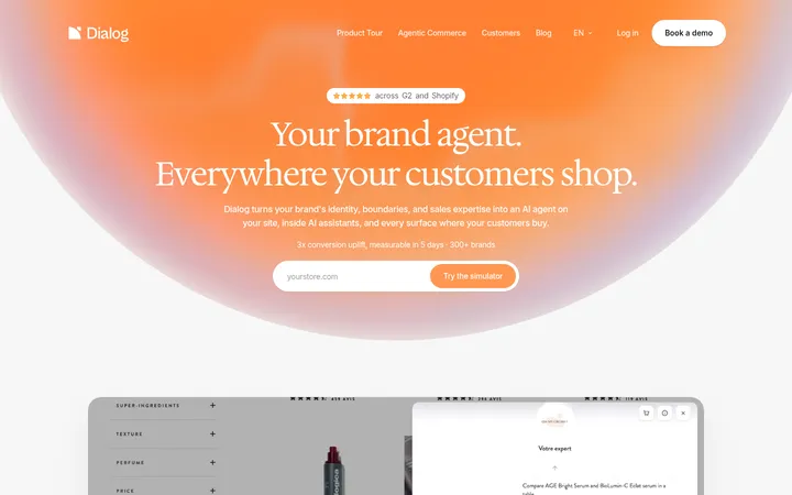
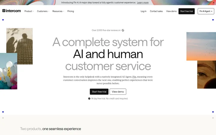
Jasper以编辑感衬线大标题搭配清爽宽松的SaaS页面,并融入鲜明的营销视觉内容。深海军蓝、白色与浅灰构成克制底色,让橙色行动按钮和多彩产品插画更醒目。
North star · Let oversized editorial headlines and open white space frame vivid, functional marketing imagery, with coral reserved for clear actions.
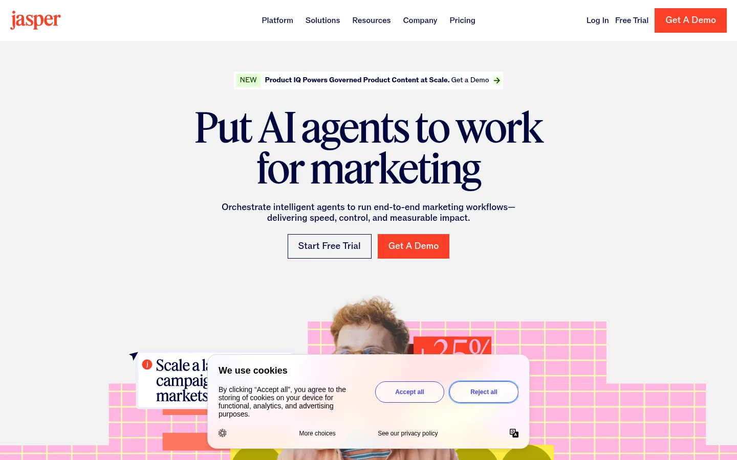
The page opens on a soft-gray hero canvas with centered, oversized navy serif typography, compact supporting copy, and a direct pair of calls to action. White becomes the dominant background through most of the long page, creating generous visual pauses between platform features, customer proof, solution content, and resources. The bright coral-orange CTA is the main interface accent; pale peach, mint, sky, lilac, and yellow appear as supporting card fills and product-illustration colors rather than competing page-wide brand colors. Feature and proof sections use modular cards, collage-like customer tiles, interface imagery, and thin coral rules. Headlines use the measured Feature display face with tight tracking, while ABC ROM keeps navigation and body text clear and restrained. The page balances centered editorial moments with left-aligned split sections and grids. A charcoal footer closes the otherwise light experience.
配色 点色块复制色值。用途说明来自对页面的实测位置(背景、文字、描边、按钮)与截图判读。
品牌色
Midnight Ink
#00063d
Primary text and links; anchors display headlines, navigation, body copy, and outlines.
强调色
Signal Coral
#fa4028
Primary demo buttons and small high-visibility text or interface accents.
Forest Signal
#103a00
Dark green type and details inside selected illustrations and marketing mockups.
Berry Ink
#5a003c
Rare dark plum text or decorative detail inside the site's supporting visuals.
表层色
Charcoal Stage
#1c1c1c
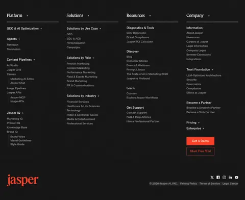
Full-width closing footer surface, paired with light footer links and text.
Soft Fog
#f2f2f3
Hero background band behind the centered introductory headline and calls to action.
Peach Wash
#ffe8e2
Pale peach card and FAQ panel backgrounds, commonly paired with coral borders.
Paper Mist
#f9f9f9
Quiet testimonial and customer-story card backgrounds.
中性色
Gallery White
#ffffff
Main canvas and card ground; also appears on inverse text and the primary CTA label.
功能色
Coral Rule
#fa7560
Thin card borders and FAQ or feature-card outlines.
Peach Line
#ffb3a3
Secondary warm illustration and card-detail color; supporting rather than a page canvas.
Sky Tint
#ceebff
Blue-tinted feature or customer cards and product mockup details.
Mint Tint
#e6ffd9
Pale green card fills and illustration panels within the marketing product visuals.
Rose Tint
#ffe6f3
Pink card fill and decorative product-illustration color.
Lilac Tint
#e7e3f7
Occasional pale purple card or illustration detail, not a core canvas color.
Lemon Tint
#fffdd9
Soft yellow card and illustration accent used among colorful proof tiles.
Fresh Mint
#d2ffc1
Light green supporting fill within feature cards and illustrated product content.
文字 背景 对比度 WCAG #00063d Midnight Ink#ffffff Gallery White19.21:1 AAA #00063d Midnight Ink#1c1c1c Charcoal Stage1.13:1 不达标 #00063d Midnight Ink#f2f2f3 Soft Fog17.17:1 AAA #00063d Midnight Ink#ffe8e2 Peach Wash16.36:1 AAA #ffffff Gallery White#1c1c1c Charcoal Stage17.04:1 AAA #ffffff Gallery White#f2f2f3 Soft Fog1.12:1 不达标
字体 字号阶梯:Augmented Fourth(比例约 1.38,正文 16px)。示例用免费替代字体渲染,数值为实测。
Aa 设计
ABC ROM 网络字体 · 字重 450 / 500 / 700 · 占比 84%
免费替代:Inter
Navigation, body copy, buttons, links, captions, and general interface text.
Aa 设计
Feature 网络字体 · 字重 450 · 占比 13%
免费替代:DM Serif Display
Display and heading typography, including the large hero and section headlines.
Aa 设计
ABC ROM Mono 网络字体 · 字重 450 · 占比 4%
免费替代:IBM Plex Mono
Code-style or compact monospaced labels where that measured role appears.
角色 示例 字号 字重 行高 字距 特大标题 Oversized hero headline and major editorial statements.
Jasper
80px 450 1 -0.03em 一级标题 Primary page and large section headlines.
Jasper
54px 450 1.05 -0.03em 二级标题 Section titles for platform, stories, and solutions.
Jasper
38px 450 1 -0.02em 三级标题 Feature, card, and subsection headlines.
Jasper
28px 450 1.1 -0.02em 四级标题 Compact headings within nested content blocks.
The quick brown fox 敏捷的狐狸
24px 450 1.1 0 正文 Descriptions, explanatory paragraphs, and supporting copy.
The quick brown fox 敏捷的狐狸
16px 450 1.4 -0.01em 辅助文字 Small labels, eyebrow text, and metadata.
The quick brown fox 敏捷的狐狸
14px 450 1.2 -0.01em 链接 Navigation, inline actions, and text links.
The quick brown fox 敏捷的狐狸
16px 450 1.4 -0.01em 代码 Technical or monospaced labels when present.
const style = 1;
16px 450 1.4 -0.01em
间距与布局 基准单位 4px · 密度:适中
80px 版块间距
16px 元素间距
12px 卡片内边距
1360px 内容最大宽度
2px
3px
4px
6px
8px
10px
12px
16px
20px
24px
32px
40px
A centered content system uses a measured maximum width of 1360px and comfortable density. The opening hero centers its announcement, headline, description, and paired actions; the image-led composition continues below. Long white sections alternate centered editorial introductions with split feature rows, multi-column card grids, and customer-story mosaics. Use generous section separation, measured at 80px, and consistent 16px element gaps. Align copy to the left when paired with product imagery, but retain centered alignment for platform and customer-story introductions. The lower FAQ shifts to a two-part layout before a full-bleed dark footer.
圆角与层次 没有测到阴影:页面是扁平的,层次靠底色和描边区分。
The interface is predominantly flat: no measured shadows, and components rely on contrast, white space, and color-blocked cards. Use square-cornered surfaces and thin coral outlines where shown; buttons also have square corners. Layer hero and feature artwork over its background as collage elements, while preserving clear text and CTA hierarchy.
组件 下面的预览按实测的按钮、输入框、徽标、卡片样式重建(字体用替代字体)。
Primary CTA Square-cornered coral button with white ABC ROM text; the measured button uses a coral border and consistent horizontal padding.
Hero announcement Compact centered announcement strip above the hero headline, with a small NEW label and a directional link cue.
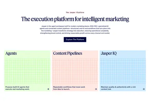
Feature cards Three-column platform cards with short serif headings, colored illustrated panels, and concise supporting copy.
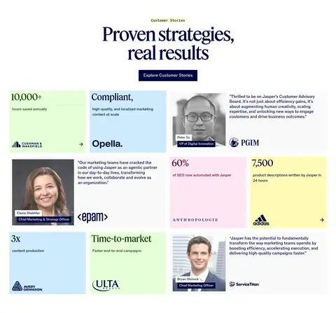
Customer proof tiles Asymmetric grid of metrics, customer logos, quotes, portraits, and pastel card fills.
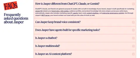
FAQ rows Peach-tinted question panels with thin coral borders and compact disclosure controls.
Footer navigation Full-width charcoal footer with grouped link columns, light text, and a coral demo action.
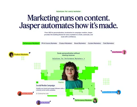
Imagery · Use a mix of customer and team photography, product-interface mockups, and playful graphic compositions. Frame people within colorful geometric backdrops, grid patterns, and cards; keep imagery integrated into the modular layout instead of using generic full-bleed stock banners. Customer-story sections mix portraits, brand marks, and oversized metric tiles. Product imagery may carry mint, sky, peach, pink, or yellow colors that belong to the illustrations, not the global canvas.
页面版块 共 12 个版块,按页面从上到下排列,每个都标了类型、布局和交互套路。
该做与不该做 ✓ 该做 Use Midnight Ink for primary headings and navigation. Keep the opening hero centered on the Soft Fog canvas. Use Signal Coral for primary conversion actions. Reserve Feature for prominent editorial headlines. Create visual pauses with generous white sections. Use pastel colors mainly in cards and product artwork. ✕ 不该做 Do not turn the pastel illustration palette into a full-page gradient. Do not add shadows to the otherwise flat card system. Do not round buttons or cards into pill shapes. Do not use coral as the dominant text color. Do not crowd centered hero content with extra navigation elements. Do not treat illustration colors as the core brand palette. 给 AI 的提示词 想快速出一个同风格的新页面,把这段话连同 DESIGN.md 一起发给 AI。
复制 Build a new Jasper-style AI marketing page with a clean, editorial SaaS feel. Use Midnight Ink (#00063d) for headlines, links, and body text on Gallery White (#ffffff), with a Soft Fog (#f2f2f3) opening hero. Set large headlines in a high-contrast serif substitute for Feature; use a neutral sans-serif similar to Inter for interface text. Keep the hero centered with a compact announcement, concise copy, and a square Signal Coral (#fa4028) primary CTA. Organize content into generous white sections with split image-and-copy rows, modular proof tiles, and feature grids. Use Peach Wash (#ffe8e2), mint, sky, and other pale colors inside cards and illustrations only. Favor flat surfaces, thin coral rules, simple interactions, and a charcoal footer. Match Jasper's mix of editorial whitespace and vivid product imagery.
DESIGN.md Tailwind v4 CSS 变量 Design Tokens
---
title: "Jasper design system"
variant: extended
source: https://www.jasper.ai/
captured_at: 2026-10-12
theme: light
industry: ai
generator: Design DNA (https://four.wiralomi.com/style/jasper-ai)
ai_generated: true
ai_label: "本文件由 AI 辅助生成:数值取自公开网页的实测样式,命名、用途说明与建议为模型解读。商标归原所有者。 / AI-assisted content"
---
# Jasper · Design System
> Editorial typography meets vivid, practical AI
**Theme:** light · **Industry:** ai · **Source:** https://www.jasper.ai/ · **Captured:** 2026-10-12 (1440×900 desktop)
_AI-assisted content: values are measured from the public page at capture time; names, roles and guidance are model-written interpretations. Trademarks belong to their owners._
Jasper pairs an editorial serif display style with clean, spacious SaaS layouts and vivid marketing imagery. A restrained navy, white, and soft-gray foundation lets orange calls to action and colorful product illustrations stand out.
## North star
Let oversized editorial headlines and open white space frame vivid, functional marketing imagery, with coral reserved for clear actions.
## Overview
The page opens on a soft-gray hero canvas with centered, oversized navy serif typography, compact supporting copy, and a direct pair of calls to action. White becomes the dominant background through most of the long page, creating generous visual pauses between platform features, customer proof, solution content, and resources. The bright coral-orange CTA is the main interface accent; pale peach, mint, sky, lilac, and yellow appear as supporting card fills and product-illustration colors rather than competing page-wide brand colors. Feature and proof sections use modular cards, collage-like customer tiles, interface imagery, and thin coral rules. Headlines use the measured Feature display face with tight tracking, while ABC ROM keeps navigation and body text clear and restrained. The page balances centered editorial moments with left-aligned split sections and grids. A charcoal footer closes the otherwise light experience.
## Colors
| Name | Hex | Token | Group | Role |
|---|---|---|---|---|
| Midnight Ink | ` | `--color-midnight-ink` | brand | Primary text and links; anchors display headlines, navigation, body copy, and outlines. |
| Gallery White | ` | `--color-gallery-white` | neutral | Main canvas and card ground; also appears on inverse text and the primary CTA label. |
| Signal Coral | ` | `--color-signal-coral` | accent | Primary demo buttons and small high-visibility text or interface accents. |
| Charcoal Stage | ` | `--color-charcoal-stage` | surface | Full-width closing footer surface, paired with light footer links and text. |
| Soft Fog | ` | `--color-soft-fog` | surface | Hero background band behind the centered introductory headline and calls to action. |
| Coral Rule | ` | `--color-coral-rule` | semantic | Thin card borders and FAQ or feature-card outlines. |
| Peach Line | ` | `--color-peach-line` | semantic | Secondary warm illustration and card-detail color; supporting rather than a page canvas. |
| Peach Wash | ` | `--color-peach-wash` | surface | Pale peach card and FAQ panel backgrounds, commonly paired with coral borders. |
| Paper Mist | ` | `--color-paper-mist` | surface | Quiet testimonial and customer-story card backgrounds. |
| Sky Tint | ` | `--color-sky-tint` | semantic | Blue-tinted feature or customer cards and product mockup details. |
| Mint Tint | ` | `--color-mint-tint` | semantic | Pale green card fills and illustration panels within the marketing product visuals. |
| Rose Tint | ` | `--color-rose-tint` | semantic | Pink card fill and decorative product-illustration color. |
| Lilac Tint | ` | `--color-lilac-tint` | semantic | Occasional pale purple card or illustration detail, not a core canvas color. |
| Lemon Tint | ` | `--color-lemon-tint` | semantic | Soft yellow card and illustration accent used among colorful proof tiles. |
| Forest Signal | ` | `--color-forest-signal` | accent | Dark green type and details inside selected illustrations and marketing mockups. |
| Fresh Mint | ` | `--color-fresh-mint` | semantic | Light green supporting fill within feature cards and illustrated product content. |
| Berry Ink | ` | `--color-berry-ink` | accent | Rare dark plum text or decorative detail inside the site's supporting visuals. |
### Semantic aliases
`--color-canvas` → ` (Gallery White) · `--color-surface` → ` (Charcoal Stage) · `--color-surface-2` → ` (Soft Fog) · `--color-surface-3` → ` (Peach Wash) · `--color-surface-4` → ` (Paper Mist) · `--color-text` → ` (Midnight Ink) · `--color-text-muted` → ` (Gallery White) · `--color-border` → ` (Coral Rule) · `--color-accent` → ` (Signal Coral) · `--color-accent-2` → ` (Forest Signal) · `--color-accent-3` → ` (Berry Ink) · `--color-on-accent` → ` (Gallery White)
### Contrast (WCAG 2.x)
| Text | Background | Ratio | Level |
|---|---|---|---|
| ` | ` | 19.21:1 | AAA |
| ` | ` | 1.13:1 | fail |
| ` | ` | 17.17:1 | AAA |
| ` | ` | 16.36:1 | AAA |
| ` | ` | 17.04:1 | AAA |
| ` | ` | 1.12:1 | fail |
| ` | ` | 1.17:1 | fail |
| ` | ` | 3.6:1 | AA-large |
| ` | ` | 4.73:1 | AA |
| ` | ` | 3.22:1 | AA-large |
## Typography
| Family | Token | Source | Weights | Role | Free substitute |
|---|---|---|---|---|---|
| ABC ROM | `--font-body` | webfont | 450, 500, 700 | Navigation, body copy, buttons, links, captions, and general interface text. | Inter |
| Feature | `--font-display` | webfont | 450 | Display and heading typography, including the large hero and section headlines. | DM Serif Display |
| ABC ROM Mono | `--font-mono` | webfont | 450 | Code-style or compact monospaced labels where that measured role appears. | IBM Plex Mono |
- **ABC ROM:** Regular measured weight is 450; compact, lightly negative tracking and sentence-case UI keep copy crisp.
- **Feature:** Measured at 450 with tight negative tracking; use expressive serif forms and natural title casing.
- **ABC ROM Mono:** Regular 450 weight; reserve for short technical labels, not long reading text.
### Type scale — Augmented Fourth (ratio ≈ 1.38, base 16px)
| Role | Size | Weight | Line height | Letter spacing | Case | Family | Used for |
|---|---|---|---|---|---|---|---|
| display | 80px | 450 | 1 | -0.03em | — | Feature | Oversized hero headline and major editorial statements. |
| h1 | 54px | 450 | 1.05 | -0.03em | — | Feature | Primary page and large section headlines. |
| h2 | 38px | 450 | 1 | -0.02em | — | Feature | Section titles for platform, stories, and solutions. |
| h3 | 28px | 450 | 1.1 | -0.02em | — | Feature | Feature, card, and subsection headlines. |
| h4 | 24px | 450 | 1.1 | 0 | — | Feature | Compact headings within nested content blocks. |
| body | 16px | 450 | 1.4 | -0.01em | — | ABC ROM | Descriptions, explanatory paragraphs, and supporting copy. |
| caption | 14px | 450 | 1.2 | -0.01em | — | ABC ROM | Small labels, eyebrow text, and metadata. |
| link | 16px | 450 | 1.4 | -0.01em | — | ABC ROM | Navigation, inline actions, and text links. |
| code | 16px | 450 | 1.4 | -0.01em | — | ABC ROM Mono | Technical or monospaced labels when present. |
## Spacing & layout
- Base unit **4px**, density **comfortable**.
- Scale (most used values): 2, 3, 4, 6, 8, 10, 12, 16, 20, 24, 32, 40 px.
- Section rhythm 80px · element gap 16px · card padding 12px · max content width 1360px.
A centered content system uses a measured maximum width of 1360px and comfortable density. The opening hero centers its announcement, headline, description, and paired actions; the image-led composition continues below. Long white sections alternate centered editorial introductions with split feature rows, multi-column card grids, and customer-story mosaics. Use generous section separation, measured at 80px, and consistent 16px element gaps. Align copy to the left when paired with product imagery, but retain centered alignment for platform and customer-story introductions. The lower FAQ shifts to a two-part layout before a full-bleed dark footer.
## Shape & elevation
- Radius: link `2px` · xs `2px` · sm `4px`
- No box shadows measured: the page is flat.
- Motion: standard transition `0.4s ease` on interactive elements.
The interface is predominantly flat: no measured shadows, and components rely on contrast, white space, and color-blocked cards. Use square-cornered surfaces and thin coral outlines where shown; buttons also have square corners. Layer hero and feature artwork over its background as collage elements, while preserving clear text and CTA hierarchy.
## Imagery
Use a mix of customer and team photography, product-interface mockups, and playful graphic compositions. Frame people within colorful geometric backdrops, grid patterns, and cards; keep imagery integrated into the modular layout instead of using generic full-bleed stock banners. Customer-story sections mix portraits, brand marks, and oversized metric tiles. Product imagery may carry mint, sky, peach, pink, or yellow colors that belong to the illustrations, not the global canvas.
## Components
### Primary CTA
Square-cornered coral button with white ABC ROM text; the measured button uses a coral border and consistent horizontal padding.
### Hero announcement
Compact centered announcement strip above the hero headline, with a small NEW label and a directional link cue.
### Feature cards
Three-column platform cards with short serif headings, colored illustrated panels, and concise supporting copy.
### Customer proof tiles
Asymmetric grid of metrics, customer logos, quotes, portraits, and pastel card fills.
### FAQ rows
Peach-tinted question panels with thin coral borders and compact disclosure controls.
### Footer navigation
Full-width charcoal footer with grouped link columns, light text, and a coral demo action.
### Measured component styles
- **Primary button** (“Get A Demo Get A Demo”): background ## Do
- Use Midnight Ink for primary headings and navigation.
- Keep the opening hero centered on the Soft Fog canvas.
- Use Signal Coral for primary conversion actions.
- Reserve Feature for prominent editorial headlines.
- Create visual pauses with generous white sections.
- Use pastel colors mainly in cards and product artwork.
## Don't
- Do not turn the pastel illustration palette into a full-page gradient.
- Do not add shadows to the otherwise flat card system.
- Do not round buttons or cards into pill shapes.
- Do not use coral as the dominant text color.
- Do not crowd centered hero content with extra navigation elements.
- Do not treat illustration colors as the core brand palette.
## Agent prompt
Build a new Jasper-style AI marketing page with a clean, editorial SaaS feel. Use Midnight Ink (## Page sections (top to bottom)
| # | Type | Layout | UX patterns | UI patterns |
|---|---|---|---|---|
| 1 | hero | Soft-gray full-width hero; centered announcement, headline, description, CTAs, and image-led artwork. | announcement link, paired calls to action | centered serif headline, coral primary button, illustrated hero |
| 2 | logo-cloud | White horizontal trust band with a centered introduction and evenly spaced customer logos. | social proof | logo row, centered label |
| 3 | feature-grid | Centered platform introduction above three colored feature cards. | explore platform action, feature discovery | three-column cards, pastel illustration panels |
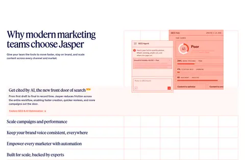
| 4 | feature-split | Left-aligned section intro with product visual and stacked feature rows. | expandable feature rows, feature links | split layout, interface mockup, thin row dividers |
| 5 | other | Short white spacer between the feature area and customer-story content. | visual pacing | open white space |
| 6 | testimonials | Centered heading and action above a three-column mosaic of proof cards. | customer proof, case-study exploration | metric tiles, quotes, portraits and logos |
| 7 | feature-grid | Centered section heading followed by a two-column mix of role tabs and illustrated solution content. | role selection, solution discovery | category tabs, colorful product collage |
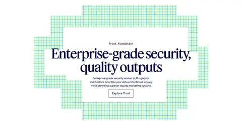
| 8 | feature-split | Centered message inside a broad geometric, grid-patterned illustration. | trust information, learn more action | framed text panel, decorative grid |
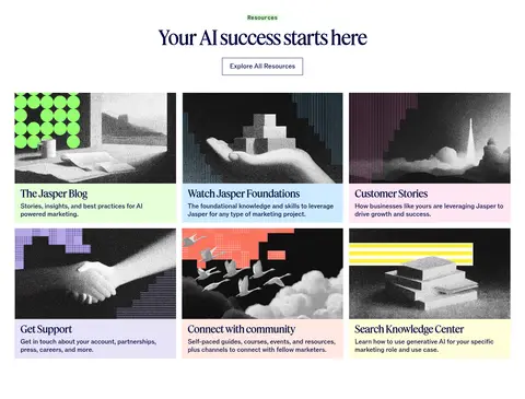
| 9 | content-feed | Centered introduction above a three-column by two-row resource-card grid. | browse resources | image-led cards, six-item grid |
| 10 | cta | Large left-aligned copy and coral action beside a collaborative workplace photograph. | demo conversion | split image and copy, large serif headline |
| 11 | faq | Two-part FAQ area: editorial title at left, stacked peach question panels at right. | accordion disclosure | coral hairline borders, compact expand controls |
| 12 | footer | Full-bleed charcoal footer with grouped link columns, CTA actions, brand mark, and legal row. | multi-column navigation, demo and trial links | inverse light text, coral CTA, dark surface |
## Source CSS custom properties (selected)
```css
--_theme---background: white;
--_text-style---font-family: "ABC ROM",Arial,sans-serif;
--_theme---text: