Wispr Flow 以浅奶油色背景和富有表现力的衬线标题,打造沉静、编辑感十足的语音输入产品主页。深色口碑区块、深绿功能带和淡紫色按钮提供对比,同时保留宽松的页面节奏。
North star · Keep the cream canvas and expressive serif message dominant, using dark and green bands as deliberate punctuation.
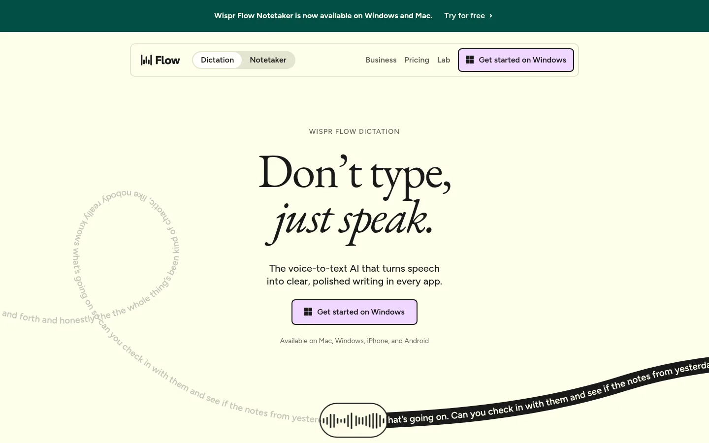
The page is defined by a warm cream canvas (#ffffeb) that carries most of the experience, with near-black (#1a1a1a) typography and occasional full-width dark panels for customer logos and testimonials. A deep green (#034f46) performance section provides a strong mid-page color shift; pale lavender (#f0d7ff) is reserved for the primary download action and selected testimonial artwork. Large, lightly tracked EB Garamond headings bring an editorial, literary tone, while Figtree keeps navigation, body copy, and controls practical and legible. The hero centers its promise and CTA, then demonstrates speech in a curved text treatment rather than relying on a conventional product screenshot. Sections use generous breathing room and broad, rounded bands, with product-interface fragments and customer proof introduced as supporting evidence. Borders are delicate and shadows are not a defining device. Bright orange, coral, and mint hues appear sparingly in accent or illustrative material rather than setting the core identity.
配色 点色块复制色值。用途说明来自对页面的实测位置(背景、文字、描边、按钮)与截图判读。
品牌色
Soft Ink
#1a1a1a
Primary text, navigation, dark testimonial and logo panels, and dark outlines on lavender CTAs.
Flow Cream
#ffffeb
Main page canvas, light cards, and reversed text on dark or green surfaces.
Deep Flow Green
#034f46
Large feature section background and dark green announcement strip.
强调色
Pine Edge
#1d6157
Fine borders and outlines around cards or green-toned interface details.
Lilac Signal
#f0d7ff
Primary Get started button background and lavender testimonial artwork.
Amber Spark
#ffa946
Small decorative or illustrative accent, not a major page surface.
Coral Note
#ff6c4c
Minor warm accent in decorative or illustrative content.
表层色
Sage Paper
#e4e4d0
Muted navigation and card surfaces, including subdued interface-style elements.
Linen Mist
#eeebe3
Low-key secondary surface detail within interface or media elements.
中性色
Stone Hairline
#d1d1c1
Subtle card borders and separators against the cream canvas.
Olive Gray
#565650
Secondary copy and low-emphasis text.
Moss Gray
#5e5e58
Muted navigation and supporting text.
Quiet Taupe
#8c8c82
Low-emphasis captions and supporting text.
功能色
Gradient Black
#080808
Gradient artifact measured in decorative media; not a defining page background color.
Mint Glint
#34d399
Small success-like or product illustration detail, not a core brand field.
文字 背景 对比度 WCAG #1a1a1a Soft Ink#ffffeb Flow Cream17.2:1 AAA #1a1a1a Soft Ink#034f46 Deep Flow Green1.83:1 不达标 #1a1a1a Soft Ink#e4e4d0 Sage Paper13.51:1 AAA #ffffeb Flow Cream#1a1a1a Soft Ink17.2:1 AAA #ffffeb Flow Cream#034f46 Deep Flow Green9.39:1 AAA #ffffeb Flow Cream#e4e4d0 Sage Paper1.27:1 不达标
字体 字号阶梯:Augmented Fourth(比例约 1.431,正文 16px)。示例用免费替代字体渲染,数值为实测。
Aa 设计
Figtree 网络字体 · 字重 500 / 600 / 400 / 700 · 占比 62%
免费替代:Inter
Navigation, body copy, labels, buttons, and interface text.
Aa 设计
Eb garamond 网络字体 · 字重 400 · 占比 38%
免费替代:EB Garamond
Display headlines and editorial section titles.
角色 示例 字号 字重 行高 字距 特大标题 Oversized editorial statements and prominent brand messaging.
Wispr Flow
96px 400 0.95 -0.03em 一级标题 Hero headline and primary page-level statement.
Wispr Flow
75px 400 1 -0.03em 二级标题 Major feature and testimonial section headings.
Wispr Flow
64px 400 0.95 -0.03em 三级标题 Feature titles and secondary editorial headings.
Wispr Flow
48px 400 0.95 -0.03em 四级标题 Smaller card and supporting section headings.
Wispr Flow
32px 400 0.95 -0.03em 正文 Main explanatory copy and product descriptions.
The quick brown fox 敏捷的狐狸
16px 500 1.3 0 辅助文字 Small supporting labels, notes, and card metadata.
The quick brown fox 敏捷的狐狸
12px 600 1.54 -0.02em 导航 Primary navigation labels and menu controls.
The quick brown fox 敏捷的狐狸
16px 600 1 0 眉题 Uppercase section labels above headlines.
The quick brown fox 敏捷的狐狸
14px 500 1.3 0.08em
间距与布局 基准单位 8px · 密度:宽松
40px 版块间距
64px 元素间距
— 卡片内边距
1240px 内容最大宽度
4px
6px
8px
9px
10px
12px
16px
24px
32px
40px
48px
64px
80px
Use a centered content frame with a measured maximum width of 1240px, while letting key color bands extend across the viewport. The page opens with a narrow announcement strip, an inset pill-like navigation bar, and a centered hero. Alternate broad cream intervals with dark proof panels and a deep green feature section. Keep headings centered where the message is a single statement; use split content for feature details and security proof. The measured spacing system is based on an 8px unit and is described as spacious, with noticeable section-to-section breathing room.
圆角与层次 没有测到阴影:页面是扁平的,层次靠底色和描边区分。
The visual language is mostly flat: no measured shadows define the cards or page. Use fine borders and subtle tonal changes to separate light surfaces, plus strong contrast between cream, green, and dark section bands. Rounded panel edges create the main sense of layering; reserve the dark-to-transparent gradients for media overlays.
组件 下面的预览按实测的按钮、输入框、徽标、卡片样式重建(字体用替代字体)。
Announcement strip A deep green top band with centered availability messaging and a small cream-colored link.
Inset navigation A cream-toned, rounded horizontal bar with the Flow mark, pill-style product choices, text links, and a lavender download button.
Hero CTA Centered serif headline and short sans-serif explanation above a lavender button with a dark outline.
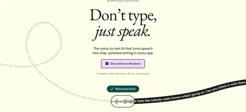
Speech demo Curved transcript trails lead to a compact waveform control, making live dictation the hero visual.
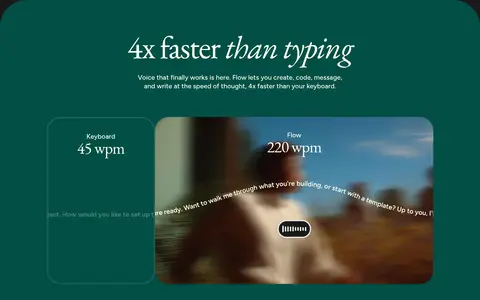
Feature band A deep green rounded section pairs a centered serif claim with a wide product comparison and media frame.
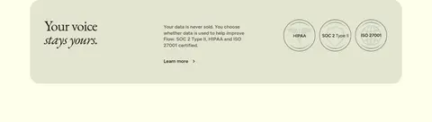
Trust panel A muted sage card combines a serif privacy statement, concise security copy, and certification marks.
Testimonial panel A dark section introduces customer proof cards, including a lilac card with portrait photography and metrics.
Imagery · The hero uses curved, flowing transcript text and a compact waveform-like control as a product demonstration, not a large conventional screenshot. A feature section includes a wide media frame with a comparison panel. Later content uses restrained interface fragments and testimonial cards with a customer portrait. Keep image edges rounded and let imagery support, rather than overpower, the typography.
页面版块 共 11 个版块,按页面从上到下排列,每个都标了类型、布局和交互套路。
该做与不该做 ✓ 该做 Keep Flow Cream (#ffffeb) as the dominant canvas. Use EB Garamond for large editorial headlines. Set practical copy and controls in Figtree. Reserve Soft Ink (#1a1a1a) for strong text and proof panels. Use Deep Flow Green (#034f46) for a distinct feature band. Make Lilac Signal (#f0d7ff) the clear download-action accent. Preserve generous whitespace around major messages. ✕ 不该做 Do not turn the page into a dense dashboard layout. Do not use gradients as the dominant page treatment. Do not apply bright accent colors across large areas. Do not replace the editorial serif headline with a heavy geometric display face. Do not add prominent drop shadows to otherwise flat cards. Do not make every section or card equally dark. Do not crowd the hero with multiple competing actions. 给 AI 的提示词 想快速出一个同风格的新页面,把这段话连同 DESIGN.md 一起发给 AI。
复制 Build a new page in Wispr Flow's calm editorial SaaS style. Keep Flow Cream (#ffffeb) as the main canvas and Soft Ink (#1a1a1a) for readable text, navigation, and occasional dark proof panels. Use EB Garamond for large, tightly tracked serif headlines, with Figtree for body copy, labels, and controls. Place one centered primary message and a clear Lilac Signal (#f0d7ff) CTA in the opening area. Use Deep Flow Green (#034f46) as a deliberate feature-section band, not a general background. Favor broad whitespace, centered content, rounded sections, fine borders, and flat surfaces. Include a product demonstration or interface fragment as supporting evidence; avoid overloading the page with decorative color, shadows, or dense grids.
DESIGN.md Tailwind v4 CSS 变量 Design Tokens
---
title: "Wispr Flow design system"
variant: extended
source: https://wisprflow.ai/
captured_at: 2026-10-12
theme: light
industry: ai
generator: Design DNA (https://four.wiralomi.com/style/wisprflow-ai)
ai_generated: true
ai_label: "本文件由 AI 辅助生成:数值取自公开网页的实测样式,命名、用途说明与建议为模型解读。商标归原所有者。 / AI-assisted content"
---
# Wispr Flow · Design System
> Warm editorial typography meets effortless voice technology.
**Theme:** light · **Industry:** ai · **Source:** https://wisprflow.ai/ · **Captured:** 2026-10-12 (1440×900 desktop)
_AI-assisted content: values are measured from the public page at capture time; names, roles and guidance are model-written interpretations. Trademarks belong to their owners._
Wispr Flow presents voice dictation through a calm, editorial landing page built around a pale cream canvas and expressive serif headlines. Dark proof sections, a deep green feature band, and lilac calls to action add contrast without disrupting the spacious flow.
## North star
Keep the cream canvas and expressive serif message dominant, using dark and green bands as deliberate punctuation.
## Overview
The page is defined by a warm cream canvas (## Colors
| Name | Hex | Token | Group | Role |
|---|---|---|---|---|
| Soft Ink | ` | `--color-soft-ink` | brand | Primary text, navigation, dark testimonial and logo panels, and dark outlines on lavender CTAs. |
| Flow Cream | ` | `--color-flow-cream` | brand | Main page canvas, light cards, and reversed text on dark or green surfaces. |
| Gradient Black | ` | `--color-gradient-black` | semantic | Gradient artifact measured in decorative media; not a defining page background color. |
| Deep Flow Green | ` | `--color-deep-flow-green` | brand | Large feature section background and dark green announcement strip. |
| Sage Paper | ` | `--color-sage-paper` | surface | Muted navigation and card surfaces, including subdued interface-style elements. |
| Pine Edge | ` | `--color-pine-edge` | accent | Fine borders and outlines around cards or green-toned interface details. |
| Stone Hairline | ` | `--color-stone-hairline` | neutral | Subtle card borders and separators against the cream canvas. |
| Olive Gray | ` | `--color-olive-gray` | neutral | Secondary copy and low-emphasis text. |
| Moss Gray | ` | `--color-moss-gray` | neutral | Muted navigation and supporting text. |
| Lilac Signal | ` | `--color-lilac-signal` | accent | Primary Get started button background and lavender testimonial artwork. |
| Amber Spark | ` | `--color-amber-spark` | accent | Small decorative or illustrative accent, not a major page surface. |
| Linen Mist | ` | `--color-linen-mist` | surface | Low-key secondary surface detail within interface or media elements. |
| Coral Note | ` | `--color-coral-note` | accent | Minor warm accent in decorative or illustrative content. |
| Mint Glint | ` | `--color-mint-glint` | semantic | Small success-like or product illustration detail, not a core brand field. |
| Quiet Taupe | ` | `--color-quiet-taupe` | neutral | Low-emphasis captions and supporting text. |
### Semantic aliases
`--color-canvas` → ` (Flow Cream) · `--color-surface` → ` (Soft Ink) · `--color-surface-2` → ` (Deep Flow Green) · `--color-surface-3` → ` (Sage Paper) · `--color-surface-4` → ` (Lilac Signal) · `--color-text` → ` (Soft Ink) · `--color-text-muted` → ` (Flow Cream) · `--color-border` → ` (Pine Edge) · `--color-accent` → ` (Deep Flow Green) · `--color-accent-2` → ` (Amber Spark) · `--color-accent-3` → ` (Coral Note)
### Contrast (WCAG 2.x)
| Text | Background | Ratio | Level |
|---|---|---|---|
| ` | ` | 17.2:1 | AAA |
| ` | ` | 1.83:1 | fail |
| ` | ` | 13.51:1 | AAA |
| ` | ` | 17.2:1 | AAA |
| ` | ` | 9.39:1 | AAA |
| ` | ` | 1.27:1 | fail |
| ` | ` | 9.39:1 | AAA |
| ` | ` | 1.83:1 | fail |
| ` | ` | 7.38:1 | AAA |
### Gradients
- `linear-gradient(rgba(255, 255, 255, 0), rgba(0, 0, 0, 0.7))`
- `linear-gradient(90deg, rgba(0, 0, 0, 0), rgb(255, 255, 235))`
## Typography
| Family | Token | Source | Weights | Role | Free substitute |
|---|---|---|---|---|---|
| Figtree | `--font-body` | webfont | 500, 600, 400, 700 | Navigation, body copy, labels, buttons, and interface text. | Inter |
| Eb garamond | `--font-display` | webfont | 400 | Display headlines and editorial section titles. | EB Garamond |
- **Figtree:** Use practical sans-serif forms; mostly medium and semibold, with compact uppercase eyebrow labels and restrained tracking.
- **Eb garamond:** Regular-weight serif with tight negative tracking; use expressive italic emphasis within selected headlines.
### Type scale — Augmented Fourth (ratio ≈ 1.431, base 16px)
| Role | Size | Weight | Line height | Letter spacing | Case | Family | Used for |
|---|---|---|---|---|---|---|---|
| display | 96px | 400 | 0.95 | -0.03em | — | Eb garamond | Oversized editorial statements and prominent brand messaging. |
| h1 | 75px | 400 | 1 | -0.03em | — | Eb garamond | Hero headline and primary page-level statement. |
| h2 | 64px | 400 | 0.95 | -0.03em | — | Eb garamond | Major feature and testimonial section headings. |
| h3 | 48px | 400 | 0.95 | -0.03em | — | Eb garamond | Feature titles and secondary editorial headings. |
| h4 | 32px | 400 | 0.95 | -0.03em | — | Eb garamond | Smaller card and supporting section headings. |
| body | 16px | 500 | 1.3 | 0 | — | Figtree | Main explanatory copy and product descriptions. |
| caption | 12px | 600 | 1.54 | -0.02em | — | Figtree | Small supporting labels, notes, and card metadata. |
| nav | 16px | 600 | 1 | 0 | — | Figtree | Primary navigation labels and menu controls. |
| eyebrow | 14px | 500 | 1.3 | 0.08em | uppercase | Figtree | Uppercase section labels above headlines. |
## Spacing & layout
- Base unit **8px**, density **spacious**.
- Scale (most used values): 4, 6, 8, 9, 10, 12, 16, 24, 32, 40, 48, 64, 80 px.
- Section rhythm 40px · element gap 64px · card padding — · max content width 1240px.
Use a centered content frame with a measured maximum width of 1240px, while letting key color bands extend across the viewport. The page opens with a narrow announcement strip, an inset pill-like navigation bar, and a centered hero. Alternate broad cream intervals with dark proof panels and a deep green feature section. Keep headings centered where the message is a single statement; use split content for feature details and security proof. The measured spacing system is based on an 8px unit and is described as spacious, with noticeable section-to-section breathing room.
## Shape & elevation
- Radius: button `8px` · card `7px` · media `9999px` · nav `9999px` · link `48px` · xs `7px` · sm `8px` · md `16px` · lg `32px` · xl `40px` · 2xl `48px` · pill `9999px`
- No box shadows measured: the page is flat.
- Motion: standard transition `0.3s ease` on interactive elements.
The visual language is mostly flat: no measured shadows define the cards or page. Use fine borders and subtle tonal changes to separate light surfaces, plus strong contrast between cream, green, and dark section bands. Rounded panel edges create the main sense of layering; reserve the dark-to-transparent gradients for media overlays.
## Imagery
The hero uses curved, flowing transcript text and a compact waveform-like control as a product demonstration, not a large conventional screenshot. A feature section includes a wide media frame with a comparison panel. Later content uses restrained interface fragments and testimonial cards with a customer portrait. Keep image edges rounded and let imagery support, rather than overpower, the typography.
## Components
### Announcement strip
A deep green top band with centered availability messaging and a small cream-colored link.
### Inset navigation
A cream-toned, rounded horizontal bar with the Flow mark, pill-style product choices, text links, and a lavender download button.
### Hero CTA
Centered serif headline and short sans-serif explanation above a lavender button with a dark outline.
### Speech demo
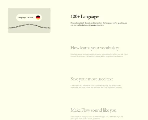
Curved transcript trails lead to a compact waveform control, making live dictation the hero visual.
### Feature band
A deep green rounded section pairs a centered serif claim with a wide product comparison and media frame.
### Trust panel
A muted sage card combines a serif privacy statement, concise security copy, and certification marks.
### Testimonial panel
A dark section introduces customer proof cards, including a lilac card with portrait photography and metrics.
### Measured component styles
- **Primary button** (“Dictation”): background ## Do
- Keep Flow Cream (## Don't
- Do not turn the page into a dense dashboard layout.
- Do not use gradients as the dominant page treatment.
- Do not apply bright accent colors across large areas.
- Do not replace the editorial serif headline with a heavy geometric display face.
- Do not add prominent drop shadows to otherwise flat cards.
- Do not make every section or card equally dark.
- Do not crowd the hero with multiple competing actions.
## Agent prompt
Build a new page in Wispr Flow's calm editorial SaaS style. Keep Flow Cream (## Page sections (top to bottom)
| # | Type | Layout | UX patterns | UI patterns |
|---|---|---|---|---|
| 1 | announcement | Full-width, narrow dark green strip with centered message and link. | Availability announcement, Inline try-free link | Deep green band, Small centered sans-serif text |
| 2 | hero | Centered hero beneath inset navigation, with curved transcript detail around the main message. | Primary download CTA, Cross-platform availability note, Product demonstration | Large serif headline, Lavender outlined button, Waveform control |
| 3 | logo-cloud | Full-width dark panel with a centered eyebrow and horizontally arranged customer logos. | Social proof, Customer logo recognition | Dark rounded band, Light logo marks, Small uppercase label |
| 4 | product-showcase | Deep green feature band with centered title and wide comparison media below. | Speed comparison, Product capability demonstration | Green background, Serif heading, Rounded media frame |
| 5 | how-it-works | Centered section introduction on the cream canvas. | Feature overview, Section transition | Small uppercase eyebrow, Large serif title, Open whitespace |
| 6 | feature-grid | Two-column feature content on a continuous cream background. | Feature discovery, Benefits overview | Sparse feature blocks, Sans-serif descriptions, Subtle illustrations |
| 7 | other | Single-column cream interval with no prominent content. | Visual breathing room | Uninterrupted cream canvas |
| 8 | feature-split | Long cream section with product examples alongside stacked feature descriptions. | Language support, Vocabulary learning, Reusable text shortcuts | Split content, Interface-style examples, Serif feature titles |
| 9 | feature-split | Three-part muted card on cream: statement, explanatory copy, and certification marks. | Privacy reassurance, Security credentials link | Sage surface, Serif statement, Circular certification marks |
| 10 | testimonials | Full-width dark section with centered heading and testimonial cards below. | Customer validation, Case-study discovery | Near-black background, Serif title, Floating card composition |
| 11 | stats | Dark continuation with testimonial quote, case study, and compact outcome metrics. | Customer quote, Case-study link, Outcome metrics | Light-on-dark text, Customer image, Metric callouts |
## Source CSS custom properties (selected)
```css
--background-color--background-primary: