North star · Use a near-black plum stage and oversized serif headlines, then let bright, rounded product surfaces carry the visual color.
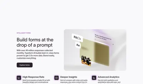
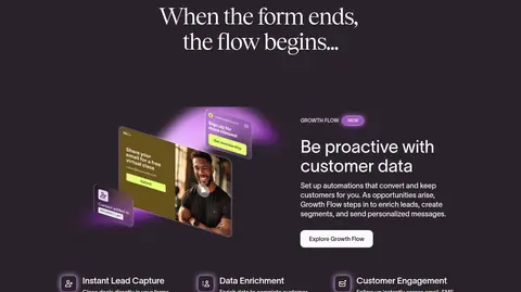
The page opens on a near-black plum canvas, with centered ivory typography and a dramatic Tobias headline. A compact navigation row gives way to the hero statement, supporting copy, and a pale pill-shaped CTA. Product concepts sit in three restrained cards above a wide showcase with purple ambient glow; this glow belongs to product presentation, not to the core canvas. Below, broad light sections create a deliberate contrast break for form features, customer logos, case-study cards, and integrations. Dark feature bands return for workflow and research content, using white text, small purple NEW badges, and floating interface imagery. Typography combines expressive serif display headlines with clean Twklausanne sans-serif navigation, copy, and controls. Cards use generous rounded corners, subtle borders, and occasional inset or colored glow rather than heavy drop shadows. The overall rhythm is spacious and editorial, with centered moments balanced by left-aligned feature details.
Body copy, navigation, captions, and standard card content.
Aa 设计
Tobias
网络字体 · 字重 400 · 占比 15%
免费替代:DM Serif Display
Display, H1, and H2 headlines, especially hero and dark CTA statements.
Aa 设计
Twklausanne 500
网络字体 · 字重 400 · 占比 8%
免费替代:Inter
Button labels and selected action text.
Aa 设计
Twklausanne 350
网络字体 · 字重 400 · 占比 4%
免费替代:Inter
H3 feature headings and prominent sans-serif subheads.
Aa 设计
Arial
系统字体 · 字重 400 · 占比 2%
免费替代:Arial
Fallback for body and action text when the webfont is unavailable.
Aa 设计
Twklausanne 600
网络字体 · 字重 400 · 占比 2%
免费替代:Inter
Eyebrow labels and small section identifiers.
角色
示例
字号
字重
行高
字距
特大标题
Oversized editorial statements in the hero and closing CTA.
Typeform
80px
400
1
-0.012em
一级标题
Primary hero headline.
Typeform
64px
400
1.1
-0.031em
二级标题
Major section headlines and campaign statements.
Typeform
56px
400
1
-0.031em
三级标题
Feature-section and supporting feature headings.
Typeform
48px
400
1.1
0
四级标题
Card titles and secondary content headings.
Typeform
36px
400
1.15
0
正文
Introductory copy, feature explanations, and general content.
The quick brown fox 敏捷的狐狸
16px
400
1.3
0
辅助文字
Eyebrows, compact notes, and supporting labels.
The quick brown fox 敏捷的狐狸
14px
400
1.49
0
按钮
CTA labels and compact action controls.
The quick brown fox 敏捷的狐狸
14px
400
1.49
0
导航
Top navigation and prominent footer navigation labels.
The quick brown fox 敏捷的狐狸
16px
400
1.4
0
间距与布局
基准单位 8px · 密度:适中
48px版块间距
8px元素间距
—卡片内边距
1344px内容最大宽度
1px
6px
8px
12px
16px
20px
24px
32px
40px
48px
54px
Use a broad centered content frame, measured at a 1344px maximum width, with a comfortable rather than dense feel. The first screen centers the hero headline, copy, and CTA; three product cards form a row beneath it. Alternate wide, full-bleed dark and light bands, placing feature copy beside product media and smaller benefit groups below. Use centered alignment for brand proof, integrations, and closing CTA, with left-aligned detail in feature sections. Section spacing follows a generous measured rhythm; preserve clear separation rather than compressing content.
圆角与层次
按钮 · 12px
卡片 · 24px
徽标 · 9999px
md · other
md · other
inset · card
md · other
Most content reads as flat blocks with contrast carried by alternating backgrounds. Use delicate outlines and muted hairlines on dark cards, softly rounded card surfaces on light bands, and restrained purple glow around product mockups. Avoid heavy generic shadows; layered inset treatment is reserved for selected product-like cards or controls.
组件
下面的预览按实测的按钮、输入框、徽标、卡片样式重建(字体用替代字体)。
Primary CTA
Pale ivory fill with plum text, rounded corners, and compact Twklausanne 500 label; centered below hero copy.
Outlined navigation action
Transparent dark-surface button with an ivory hairline and ivory label, paired with the filled sign-up action.
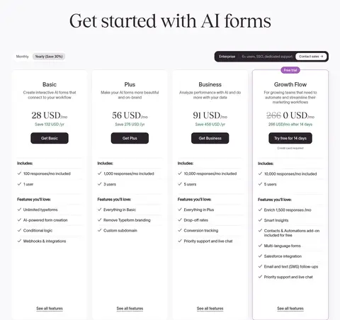
Product capability cards
Three horizontally aligned dark cards with short ASK, ACT, or LEARN labels, concise copy, fine borders, and purple NEW pills where relevant.
Showcase panel
Wide rounded media stage with a plum-to-purple glow surrounding a floating form or interface preview.
Customer story cards
Large pale-gray rounded cards with customer identity and prominent serif outcome statements, arranged as a carousel.
Integration board
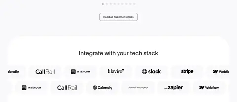
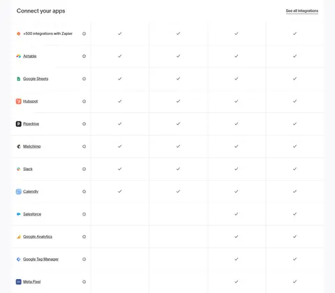
White rounded panel with a centered heading, rows of partner marks, and a compact outlined view-integrations action.
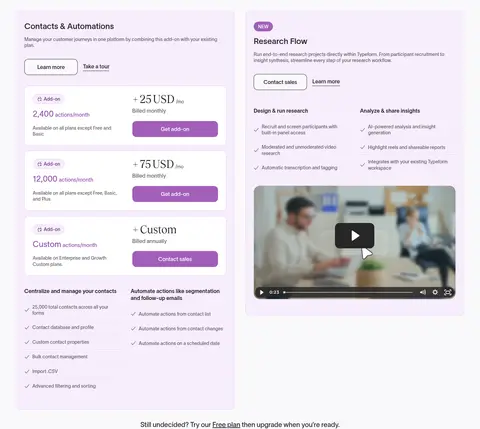
Imagery · Product UI is the primary visual: floating form previews, interface panels, and workflow mockups, often composed as layered showcases. Photography appears within some product mockups rather than as a broad lifestyle campaign. Purple ambient glow and gradients frame these visuals on dark sections. Customer and integration logos remain small, crisp, and orderly on light backgrounds.
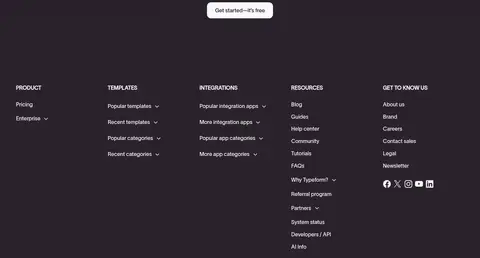
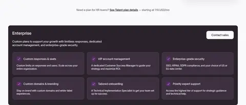
Use Plum Ink #2a222b for dramatic hero and footer bands.
Reserve Tobias-style serif for high-impact display headlines.
Keep navigation, copy, and controls clean and sans-serif.
Use Soft Ivory #faf9fb for readable inverse text and filled CTAs.
Alternate dark feature storytelling with bright proof sections.
Apply Orchid Glow #a057bb sparingly to badges and product lighting.
✕ 不该做
Do not make the entire page uniformly dark or uniformly light.
Do not use purple as a large flat background for ordinary content.
Do not replace the editorial headline contrast with generic all-sans headings.
Do not crowd feature sections or customer proof into dense grids.
Do not add heavy shadows to every card or control.
Do not mistake colors embedded in product mockups for the core brand palette.
给 AI 的提示词
想快速出一个同风格的新页面,把这段话连同 DESIGN.md 一起发给 AI。
Build a new Typeform-style SaaS page with a near-black Plum Ink #2a222b hero, oversized editorial serif headlines, and crisp sans-serif body copy. Use Soft Ivory #faf9fb for inverse text and primary filled CTAs, with Orchid Glow #a057bb as a restrained badge and product-light accent. Alternate wide dark storytelling bands with bright, spacious proof sections. Pair feature copy with floating, layered form or workflow interfaces; use softly rounded cards and subtle borders, not heavy shadows. Give customer stories and integrations clean light surfaces, strong alignment, and room to breathe. Keep navigation compact, use centered alignment for hero and CTA moments, and shift to left-aligned copy for detailed feature explanations. Treat product imagery as a designed focal point, not decoration.