Retool以近黑色画布、克制的字体和鲜明的产品画面,突出内部软件平台。首页从视频主导的居中首屏展开,依次呈现客户标识、应用预览、功能内容和宽松的页脚。
North star · Keep the interface quiet and near-black so clear, light typography and real product UI carry the story.
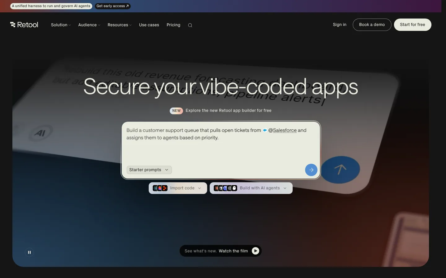
The page uses a consistently near-black canvas, with warm off-white text providing the primary contrast and softer gray for supporting copy. Restrained blue and rust tones appear mainly in the hero’s atmospheric video and gradients rather than as a broad interface palette; the brighter blue is reserved for small interactive emphasis. Lightweight Saans headings use close tracking and generous line height to keep oversized statements calm, while compact grotesk labels and UI copy add a technical counterpoint. The opening is centered and media-led, with the product prompt floating over a cinematic, rounded video frame. Customer marks and a dense app gallery create a quick proof-of-work transition; later feature sections alternate concise copy with large interface captures. Spacing is generous around key storytelling moments, while card and control clusters stay compact. Hairline borders, modest corner radii, and limited shadows keep interface surfaces legible without competing with product imagery.
配色 点色块复制色值。用途说明来自对页面的实测位置(背景、文字、描边、按钮)与截图判读。
品牌色
Carbon Canvas
#151515
Dominant page canvas across the hero, feature bands, and footer.
Warm Porcelain
#e9ebdf
Primary headings, body text, inverted prompt surfaces, and main CTA.
强调色
Rust Trace
#7e463a
Very faint sampled warm badge and atmospheric media tone, not a dominant UI color.
Signal Blue
#518dd2
Small interactive emphasis, notably the prompt submit control.
表层色
Near Black
#0c0c0c
Occasional darker section surface beneath the main canvas.
Raised Charcoal
#242424
Subtle raised controls, links, and compact UI surfaces.
Prompt Stone
#dbddd2
Pale prompt controls and starter-prompt chip surfaces.
中性色
Soft Ash
#cbccc4
Muted paragraphs, footer copy, and secondary links.
Graphite Hairline
#2e302e
Fine outlines on cards, buttons, and links against dark surfaces.
Warm Border
#433e38
Low-visibility sampled borders in cards and footer details.
Muted Sage Gray
#94958e
Minor navigation and text detail; not a primary copy color.
Midnight Gray
#646464
Sparse subdued text detail within the interface.
Footer Mist
#b6b8af
Low-emphasis footer text.
Slate Olive
#6a6b66
Faint supporting text or gradient detail.
功能色
Video Slate
#273e5a
Blue component of the hero’s atmospheric gradient and video imagery.
Ember Shade
#56291f
Rust component of atmospheric section gradients and hero media.
文字 背景 对比度 WCAG #e9ebdf Warm Porcelain#151515 Carbon Canvas15.14:1 AAA #e9ebdf Warm Porcelain#0c0c0c Near Black16.22:1 AAA #e9ebdf Warm Porcelain#242424 Raised Charcoal12.87:1 AAA #cbccc4 Soft Ash#151515 Carbon Canvas11.28:1 AAA #cbccc4 Soft Ash#0c0c0c Near Black12.08:1 AAA #cbccc4 Soft Ash#242424 Raised Charcoal9.59:1 AAA
字体 字号阶梯:Perfect Fourth(比例约 1.351,正文 16px)。示例用免费替代字体渲染,数值为实测。
Aa 设计
saansFont 网络字体 · 字重 380 / 300 · 占比 68%
免费替代:DM Sans
Display, headings, and most body copy
Aa 设计
pxGroteskFont 网络字体 · 字重 400 · 占比 18%
免费替代:Space Grotesk
Compact labels, announcement and control text
Aa 设计
ui-sans-serif 系统字体 · 字重 400 · 占比 14%
免费替代:Inter
Product prompt and selected utility links
角色 示例 字号 字重 行高 字距 特大标题 Oversized hero or campaign statement.
Retool
72px 300 1.05 -0.022em 一级标题 Primary page headline and major feature statements.
Retool
60px 300 1.05 -0.02em 二级标题 Section headlines such as the app gallery heading.
Retool
48px 300 1.05 -0.01em 三级标题 Feature and product-story subsection headings.
Retool
32px 300 1.05 -0.01em 四级标题 Compact card or supporting section titles.
The quick brown fox 敏捷的狐狸
24px 380 1.2 -0.01em 正文 Explanatory feature copy and descriptive paragraphs.
The quick brown fox 敏捷的狐狸
16px 300 1.5 0.01em 辅助文字 Uppercase micro-labels and small interface annotations.
The quick brown fox 敏捷的狐狸
12px 400 1.2 0.01em 导航 Prominent navigation or oversized navigation treatment.
The quick brown fox 敏捷的狐狸
24px 380 1.2 -0.01em 链接 Functional links and calls to explore product details.
The quick brown fox 敏捷的狐狸
16px 400 1.5 0
间距与布局 基准单位 4px · 密度:紧凑
40px 版块间距
8px 元素间距
— 卡片内边距
— 内容最大宽度
2px
4px
6px
8px
12px
14px
16px
17px
20px
24px
32px
34px
40px
80px
A dark, full-width canvas organizes the page as a long single-column narrative, with centered hero and app-gallery moments followed by left-aligned feature stories. Customer logos form a compact multi-column band; product captures sit beside or beneath short copy in broad sections. The footer shifts into several narrow link columns. Measured spacing runs from tight control groupings to notably open section intervals; preserve this contrast without inventing fixed page dimensions. The overall density is low, with interface details concentrated inside media.
圆角与层次 hairline · media
xl · card
Most sections remain flat against the canvas. Thin graphite outlines define dark cards and controls; pale prompt surfaces create contrast through color rather than heavy elevation. Rounded media frames and layered product screenshots provide depth. A strong shadow is measured on select cards, but the overall page avoids a consistently raised-card aesthetic.
组件 下面的预览按实测的按钮、输入框、徽标、卡片样式重建(字体用替代字体)。
Announcement strip A narrow, top-edge campaign strip with compact pill-like message and early-access link over a multicolor gradient.
Primary navigation Dark horizontal bar with Retool mark, compact links, sign-in, outlined demo action, and a Warm Porcelain (#e9ebdf) pill CTA.
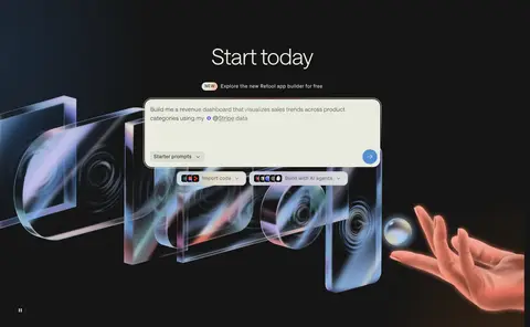
Hero prompt Centered product prompt on a pale Warm Porcelain (#e9ebdf) surface, with concise copy, starter-prompts chip, blue submit control, and adjacent import/build actions.
Customer logo band Compact row-based display of customer marks on the uninterrupted Carbon Canvas (#151515).
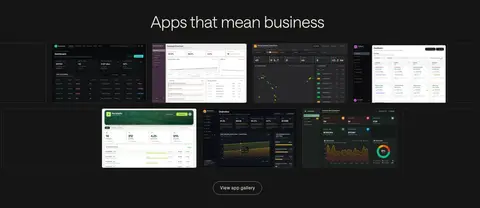
App gallery Centered heading above a dense grid of varied internal-app screenshots and a small gallery link.
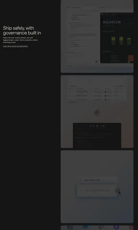
Feature showcase Large product UI captures paired with short feature headlines, explanatory copy, and restrained links or NEW badges.
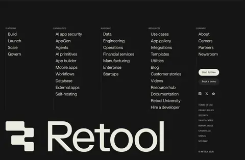
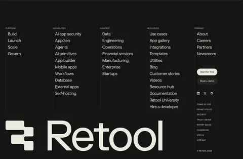
Footer directory Multi-column product, capability, audience, resource, and company links, ending with an oversized Retool wordmark.
Imagery · The hero uses a wide, rounded video frame with a darkened product scene and blue-to-rust atmospheric color. Product screenshots and app mockups are the main supporting imagery, shown large and sometimes stacked beside feature copy. Customer logos provide a brief, clean proof-point band. Treat interface captures as readable content, while keeping video and decorative color subdued behind text.
页面版块 共 27 个版块,按页面从上到下排列,每个都标了类型、布局和交互套路。
该做与不该做 ✓ 该做 Use Carbon Canvas (#151515) as the dominant page background. Set key copy in Warm Porcelain (#e9ebdf) and secondary copy in Soft Ash (#cbccc4). Give the hero a clear central focus and let its video provide atmosphere. Use large, real-looking product captures to explain features. Reserve Signal Blue (#518dd2) for small interactive accents. Keep borders fine and card treatments restrained. ✕ 不该做 Do not turn the page into a bright, multicolor interface. Do not use gradients as a substitute for product imagery. Do not crowd major headlines with dense supporting copy. Do not apply heavy shadows to every card. Do not use saturated accents for large text areas. Do not make every section a repeated card grid. 给 AI 的提示词 想快速出一个同风格的新页面,把这段话连同 DESIGN.md 一起发给 AI。
复制 Build a new Retool-style page on a Carbon Canvas (#151515), using Warm Porcelain (#e9ebdf) for primary text and pale UI surfaces, and Soft Ash (#cbccc4) for secondary copy. Keep the palette quiet: Graphite Hairline (#2e302e) defines delicate borders, Raised Charcoal (#242424) supports subtle controls, and Signal Blue (#518dd2) appears only as a small action accent. Use lightweight, tightly tracked sans headings and compact grotesk labels. Lead with a centered, media-rich hero and a legible product prompt; follow with a customer mark band, an app screenshot gallery, and alternating feature copy with large product captures. Keep the page spacious between stories but compact within controls. Favor flat surfaces, rounded media, fine outlines, and minimal shadows. Let screenshots—not decorative gradients—explain the product.
DESIGN.md Tailwind v4 CSS 变量 Design Tokens
---
title: "Retool design system"
variant: extended
source: https://retool.com/
captured_at: 2026-10-12
theme: dark
industry: devtools
generator: Design DNA (https://four.wiralomi.com/style/retool-com)
ai_generated: true
ai_label: "本文件由 AI 辅助生成:数值取自公开网页的实测样式,命名、用途说明与建议为模型解读。商标归原所有者。 / AI-assisted content"
---
# Retool · Design System
> Quiet dark canvas, vivid software in motion.
**Theme:** dark · **Industry:** devtools · **Source:** https://retool.com/ · **Captured:** 2026-10-12 (1440×900 desktop)
_AI-assisted content: values are measured from the public page at capture time; names, roles and guidance are model-written interpretations. Trademarks belong to their owners._
Retool pairs a near-black canvas with restrained typography and luminous product imagery to foreground its internal-software platform. A centered, video-led hero gives way to customer logos, app previews, feature storytelling, and a spacious footer.
## North star
Keep the interface quiet and near-black so clear, light typography and real product UI carry the story.
## Overview
The page uses a consistently near-black canvas, with warm off-white text providing the primary contrast and softer gray for supporting copy. Restrained blue and rust tones appear mainly in the hero’s atmospheric video and gradients rather than as a broad interface palette; the brighter blue is reserved for small interactive emphasis. Lightweight Saans headings use close tracking and generous line height to keep oversized statements calm, while compact grotesk labels and UI copy add a technical counterpoint. The opening is centered and media-led, with the product prompt floating over a cinematic, rounded video frame. Customer marks and a dense app gallery create a quick proof-of-work transition; later feature sections alternate concise copy with large interface captures. Spacing is generous around key storytelling moments, while card and control clusters stay compact. Hairline borders, modest corner radii, and limited shadows keep interface surfaces legible without competing with product imagery.
## Colors
| Name | Hex | Token | Group | Role |
|---|---|---|---|---|
| Carbon Canvas | ` | `--color-carbon-canvas` | brand | Dominant page canvas across the hero, feature bands, and footer. |
| Warm Porcelain | ` | `--color-warm-porcelain` | brand | Primary headings, body text, inverted prompt surfaces, and main CTA. |
| Soft Ash | ` | `--color-soft-ash` | neutral | Muted paragraphs, footer copy, and secondary links. |
| Graphite Hairline | ` | `--color-graphite-hairline` | neutral | Fine outlines on cards, buttons, and links against dark surfaces. |
| Rust Trace | ` | `--color-rust-trace` | accent | Very faint sampled warm badge and atmospheric media tone, not a dominant UI color. |
| Near Black | ` | `--color-near-black` | surface | Occasional darker section surface beneath the main canvas. |
| Signal Blue | ` | `--color-signal-blue` | accent | Small interactive emphasis, notably the prompt submit control. |
| Raised Charcoal | ` | `--color-raised-charcoal` | surface | Subtle raised controls, links, and compact UI surfaces. |
| Video Slate | ` | `--color-video-slate` | semantic | Blue component of the hero’s atmospheric gradient and video imagery. |
| Ember Shade | ` | `--color-ember-shade` | semantic | Rust component of atmospheric section gradients and hero media. |
| Prompt Stone | ` | `--color-prompt-stone` | surface | Pale prompt controls and starter-prompt chip surfaces. |
| Warm Border | ` | `--color-warm-border` | neutral | Low-visibility sampled borders in cards and footer details. |
| Muted Sage Gray | ` | `--color-muted-sage-gray` | neutral | Minor navigation and text detail; not a primary copy color. |
| Midnight Gray | ` | `--color-midnight-gray` | neutral | Sparse subdued text detail within the interface. |
| Footer Mist | ` | `--color-footer-mist` | neutral | Low-emphasis footer text. |
| Slate Olive | ` | `--color-slate-olive` | neutral | Faint supporting text or gradient detail. |
### Semantic aliases
`--color-canvas` → ` (Carbon Canvas) · `--color-surface` → ` (Near Black) · `--color-surface-2` → ` (Raised Charcoal) · `--color-surface-3` → ` (Warm Porcelain) · `--color-text` → ` (Warm Porcelain) · `--color-text-muted` → ` (Soft Ash) · `--color-text-subtle` → ` (Carbon Canvas) · `--color-border` → ` (Graphite Hairline) · `--color-accent` → ` (Signal Blue) · `--color-accent-2` → ` (Ember Shade)
### Contrast (WCAG 2.x)
| Text | Background | Ratio | Level |
|---|---|---|---|
| ` | ` | 15.14:1 | AAA |
| ` | ` | 16.22:1 | AAA |
| ` | ` | 12.87:1 | AAA |
| ` | ` | 11.28:1 | AAA |
| ` | ` | 12.08:1 | AAA |
| ` | ` | 9.59:1 | AAA |
| ` | ` | 1.34:1 | fail |
| ` | ` | 1.07:1 | fail |
| ` | ` | 1.18:1 | fail |
| ` | ` | 15.14:1 | AAA |
### Gradients
- `radial-gradient(at 0% 100%, color(srgb 0.176471 0.298039 0.443137 / 0.75) 0%, rgba(0, 0, 0, 0) 55%), radial-gradient(at 100% 100%, color(srgb 0.47451 0.2 0.145098 / 0.65) 0%, rgba(0, 0, 0, 0) 50%), none`
- `linear-gradient(rgb(21, 21, 21) 25%, rgba(21, 21, 21, 0.9) 31.25%, rgba(21, 21, 21, 0.8) 37.5%, rgba(21, 21, 21, 0.7) 43.75%, rgba(21, 21, 21, 0.6) 50%, rgba(21, 21, 21, 0.5) 56.25%, rgba(21, 21, 21, 0.4) 62.5%, rgba(21,`
- `linear-gradient(90deg, rgb(21, 21, 21) 0%, rgba(21, 21, 21, 0.6) 50%, rgb(21, 21, 21) 100%)`
- `linear-gradient(90deg, rgb(121, 51, 37) 0%, rgb(45, 76, 113) 20%, rgb(61, 22, 61) 100%)`
## Typography
| Family | Token | Source | Weights | Role | Free substitute |
|---|---|---|---|---|---|
| saansFont | `--font-body` | webfont | 380, 300 | Display, headings, and most body copy | DM Sans |
| pxGroteskFont | `--font-pxgroteskfont` | webfont | 400 | Compact labels, announcement and control text | Space Grotesk |
| ui-sans-serif | `--font-ui-sans-serif` | system | 400 | Product prompt and selected utility links | Inter |
- **saansFont:** Light weights dominate; oversized headings use tight negative tracking. Body stays airy and sentence case.
- **pxGroteskFont:** Used for small UI labels and uppercase captions; keep these compact and crisp.
- **ui-sans-serif:** Neutral interface sans; used for prompt copy and functional link text.
### Type scale — Perfect Fourth (ratio ≈ 1.351, base 16px)
| Role | Size | Weight | Line height | Letter spacing | Case | Family | Used for |
|---|---|---|---|---|---|---|---|
| display | 72px | 300 | 1.05 | -0.022em | — | saansFont | Oversized hero or campaign statement. |
| h1 | 60px | 300 | 1.05 | -0.02em | — | saansFont | Primary page headline and major feature statements. |
| h2 | 48px | 300 | 1.05 | -0.01em | — | saansFont | Section headlines such as the app gallery heading. |
| h3 | 32px | 300 | 1.05 | -0.01em | — | saansFont | Feature and product-story subsection headings. |
| h4 | 24px | 380 | 1.2 | -0.01em | — | saansFont | Compact card or supporting section titles. |
| body | 16px | 300 | 1.5 | 0.01em | — | saansFont | Explanatory feature copy and descriptive paragraphs. |
| caption | 12px | 400 | 1.2 | 0.01em | uppercase | pxGroteskFont | Uppercase micro-labels and small interface annotations. |
| nav | 24px | 380 | 1.2 | -0.01em | — | saansFont | Prominent navigation or oversized navigation treatment. |
| link | 16px | 400 | 1.5 | 0 | — | ui-sans-serif | Functional links and calls to explore product details. |
## Spacing & layout
- Base unit **4px**, density **compact**.
- Scale (most used values): 2, 4, 6, 8, 12, 14, 16, 17, 20, 24, 32, 34, 40, 80 px.
- Section rhythm 40px · element gap 8px · card padding — · max content width —.
A dark, full-width canvas organizes the page as a long single-column narrative, with centered hero and app-gallery moments followed by left-aligned feature stories. Customer logos form a compact multi-column band; product captures sit beside or beneath short copy in broad sections. The footer shifts into several narrow link columns. Measured spacing runs from tight control groupings to notably open section intervals; preserve this contrast without inventing fixed page dimensions. The overall density is low, with interface details concentrated inside media.
## Shape & elevation
- Radius: button `9999px` · card `4px` · media `5px` · badge `9999px` · nav `9999px` · link `50%` · xs `4px` · sm `5px` · md `8px` · lg `12px` · xl `16px` · 2xl `20px` · pill `9999px`
- Shadow `hairline` (media): `rgba(0, 0, 0, 0) 0px 0px 0px 0px, rgba(0, 0, 0, 0) 0px 0px 0px 0px, rgba(0, 0, 0, 0) 0px 0px 0px 0px, rgb(233, 234, 231) 0px 0px 0px 1px, rgba(0, 0, 0, 0) 0px 0px 0px 0px`
- Shadow `xl` (card): `rgba(0, 0, 0, 0) 0px 0px 0px 0px, rgba(0, 0, 0, 0) 0px 0px 0px 0px, rgba(0, 0, 0, 0) 0px 0px 0px 0px, rgba(0, 0, 0, 0) 0px 0px 0px 0px, rgba(0, 0, 0, 0.35) 0px 68px 116px 0px`
- Motion: standard transition `0.6s cubic-bezier(0.72, 0, 0.12, 1)` on interactive elements.
Most sections remain flat against the canvas. Thin graphite outlines define dark cards and controls; pale prompt surfaces create contrast through color rather than heavy elevation. Rounded media frames and layered product screenshots provide depth. A strong shadow is measured on select cards, but the overall page avoids a consistently raised-card aesthetic.
## Imagery
The hero uses a wide, rounded video frame with a darkened product scene and blue-to-rust atmospheric color. Product screenshots and app mockups are the main supporting imagery, shown large and sometimes stacked beside feature copy. Customer logos provide a brief, clean proof-point band. Treat interface captures as readable content, while keeping video and decorative color subdued behind text.
## Components
### Announcement strip
A narrow, top-edge campaign strip with compact pill-like message and early-access link over a multicolor gradient.
### Primary navigation
Dark horizontal bar with Retool mark, compact links, sign-in, outlined demo action, and a Warm Porcelain (### Hero prompt
Centered product prompt on a pale Warm Porcelain (### Customer logo band
Compact row-based display of customer marks on the uninterrupted Carbon Canvas (### App gallery
Centered heading above a dense grid of varied internal-app screenshots and a small gallery link.
### Feature showcase
Large product UI captures paired with short feature headlines, explanatory copy, and restrained links or NEW badges.
### Footer directory
Multi-column product, capability, audience, resource, and company links, ending with an oversized Retool wordmark.
### Measured component styles
- **Primary button** (“Import code”): background ## Do
- Use Carbon Canvas (## Don't
- Do not turn the page into a bright, multicolor interface.
- Do not use gradients as a substitute for product imagery.
- Do not crowd major headlines with dense supporting copy.
- Do not apply heavy shadows to every card.
- Do not use saturated accents for large text areas.
- Do not make every section a repeated card grid.
## Agent prompt
Build a new Retool-style page on a Carbon Canvas (## Page sections (top to bottom)
| # | Type | Layout | UX patterns | UI patterns |
|---|---|---|---|---|
| 1 | hero | Centered headline and prompt over a full-width rounded video hero. | Announcement link, Prompt input, Primary action, Video playback control | Dark navigation, Pale prompt card, Blue submit button, Atmospheric video |
| 2 | logo-cloud | Customer marks arranged in a compact multi-column band. | Customer credibility | Monochrome logo display, Dark canvas |
| 3 | gallery | Centered heading above a dense, multi-column app screenshot grid. | Browse examples, Gallery link | Mixed product previews, Fine image edges |
| 4 | feature-split | Long single-column feature narrative with copy and large product imagery. | Feature explanation, Learn-more links, NEW badge | Alternating text and UI captures, Pale product screens, Dark outlined cards |
| 5 | stats | Three-column band of concise platform points. | Scan platform benefits | Minimal columns, Dark background |
| 6 | product-showcase | Dense, multi-column product content with interface visuals and supporting links. | Explore capabilities, Product links | Large UI imagery, Grid arrangement, Dark surfaces |
| 7 | cta | Open full-width call-to-action zone with minimal surrounding content. | Conversion prompt | Sparse composition, Dark canvas |
| 8 | cta | Two-part call to action with headline and product imagery. | Start now, Explore app builder | Large product visual, Dark atmospheric treatment |
| 9 | footer | Four-column link directory with brand mark below. | Browse site categories, Footer CTA links | Compact link columns, Fine divider, Oversized wordmark |
## Source CSS custom properties (selected)
```css
--raw-blue-primary: