North star · Keep the interface quiet and product-led so vivid maker imagery carries the colour and personality.
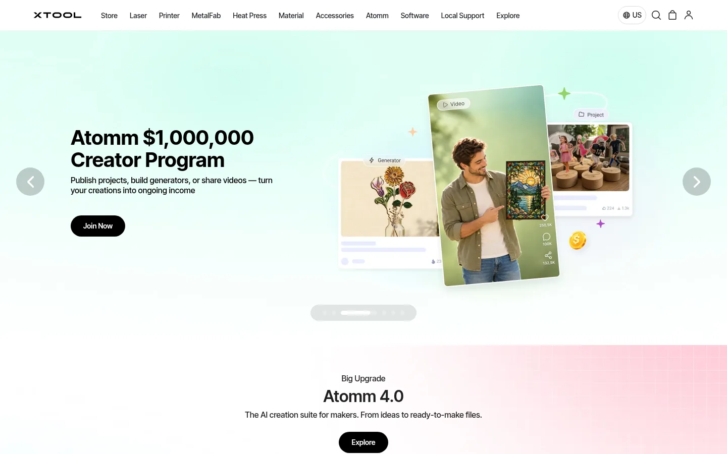
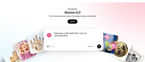
The visual system starts with a white canvas and a compact black-and-white storefront header. Black anchors headings and pill-shaped primary actions, while muted gray text and fine gray borders keep product details legible without competing with imagery. Pale gray and blue-white surfaces distinguish selected cards and quiet content bands. The homepage’s strongest colour moments come from campaign artwork: mint and blush gradients, colourful product scenes, and community photography; treat these as section-specific media rather than a site-wide palette. InterTight provides a modern, compact sans-serif voice, with medium body and navigation weights and stronger, larger headings. The page alternates broad, image-led campaign areas with product grids, editorial cards, and support links. Left-aligned titles organize most sections, while the AI feature is centered. Generous whitespace around major stories contrasts with dense product and footer information. Rounded black CTAs and card corners soften the technical product focus.
配色
点色块复制色值。用途说明来自对页面的实测位置(背景、文字、描边、按钮)与截图判读。
品牌色
强调色
表层色
中性色
页面底色 · Gallery White表层 · Maker Black表层 2 · Cool Porcelain表层 3 · Soft Fog主文字 · Maker Black次要文字 · Quiet Graphite弱文字 · Gallery White描边 · Fine Silver强调 · Signal Blue
Site-wide headings, body copy, navigation, buttons, captions, and links.
角色
示例
字号
字重
行高
字距
一级标题
Primary campaign and lead headline.
xTool
40px
600
1.1
0
二级标题
Major section titles and prominent product or feature headings.
xTool
32px
600
1.13
0
三级标题
Subsection headings and product names.
The quick brown fox 敏捷的狐狸
24px
500
1.33
0
正文
Product descriptions, campaign support copy, and explanatory text.
The quick brown fox 敏捷的狐狸
14px
500
1.29
0
辅助文字
Compact metadata and small supporting labels.
The quick brown fox 敏捷的狐狸
12px
500
1.33
0
按钮
Primary and secondary CTA labels.
The quick brown fox 敏捷的狐狸
14px
600
1.29
0
导航
Header navigation items and store category links.
The quick brown fox 敏捷的狐狸
14px
500
1.64
0
链接
Editorial, product-detail, and footer text links.
The quick brown fox 敏捷的狐狸
13px
500
1.5
0
间距与布局
基准单位 8px · 密度:紧凑
32px版块间距
8px元素间距
34px卡片内边距
1312px内容最大宽度
4px
8px
11px
12px
15px
16px
24px
32px
36px
40px
64px
Use a centered storefront frame with a measured maximum width of 1312px and a compact overall density. The header runs horizontally above a sequence of broad campaign sections and narrower content grids. Most section titles align left; the Atomm feature centers its title and copy. Measured sections use two-, three-, four-, six-, and eight-column arrangements, with full-bleed media for hero campaigns and contained layouts for product and editorial content. Keep section changes clear and whitespace generous around major imagery.
圆角与层次
按钮 · 9999px
输入框 · 8px
卡片 · 16px
导航 · 4px
链接 · 8px
没有测到阴影:页面是扁平的,层次靠底色和描边区分。
The measured system has no defined shadows; rely on flat surfaces, fine borders, and image layering instead. Product cards use subtle outlines, while black filled buttons and rounded card corners provide distinction without heavy elevation. Hero artwork can overlap or layer within the composition, but keep the surrounding page clean and flat.
组件
下面的预览按实测的按钮、输入框、徽标、卡片样式重建(字体用替代字体)。
Store header
Compact white horizontal navigation with dark labels, xTool wordmark, and utility icons; keep it distinct from the campaign imagery below.
Primary CTA
Black pill button with white InterTight semibold text; measured labels are 14px, with generous horizontal padding and no shadow.
Outlined product action
Secondary Buy action uses dark text, a fine gray outline, and a rounded pill treatment.
Product card
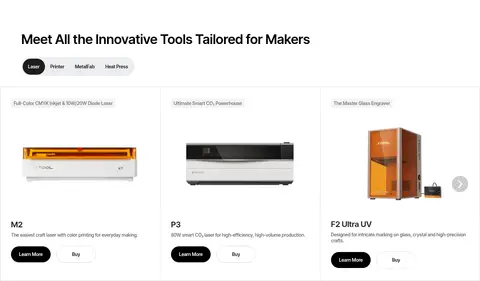
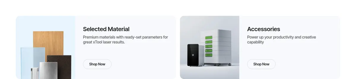
Equipment image, concise product title, short description, and paired actions; measured cards use a thin gray border and compact text.
Campaign hero
Broad image-led slide combining a left-aligned headline and CTA with creator or product media; carousel arrows and a small progress indicator support browsing.
Editorial feature card
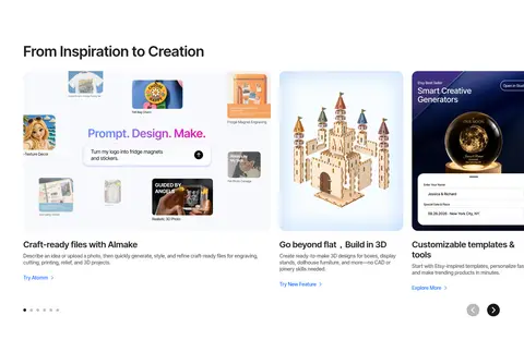
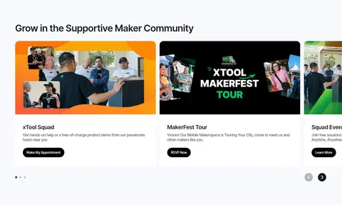
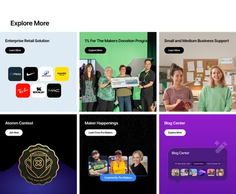
Image-led card with a compact title and copy beneath or over media; use for creative tools, community, and business content.
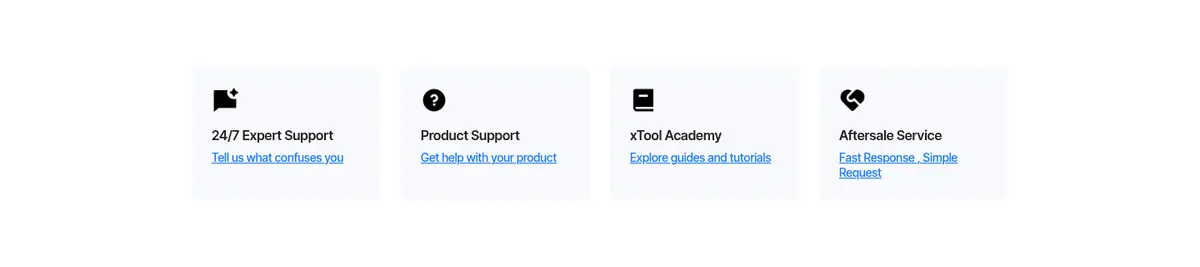
Support link tile
Small utility tile combining an icon, short support heading, and a blue or dark text link.
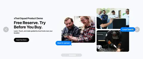
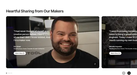
Imagery · Lead with large campaign images that combine product scenes, creator portraits, and interface-like creative outputs. Product grids use isolated equipment photography; editorial blocks mix maker photos, event artwork, and brand graphics. Video testimonials appear as broad photographic cards. Campaign imagery may contain vivid gradients and colours not present in the measured interface palette, so keep those colours within their media rather than extending them to global controls.
Use InterTight-style compact sans-serif typography.
Let campaign photography supply most vivid colour.
Separate product cards with fine gray borders.
Use rounded pill shapes for primary buttons.
Alternate broad media sections with tidy content grids.
✕ 不该做
Do not turn campaign artwork colours into global UI colours.
Do not add heavy shadows to otherwise flat cards.
Do not use oversized, decorative display typography.
Do not crowd hero images with extra interface elements.
Do not use blue as the dominant CTA colour.
Do not make all sections center-aligned.
Do not replace product photography with generic abstract graphics.
给 AI 的提示词
想快速出一个同风格的新页面,把这段话连同 DESIGN.md 一起发给 AI。
Build a new xTool-style page as a clean, image-led ecommerce experience. Use Gallery White (#ffffff) as the canvas, Maker Black (#000000) for headings and primary pill CTAs, Quiet Graphite (#595959) for secondary copy, and Fine Silver (#d9d9d9) for restrained borders. Use Cool Porcelain (#f8f9fd) or Soft Fog (#f3f3f3) only for quiet surfaces. Set compact InterTight-like sans-serif typography with clear heading hierarchy and left-aligned section titles. Compose a broad campaign hero, then alternate contained product or editorial grids with spacious feature sections. Use real product and maker imagery as the main source of colour; keep campaign gradients inside the media. Prefer flat layouts, subtle outlines, rounded buttons, and clear shopping actions. Avoid heavy shadows and decorative interface clutter.