North star · Keep the page calm and spacious, using Replay pink only to make the next action unmistakable.
The visual strategy is built on an unusually quiet palette: white and pale gray alternate across broad horizontal sections, while deep charcoal carries headlines and muted gray supports body copy. Saturated Replay pink is reserved for the primary CTA, small section labels, and links, so it reads as a deliberate action signal rather than a decorative wash. Inter provides a consistent, modern voice; bold, tightly tracked display headlines contrast with smaller, comfortably spaced explanatory text. The page uses a centered, constrained content column for most messaging, then introduces wider product imagery and occasional multi-column cards to demonstrate the workflow. Generous vertical breathing room separates the sections, while repeated gray bands establish a steady scroll rhythm. Rounded pill buttons, softly rounded cards, fine gray borders, and restrained shadows keep interface examples legible without making the page feel heavy. Product screenshots are evidence, not the page’s color source.
All page typography: hero and section headings, body copy, navigation, labels, links, and buttons.
角色
示例
字号
字重
行高
字距
特大标题
Oversized, bold hero headline with tight tracking.
Replay
60px
700
1
-0.025em
一级标题
Primary section headlines and prominent page titles.
Replay
40px
700
1.4
0
二级标题
Secondary headings and feature or FAQ titles.
The quick brown fox 敏捷的狐狸
24px
500
1.33
-0.025em
三级标题
Card titles and tertiary explanatory headings.
The quick brown fox 敏捷的狐狸
18px
400
1.78
0
正文
Paragraphs describing workflows, product value, and setup.
The quick brown fox 敏捷的狐狸
14px
400
1.63
0
辅助文字
Fine print, author details, and short supporting notes.
The quick brown fox 敏捷的狐狸
12px
400
1.33
0
按钮
Primary CTA and other prominent action labels.
The quick brown fox 敏捷的狐狸
16px
500
1.75
0
导航
Top-level navigation and prominent nav actions.
The quick brown fox 敏捷的狐狸
16px
500
1.75
0
链接
Inline learn-more links and secondary navigation actions.
The quick brown fox 敏捷的狐狸
14px
500
1.71
0
眉题
Small uppercase labels above section headlines.
The quick brown fox 敏捷的狐狸
14px
700
1.71
0.05em
间距与布局
基准单位 8px · 密度:宽松
96px版块间距
24px元素间距
28px卡片内边距
768px内容最大宽度
8px
10px
12px
14px
16px
20px
24px
28px
32px
40px
48px
96px
Use a centered, constrained content column, with the measured page maximum of 768px guiding text and FAQ widths. Sections span the page and alternate white with pale gray; keep major content centered, except for editorial copy and workflow details that align to the start. The measured section rhythm is spacious, with 96px section gaps and 24px element gaps as the underlying cadence. Use a single column for most storytelling, then introduce three-column process cards and two-column workflow content. Keep the overall density low and let screenshots occupy a clear, contained focal area.
圆角与层次
按钮 · 50%
卡片 · 12px
图片 · 50%
导航 · 9999px
xl · card
md · nav
hairline · button
hairline · card
Favor flat section bands and fine #e5e7eb borders over strong shadows. Cards have a measured 12px radius and a light hairline edge; nav and card shadows are subtle, not a defining visual layer. Reserve deeper separation for screenshot mock-ups, keeping the surrounding page calm.
组件
下面的预览按实测的按钮、输入框、徽标、卡片样式重建(字体用替代字体)。
Primary CTA
Use a #f02d5e pill with white Inter text, measured 9999px radius, and generous horizontal padding; repeat the same treatment for the main conversion action.
Header navigation
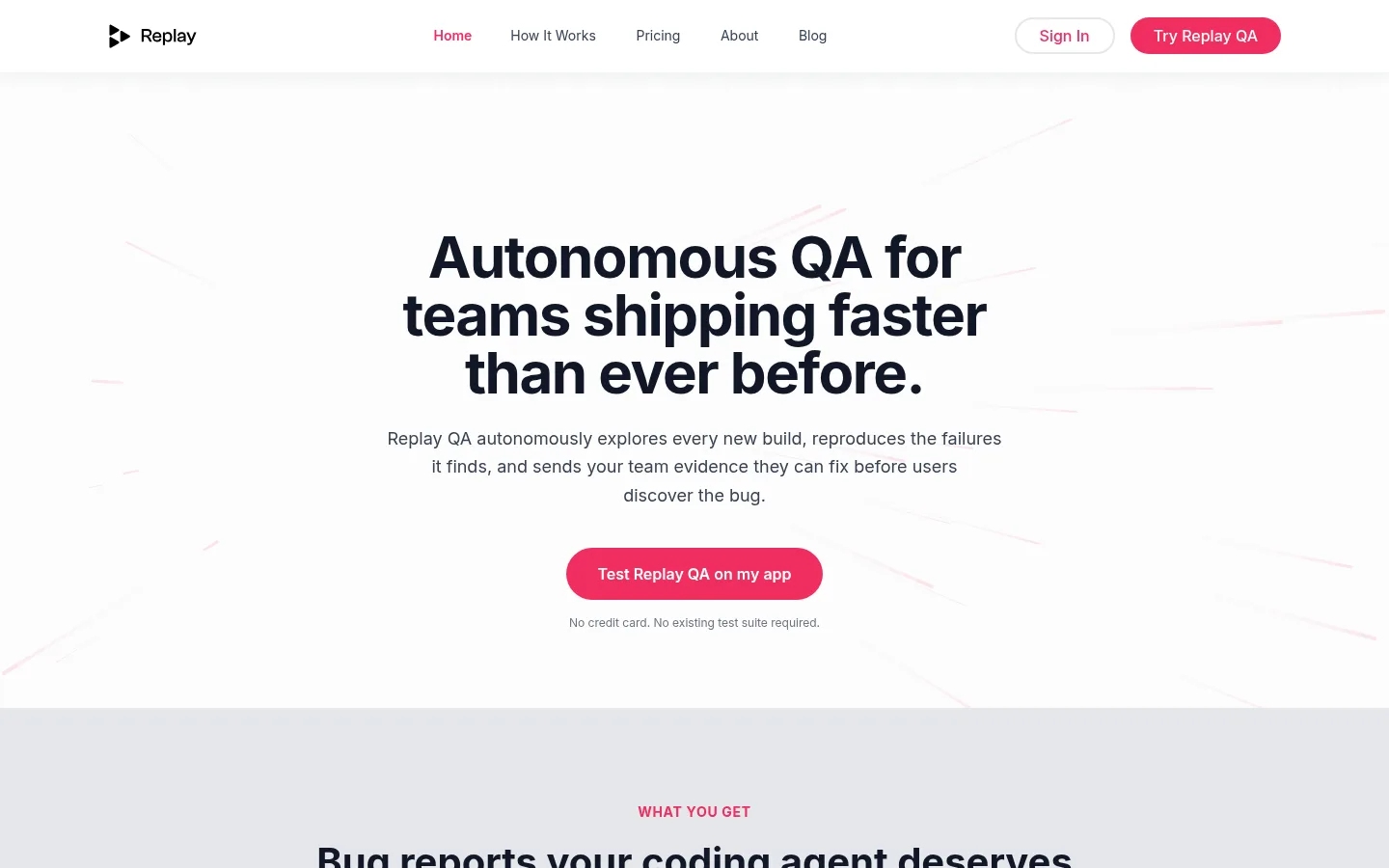
Place the Replay mark at left, compact navigation centrally, and outlined Sign In plus a pink pill CTA at right. Use dark labels and a subtle separation from the page.
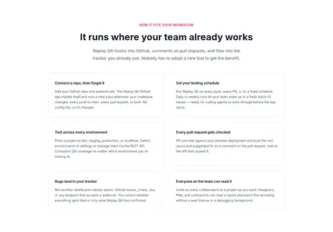
Feature cards
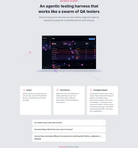
Use white surfaces, measured 12px corners, #e5e7eb hairline borders, and comfortable internal padding. Keep descriptions small and readable.
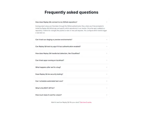
FAQ accordion
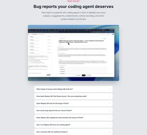
Stack clean white question rows on a light canvas with thin gray dividers and small chevrons; keep the expanded answer compact and left aligned.
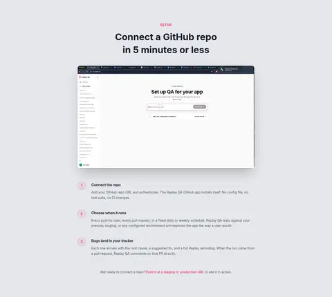
Product screenshot
Center a contained product image within its section, preserve interface detail, and use a softly rounded frame rather than a decorative crop.
Eyebrow label
Set short section labels in uppercase Inter bold with a pink accent, positioned directly above the main heading.
Testimonial band
Use a very pale blush field, centered quote, understated author details, and small carousel indicators.
Imagery · Use real product-interface screenshots and recordings as the main visual proof, framed in clean, rounded containers against pale section backgrounds. Keep screenshots centered and legible rather than cropping them into decorative backgrounds. Some interface imagery is dark, but it belongs to the product mock-up and should not change the site palette. Subtle pink strokes and a soft footer gradient may accompany the content; avoid adding unrelated illustration or stock photography.
Alternate white and pale-gray section backgrounds.
Reserve #f02d5e for actions, links, and small labels.
Use Inter consistently throughout the page.
Keep hero and section messaging centered and easy to scan.
Show product screenshots as contained evidence.
Use thin gray borders and restrained elevation.
Leave generous vertical breathing room between sections.
✕ 不该做
Do not turn the pink accent into a full-page background.
Do not add colors outside the measured palette.
Do not let product screenshot colors redefine the site palette.
Do not use heavy shadows on ordinary cards.
Do not crowd section headings with dense copy.
Do not introduce sharp, square CTA buttons.
Do not make every content block a multi-column layout.
给 AI 的提示词
想快速出一个同风格的新页面,把这段话连同 DESIGN.md 一起发给 AI。
Build a new page in Replay’s calm, product-led visual style. Use Gallery White (#ffffff) and Quiet Slate (#e5e7eb) as the main alternating surfaces, Ink Black (#111827) for headlines, and Slate Copy (#4b5563) for supporting text. Apply Replay Pink (#f02d5e) sparingly to pill CTAs, links, active states, and uppercase section labels. Set all text in Inter, using bold display headings, medium-weight controls, and regular body copy. Keep the content column centered and constrained, with generous section spacing and clear, low-density layouts. Use rounded white cards with fine gray borders, restrained shadows, and real product screenshots framed as evidence. Add only subtle blush or footer-gradient details. Prioritize legibility and a clear action hierarchy over decoration.