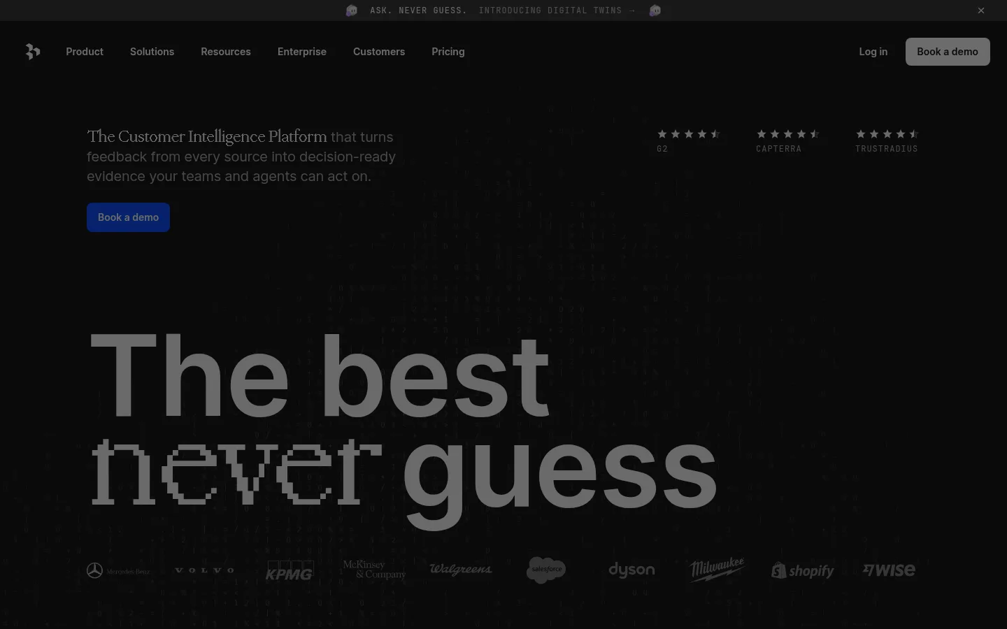
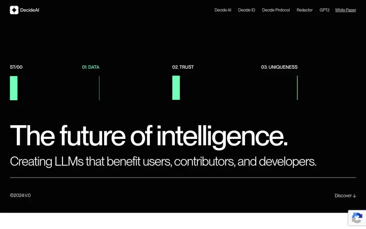
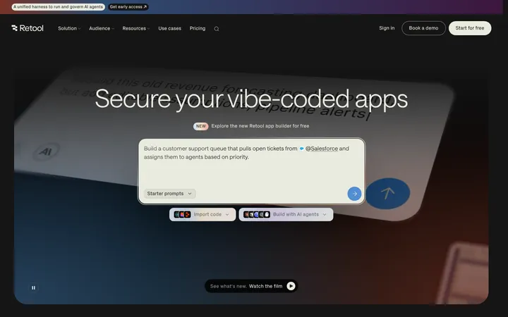
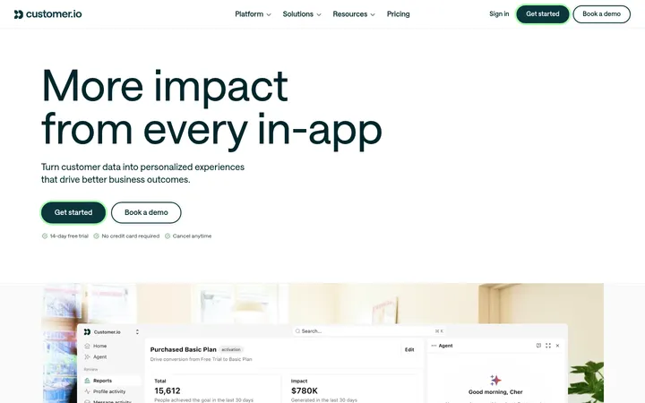
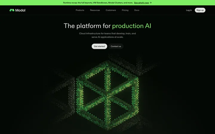
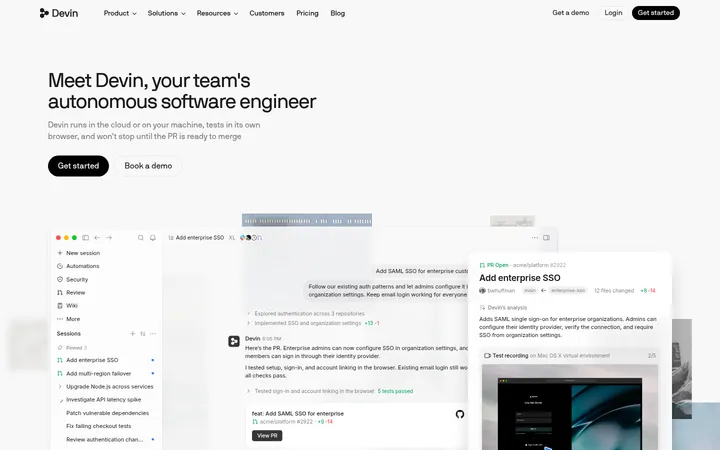
North star · Keep the page nearly black and spacious, using expressive type and product evidence for impact while reserving vivid blue for decisive actions and proof.
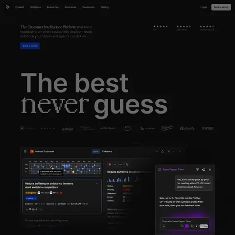
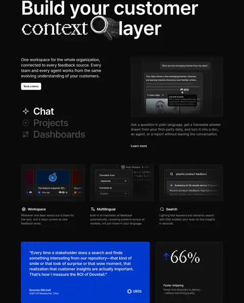
The page is built on a nearly uniform #0a0a0a canvas, with off-white typography and muted gray supporting text. Saturated blue is reserved for the main demo action and vivid customer quote panels, so it punctuates rather than overwhelms the dark presentation. Inter supplies most of the interface and headings; large, tightly tracked display lines are occasionally disrupted by a pixelated or serif-like word treatment. JetBrains Mono marks small uppercase announcements and eyebrow labels, while PP Mondwest gives select headings a distinctive editorial contrast. A centered, constrained content area supports left-aligned text, product UI panels, and alternating feature compositions. Sections have generous vertical breathing room, with denser grids used for trust details and customer stories. Product screenshots and interface mockups sit directly against dark surfaces; vivid blue testimonial cards provide the clearest color break. Fine borders and subtle surface changes define cards without relying on shadows.
Primary display, headings, body copy, navigation, buttons, and interface text.
Aa 设计
JetBrains Mono
网络字体 · 字重 400 · 占比 3%
免费替代:IBM Plex Mono
Small uppercase announcement, eyebrow, and code-like labels.
Aa 设计
PP Mondwest
网络字体 · 字重 400 · 占比 1%
免费替代:DM Mono
Occasional serif-like display word treatments and select expressive headings.
角色
示例
字号
字重
行高
字距
特大标题
Oversized hero statement and expressive campaign-style headlines.
Dovetail
112px
600
0.8
-0.019em
一级标题
Primary hero and major section headings.
Dovetail
64px
600
1.06
-0.031em
二级标题
Large feature, trust, and closing call-to-action headings.
Dovetail
56px
600
1.07
-0.036em
三级标题
Occasional editorial display phrase within mixed-style headings.
The quick brown fox 敏捷的狐狸
25px
400
1.12
-0.01em
四级标题
Secondary feature titles and card headings.
The quick brown fox 敏捷的狐狸
24px
500
1.33
-0.021em
正文
Introductory and feature explanation copy.
The quick brown fox 敏捷的狐狸
20px
500
1.4
-0.012em
辅助文字
Supporting labels, card descriptions, and customer-story details.
The quick brown fox 敏捷的狐狸
16px
500
1.5
0
按钮
Compact demo and navigation action labels.
The quick brown fox 敏捷的狐狸
14px
600
1.29
0
眉题
Uppercase announcement and small section labels.
The quick brown fox 敏捷的狐狸
12px
400
1
0.083em
代码
Monospaced uppercase interface-style microcopy.
const style = 1;
12px
400
1
0.083em
间距与布局
基准单位 8px · 密度:宽松
120px版块间距
4px元素间距
—卡片内边距
1192px内容最大宽度
4px
8px
10px
12px
15px
16px
24px
32px
48px
96px
124px
A centered content frame reaches a measured maximum width of 1192px, with most section content left-aligned. The homepage is a long sequence of generously separated blocks rather than a compressed dashboard: feature splits, product UI presentations, trust details, testimonials, and a dense multi-column footer. Measured spacing follows an 8px base-unit system with a 120px section gap. Use two- to four-column arrangements for feature and trust content, then wider grids for story cards and footer links; retain large open areas around headline and hero media.
圆角与层次
按钮 · 8px
卡片 · 8px
图片 · 4px
徽标 · 8px
链接 · 8px
没有测到阴影:页面是扁平的,层次靠底色和描边区分。
The design is mostly flat, with no measured shadows. Dark surface shifts distinguish cards from the canvas, while thin #1d1d1d borders quietly outline testimonials and panels. Product UI is layered within its own screenshots; use those contained interface details for depth rather than adding prominent page-level effects.
组件
下面的预览按实测的按钮、输入框、徽标、卡片样式重建(字体用替代字体)。
Primary demo button
Use a #0044ff fill, #fafafa label, 8px radius, and measured 14px semibold Inter styling; the larger hero action uses 18px text.
Announcement strip
A narrow top-of-page message uses small, uppercase, widely tracked JetBrains Mono text against the dark canvas.
Product interface panel
Present dashboards and AI conversation mockups on #121212 or #191919 surfaces with minimal borders and surrounding dark space.
Customer quote card
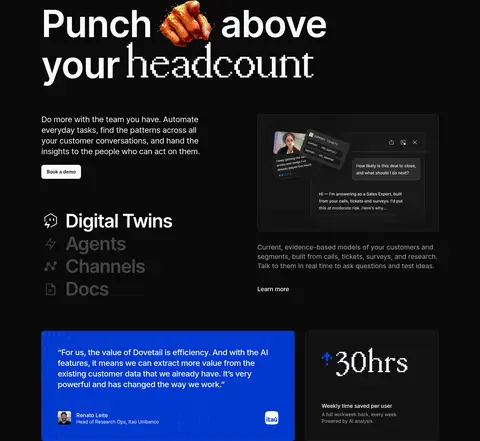
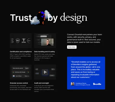
Use a bold blue panel with off-white quote text, attribution, and a customer logo; pair with adjacent dark metric cards where appropriate.
Feature selector
Stack feature names alongside a product panel; emphasize the active option in off-white and mute inactive options.
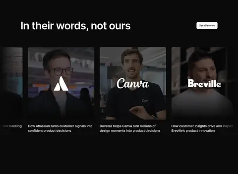
Story gallery card
Use a wide photographic or video still with darkened framing, customer branding, and a concise story caption.
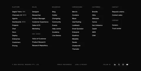
Footer link columns
Arrange small uppercase category labels above compact link lists, using muted text and understated dividers.
Imagery · The visual evidence is primarily software: dark product screenshots, conversation panels, dashboards, and feature mockups. Customer-story cards use photographic portraits and video-like stills with subdued dark treatment. Select headlines pair typography with small illustrative or rendered accents, but these are decorative exceptions, not the defining brand palette. Keep media framed in dark surroundings and avoid bright stock-photo styling.
Use #fafafa for primary text and #a7a7a7 for supporting copy.
Reserve #0044ff for primary actions and selected proof panels.
Use oversized, tightly tracked Inter headlines with occasional editorial contrast.
Give sections generous vertical breathing room.
Show product UI as concrete evidence rather than generic decoration.
✕ 不该做
Do not add gradients or prominent shadows.
Do not turn every card or link blue.
Do not introduce bright section backgrounds.
Do not make body copy compete with the headline.
Do not use decorative photography in place of product interface evidence.
Do not flatten the page into a dense dashboard grid.
给 AI 的提示词
想快速出一个同风格的新页面,把这段话连同 DESIGN.md 一起发给 AI。
Build a new Dovetail-style SaaS page on a #0a0a0a Midnight Canvas. Use #fafafa Soft Chalk for strong Inter headlines and primary copy, and #a7a7a7 Muted Silver for secondary text. Keep #0044ff Signal Blue for the main CTA and selected customer proof; use #121212 Graphite Surface and #191919 Coal Surface for restrained product panels, with #1d1d1d Quiet Hairline borders. Compose a centered, spacious page with large left-aligned editorial headings, feature splits, dark product-interface mockups, and occasional vivid quote cards. Use JetBrains Mono for small uppercase announcement labels and sparse PP Mondwest-like contrast for expressive words. Favor generous section separation, compact semibold buttons with rounded corners, and a quiet multi-column footer. Avoid gradients, strong shadows, and bright decorative imagery.