深色主题媒体内容independent film studio homepage电影感极简深色编辑式排版超大字体原网页 rokumaruichi.tokyo ↗ · 2026-10-12 采集 · 1440×900 桌面端
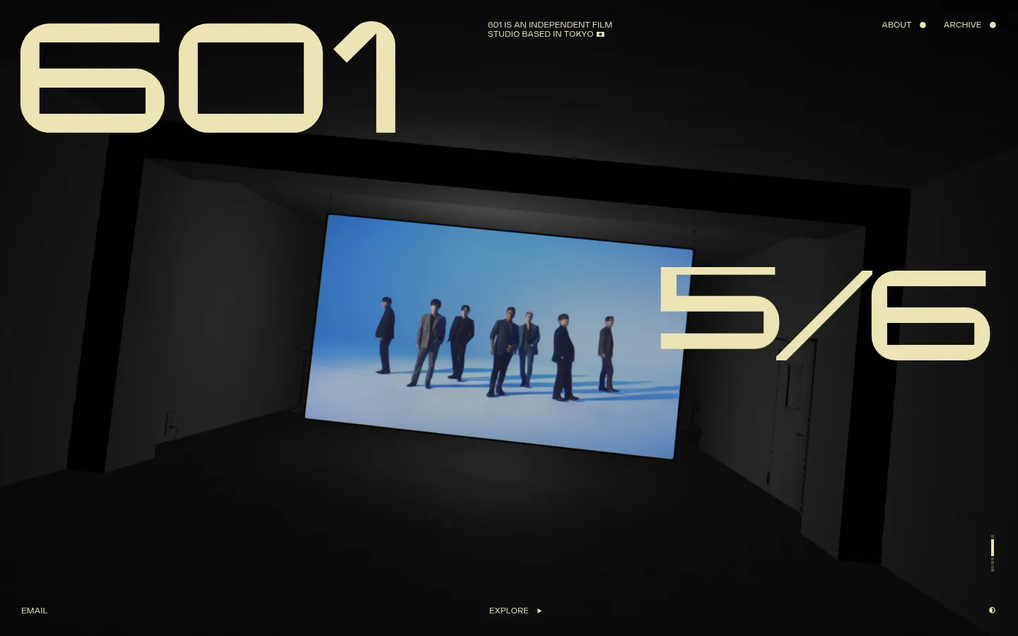
601 Inc. 以近黑色画布搭配浅黄文字,呈现沉浸式影像作品。超大品牌数字、克制的导航与不断变化的影片画面,让首页宛如电影片头。
North star · Treat the page as a dark cinema screen: let one oversized pale-yellow mark and one immersive film frame carry the composition.
The page is built around a near-black canvas (#090909) that lets the film footage read as the main visual event. Pale yellow (#ece4b4) is the sole measured brand color, used for the oversized “601” and episode counter as well as small navigation labels and utility text. The result is high contrast without introducing a separate CTA color or decorative palette. Display typography is exceptionally large, uppercase, and geometric, while compact uppercase sans-serif text handles the studio description, navigation, and bottom-edge actions. The composition uses broad, open space rather than boxed content: a large film image sits within a dark, architectural frame, with the numerals overlapping its edges. Small header details sit near the top, while email and explore actions anchor the bottom. The motion-led imagery supplies cooler blue and gray tones, but these belong to the footage rather than the core interface palette. Keep surfaces flat, edges sharp, and supporting text sparse.
Compact uppercase navigation, studio description, and utility labels.
Aa 设计
changeling-neo
网络字体 · 字重 400 · 占比 7%
免费替代:Michroma
Oversized display numerals and large uppercase headline lettering.
角色
示例
字号
字重
行高
字距
特大标题
Oversized 601 brand mark and prominent episode counter.
601 Inc.
280px
400
normal
-0.04em
一级标题
Large uppercase hero lettering where a headline is present.
601 Inc.
230px
400
normal
0
二级标题
Secondary uppercase section or feature titles.
601 Inc.
42px
400
normal
-0.04em
正文
Small uppercase studio description and supporting copy.
The quick brown fox 敏捷的狐狸
12px
400
1
0
导航
Compact uppercase header links and utility navigation.
The quick brown fox 敏捷的狐狸
12px
400
1
0
间距与布局
基准单位 2px · 密度:适中
—版块间距
—元素间距
—卡片内边距
—内容最大宽度
1px
3px
4px
5px
6px
12px
15px
21px
24px
28px
30px
Use a viewport-filling, single-scene composition with content distributed across the edges rather than placed in a centered card grid. Keep the studio mark large at the upper left, a concise description near the top, and navigation aligned at the upper right. Center the film frame within a darker architectural surround, allowing display numerals to overlap it. Keep email and explore actions near the lower edge. Measurements provide no page maximum width or section rhythm, so preserve the spacious, full-bleed impression without inventing fixed dimensions.
圆角与层次
没有测到阴影:页面是扁平的,层次靠底色和描边区分。
The interface reads as flat, with no measured shadows, gradients, or card treatments. Use sharp-edged divisions and rely on the darker architectural framing within the footage for depth. Keep the media layer visually distinct from the page canvas without adding invented borders, radii, or elevation effects.
组件
下面的预览按实测的按钮、输入框、徽标、卡片样式重建(字体用替代字体)。
Oversized studio mark
A huge pale-yellow “601” sits at the upper left in Changeling Neo, functioning as both brand signature and display typography.
Compact header navigation
Small uppercase About and Archive links align at the upper right in Diagramm, accompanied by tiny pale-yellow dot markers.
Studio descriptor
A concise uppercase statement identifying the independent Tokyo film studio appears near the top, set in small Diagramm text.
Immersive film frame
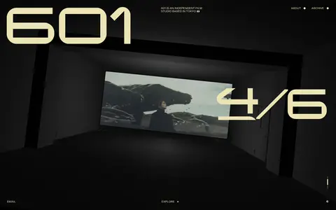
A wide film image occupies the center of a dark, room-like architectural surround, establishing the main visual focus.
Episode counter
An oversized pale-yellow fraction overlaps the right side of the film image as a prominent display element.
Bottom utility links
Email and Explore sit near the lower edge as small uppercase labels; Explore includes a small directional marker.
Imagery · Use cinematic film or video as the central visual, framed like a projected image within a dark room or architectural surround. The footage can bring in muted blue, gray, and natural scene colors; treat these as image content, not interface palette. Keep the image wide and immersive, with large type layered over or beside it rather than captions or decorative illustration.
Reserve #ece4b4 for brand typography and small interface details.
Make the film frame the central visual event.
Set primary display lettering in an oversized geometric uppercase style.
Keep navigation and supporting copy compact and uppercase.
Let display type overlap the media when it suits the composition.
✕ 不该做
Don't add a bright CTA color.
Don't turn the layout into a card grid.
Don't add rounded cards or decorative shadows.
Don't treat colors within the footage as brand palette.
Don't crowd the header with extra copy.
Don't shrink the display mark into a conventional logo lockup.
给 AI 的提示词
想快速出一个同风格的新页面,把这段话连同 DESIGN.md 一起发给 AI。
Build a new page in the visual style of 601 Inc.: an independent film studio homepage that feels like a cinematic title sequence. Use Cinema Black (#090909) as the full-page canvas and Projection Ivory (#ece4b4) for display lettering, navigation, and small labels. Place an oversized geometric uppercase brand mark near the top left, compact studio information and navigation along the top edge, and one immersive film or video frame as the central focus. Let a large episode-style counter overlap the media. Anchor sparse utility links near the bottom edge. Use Changeling Neo-like geometric display typography and Diagramm-like compact uppercase sans-serif text. Keep the composition open, flat, sharp-edged, and media-led; do not introduce cards, gradients, rounded corners, shadows, or extra interface colors.