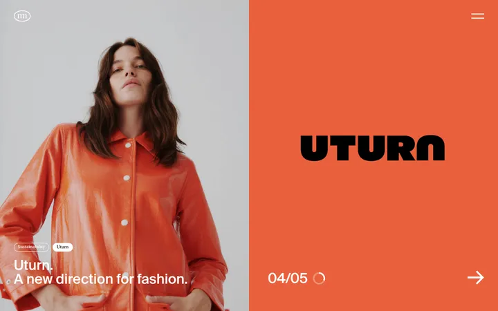
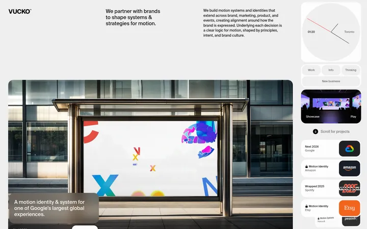
North star · Keep the interface nearly black and typographically restrained, letting oversized project imagery provide the page’s colour and energy.
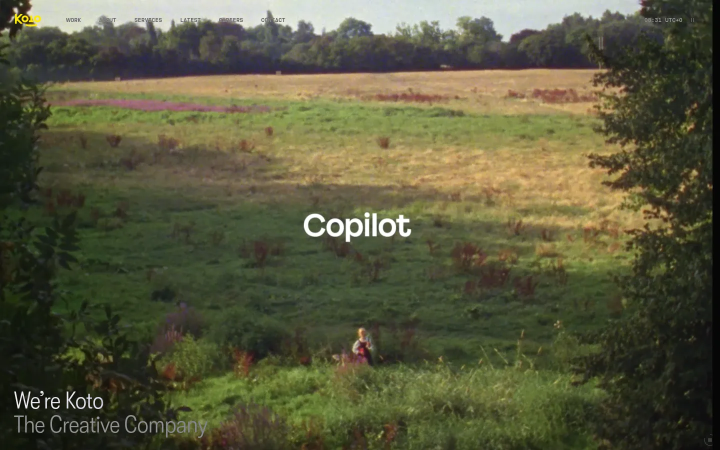
Build the page around a nearly uninterrupted #060606 canvas; it is the defining brand colour, not a backdrop for colourful UI chrome. White headings and muted grey supporting copy create a restrained hierarchy, while #141414 media surfaces and #1f1f1f hairlines separate content without adding elevation. Use the measured Koto condensed face for large, light-weight headings and the standard face for readable body copy and compact links. The mono face gives small uppercase utility labels a technical counterpoint. Keep the composition spacious and deliberately asymmetric: work media can sit offset from the page edge, while the news area uses a compact multi-column arrangement and the footer returns to sparse text. The hero and project imagery may carry strong natural or campaign colours; treat those as artwork, not interface accents. Maintain clear contrast and let imagery, typography, and negative space do the expressive work.
配色
点色块复制色值。用途说明来自对页面的实测位置(背景、文字、描边、按钮)与截图判读。
品牌色
表层色
中性色
页面底色 · Koto Black表层 · Media Charcoal表层 2 · Graphite Line主文字 · Studio White次要文字 · Soft Ash描边 · Graphite Line
文字
背景
对比度
WCAG
#ffffff Studio White
#060606 Koto Black
20.26:1
AAA
#ffffff Studio White
#141414 Media Charcoal
18.42:1
AAA
#ffffff Studio White
#1f1f1f Graphite Line
16.48:1
AAA
#989898 Soft Ash
#060606 Koto Black
7.02:1
AAA
#989898 Soft Ash
#141414 Media Charcoal
6.39:1
AA
#989898 Soft Ash
#1f1f1f Graphite Line
5.71:1
AA
字体
字号阶梯:Custom(比例约 1.732,正文 16px)。示例用免费替代字体渲染,数值为实测。
Aa 设计
gtKotoheim
网络字体 · 字重 350 · 占比 84%
免费替代:Inter
Main body copy, navigation, links, and compact labels.
Aa 设计
gtKotoheimMono
网络字体 · 字重 400 · 占比 8%
免费替代:IBM Plex Mono
Small utility and time-style labels.
Aa 设计
gtKotoheimCondensed
网络字体 · 字重 300 · 占比 8%
免费替代:Roboto Condensed
Large page and section headings.
角色
示例
字号
字重
行高
字距
一级标题
Large, light condensed hero and primary page heading.
Koto
48px
300
1
-0.01em
二级标题
Light condensed section titles and prominent editorial headings.
Koto
38px
300
1.1
-0.01em
正文
Introductory statements, article summaries, and supporting paragraphs.
The quick brown fox 敏捷的狐狸
16px
350
1.25
0
辅助文字
Compact news metadata, image labels, and secondary copy.
The quick brown fox 敏捷的狐狸
14px
350
1.25
0
代码
Uppercase mono utility details, such as the live clock.
const style = 1;
11px
400
1
0
间距与布局
基准单位 4px · 密度:紧凑
40px版块间距
12px元素间距
6px卡片内边距
1408px内容最大宽度
2px
4px
6px
8px
12px
16px
24px
36px
48px
Use a wide, single-page canvas with a measured maximum content width of 1408px and compact overall density. The hero is full bleed; work content shifts into an offset, media-led composition rather than a rigid card grid. News is a two-column section with a featured story and smaller adjacent items. The contact area is also split into columns, while the footer stays sparse. Section transitions rely on generous black negative space; align headings to the start edge and keep utility labels small.
圆角与层次
没有测到阴影:页面是扁平的,层次靠底色和描边区分。
Keep the interface flat: measured shadows are absent, corners are square in the sampled card and link styles, and separation comes mainly from empty space. Use subtle #1f1f1f hairlines and dark media backing instead of raised panels. A dark lower-edge media gradient may improve text legibility over video.
组件
下面的预览按实测的按钮、输入框、徽标、卡片样式重建(字体用替代字体)。
Top navigation
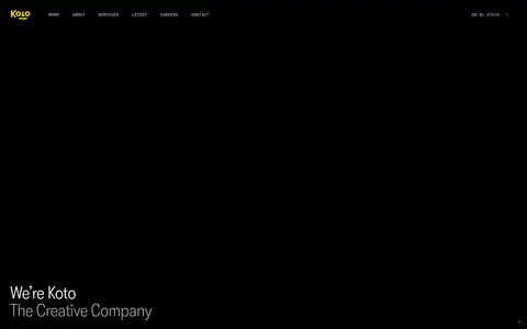
Compact links sit over the full-bleed hero, with the wordmark at the left and a small live time detail aligned to the right.
Hero statement
A cinematic full-bleed media field carries centered campaign branding and a light condensed agency introduction anchored near the lower-left.
Project showcase
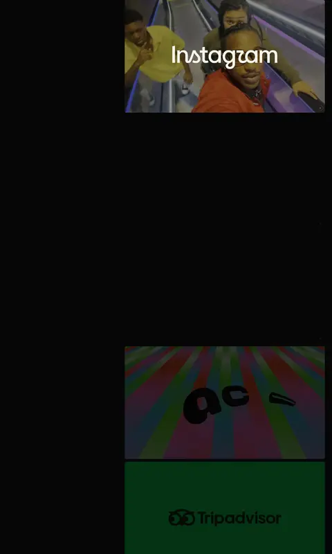
Offset project media tiles combine video or imagery with simple white labels and minimal surrounding chrome.
News feed
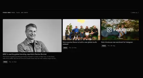
A two-column editorial area pairs a larger lead story with smaller cards, using compact metadata and concise text.
Contact and careers
Split contact information and recruitment links sit on the dark canvas with restrained headings and muted supporting links.
Footer details
Low-contrast legal and utility links remain small and unobtrusive beneath the main contact content.
Imagery · Use large, edge-to-edge or offset campaign photography and video as the primary expressive element. The hero is a cinematic full-bleed landscape with text anchored low and left; project tiles show varied campaign footage and branded artwork. Preserve each project’s own colours rather than turning them into UI accents. News imagery uses a compact editorial crop, including portraits and studio scenes.
Use muted grey for secondary copy and email links.
Let project media introduce its own colour.
Favor light, condensed headings over heavy display type.
Use asymmetrical media placement and ample negative space.
✕ 不该做
Do not add bright interface accents absent from the measured palette.
Do not use shadows to make cards appear raised.
Do not force every project into an identical grid.
Do not place dense body copy over busy imagery without contrast support.
Do not use heavy, bold headings as the default.
Do not make footer and metadata as prominent as project work.
给 AI 的提示词
想快速出一个同风格的新页面,把这段话连同 DESIGN.md 一起发给 AI。
Build a new page in Koto’s restrained creative-agency style. Use Koto Black (#060606) as the dominant canvas, Studio White (#ffffff) for primary text, and Soft Ash (#989898) for supporting copy and quiet links. Reserve Graphite Line (#1f1f1f) and Media Charcoal (#141414) for subtle boundaries and media backing; do not invent bright UI accents. Use light, narrow editorial headings, clean body text, and tiny uppercase mono utility labels. Make imagery the expressive focus: favor cinematic full-bleed or offset campaign media, then balance it with sparse copy and generous negative space. Keep layouts asymmetric where appropriate, with compact editorial content blocks and clear start-edge alignment. Avoid shadows, heavy cards, and decorative chrome; use contrast, spacing, and restrained hairlines to establish hierarchy.