North star · Let expressive film and product imagery carry the emotion while a flat black-and-white editorial system stays quiet and precise.
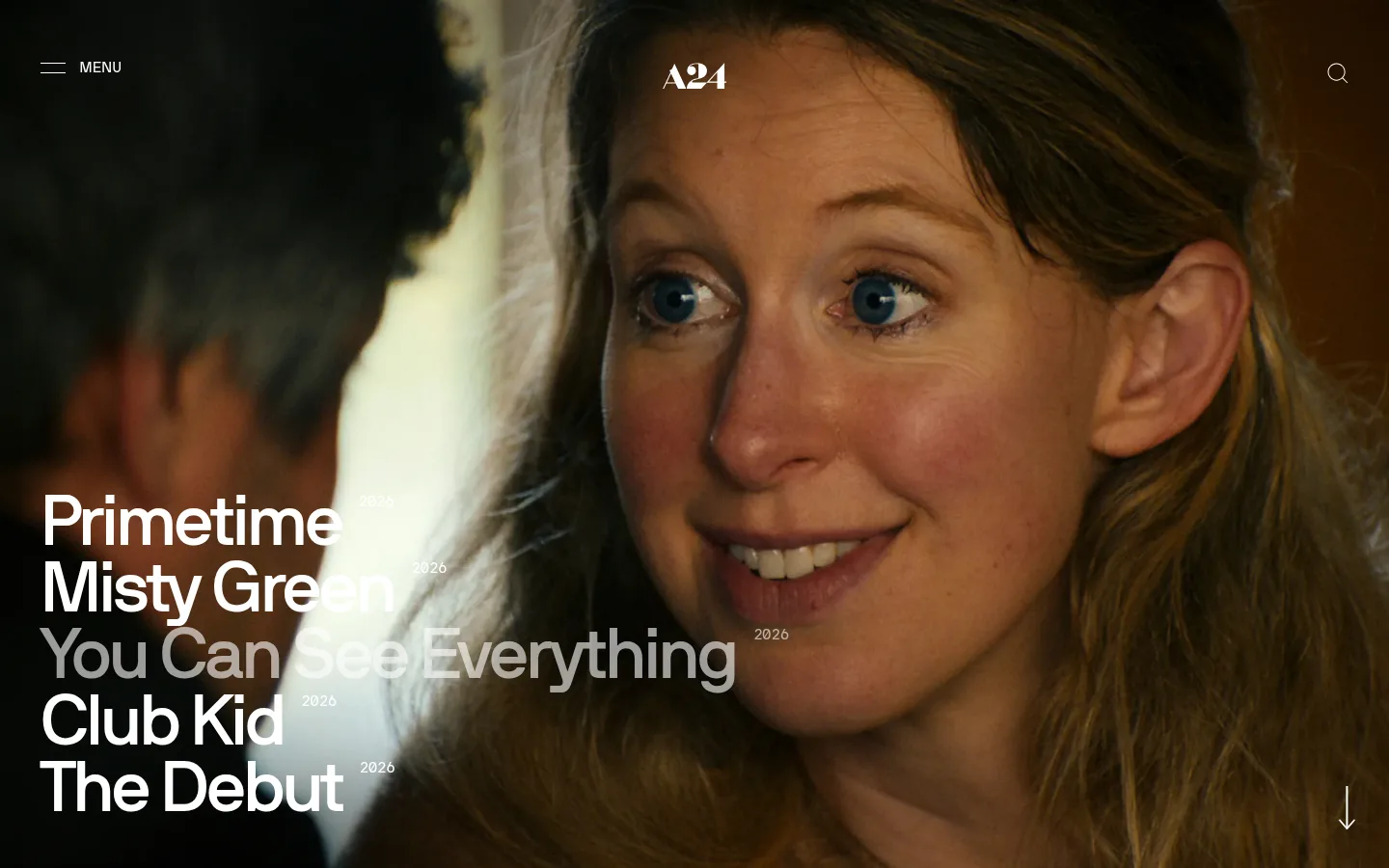
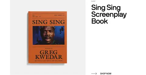
The page’s visual identity comes from a restrained black-and-white interface around richly colored film stills and product photography. Black (#000000) frames the opening hero and footer; white (#ffffff) fills the long central content run and carries navigation, headings, and links. Pale gray (#eeeeee) appears as a quiet field behind product imagery, while muted gray (#888888) softens secondary copy. NB International Web drives the oversized, tightly tracked hero titles as well as compact uppercase labels and body text, creating a clear scale contrast without decorative typography. The opening title list overlays full-bleed photography, while the rest of the page alternates spacious editorial feature rows: image on one side, text and a simple arrow link on the other. Film stills interrupt the white sequence as wide, immersive bands. Keep modules flat, edges square, and spacing generous; the imagery, not interface ornament, supplies the color and drama.
配色
点色块复制色值。用途说明来自对页面的实测位置(背景、文字、描边、按钮)与截图判读。
品牌色
表层色
中性色
页面底色 · Studio Black表层 · Soft Fog表层 2 · Gallery White主文字 · Gallery White次要文字 · Studio Black弱文字 · Quiet Gray描边 · Gallery White
文字
背景
对比度
WCAG
#ffffff Gallery White
#000000 Studio Black
21:1
AAA
#ffffff Gallery White
#eeeeee Soft Fog
1.16:1
不达标
#000000 Studio Black
#eeeeee Soft Fog
18.1:1
AAA
#000000 Studio Black
#ffffff Gallery White
21:1
AAA
#888888 Quiet Gray
#000000 Studio Black
5.92:1
AA
#888888 Quiet Gray
#eeeeee Soft Fog
3.06:1
AA-large
字体
字号阶梯:Custom(比例约 2.221,正文 15px)。示例用免费替代字体渲染,数值为实测。
Aa 设计
NB International Web
网络字体 · 字重 500 / 400 · 占比 97%
免费替代:Inter
Primary interface, titles, headings, navigation, body copy, captions, and links.
Aa 设计
NB International Mono Web
网络字体 · 字重 400 · 占比 3%
免费替代:IBM Plex Mono
Monospaced code-style text role; a minor accent in the measured type system.
角色
示例
字号
字重
行高
字距
特大标题
Oversized film titles layered over the full-bleed opening image.
A24
74px
500
0.92
-0.04em
一级标题
Compact uppercase section or content headings.
The quick brown fox 敏捷的狐狸
21px
500
1
0.014em
正文
Uppercase supporting copy and short descriptive text.
The quick brown fox 敏捷的狐狸
15px
400
1.67
0.005em
辅助文字
Small uppercase shop, podcast, and watch labels.
The quick brown fox 敏捷的狐狸
12px
400
1.32
-0.006em
导航
Large, bold menu labels in the expanded navigation treatment.
A24
74px
500
0.92
-0.04em
链接
Large editorial links, including oversized film-title entries.
A24
74px
500
0.92
-0.04em
代码
Minor monospaced detail where a code-like text treatment is needed.
const style = 1;
15px
400
0.92
-0.065em
间距与布局
基准单位 2px · 密度:宽松
102px版块间距
—元素间距
—卡片内边距
1368px内容最大宽度
2px
6px
9px
12px
22px
24px
36px
42px
48px
51px
54px
56px
96px
120px
Use a spacious, single-page editorial flow with a measured page maximum of 1368px. The opening hero is full bleed, while the central white run contains alternating image-and-copy feature rows; switch sides to create a deliberate rhythm. Film features return as full-width image bands. Keep text left-aligned, with strong negative space around image and text groups. The measured section gap is 102px, and the spacing system is based on a 2px unit with a varied scale. The overall density is spacious rather than dashboard-like.
圆角与层次
没有测到阴影:页面是扁平的,层次靠底色和描边区分。
The interface is predominantly flat: measurements report no shadows, no gradients, and no radius scale. Keep image and content edges square, with no raised-card styling. Separate modules using white space, shifts between black and white canvases, and changes in image scale rather than borders or decorative layers.
组件
下面的预览按实测的按钮、输入框、徽标、卡片样式重建(字体用替代字体)。
Full-bleed film hero
Use an edge-to-edge still with a stacked oversized title list and small year details; place minimal menu, centered mark, and search controls over the image.
Editorial feature row
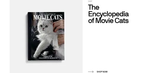
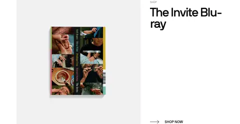
Pair an image with left-aligned text and a compact action link; alternate the image and copy sides across successive content rows.
Product image field
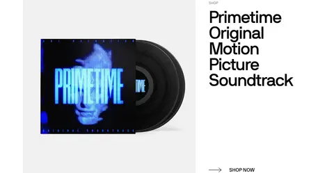
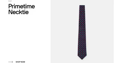
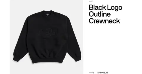
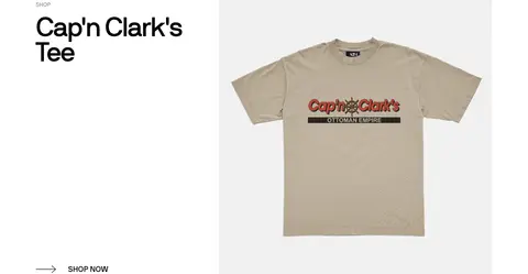
Place merchandise photography on a flat #eeeeee field within the otherwise white content canvas; avoid card shadows and rounded corners.
Film feature band
Use a full-width cinematic still with a small watch action and title anchored over the image.
Arrow action link
Render shop and listen actions as restrained text links with a simple arrow, not as filled buttons.
Footer and signup
Return to a black canvas for compact utility links, social links, and an email signup area with white text.
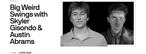
Imagery · Use cinematic photographic stills as full-bleed hero and film-feature backgrounds, cropped to immerse rather than boxed into cards. Product images sit against pale gray fields; podcast features use monochrome portrait photography. Keep imagery crisp and largely untreated by interface effects. Rich browns, greens, and other colors in screenshots belong to the film and product imagery, not the interface palette.
Use black and white as the interface’s dominant colors.
Let large photographic stills define hero and film sections.
Set titles in NB International Web or a close substitute.
Use uppercase, compact labels for content categories.
Alternate image and text placement in editorial rows.
Keep product imagery on quiet pale-gray fields.
Use whitespace and image scale to separate content.
✕ 不该做
Do not add gradients or decorative shadows.
Do not round image or card corners.
Do not introduce bright interface accents.
Do not turn simple links into filled CTA buttons.
Do not apply screenshot-dominant film colors as brand colors.
Do not crowd the editorial rows with extra UI.
Do not make the content feel like a uniform product grid.
给 AI 的提示词
想快速出一个同风格的新页面,把这段话连同 DESIGN.md 一起发给 AI。
Build a new entertainment-studio page in A24’s cinematic editorial style. Use Studio Black (#000000) and Gallery White (#ffffff) for the interface; reserve Soft Fog (#eeeeee) for restrained product-image fields and Quiet Gray (#888888) for secondary text. Start with a full-bleed film still, oversized tightly tracked title typography, and minimal overlay navigation. Continue with spacious, alternating image-and-copy rows, punctuated by wide film stills. Use NB International Web or Inter, compact uppercase labels, and simple arrow links rather than filled buttons. Keep square edges, flat surfaces, and generous measured-style spacing; do not add shadows, gradients, or ornamental borders. Treat colors inside photographs as image content, not palette additions. Finish with a compact black footer and clear signup area.